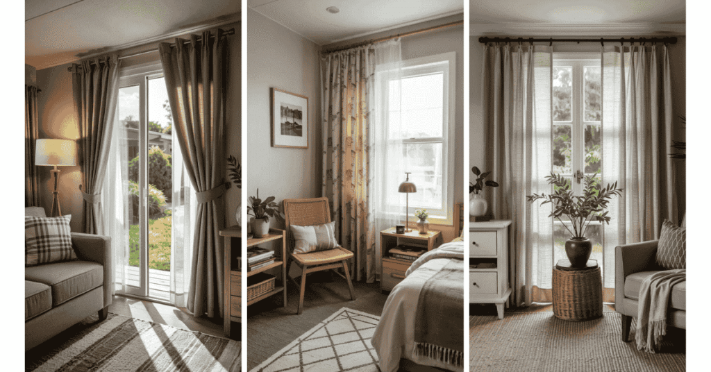
A dot the size of a pea can look like a woven texture from the doorway. A few big circles on the wall at the end of a hall can read like graphic art. Both are polka dots. The difference is what you can see from the place you usually stand or sit.
These 13 polka dot wallpaper ideas work through those decisions in adult spaces. Start with the surface you want to cover and the distance from which you’ll see it. Then look at the repeat, the contrast between the dots and the background, and how the finish behaves when your lamps are on.
1. Give a Powder Room a Fine Dot Behind the Mirror
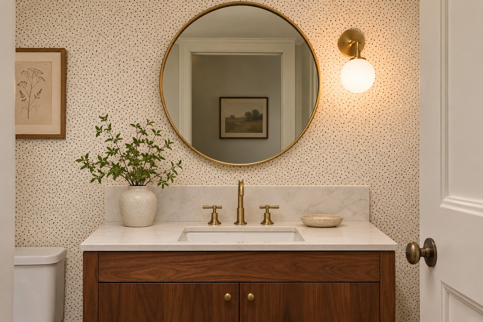
A powder room mirror brings the wall close enough to see every dot. Try a charcoal pin dot on an off-white ground and hold a sample beside the mirror with the vanity light on. If the dots look like scattered grit next to the mirror and grout, try a softer gray or a wider spacing. You want the mirror rim and faucet to read clearly from the door.
Keep tile or stone where water tends to hit behind the sink. Set the bottom row of dots far enough above that edge to show the full circles under the vanity light. Check the paper’s approved rooms and cleaning directions. These powder room decor ideas can help with the mirror and lighting around it.
2. Soften the Front Door View With Two Tones of Putty
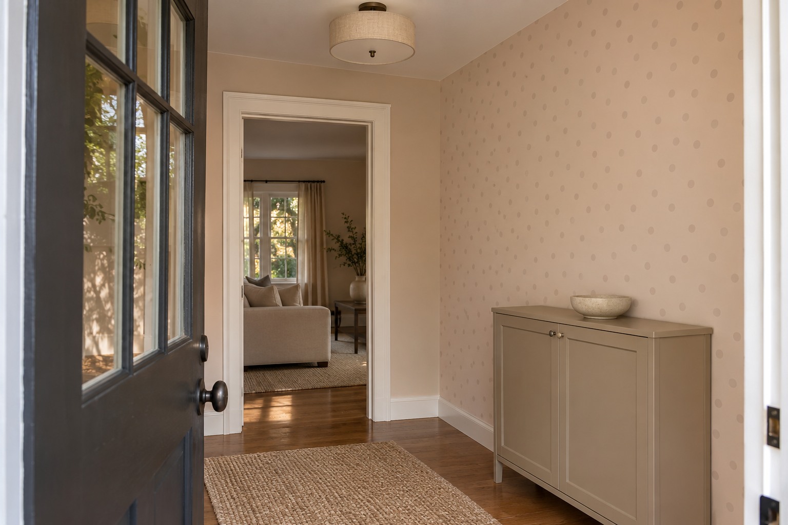
An entry gets a short, head-on glance when you come through the door. Choose dots one shade deeper than their background if you want that first view to feel quiet. Putty dots on a light clay ground can register as a pattern up close and settle into one warm color when you step back outside.
Test the paper next to the door casing, especially if the trim is bright white. A background with a warmer undertone can look more yellow beside cool trim than it does on the roll. Carry the background color onto a nearby storage piece if the paper feels disconnected from the rest of the entry.
3. Set Dark Dots Above the Dining Room Chair Rail
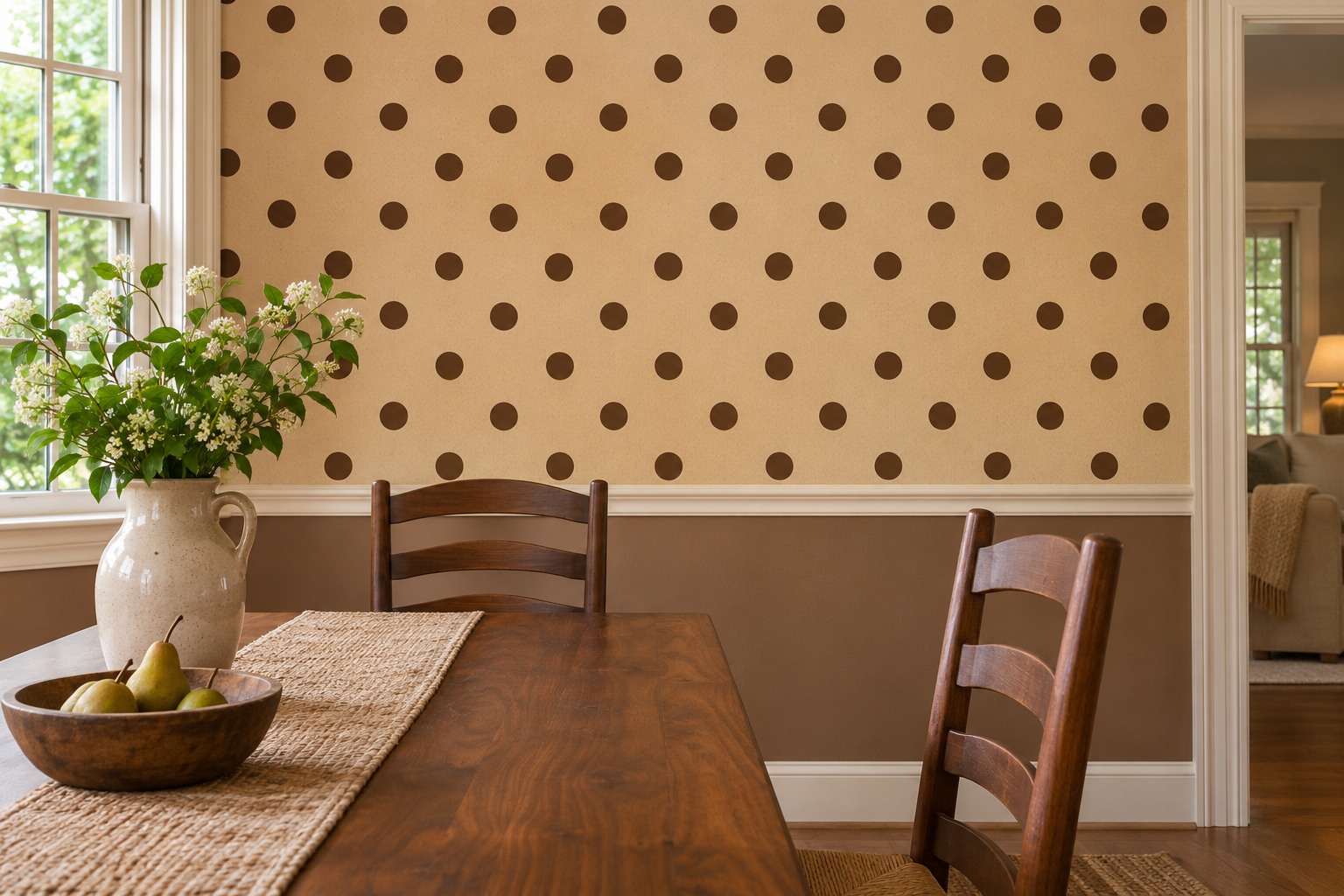
An existing chair rail gives the eye a straight reference line right beside the dots. For a print with regular rows, start by putting one complete row just above the rail. Spaced chocolate dots on a flax background work well when the painted lower wall carries a similar flax tone.
Hold two sample strips next to each other and sit at the table. Look at where the first row meets the rail at both ends and crosses the seam. If the rail slopes, keep the wallpaper plumb and adjust the starting height enough to leave the first row intact. Check what that change does at the ceiling before cutting. For more treatments built around room scale, see these dining room wallpaper ideas.
4. Use a Sparse Dot Inside a Reading Alcove
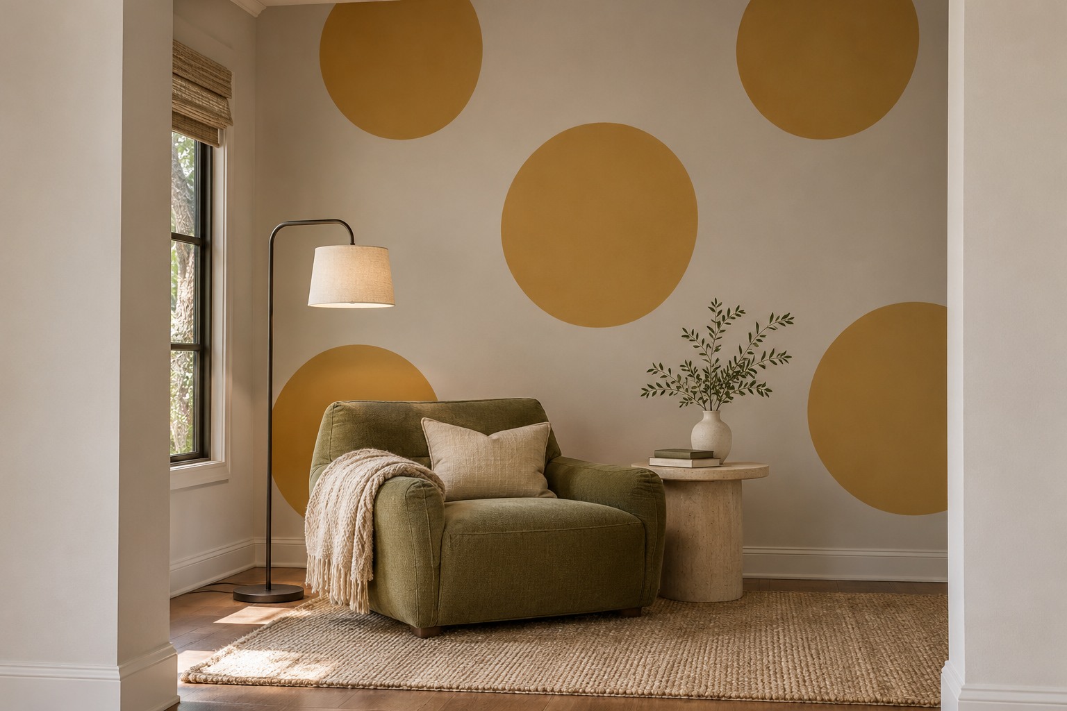
An alcove gives the wallpaper a natural edge. Try dots with wide spaces between them on the back wall of a reading recess. There should be enough background showing around the chair and lamp that a few circles can be seen whole from across the room.
Before hanging, sketch the outline of the chair on a photo of the alcove. Place two or three main circles where they’ll still show after you move the chair in. Keeping the side returns in the background color can make a shallow alcove feel like a complete little room without carrying the print around the corner.
5. Put the Office Pattern Where It Stays Out of the Call Frame
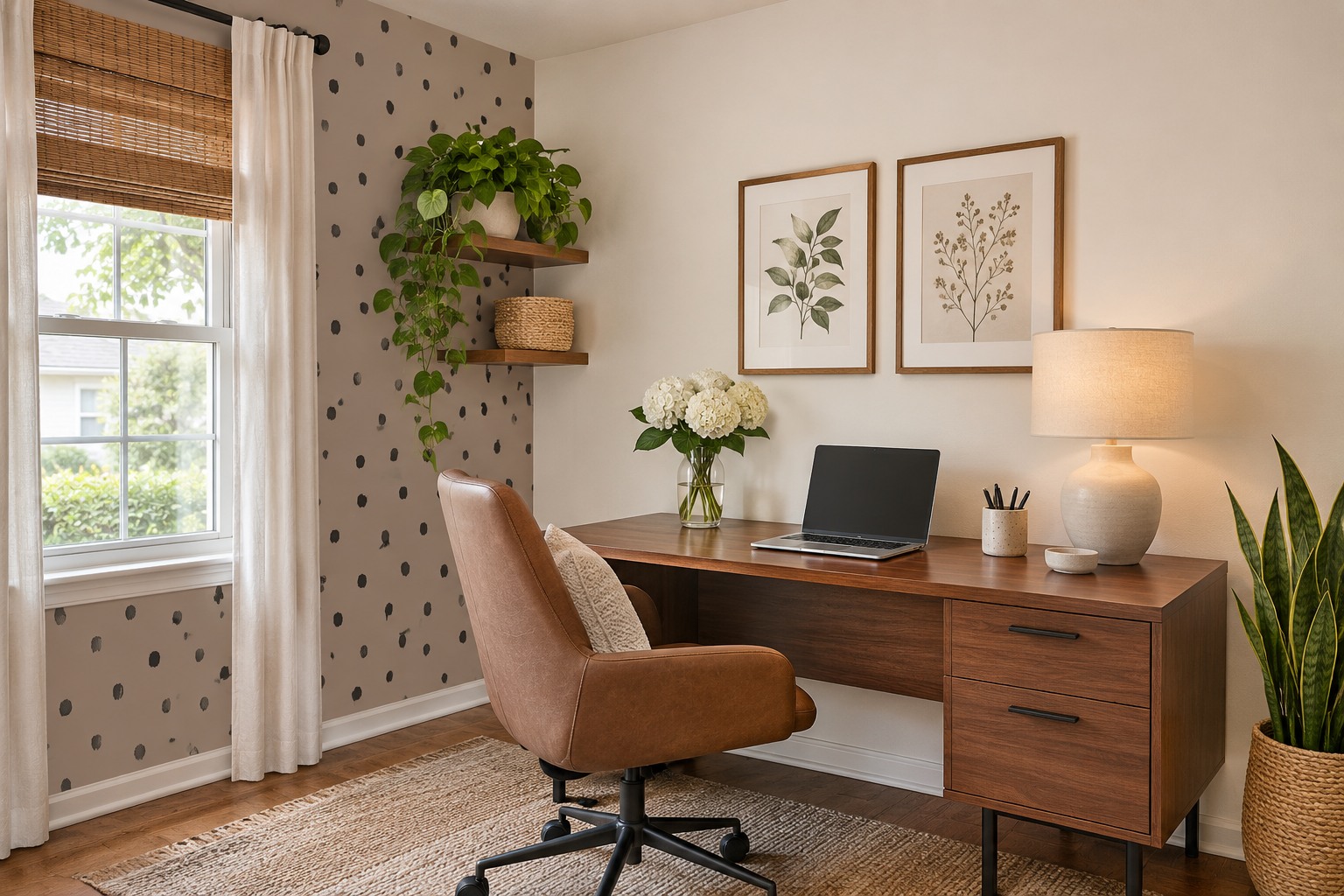
Look through your webcam before you decide which wall to paper. Fine dark dots directly behind your chair can dominate a small video frame. Put the print on a side wall you see while working and leave the wall behind your chair solid if you want a calm background on calls.
A loose, hand-drawn dot can soften the view next to a rectangular desk and monitor. Try a large enough swatch to see how the pattern reads from your chair, then glance at it on camera once more. If the desk needs to move, start with these small home office layouts and settle the chair and screen first.
6. Fit a Dotted Insert That Shows Between the Dishes
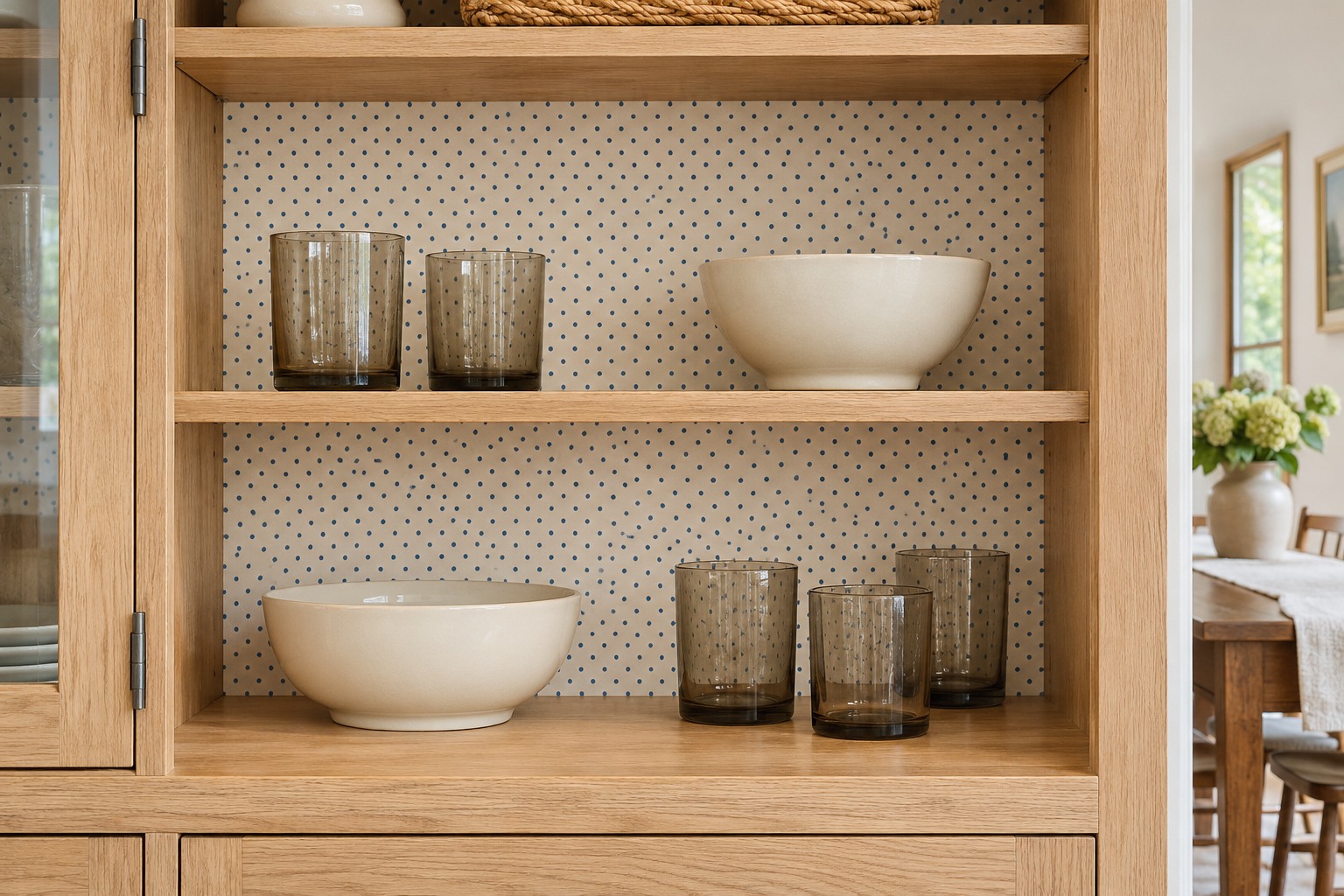
Take one cabinet bay and look at the gaps between the bowls or glasses you use most often. Choose dots small enough for a few full circles to show in those openings, even when the shelves are loaded. Denim-blue dots on pale paper keep their edges visible behind dark mugs.
Use a separate smooth insert in a bay that can hold it securely. Cut a cardboard template first and check that the insert leaves room for the shelf pins, door hardware, and the depth of your largest plate. A shallow bay may need a thinner backing or a different spot. Aim to be able to lift out the insert later without scraping the cabinet finish.
7. Try One Framed Panel Before Committing to a Wall
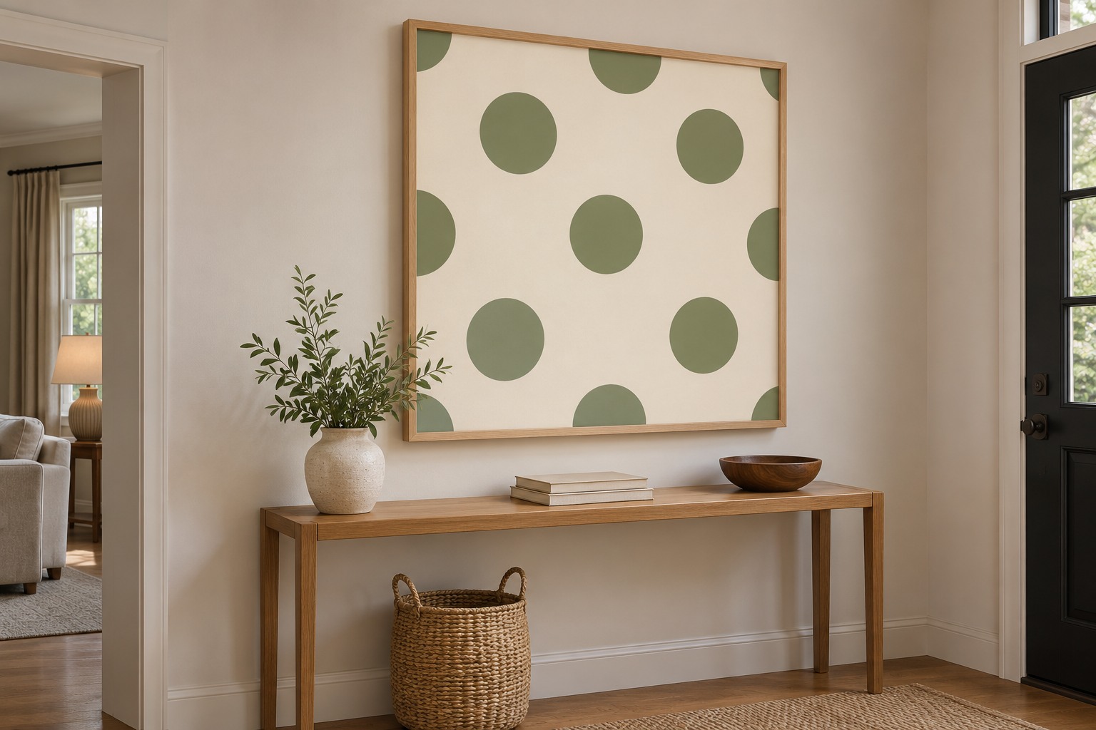
A large framed panel makes a small amount of wallpaper feel finished. Use a rigid backing that works with the paper type and choose a frame deep enough for that backing. Before cutting, lay out the paper so the frame holds several complete dots with a little room around them.
For a compatible peel-and-stick paper, apply it to a clean, smooth backing and follow the maker’s smoothing directions. Test your tool on an offcut first. If you rent, check that the hanging method is allowed for the panel’s weight and that any later changes to the wall are permitted.
The tiptopcarbon basic wallpaper smoothing kit includes a felt-edge tool you can try on an offcut first, provided your wallcovering maker allows that type of smoother.
8. Let Oversized Dots Pull the Eye Down a Long Hall
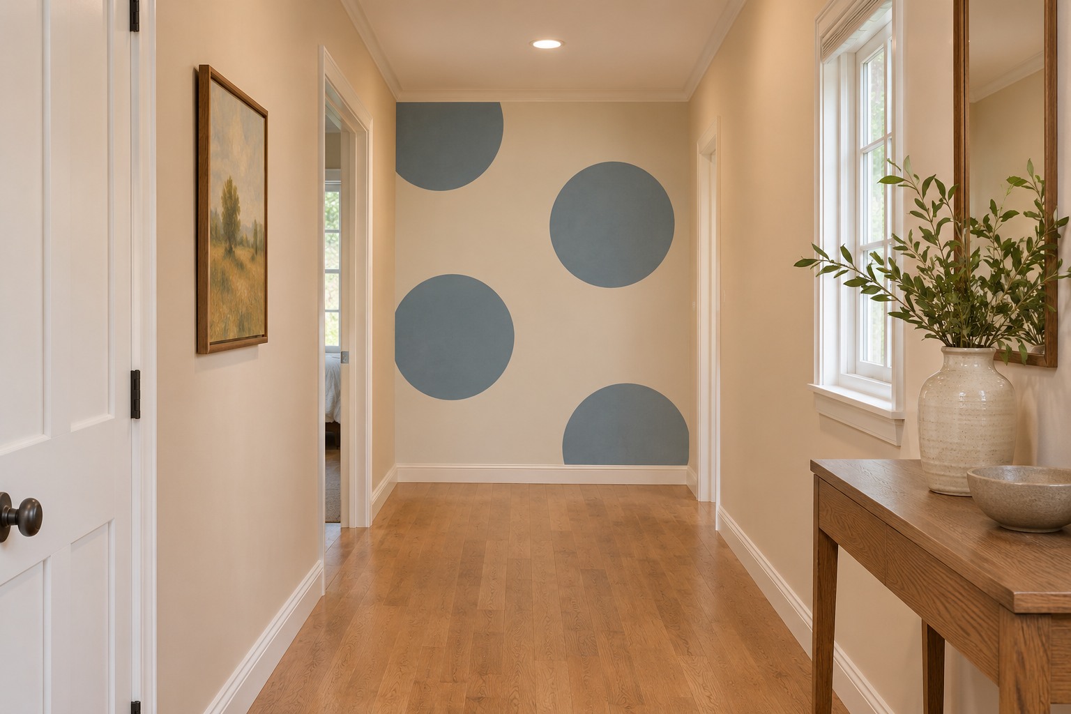
Large circles need enough viewing distance to look intentional. At the end of a long hall, a few blue-gray dots on a light ground can turn a blank wall into a destination. Use the short end wall as the boundary and keep the passage walls quiet so the scale change is easy to see.
Cut a few circles from scrap paper and mock them up at the approximate print size. Walk down the hall and look for awkward cuts at the baseboard, ceiling, and nearby door casing. If the pattern leaves little room to show a whole circle, try the next size down or move to a repeat with wider spacing.
9. Check Metallic Dots Under the Light on the Stair Landing
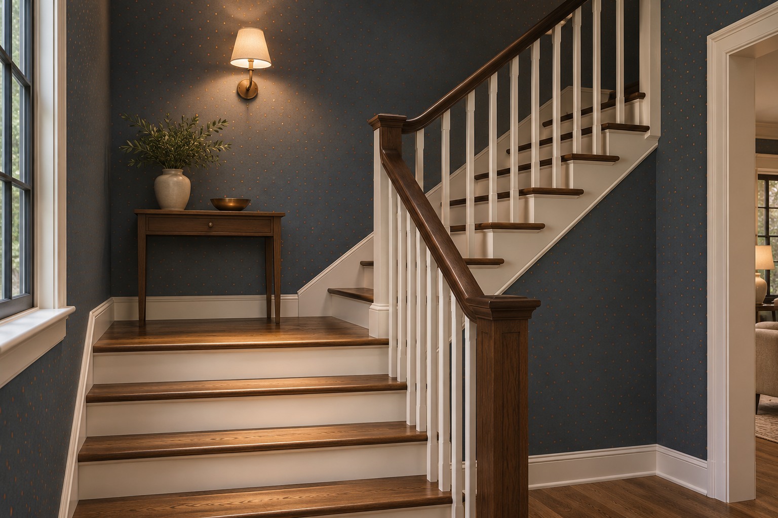
An accent with a little sheen can catch the light as you pass. On a stair landing, look at a sample from the lower and upper steps while the fixture is on. A dark background can make tiny metallic dots stand out sharply at one angle and nearly disappear at the next.
If the sample throws back too much light, use a duller print and let the lighting stay where it keeps the treads easy to see. Keep the rail and trim colors simple so the wallpaper doesn’t create a second bright line that competes with the edge of the steps.
10. Lay Out the Repeat Beside a Tall Window
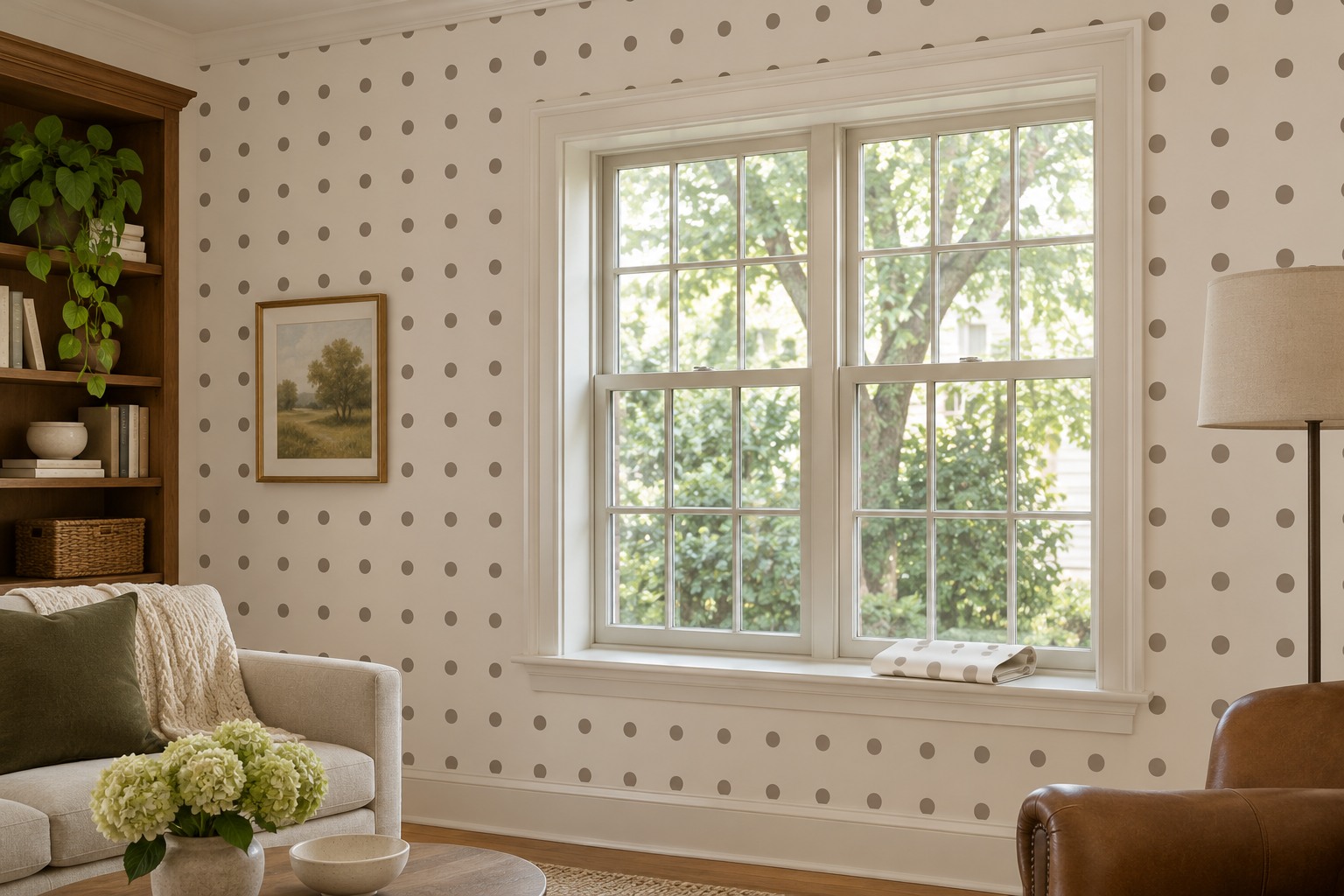
Orderly rows of dots reveal small changes in level. On a tall window wall, mark a true vertical line before treating the casing as a guide. Hold two pieces of the pattern together at a seam and see where the next row falls relative to the sill and head trim.
Read the roll’s match type before you order. A repeat that lines up straight across can use a different amount from one that drops on alternating strips. Measure the wall height and usable widths around the window, and include the extra length for matching and trimming. Follow the paper maker’s layout instructions when you transfer the plan to the wall.
11. Make the Laundry Folding Wall Easy to Wipe Down
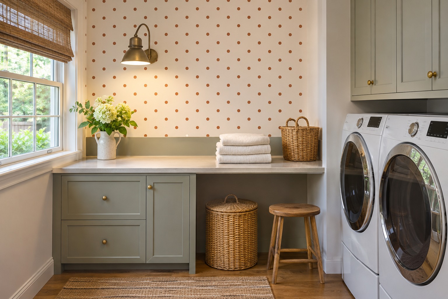
A dotted strip behind the folding surface can give a utility room a place for the eye to settle. Try medium-size rust dots on a warm white background above a short wipeable upstand. Stop the paper at the edge of the folding area, away from direct splashes, and leave the sides of the machines free for access.
Check whether the exact wallcovering is rated for your room conditions and how it can be cleaned. If the wall gets damp from a leak or persistent condensation, fix that before covering it. Look at the sample under the laundry task light. A finish that shows every small glare patch may feel busier than the pattern itself.
12. Let Dots Play a Smaller Role Near a Patterned Sofa
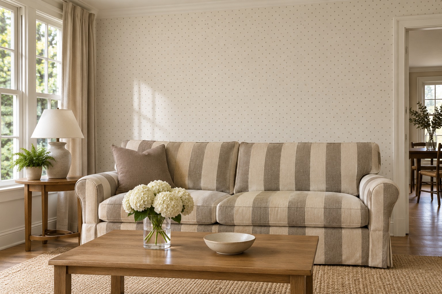
If you already have a striped or floral sofa, look at the width of its biggest stripe or flower. Choose a smaller dot that reads as background beside that scale. Low contrast helps too. A taupe pin dot on a cream wall can pick up a quiet color in the upholstery and leave its larger design visible.
Put the swatch behind the back cushion and view it from the doorway. If the two patterns compete, try the dot in a recessed display section farther from the sofa or choose a lower-contrast paper. These patterned sofa living room ideas show how to give a strong upholstery print room around it.
13. Put Two Swatches on the Wall You’ll Actually Cover
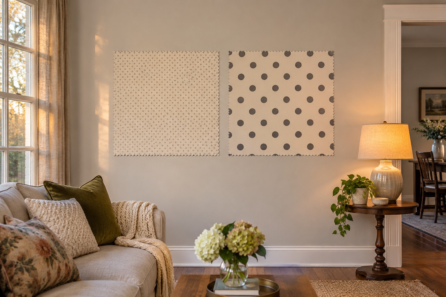
A tiny swatch can show color and finish, but it may hide the spacing that makes one dot print feel different from another. Put two samples on the actual wall where you’re thinking of using them, and step back to your normal viewing distance. Compare how many full dots you can see and how much background remains between them.
Check the finish next to the trim at midday and again with your lamps on. For a peel-and-stick product, follow its instructions for allowed surfaces and paint curing, then test adhesion and removal in a discreet spot if the wall owner allows it. If the sample is a poor match for the surface, stick with a framed panel or a different approved wallcovering.
Pick the spot you’re ready to change and see the paper there before you order rolls. Check the dot size from the doorway, the finish with your everyday lights on, and the position of the repeat at the edges.
A powder room wall, an open cabinet back, and a short hall can each take the same kind of pattern. The useful choice is how much of it you want to see and from where.
Discover more from HomeTrendora
Subscribe to get the latest posts sent to your email.