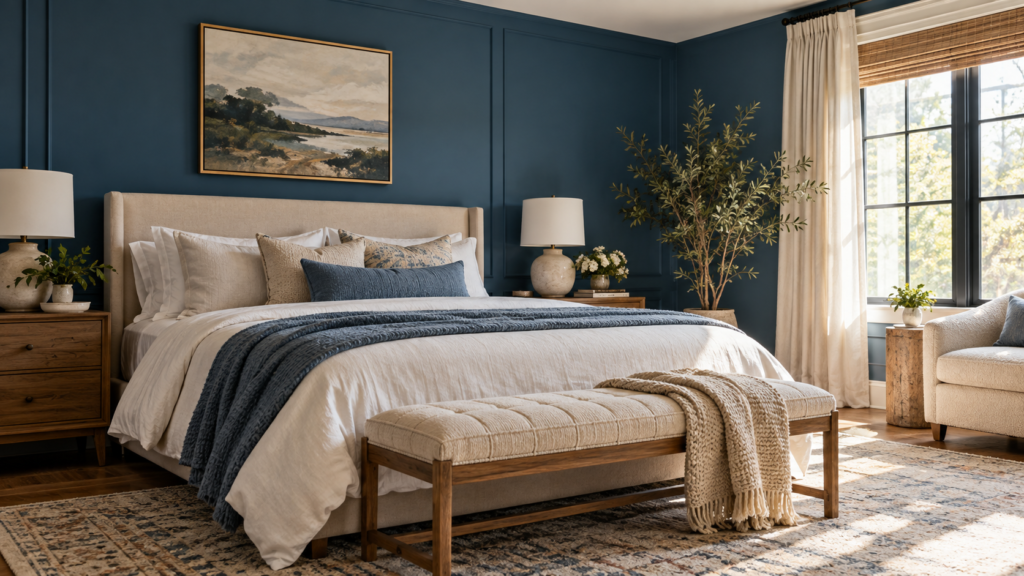
A wallpaper sample can look right in your hand and feel too busy once it runs past a window, bed, or cabinet. These 25 ideas help you choose a surface, find a natural edge for the pattern, and decide how large a repeat your room can carry.
Tape two samples next to each other so you can see a repeat and its join. View them from the doorway, turn on the lights you use after dark, and compare them with the largest finish that will stay. Then check the maker’s directions for your wall and room before you buy.
1. Keep a Botanical Print Low-Contrast Behind the Bed
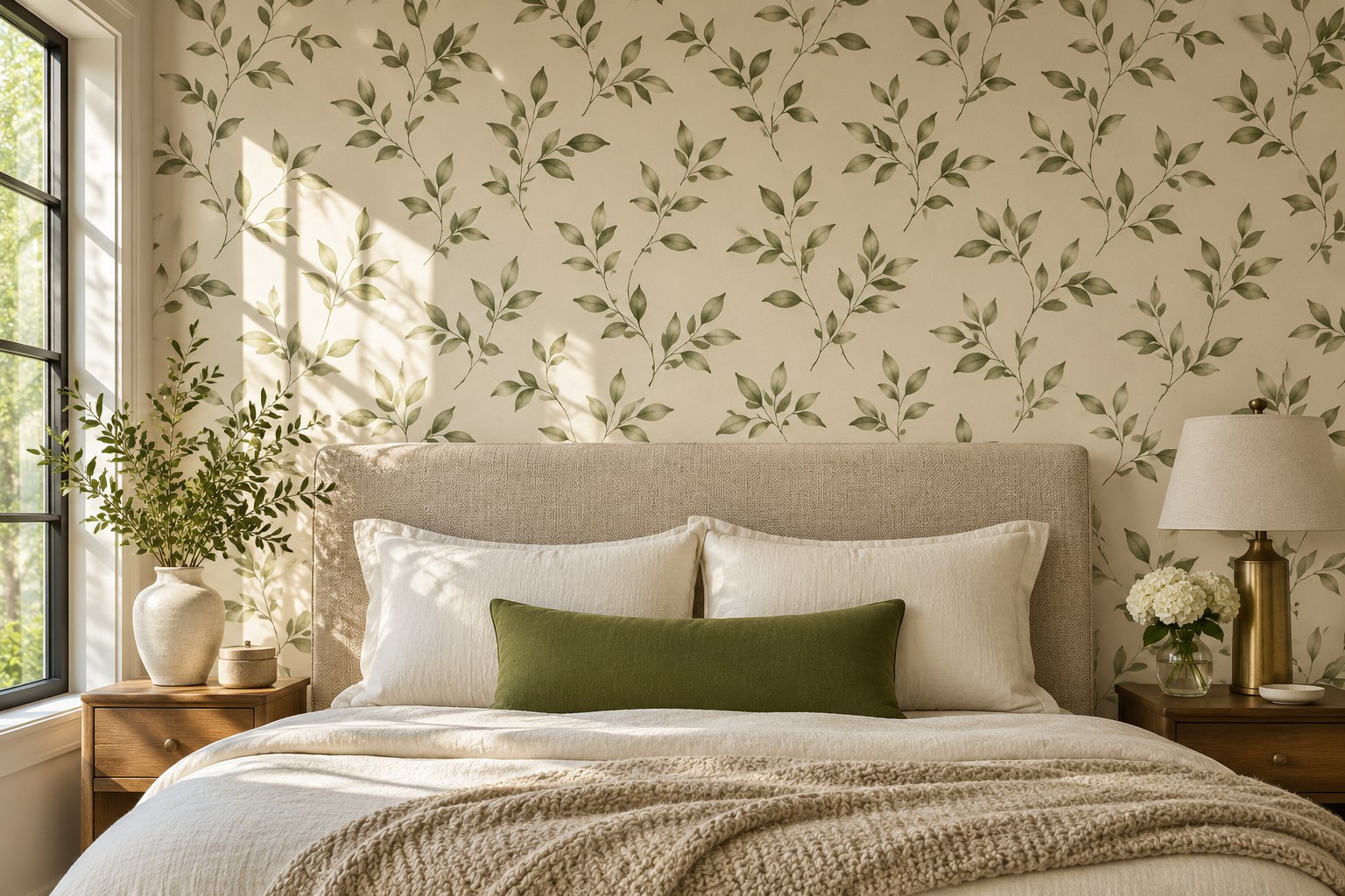
A low-contrast leaf print gives a headboard wall enough movement to feel finished while letting you use plain bedding. Look for a repeat with room between the branches. If the pattern is dense, hold a larger sample at the top of the headboard to see how the cut edge will look above it.
Bring one textile from the bed to the sample, preferably the largest solid color. A green in the paper that seems close to your throw can look distinctly warmer in the bedroom. Compare them again by the window and with the bedside lamp on.
2. Center an Art Deco Repeat on the Fireplace Wall
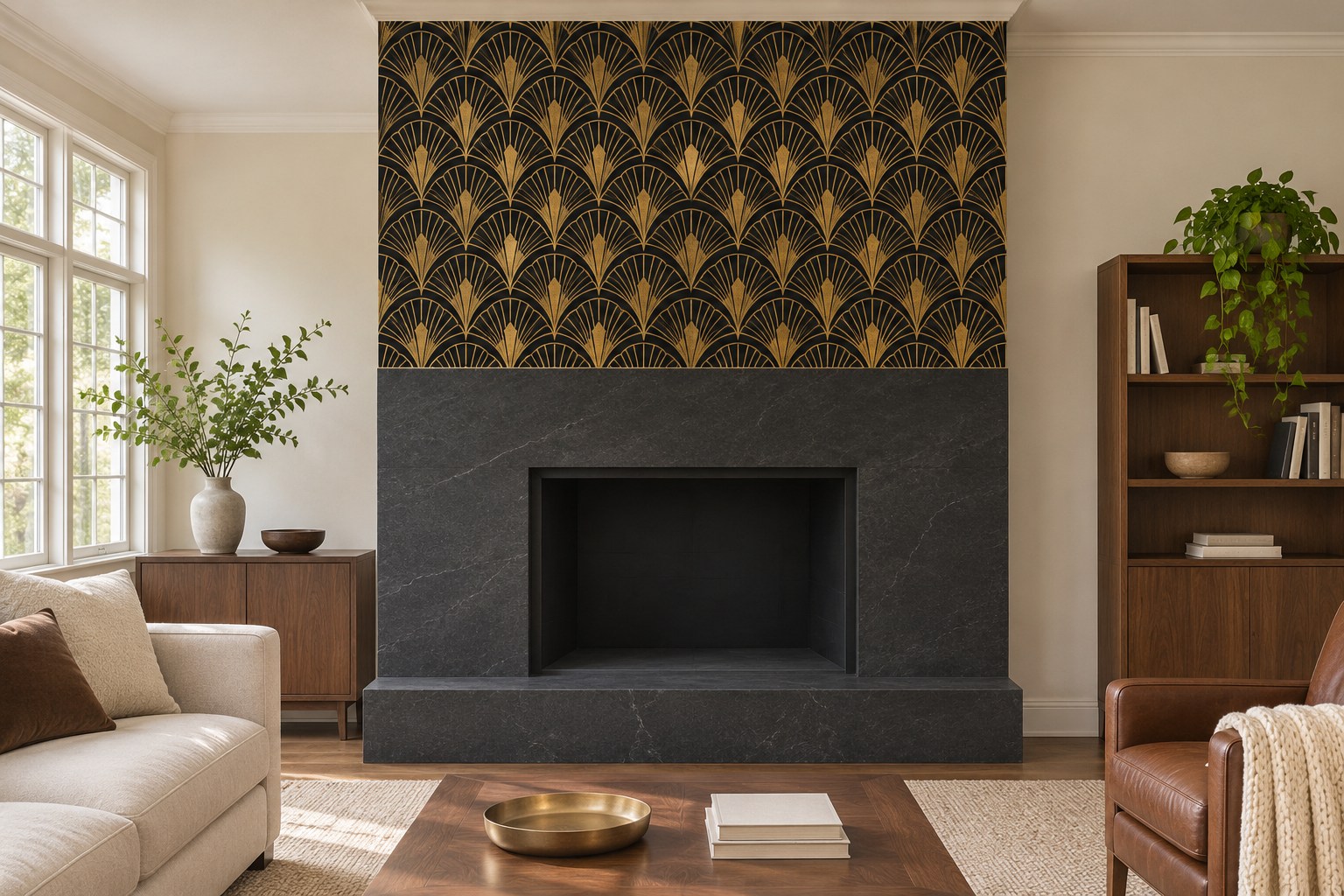
Art Deco fans or stepped shapes look more deliberate when their strongest line relates to the fireplace. Tape two repeat samples on the wall and move the center one until the pattern looks balanced over the surround. Use the wallpaper maker’s suitability guidance and the appliance’s clearance instructions for the location. An adjacent alcove gives the same pattern a clear edge when the fireplace wall is unsuitable.
Keep the border to the mantel and casing visible from the sofa. A warm metal in the paper can pick up one lamp base or hardware finish without needing to appear on every object.
HOMETRENDORA PLANNING BUNDLE
Turn the ideas you like into a room plan.
Choose what to keep, check what will fit and decide what to buy first. The Home Design Book, fillable room planner and budget tracker guide you through those decisions with worked examples and practical checks.
160-page PDF + fillable room planner + Excel budget tracker
Bonuses included with your eBook purchase.
GRAB 10% DISCOUNT
Coupon code: HOMETRENDORA10
Use this code at Payhip checkout.
3. Choose Small Woodland Motifs for a Nursery
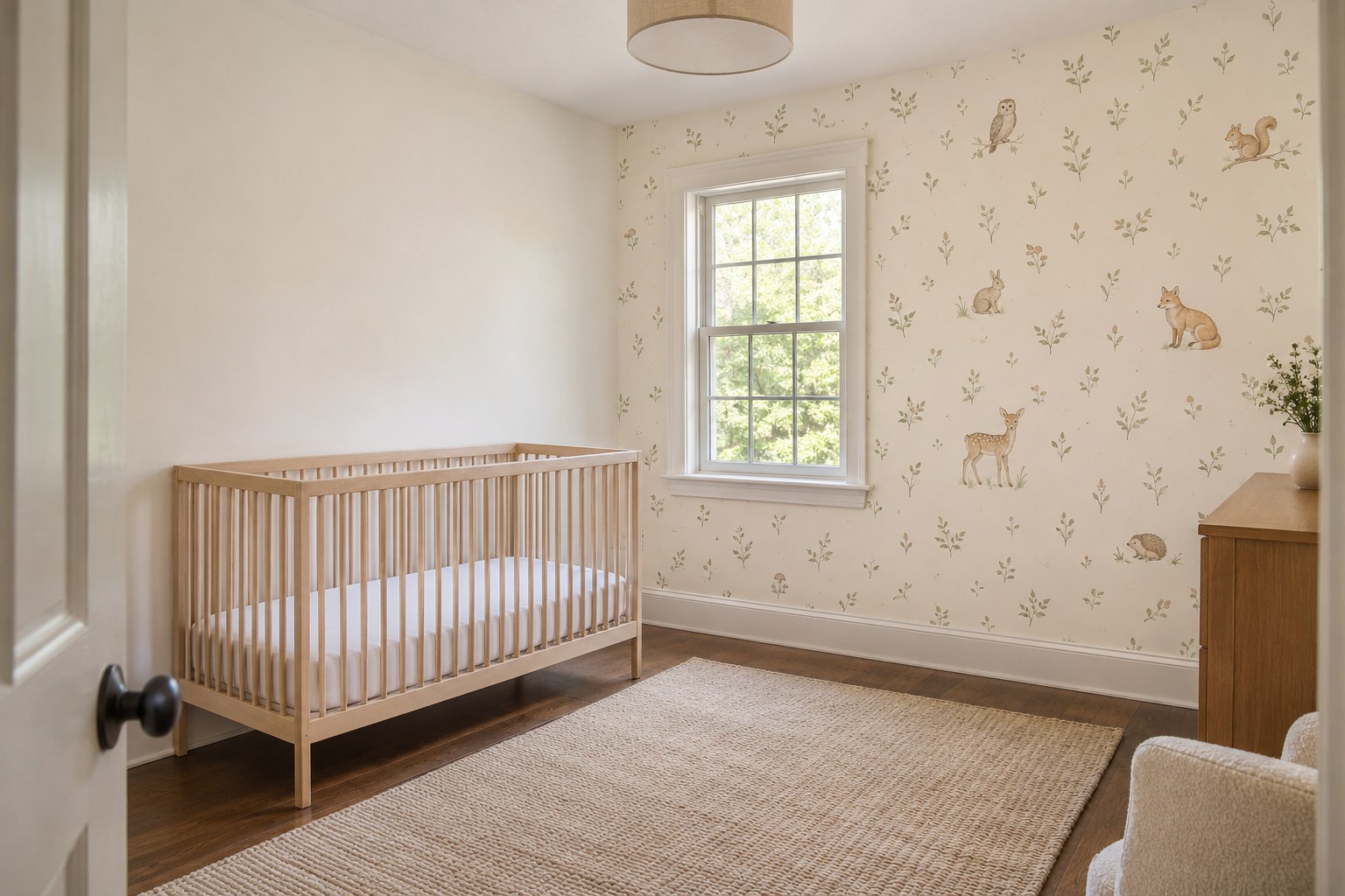
Small woodland creatures can read from across a nursery when the background and the motifs have a clear value difference. Put the print on a visible wall away from the crib if it also gives you a clean run of paper. A relatively open repeat leaves space for the shape of the furniture to show.
Check the sample under the light you use during evening changes. Cream can become quite yellow in that light, and very pale gray illustrations may fade. Place the sample beside the paint for the remaining walls before you order.
4. Try a Dark Floral Above Powder Room Tile
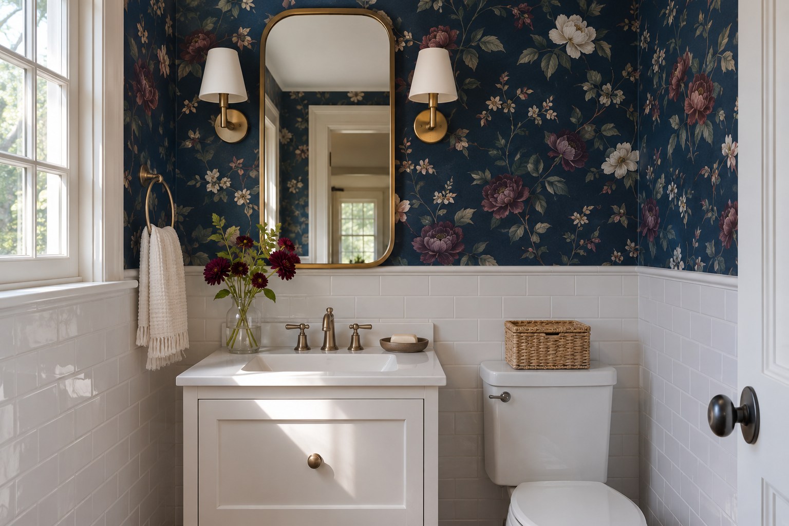
A dark floral has more presence in a powder room when you can see the full pattern above the tile or trim line. Use the wainscot as a border and check which part of the design meets it. Larger flowers can be cut by the mirror, so test the pattern on both sides before centering it.
Check the paper’s instructions for this room, the wall surface and any humidity limits. Test a sample under the mirror light as well as by the door. A navy ground can look nearly black in the darker corner, which changes how much of the pattern you see.
5. Put a Brick Print at the Eating End of the Kitchen
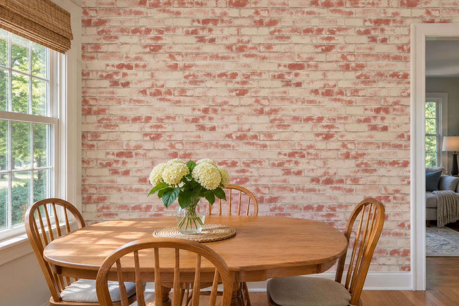
A printed brick pattern can bring subtle texture to the eating end of a kitchen. Try it where the table sits and where the wall stays dry, away from cooktop heat and sink spray. Line up the printed mortar with a table or cabinet edge when you assess the sample. A grid that looks out of scale on a whole wall will still look out of scale above a small table.
A pale print can pick up a similar color in the kitchen tile. For quiet surfaces to put beside the print, see these neutral kitchen backsplash ideas.
6. Run a Wide Stripe Down a Short Hall
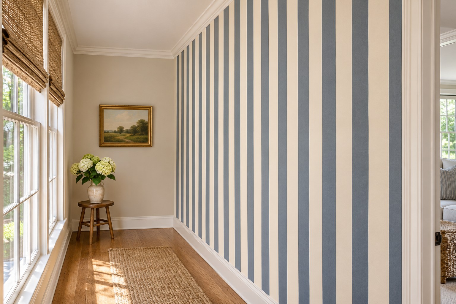
Broad vertical stripes give a short hall a readable rhythm. Choose two colors that are distinct even under the hall’s evening light. Compare the pattern with the door casing and floorboards before deciding which wall gets the paper.
Use the maker’s layout instructions and establish your first straight line independently of the trim. An old casing can lean enough to make the stripes appear to wander. Dry-plan the repeats at the far corner to see whether a tiny sliver will be conspicuous from the entry.
7. Give a Home Office One Grasscloth Wall
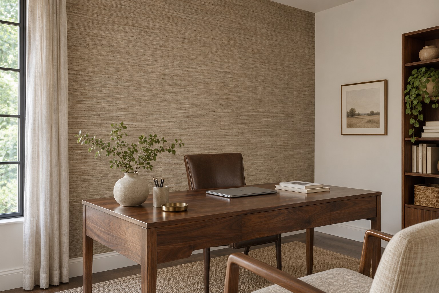
Grasscloth can give the wall behind a desk a visible woven texture. The panel joins are often part of its appearance, especially with natural fibers. Put two panels or large samples beside each other and view them from where you enter, with side light crossing the surface.
Try grasscloth on one office wall if the adjacent doors and windows would create many narrow cuts. Check the manufacturer’s instructions for handling, adhesive, cleaning and wall condition before choosing where to use it. A desk lamp raking across the wall can make the seams and grain more visible after dark.
8. Smooth a Long Drop With a Felt-Edge Tool
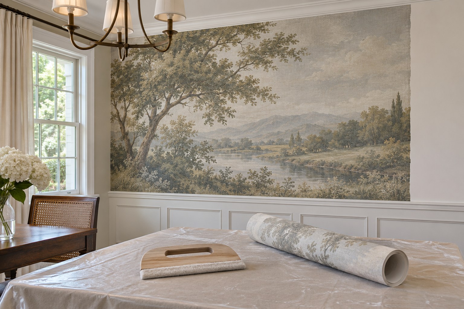
A landscape mural behind a dining table gives you a long wall where the pieces can build one picture. Lay out the panel sequence first. Use the chair backs, pendant and any sideboard to mark where the horizon or main feature will be in the finished room.
Follow the mural maker’s instructions on smoothing, including whether a felt edge is suitable and how much pressure the surface can take. Try your technique on a spare piece or a hidden edge first. A long panel can shift the picture sideways if you work too far ahead of the join. Check the alignment often, especially at a visible detail such as a hill line.
If your wallpaper instructions allow a felt-edge smoother, test the blue felt-edge squeegee in the tiptopcarbon kit on a scrap first and use the pressure the paper maker specifies.
Discover the wallpaper smoothing kit (paid link)
9. Put a Geometric Print on the Dry Bathroom Wall
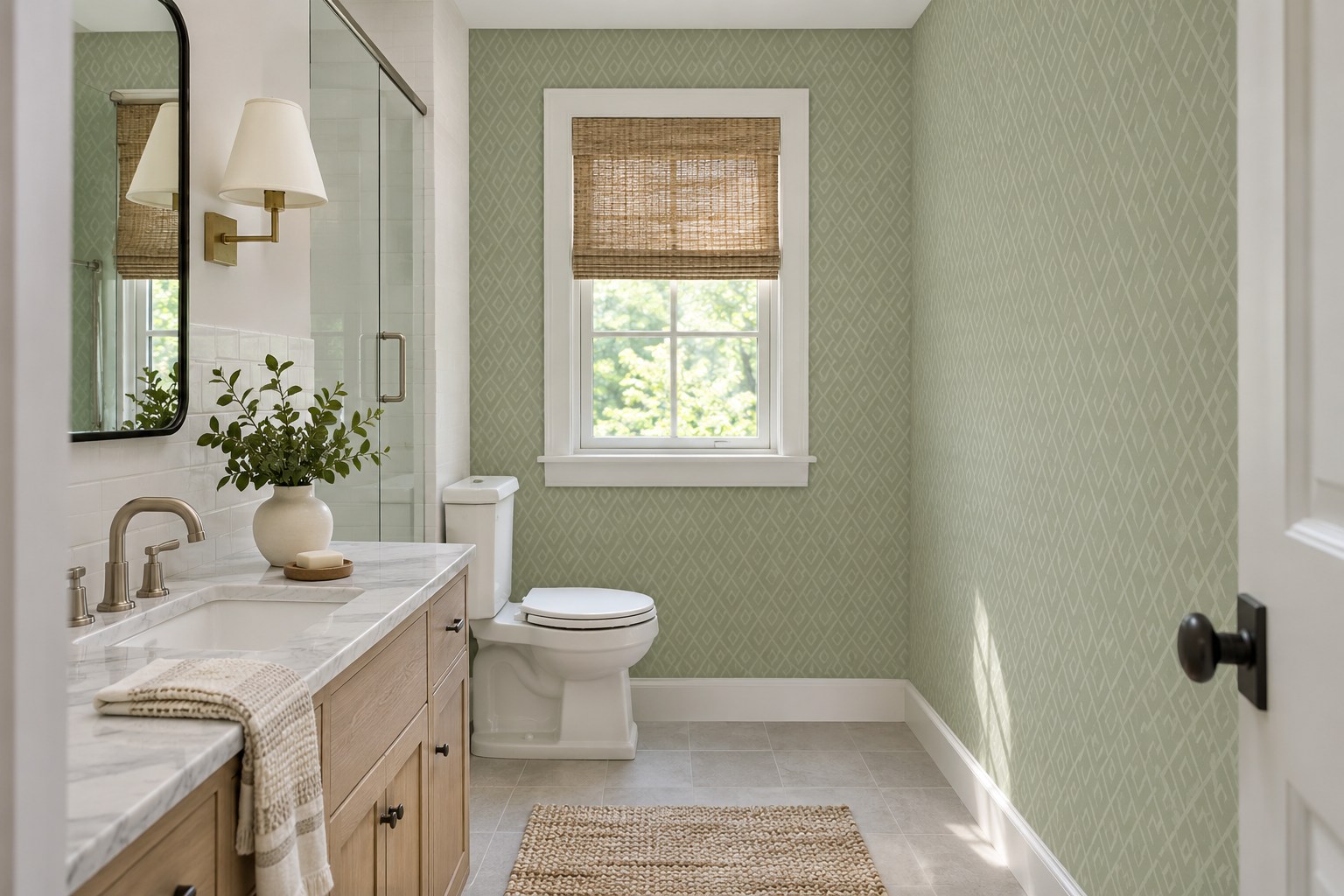
A small geometric print can make a plain bathroom feel more structured when it sits on a dry wall. Choose a repeat that remains legible next to grout lines. A pattern nearly the same size as the tile grid may feel busier than one clearly smaller or larger.
Look at the sample in the mirror and from the doorway. You may see the design twice from one of those positions. Check the wallcovering’s room and moisture instructions, then choose the wall farthest from the water you regularly use.
10. Use Ceiling Paper in a Bounded Alcove
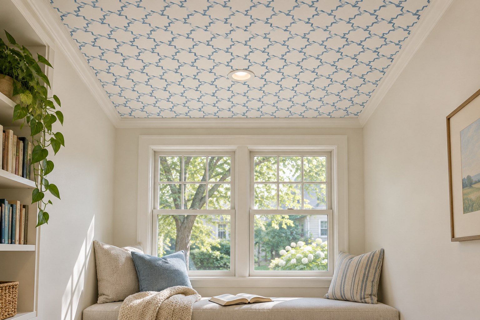
A recess gives a papered ceiling a natural frame. Start with an alcove you can see from the room, where the wallpaper would end against trim or an existing ceiling edge. A small motif is easier to read at this scale than a huge repeat cut to an awkward fragment.
Hold the sample in the actual overhead light and check the paper and adhesive maker’s suitability for ceiling use. If the paper is heavy or the area is difficult to reach, price installation before buying. A quiet wall color keeps the upward pattern as the part you notice first.
11. Make a Tonal Damask the Main Living Room Pattern
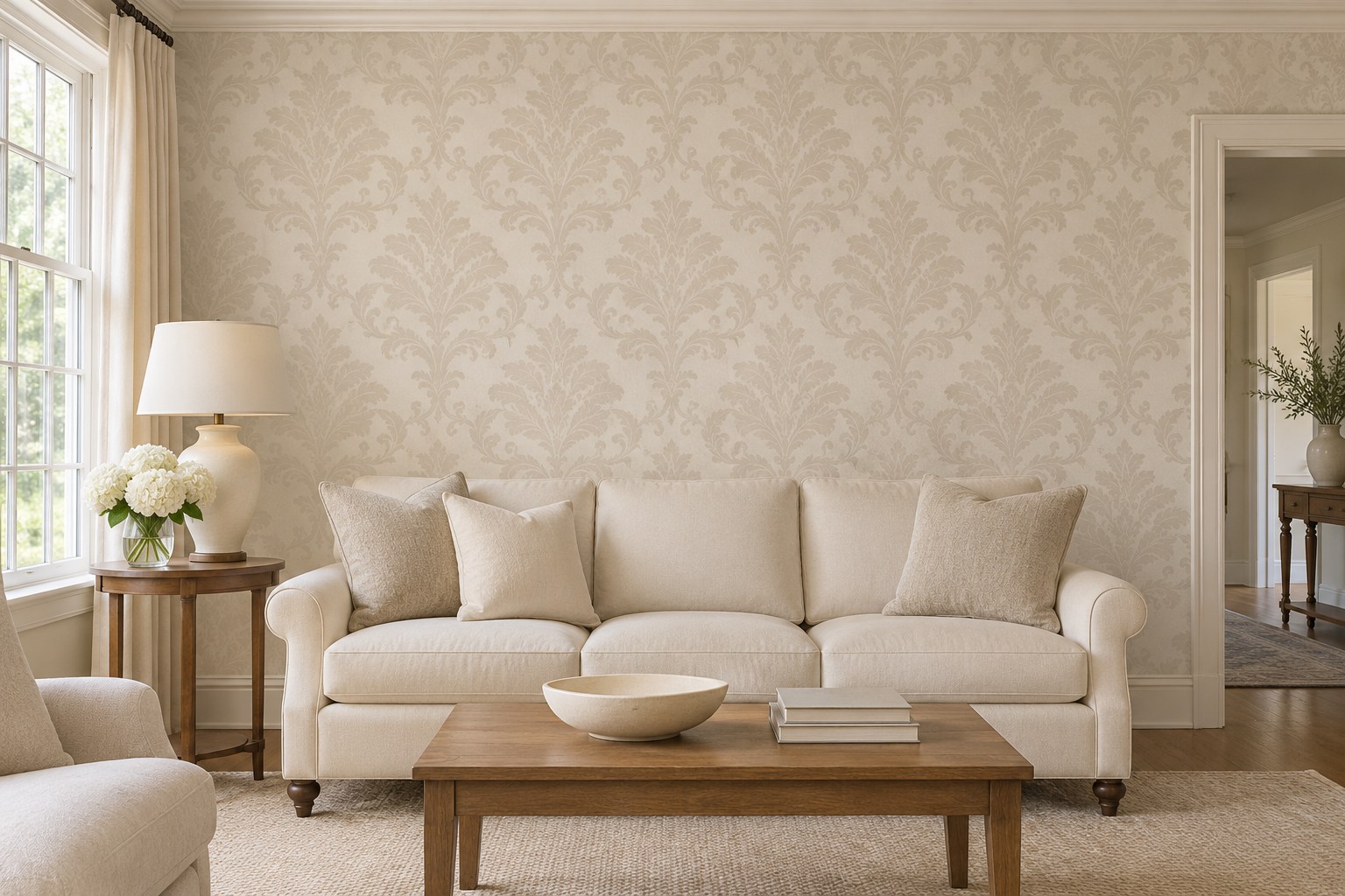
A tonal damask can be the main pattern in a traditional living room. Try a large repeat with a small difference between the motif and the ground so it shows in side light. Solid seat fabric and a mostly plain rug leave enough open space to see the shape.
Compare a sample beside wood that will stay. Walnut can make cream look brighter and oak can pull the warm notes forward. These English cottage living room ideas give you ways to pair a more intricate pattern with simpler seating and textiles.
12. Bring a Lemon Print to a Breakfast Nook
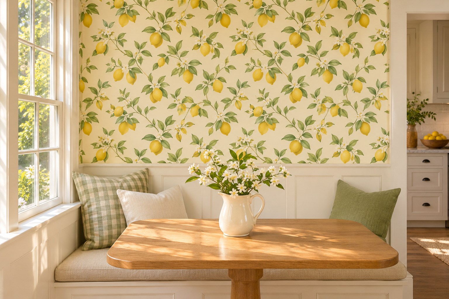
A lemon print can give a breakfast bench a color you can carry into one or two kitchen details. Sample the print right above the seat back. If most of the lemons land behind the bench or pillow line, move the repeat upward in your dry layout before installation.
Let the tabletop and cabinets supply the quieter surfaces. Check the print next to any yellow light from a pendant. A paper that looks sunny by the window can look more orange under a warm lamp. Compare it while the nook is set up for a usual meal.
13. Frame a Single Tropical Print in the Sunroom
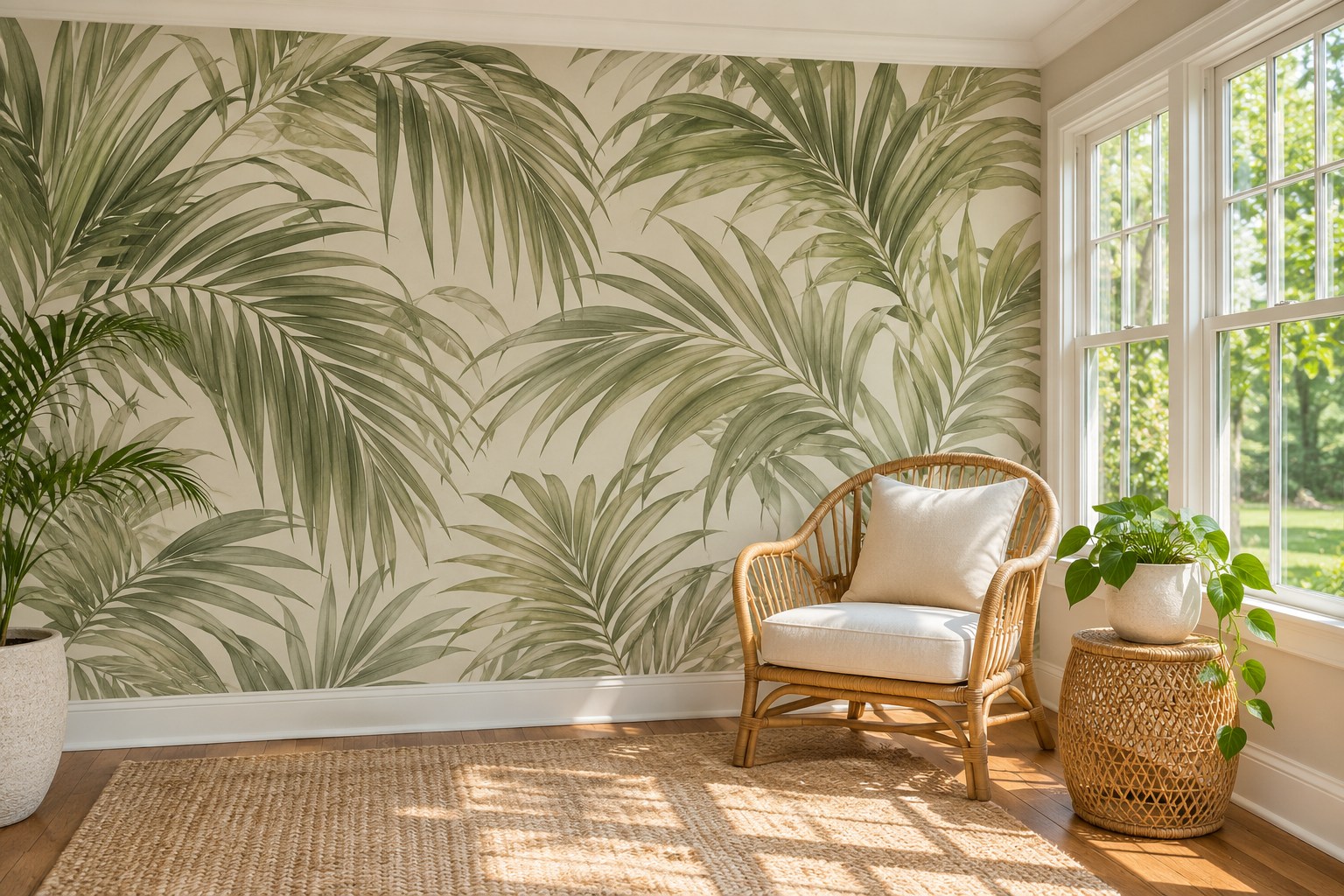
A sunroom with a full solid wall gives big palm leaves room to read. Use a paper with clear space between the leaves and put it opposite or beside the windows, whichever gives you a better view from the seat. A solid cushion leaves more of the larger leaf shapes visible.
Look at a large sample in the brightest and darkest parts of the wall. Check the maker’s sunlight and fade guidance before putting it where it receives prolonged direct sun. A muted olive print can be easier to pair with woven shades than a vivid emerald.
14. Use Toile as a Calm Bedroom Backdrop
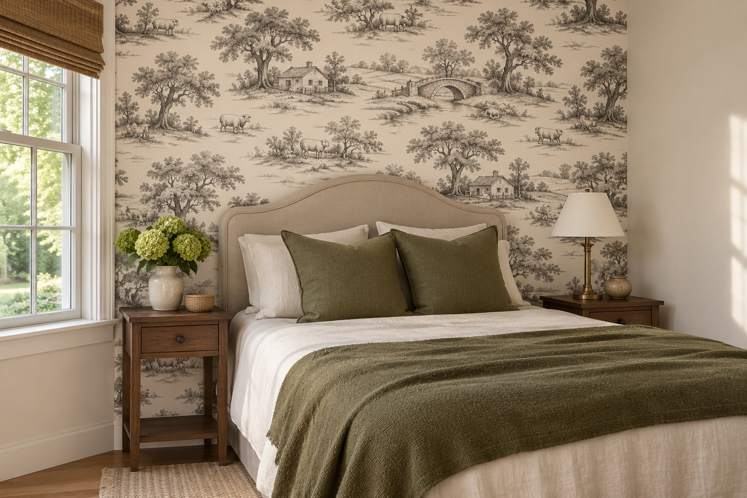
Fine toile gives a guest bed an illustrated backdrop that looks quieter at a distance. Center a recognizable part of the repeat behind the bed so it does not end awkwardly beside a bedside lamp. Solid flax bedding can soften the contrast of a black-on-cream print.
Set the sample on the bed wall and stand in the doorway. If it blends into a busy gray patch, compare a version with wider space between the little scenes. This is also a good place to check where the top of your headboard cuts into the pattern.
15. Try a Fine Architectural Grid Behind a Low Console
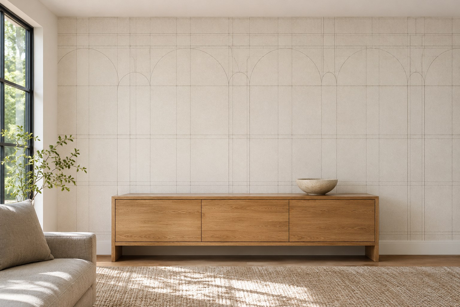
A fine architectural grid can give a minimalist room a hint of structure above a low console. Pick an off-white background close to the current wall color if you want the pattern to come forward slowly as you walk in. Keep the top of the console simple so its edge makes a clean line below the print.
Judge the grid against the adjacent baseboard and corner. A wall that bows or a corner out of square may stand out once you add a crisp line pattern. Test a larger sample there before choosing between a straight grid and a looser drawing.
16. Give a Small Entry a Wash of Color
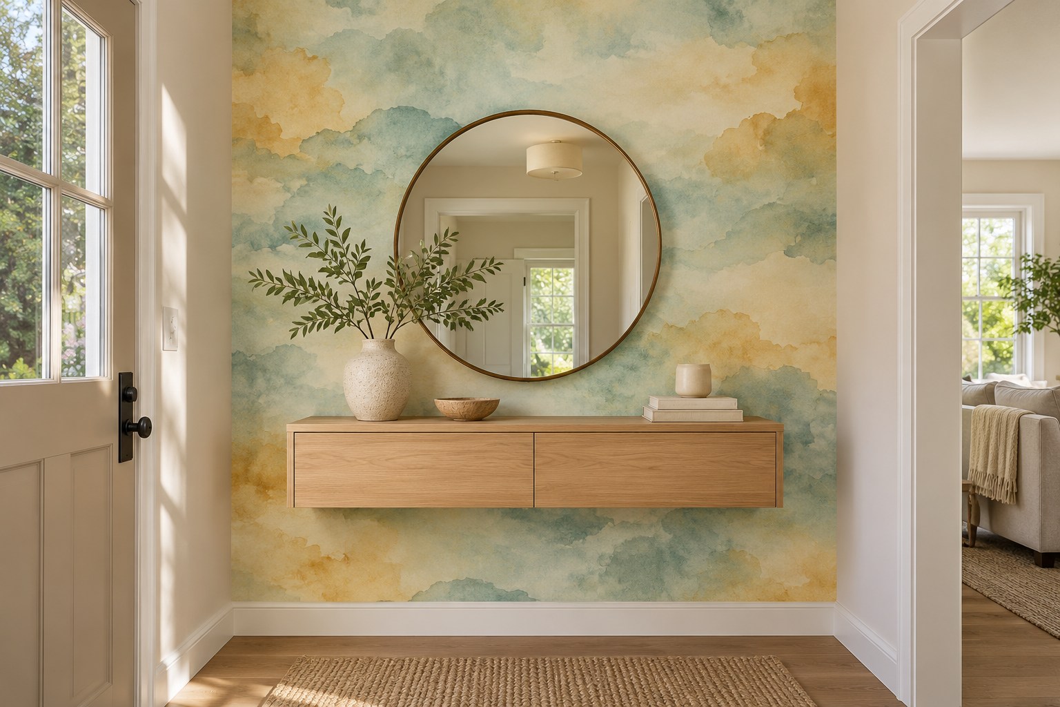
A watercolor print gives a small entry color without setting up a regular grid beside every door. Choose one wall you see as you arrive and pull one of the quieter background colors into the surrounding paint. A plain oak console will give the loose pattern something solid to sit behind.
Hold the sample at the height where you see it from the next room. Some washes read like a single color at that distance. If you want the softer edges to be visible, choose a design with a little more separation between the pale ground and the main shape.
17. Let Painted Paneling Define the Bottom Edge
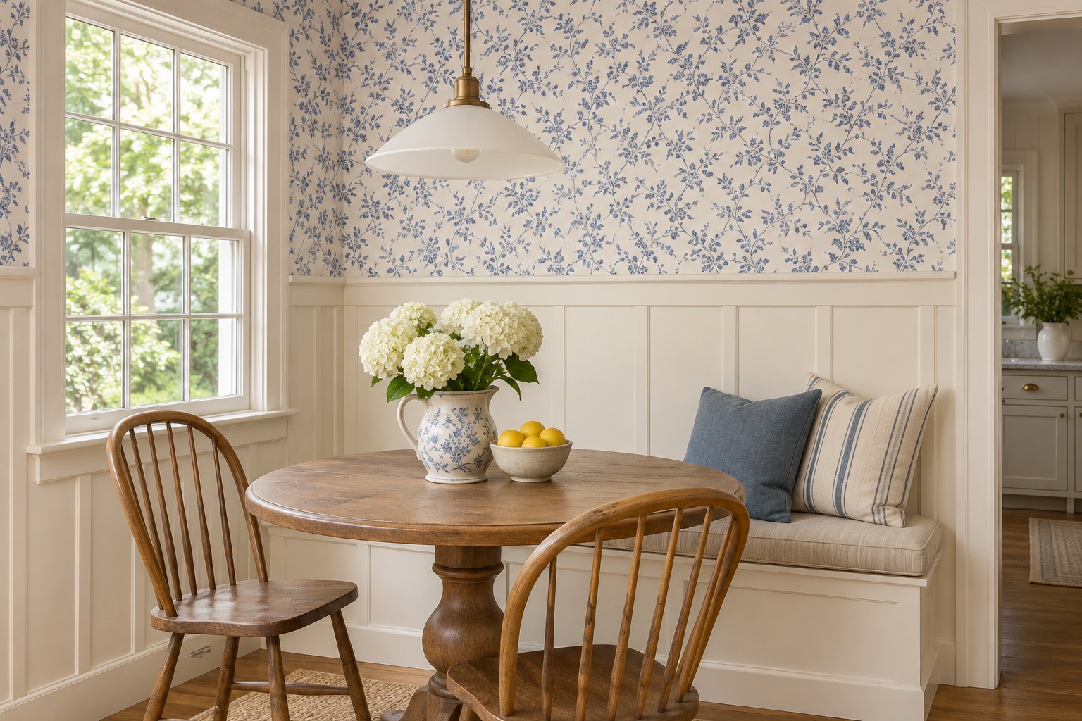
Use a cap rail or the top of painted paneling as a firm bottom edge for a print. The lower wall can handle the furniture and foot traffic while the upper area holds the detail. Match the trim to one color in the paper if you want the two surfaces to feel connected.
Look at the print beside the paint at the actual joint before choosing a color. A blue can appear cooler on cream paneling than on the sample card. These modern accent wall paint ideas show ways to choose a natural boundary when the rest of the room needs a different finish.
18. Paper the Removable Back of a Bookcase
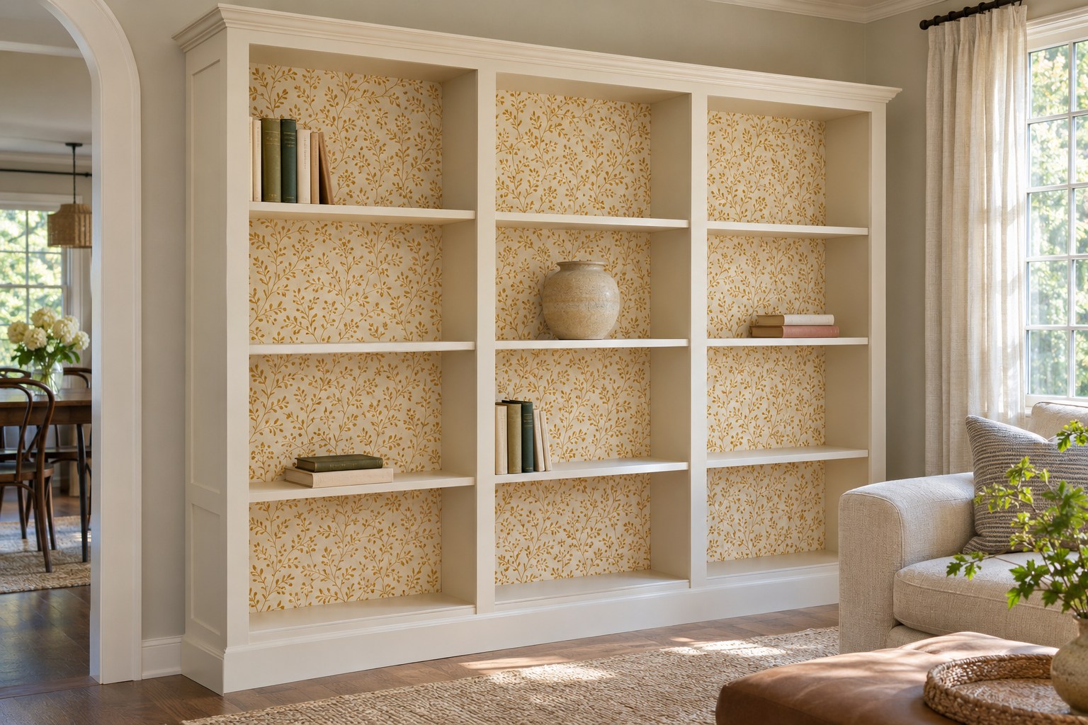
A small repeat behind open shelves is easier to see if the backs are pale and the items have space around them. If the back panels are removable, use one as a template for a papered insert. Check thickness and fit so the replacement sits flat and the shelves go back in securely.
Try one bay before doing the whole bookcase. Dense books can hide almost all of a busy paper, while a few large ceramics give it room. Use these shelf styling layouts to check how much of the back wall you plan to leave visible.
19. Put Faux Marble on the Wall You See at the Door
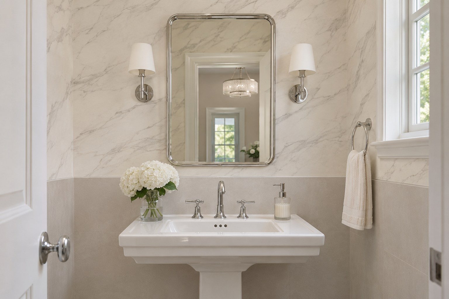
A broad, quiet marble print can look coherent on a wall you see from a powder-room doorway. Use a dry upper wall and choose a paper suitable for the room. Put two repeat samples next to the tile to see how often the same vein returns.
Read the pattern from the hall before worrying about the effect at close range. A small, highly contrasted repeat can look tiled even on a wide panel. A cream ground next to matte white tile is a useful comparison for how strong you want the lines to be.
20. Use Small Terrazzo Motifs Around a Playroom Bench
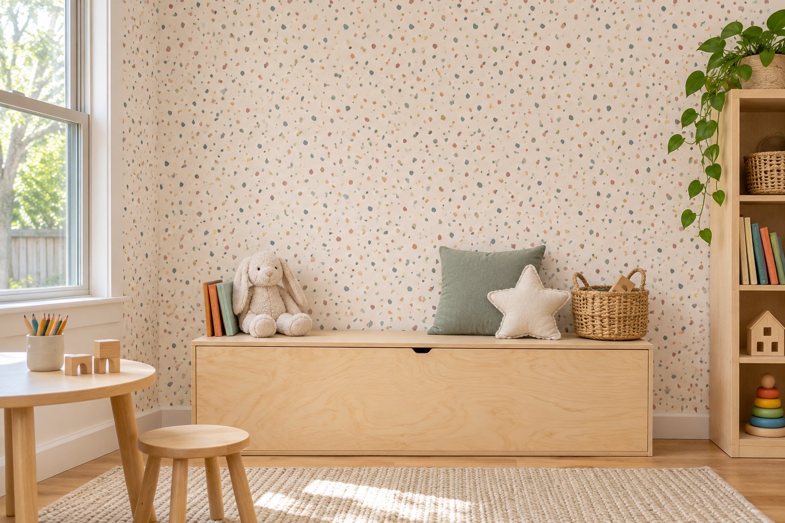
Small printed terrazzo shapes give a playroom wall several colors to draw from. Keep most of the objects by a storage bench in solid colors, especially if the print already contains bright red or yellow. Use a sample wide enough to tell whether the chip pattern repeats at an obvious interval.
Check the wallcovering’s cleaning instructions before using it at hand height. If you need a more easily cleaned lower area, keep the print above a painted panel or at the back of a recess. The upper pattern still reads when the bench is full.
21. Check Metallic Paper Under the Dining Light
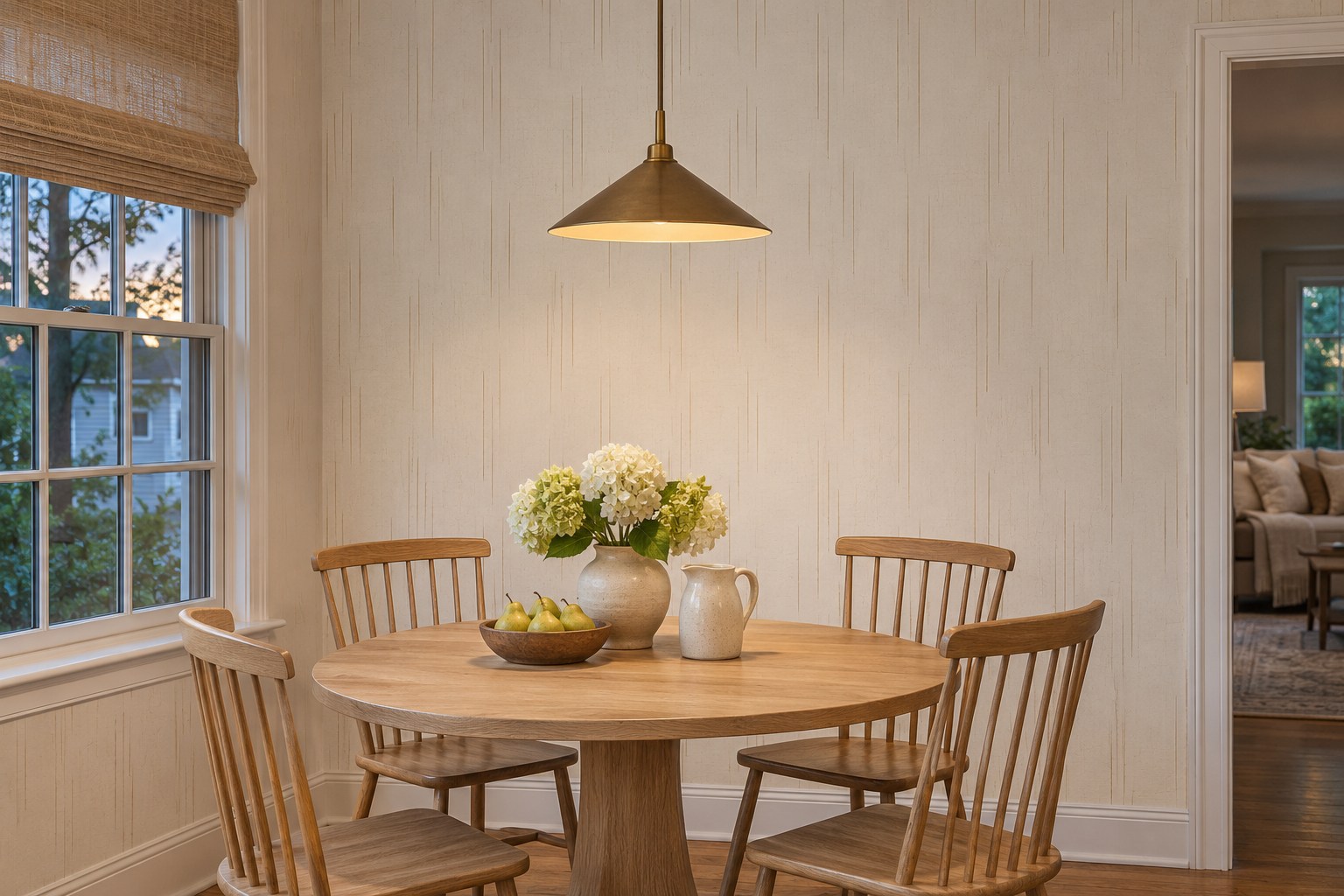
Put a metallic accent near the light you use at the dining table and check it at meal height. Thin gold lines can glow softly under a pendant, but the same lines may create a bright spot if the light faces them directly. Tilt a large sample under the fixture before choosing the wall.
Compare the paper with the finish of the fixture. They can share a warm tone without matching exactly. If the metal looks too reflective from one seat, choose a quieter print with a larger area of matte background.
22. Give a Map Mural Space Around the Desk
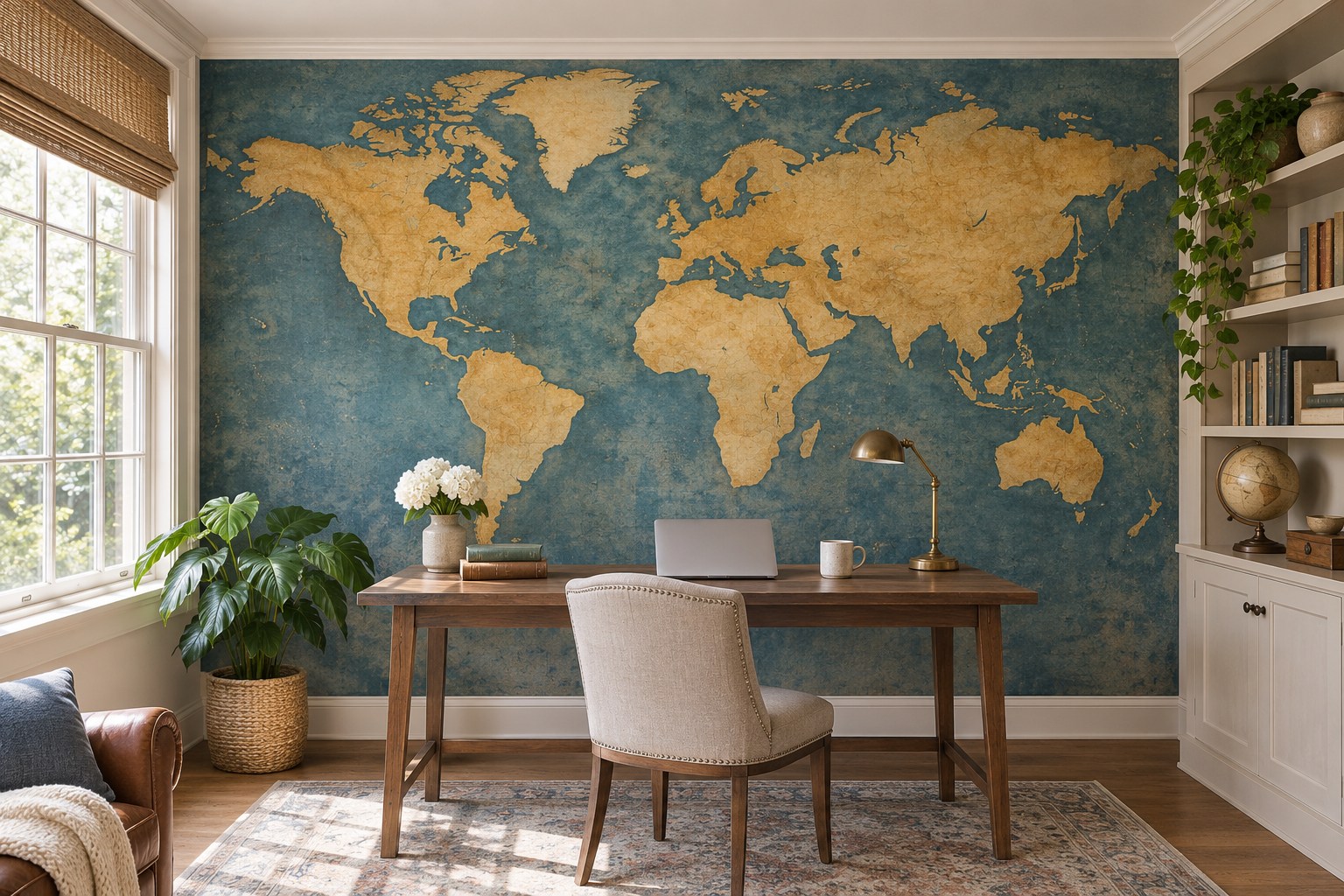
A map mural works best when there is room to see its main shapes around the desk. Lay out the panels and check which part lands behind the monitor, shelves and task lamp. If one coastline is an important part of the picture, shift the planned center enough to keep it visible from the doorway.
Choose a muted palette if the desk already holds several items. A pale map can have a stronger effect on a largely empty wall than a bright one behind open shelving. See the full mural dimensions and crop plan before ordering.
23. Keep Gingham to a Dry Kitchen Wall
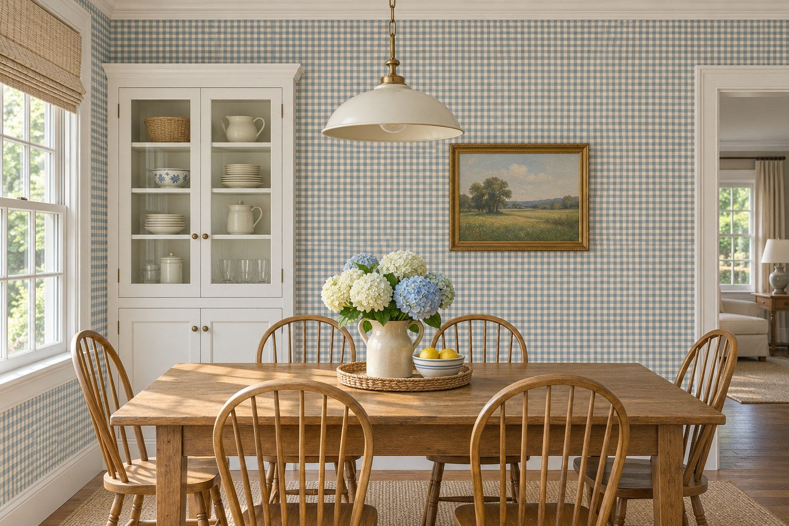
A small gingham on a dry kitchen dining wall can pick up a single paint color from the cabinets. Test the repeat beside the cabinet fronts and tile. If both the check and the grout lines are close in size, choose a smaller check or use it farther from the tile.
A blue-and-cream print can look cooler at a window seat than under the ceiling light. Compare it beside one of the actual fronts and look at these kitchen cabinet colors from real kitchens for other ways to match a pattern to fixed finishes.
24. Treat Chinoiserie Panels Like Large Pieces of Art
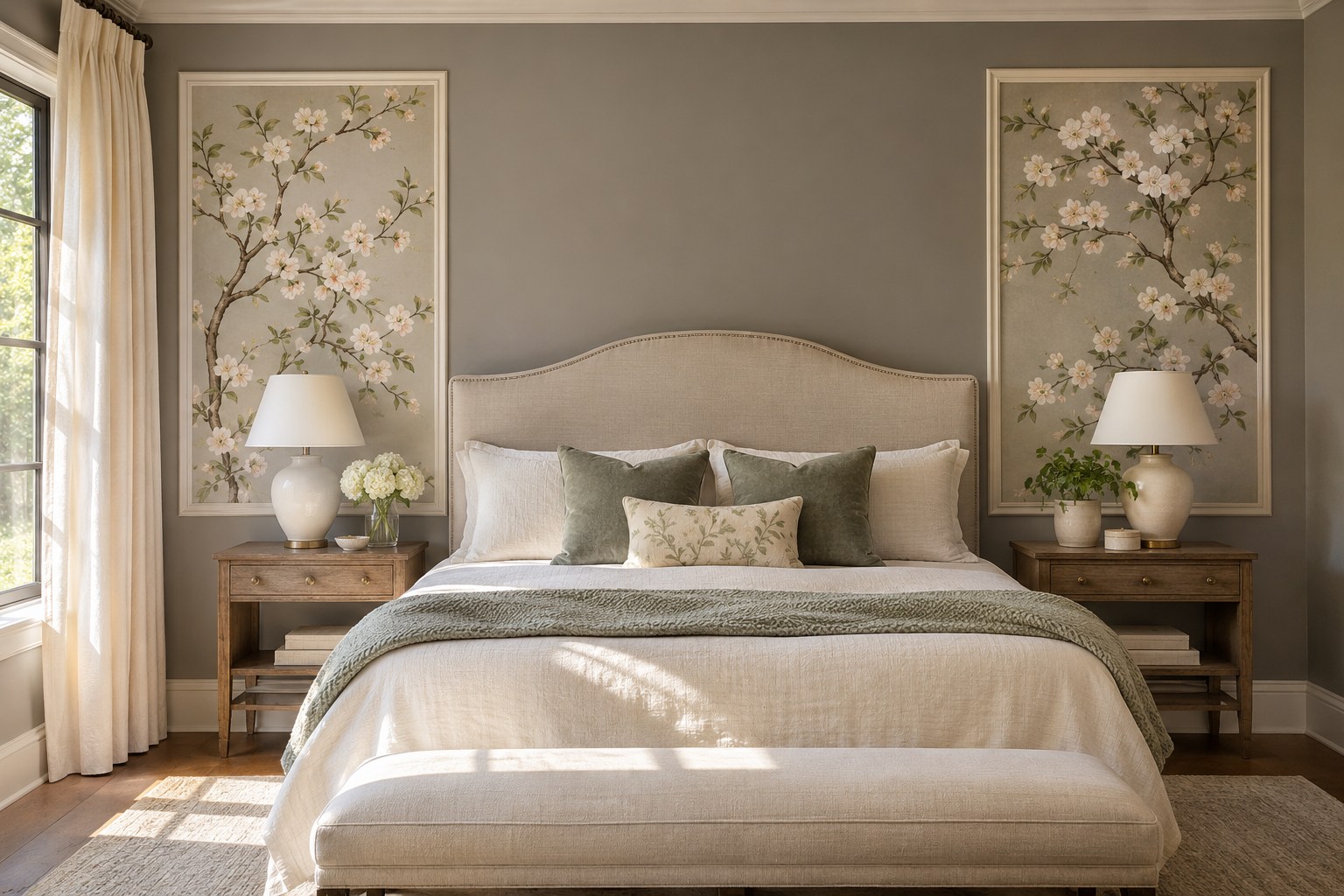
Two wallpaper panels can give you the reach of a large branch motif without papering the whole room. Pick the portion of the design you want in each rectangle and lay both out before cutting. Leave enough room around a bird or branch that the frame will read as an intentional edge.
Test the mock-up against the headboard or dresser for scale. A high bed can hide more of the panels than you think. Keep the frame finish simple and choose a solid wall color that holds the edges clearly in daylight.
25. Give an Animal Print One Bounded Wall
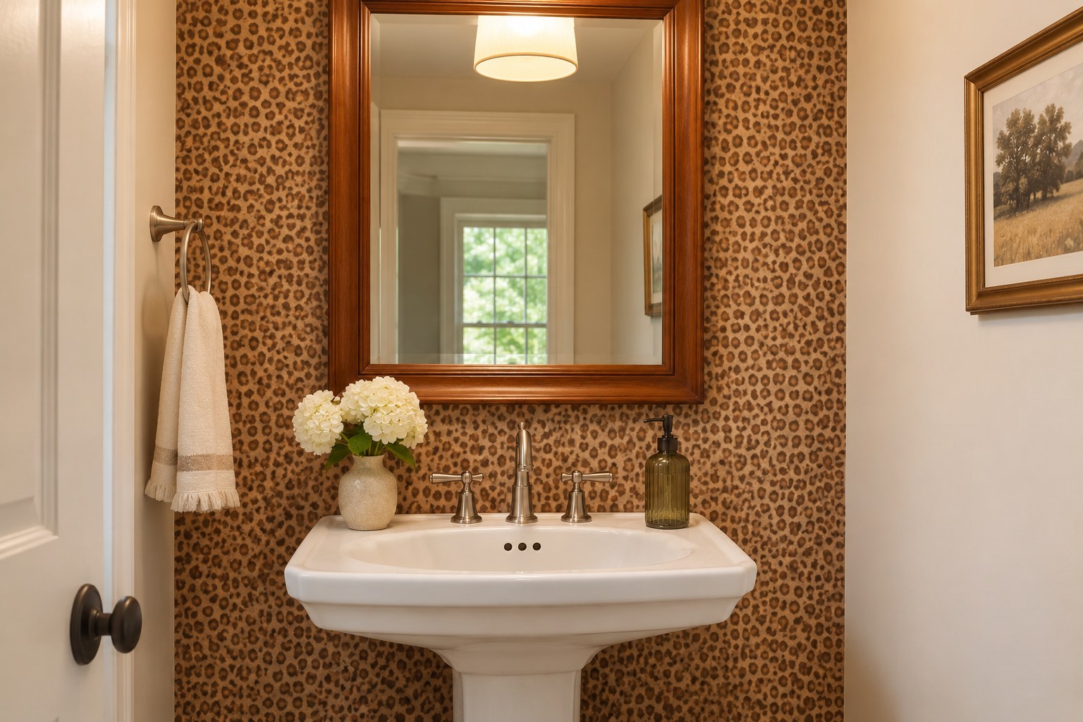
An animal print on a single powder-room wall gives the pattern a natural end. Check the width of the wall first. Small spots may read like a neutral at the door, while oversized markings can look like a single broad shape. Put the sample beside the mirror to see both versions at once.
Keep the adjacent walls and fixtures simple and check the paper’s humidity and cleaning guidance for the room. A warm brown spot print with cream around it can relate to an oak frame. A cooler gray spot print may sit better beside polished chrome and a white sink.
Pick the wall where the pattern has enough uninterrupted space and a clear place to end. A large sample, a look at the room’s evening light, and a dry layout of the repeat will tell you whether to paper the wall, contain it in a recess, or use a few panels.
Discover more from HomeTrendora
Subscribe to get the latest posts sent to your email.