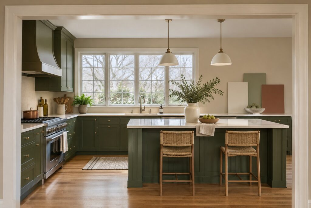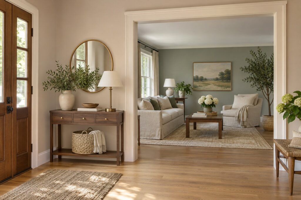
An interior paint color can look right on a chip and pull blue, pink, or brown as soon as it meets your floors. These 25 ideas pair a color with a specific surface, so you can decide what to paint and where the color should stop.
Bring a large sample next to a finish you plan to keep. Look at it in the morning and with your regular lights on at night. If a color works at one end of a room only, you can put it on a smaller surface with a clear edge, such as a cabinet front or a window wall.
1. Put Coastal Blue on the Living Room Window Wall
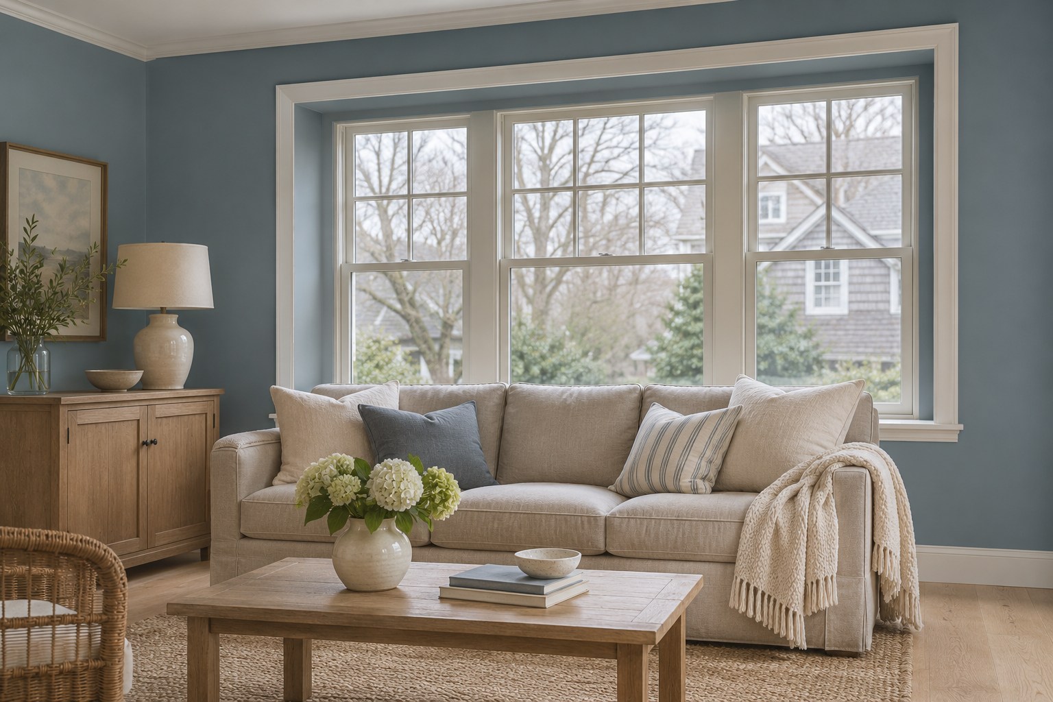
Try a coastal blue with a little gray on the living room window wall. Keep the casing pale so you can see a clear edge around the glass. A flax or ivory sofa will give you another reference for how cool the blue looks on that wall.
Move a large sample from the sunny edge of the window to the corner with the longest shadow. If it reads steely beside the upholstery on a cloudy afternoon, compare a slightly warmer blue before painting the wall.
2. Warm a Dining Room With Earthy Terracotta
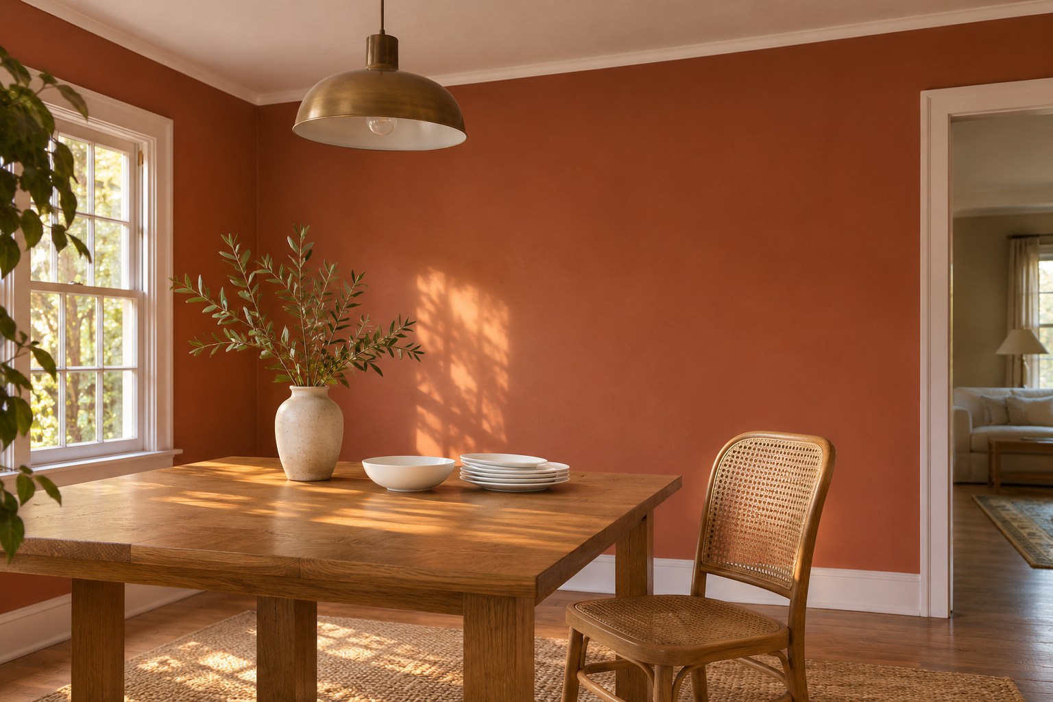
Set earthy terracotta behind the dining table if you want the color to show across a full wall. Choose a softened clay tone that stays distinct from your table finish. Pale tableware or a light ceiling gives the eye a break when the room is viewed from a distance.
Hold the sample near the table edge and sit where you usually eat. Turn on the dinner light and look at the paint with white dishes in view. A slightly browner terracotta can soften an orange cast under a warm fixture.
HOMETRENDORA PLANNING BUNDLE
Turn the ideas you like into a room plan.
Choose what to keep, check what will fit and decide what to buy first. The Home Design Book, fillable room planner and budget tracker guide you through those decisions with worked examples and practical checks.
160-page PDF + fillable room planner + Excel budget tracker
Bonuses included with your eBook purchase.
GRAB 10% DISCOUNT
Coupon code: HOMETRENDORA10
Use this code at Payhip checkout.
3. Use Greige Beside a Wood Desk
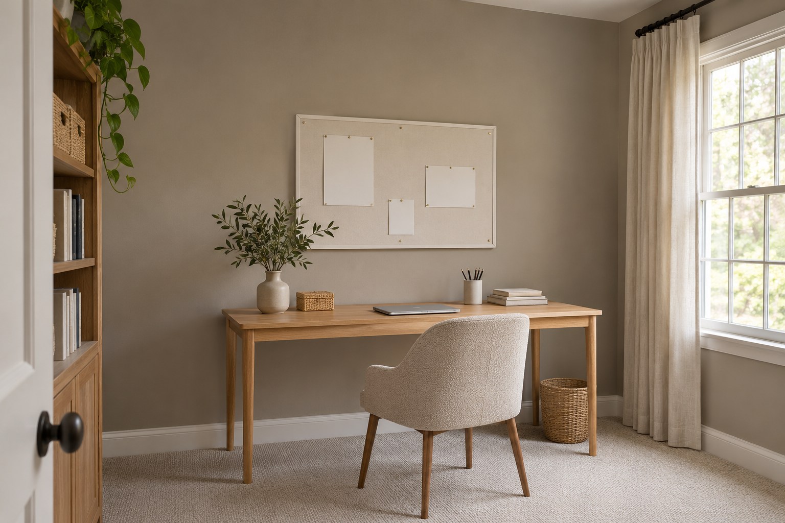
Greige can sit between a wood desk and white paper without making either look out of place. Start behind the desk and bring a pale wood sample or the actual chair into the room. Compare two greiges at once so the warmer and cooler undertones are easier to spot.
Judge the sample with the desk lamp on as well as off. If the wall and wood both read very yellow in the evening, try a cooler greige next to the same desk. If the wall turns flat gray, compare a softer beige-leaning version.
4. Paint a Deep Teal Wall Behind the Bed
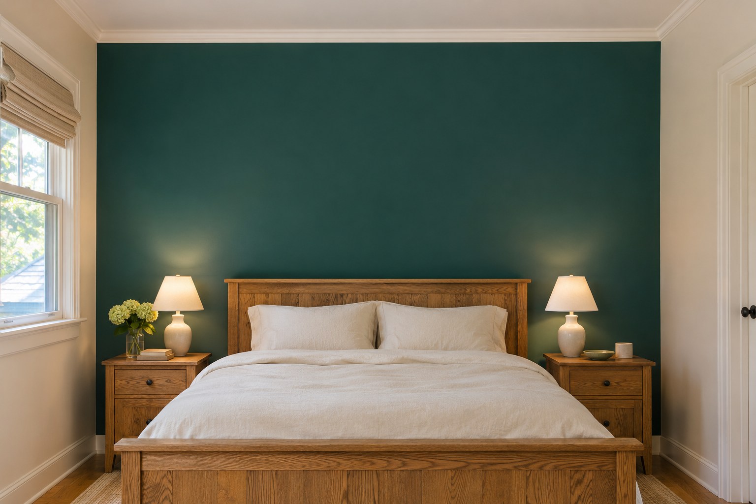
The wall behind the bed gives deep teal a natural edge. Check the paint with the headboard and your usual bedding in place, especially if either has a strong green or blue cast. Soft cream on the next wall can keep the darker color legible from the doorway.
Place one sample near the headboard and another closer to the window. If you can barely see the green in the shaded sample, a lighter teal may carry the same idea more clearly. These accent wall paint ideas show other ways to choose a stopping point for a strong color.
5. Give a Breakfast Nook One Sunny Yellow Wall
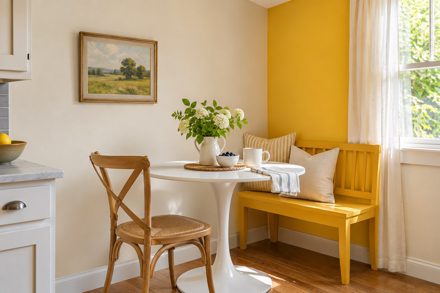
Put sunny yellow on the short wall beside the breakfast bench and let it end at the inside corner. Use the light wall and table around it to see how much yellow the space can hold. Try a muted sunny shade if the nook already has warm wood and warm-colored light.
Check the yellow when you actually eat breakfast. At that hour, a strong beam through the window can make a small patch seem brighter than expected. A large sample on the short wall will show whether you like the color from the kitchen as well as from the bench.
6. Frame a Library With Charcoal Gray
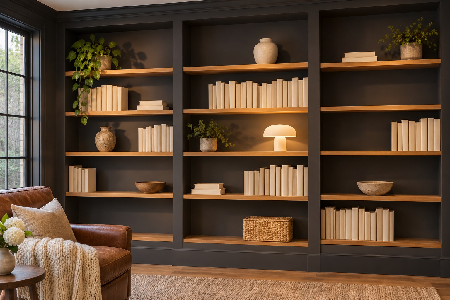
Try charcoal gray behind light wood bookshelves so the dark color has a place to stop. Leave one shelf partly open while you look at the sample. A darker backing can make lighter books and ceramics easier to pick out, while black frames or book spines may blend into it.
Put a sample on a lower shelf that gets little daylight and another near the top. If it looks almost black low down, test a softer charcoal. Keep the front edge of the shelves visible so you can judge the contrast from a chair across the room.
7. Try Soft Sage Green on Kitchen Lower Cabinets
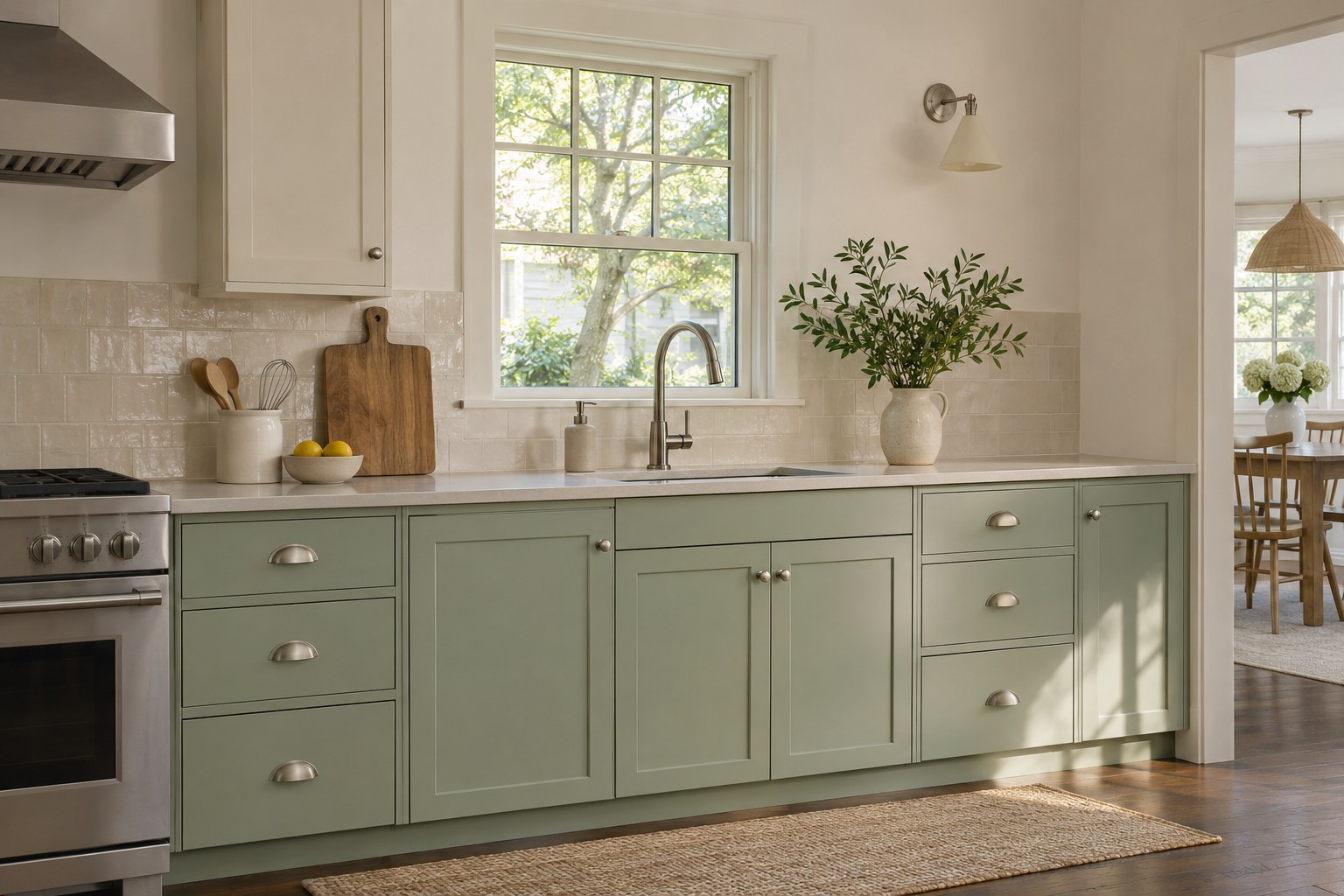
Put soft sage green on the lower cabinets if the fixed countertop and backsplash already suit it. Hold the paint sample upright against a door near the counter. This lets you compare it with the actual tile and hardware at the angle it will be seen.
Look at a sample beside the brightest drawer and the cabinet farthest from the window. If the pale counter makes the green look gray, try a slightly stronger sage. Check that the chosen paint system is suitable for the existing cabinet finish and normal kitchen cleaning.
8. Keep Warm Peach Soft in a Nursery
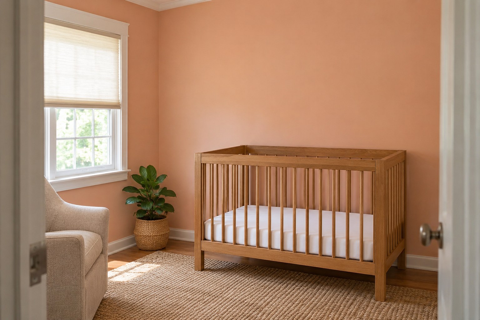
A warm peach wall can pick up the color in a natural wood crib. Compare a subdued peach with the trim and flooring first. White casing can help you see whether the peach is closer to a warm neutral or a stronger orange.
Check a large sample during a bright part of the day and again when the shade is drawn. If the whole wall feels warmer than you wanted, test a paler peach. Follow the paint maker’s preparation, ventilation, and drying instructions before putting the room back in use.
9. Put Bold Emerald Green Inside an Entryway
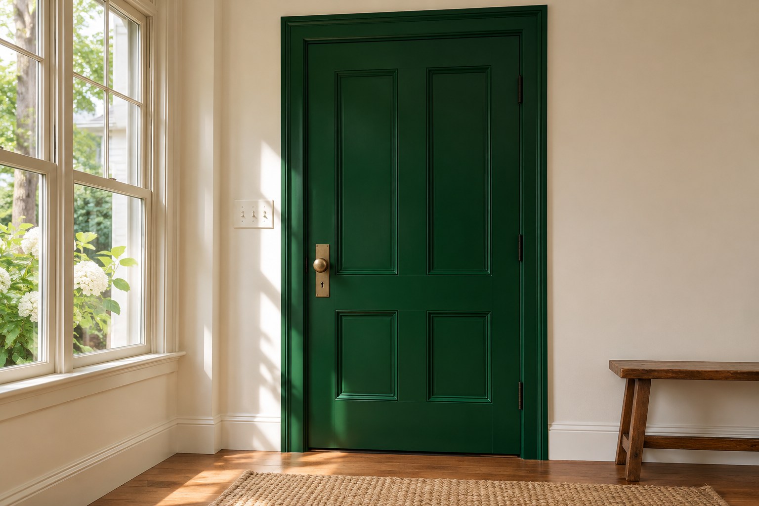
Try emerald green on the interior face of the front door. The door itself gives the bold color a defined shape, and a pale entry wall keeps the view from the next room open. Leave enough of the floor and casing visible to see how the green meets existing finishes.
Put a paint sample at handle height and check it with the door closed and open. The same color can deepen on the shaded side. Compare a slightly lighter emerald if the green becomes hard to distinguish from black when you come in after dark.
10. Ground a Bathroom With a Navy Vanity
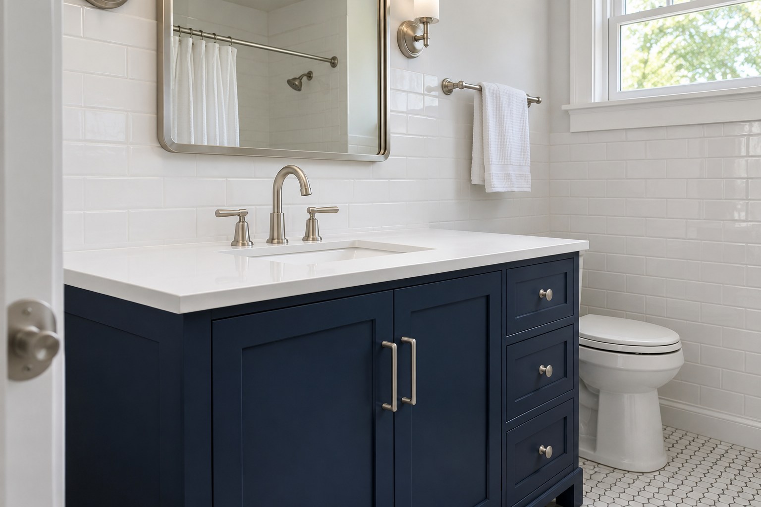
Use navy on a bathroom vanity if the white tile and countertop already work with it. Test the navy close to the sink with your actual tile in view. A single dark cabinet front will show how the color sits beside the room’s brightest finish.
A bathroom mirror light can make one navy sample look much cooler than it did in the hall. Look at it with that light on and off. For a painted cabinet, check that the primer and finish suit the existing surface and the way you clean it.
11. Use Pale Lilac on a Quiet Room’s Main Wall
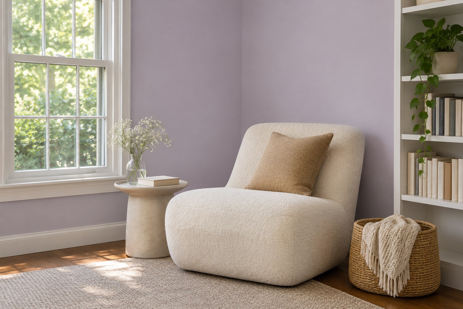
Choose pale lilac for the main wall of a room where you sit quietly. A gray-leaning version is easy to compare with an ivory chair or white casing. Keep the rest of the wall clear while you test it, so artwork and fabric colors do not dominate the decision.
Read the color from the chair as well as the doorway. In a softly lit room, one lilac may shift pink and another may all but disappear. Hold both beside the same white trim and choose the one you can still recognize under your regular evening light.
12. Wrap a Media Wall in Rich Burgundy
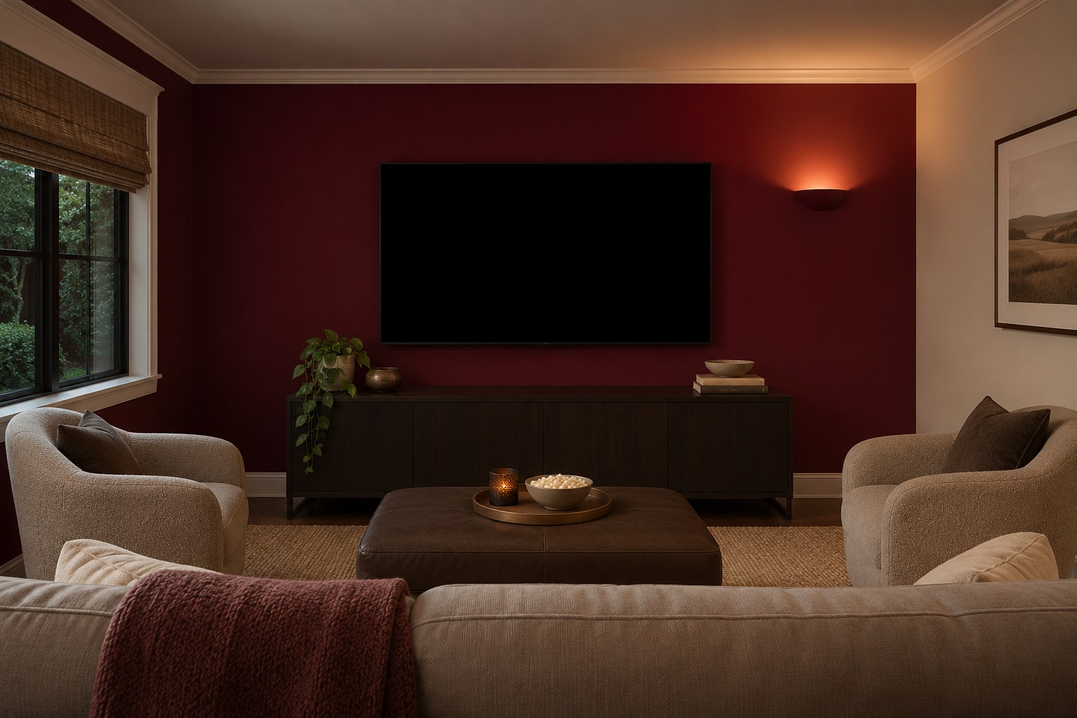
Try rich burgundy on the wall behind the television in a small media room. Keep a lighter adjacent wall visible at the room edge if you want a clear stopping point. A quiet wall finish leaves the color and the screen as the main features in the view.
Tape the sample near the screen and look at it with the lights set as you normally use them. If it looks brown and you want more red, compare a cooler burgundy. Move the sample out of the direct beam before you decide how it reads from the sofa.
13. Try Cheerful Coral Above a Powder Room Sink
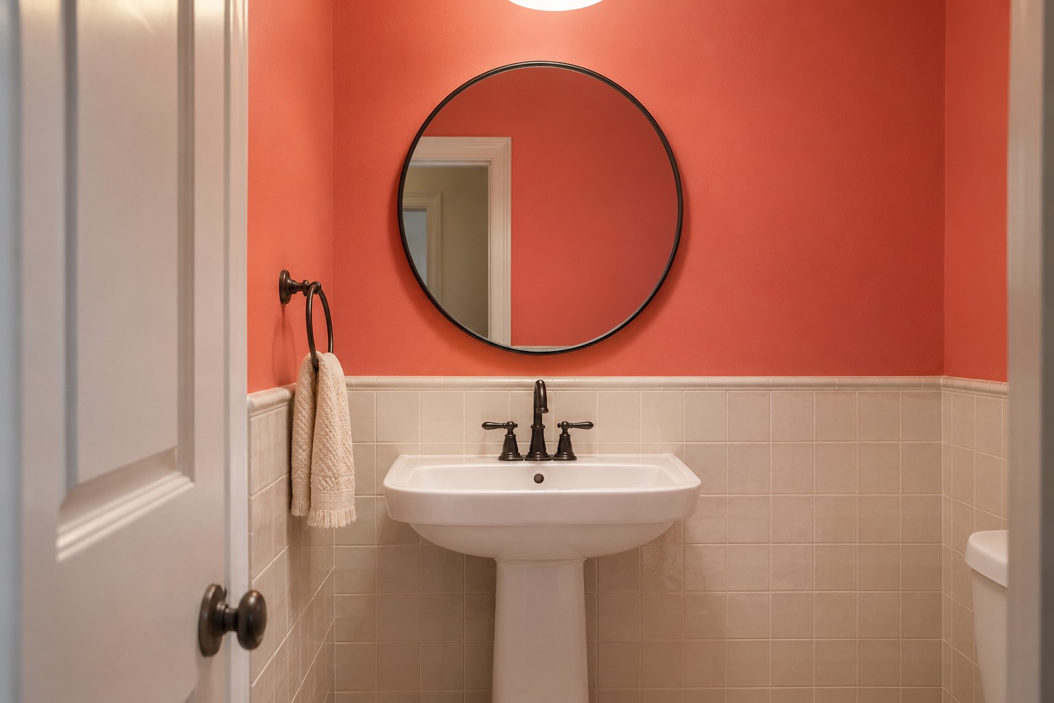
A coral upper wall gives a powder room a bright color where there may be little daylight. Put the sample close to the white sink and existing mirror, with tile or a clean trim line as a lower boundary if the room already has one.
Check your face in the mirror while the coral sample is beside it. A very saturated coral can cast a noticeable tint under close lighting. A softer version can keep the color visible while easing that reflection.
14. Try Muted Olive Green in a Study
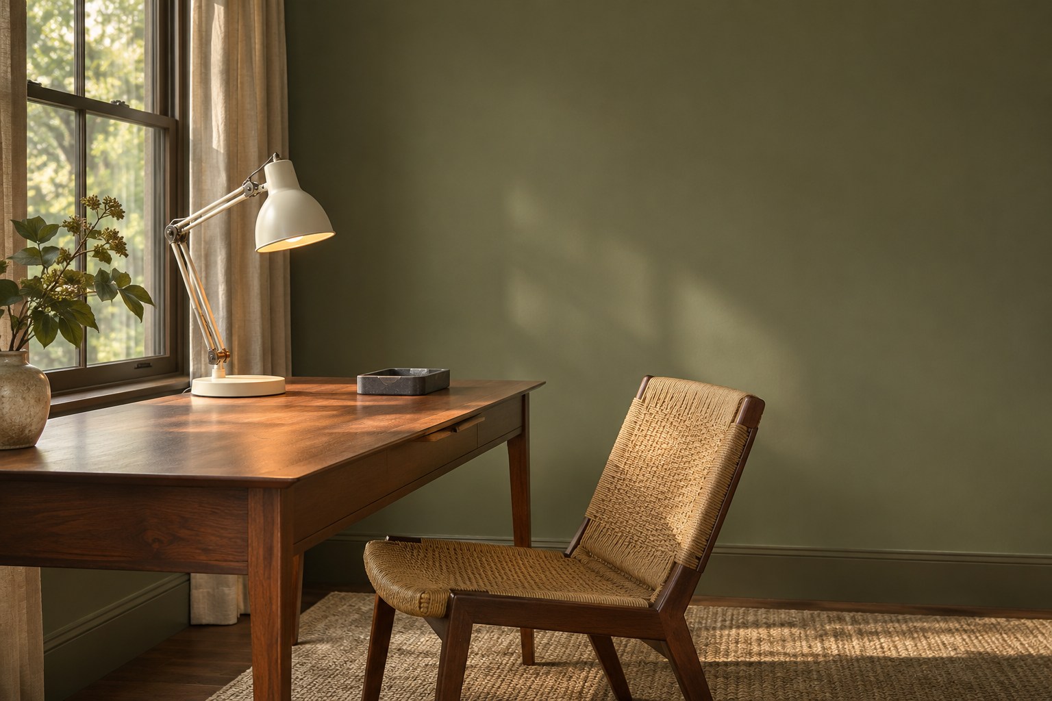
Try muted olive behind the desk in a study with brown wood furniture. Hold a sample against both a broad wood face and the lighter edge of a lamp shade. Olive can move toward yellow beside some finishes, and a slightly grayer version may be easier to pair with warm wood.
Check it when the desk is in shadow. If the paint looks muddy next to the chair or a warm lampshade, compare an olive with a little more green. Try the sample at seated height before deciding whether to paint beyond the desk wall.
15. Choose Dusty Rose Behind a Bedroom Headboard
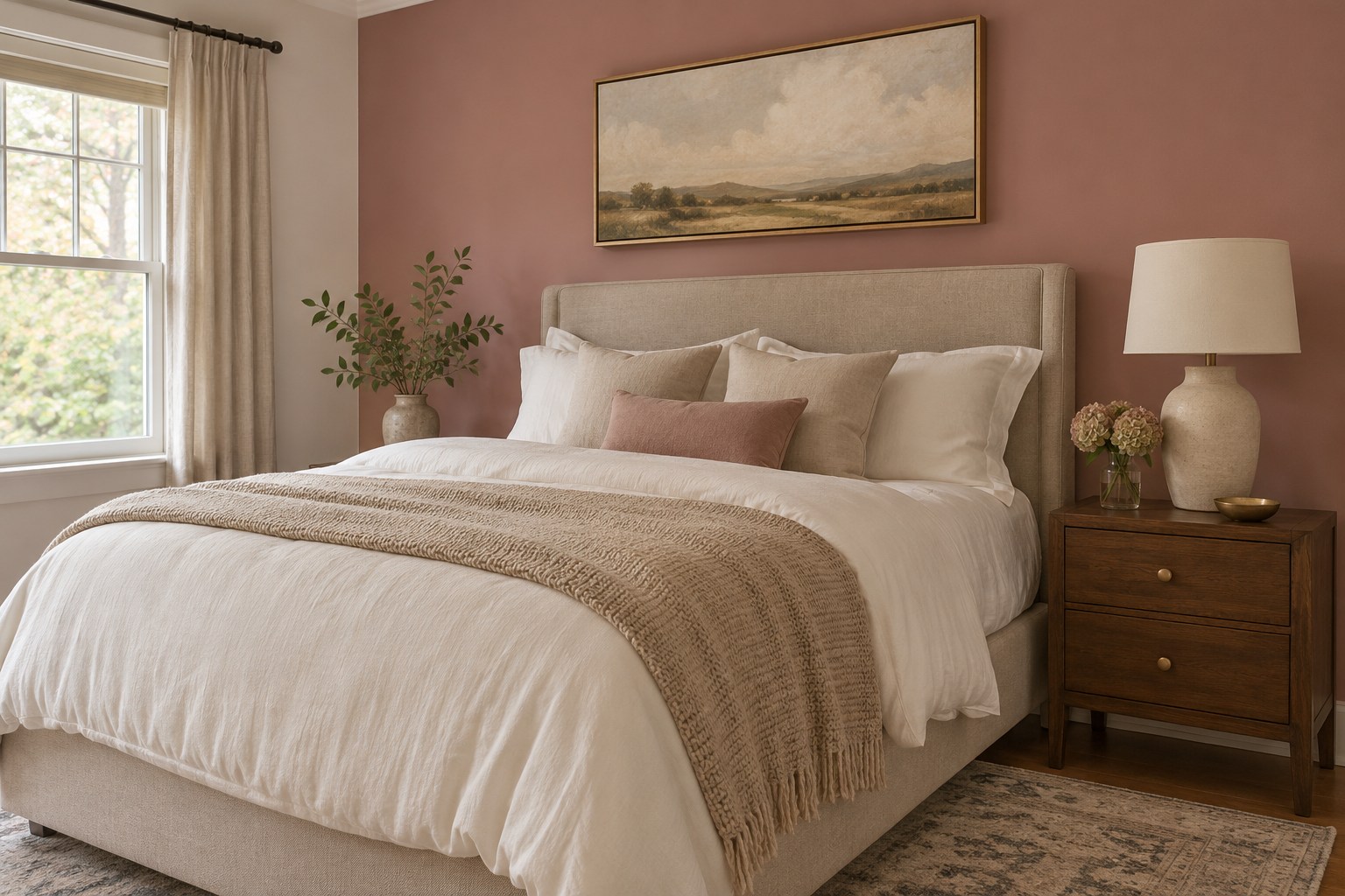
Dusty rose works on a bed wall when its undertone suits the upholstery. Set a broad swatch directly behind an oatmeal or neutral headboard and leave a white pillow nearby for reference. Medium or dark wood on the bedside table can bring out the muted color.
Look across the bed with your usual lamp on. If the wall leans salmon and you want a cooler pink, compare a grayer rose beside the same fabrics. Keep the sample at wall height so a warmer floor reflection does not dominate what you see.
16. Split Slate Blue and White Between Kitchen Surfaces
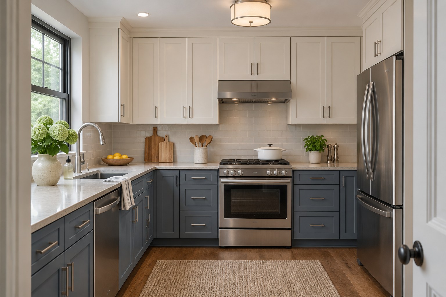
Give slate blue to the lower cabinets and keep the upper surfaces white. The counter creates a clean division, which can make this easier to picture in a kitchen where you plan to keep the tile. Compare the white and blue together beside the backsplash.
Try the two samples on the same vertical line at the top and bottom of the counter. If the blue looks dull below it, a clearer slate blue may suit that lower light. These modern white kitchens offer ideas for the pale finishes that will sit alongside it.
17. Put Burnt Orange on a Living Room Fireplace Breast
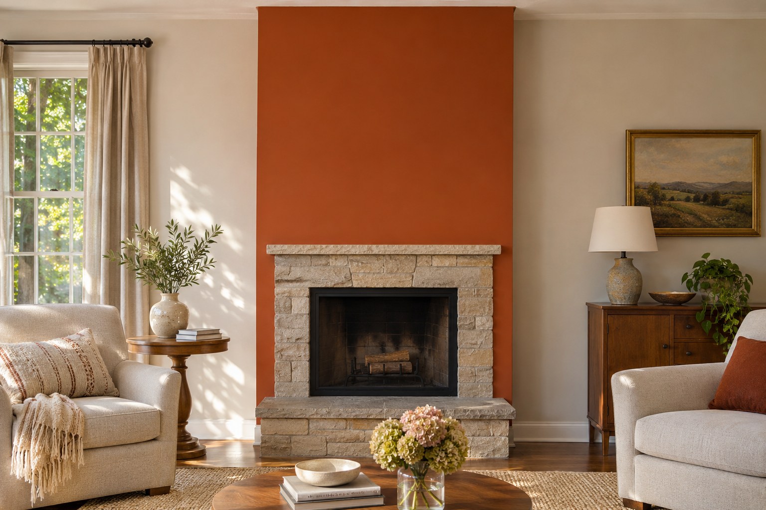
Let the edge of a fireplace wall set the width of a burnt-orange accent. Keep the paint on the appropriate surrounding wall surface and use the stone or masonry as a color reference. A narrow section can carry the color without making every wall feel equally busy.
Hold the sample at different heights beside the surround and look from the sofa. If warm stone and paint blend into one block, test a slightly browner or deeper orange for clearer edges. Check the paint maker’s surface and fireplace-area guidance before choosing a finish.
18. Carry Creamy Off-White Across an Open Floor Plan
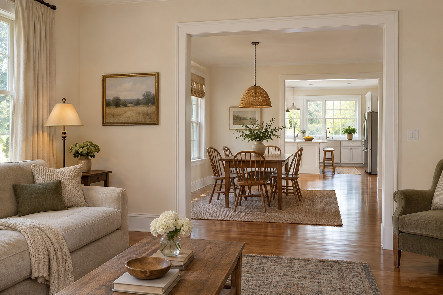
Carry creamy off-white across connected living and dining walls if you want them to read as one room. Choose the cream beside the flooring and cabinet finish you already have. The same paint can look warmer in one zone when it receives less daylight.
Move one large sample between the two areas at the same time of day. If the cream feels yellow in the darker area, compare a quieter cream in both places. These kitchen and living room layouts show where the shared wall color can continue between zones.
19. Give a Dining Nook a Deep Plum Back Wall
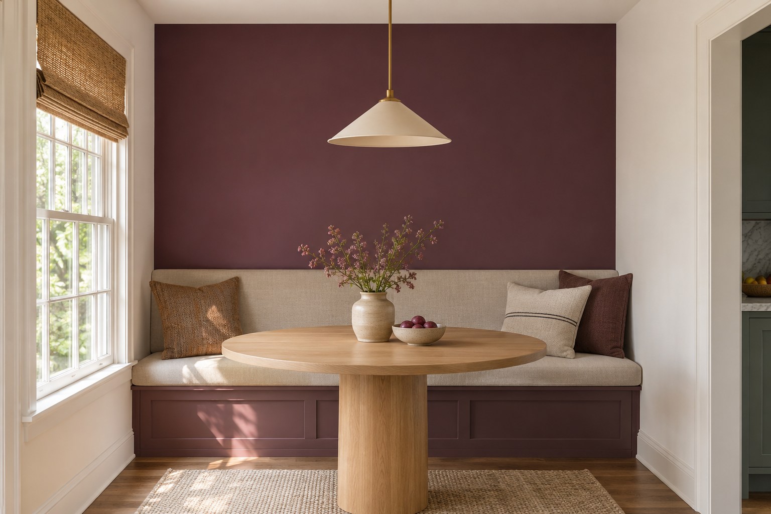
Give deep plum to the back wall of a built-in dining nook. A pale bench cushion and table let the color remain visible from the kitchen. Use the corners of the alcove to set its edges so the nearby walls can stay lighter.
View a sample at seat level with the pendant on. If the plum turns almost black, try a shade one step lighter against the same cushion. Check again from the room entrance, where the darker wall will sit farther away.
20. Set Sky Blue at Playroom Height
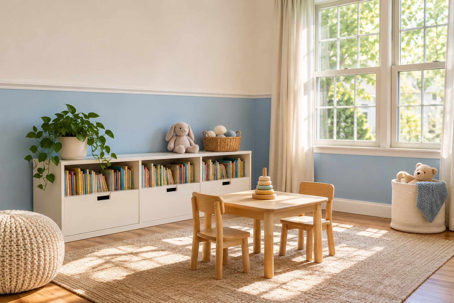
Use sky blue below an existing horizontal trim line in a playroom. The line gives the blue a steady height, even when you change the toy storage or table. Keep the upper wall a warmer white if you want a gentler transition near the windows.
Put a paint sample low on the wall, where furniture and people cast more shadow. If it reads too gray there, try a clearer sky blue. Pick a finish suitable for the substrate and the amount of wiping the wall gets, using the manufacturer’s care guidance.
21. Try Forest Green in a Reading Corner
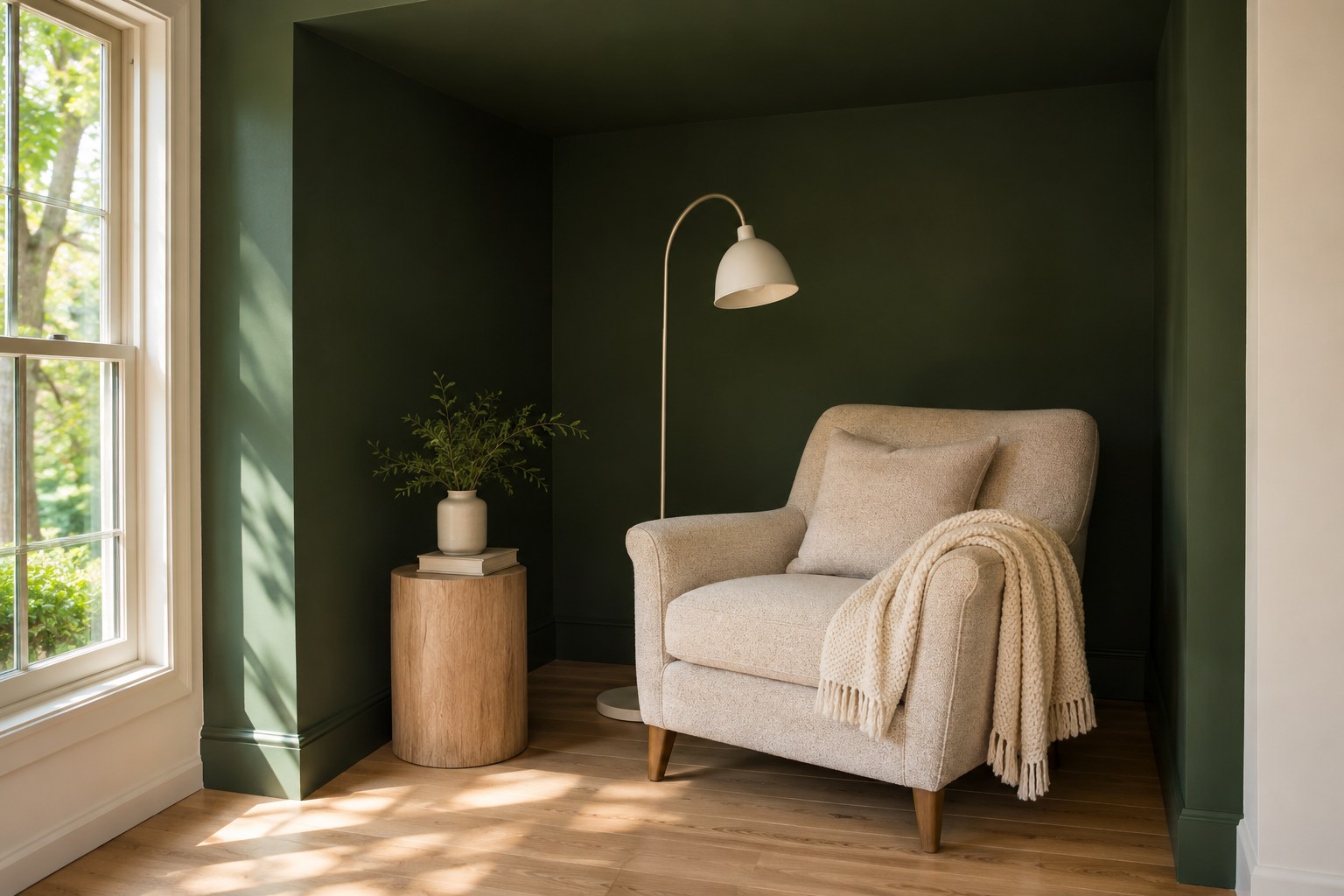
Paint the back and sides of a small reading alcove forest green. The pale wall just outside it gives the deeper paint an edge. Bring in the chair you plan to use so you can see where the green sits beside its fabric.
Check the back corner with the reading light on. If the forest green falls into a single dark block, compare a lighter version on the same three sides. Use the sample from the chair and doorway so you can decide whether to wrap the sides or keep the color on the rear wall.
22. Match a Bathroom Taupe to the Wood
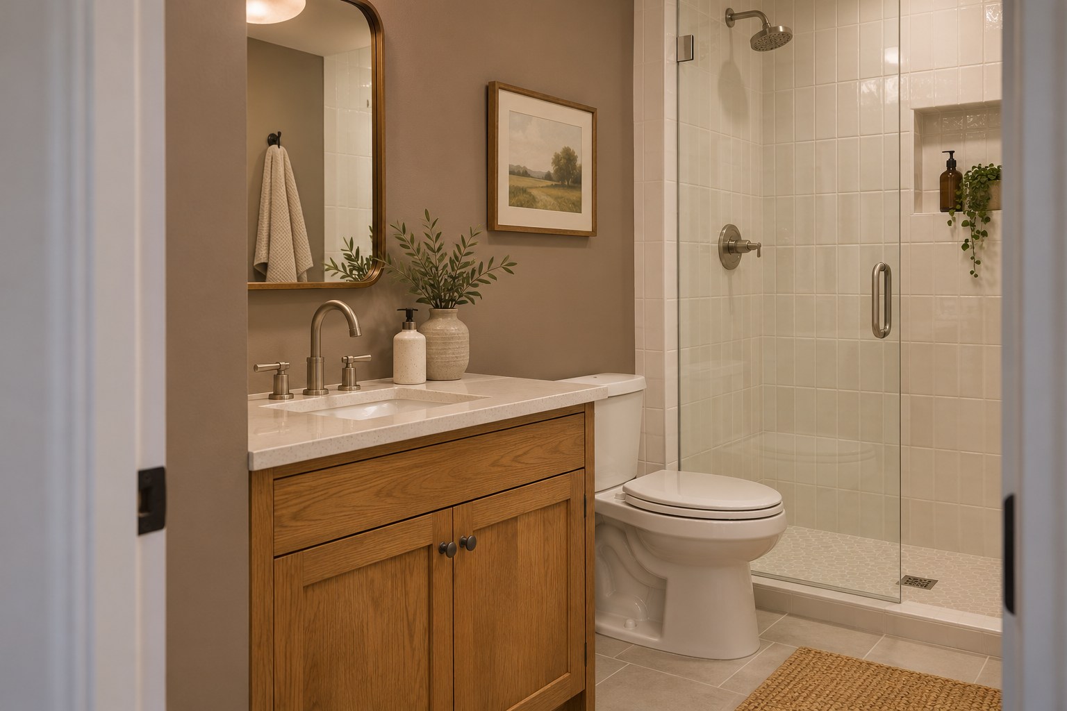
Find a taupe that matches the undertone of the bathroom wood and fixed tile. Compare it on a dry wall near the vanity so both materials are in view. Warm taupe will often look different beside a honey-toned wood and a cooler tile.
Set two samples near the tile seam and check the room with the vanity light on. If one reads pink and the other gray, choose the one that looks better beside both fixed surfaces. Use a finish intended for the surface and moisture conditions where it will go.
23. Use Mustard Yellow on One Kitchen End Panel
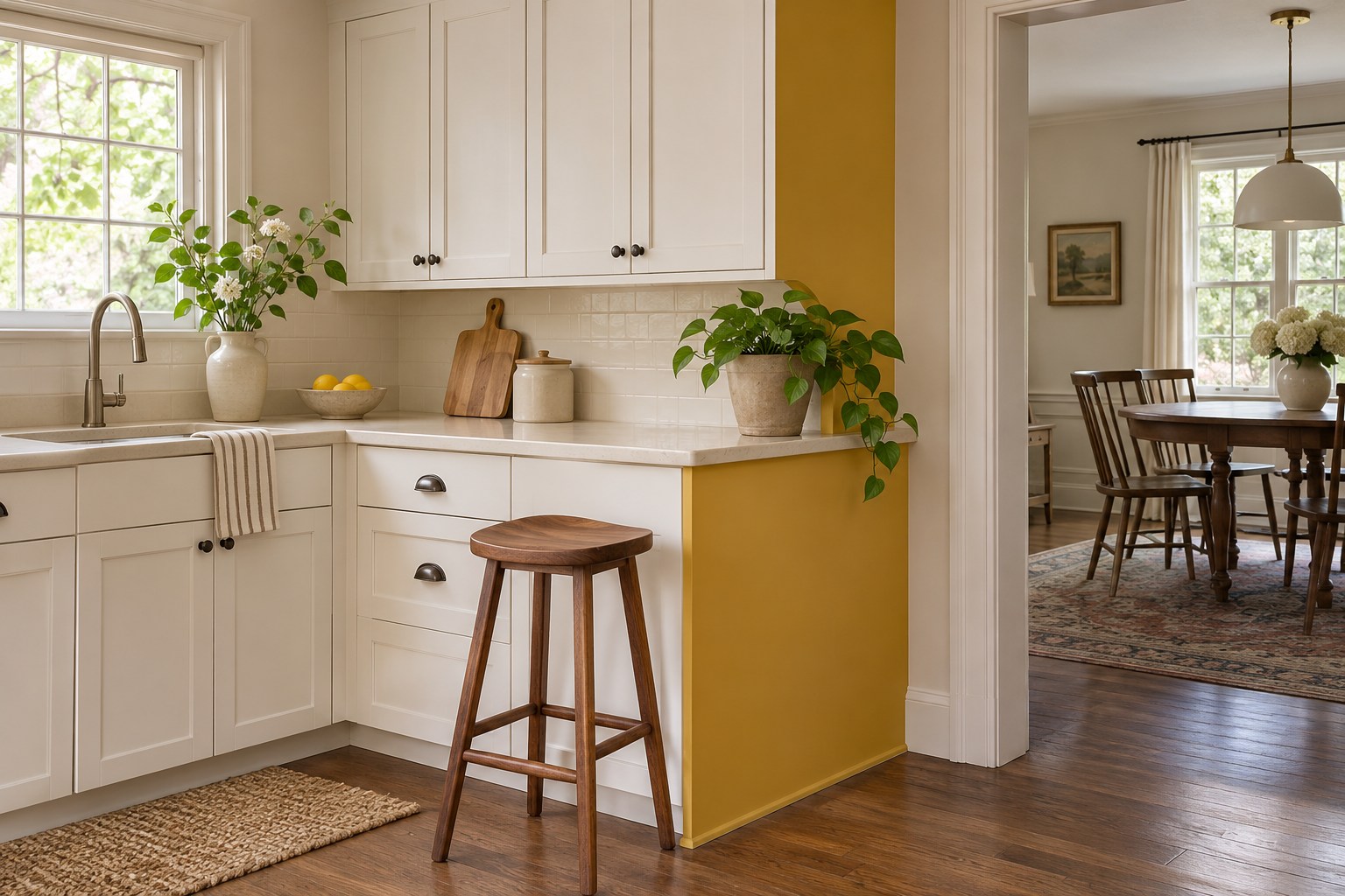
Try mustard yellow on a cabinet end panel that faces the dining area. The existing end panel gives the accent a clear outline, and nearby pale cabinet doors stay in view. A muted mustard is easy to compare against the undertones already in your wood or countertop.
Check the sample from both the kitchen and the adjacent room. If it looks strong from only one side, choose a slightly quieter mustard before painting. Match the primer and topcoat to the cabinet panel material and how you clean it.
24. Test Faded Denim Blue Behind a Bed
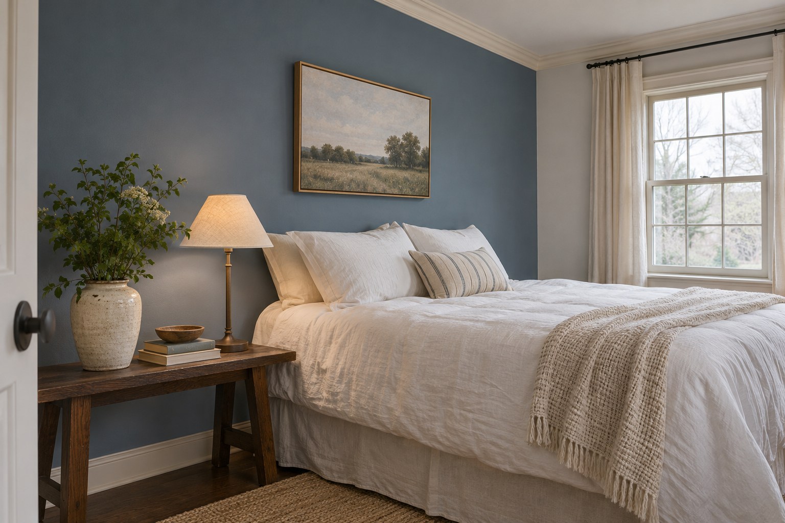
Faded denim blue brings a softened blue to the wall behind a guest bed. Try it beside your white bedding and window casing. The shade should still look blue where the headboard or curtains throw a shadow.
Place the sample next to the trim in daylight and under the lamp you use in the evening. If the wall looks colder than you wanted beside a warm white, compare a denim shade with a slightly warmer gray undertone.
25. Keep a Black Living Room Accent Wall Visually Clear
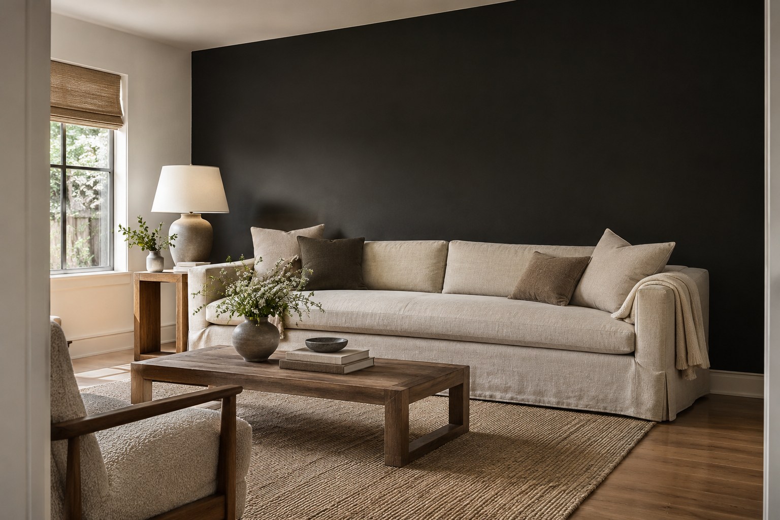
Use a soft black behind a pale sofa when the accent wall has clear sides and some daylight. Keep the adjoining wall and nearby wood or upholstery visible so you can judge where the black ends. A matte sample helps you see the undertone without strong glare from a window.
Look at the center and the edges of the sample in your evening light. If the center absorbs so much light that you lose details you want to see, compare a charcoal or move the black to a shorter wall. Take the same sample into daylight before choosing the final finish.
Pick the idea that works with the flooring, tile, or upholstery you already have. Start with one large sample beside that finish and check it during the hours you use the room. Once you can see where the color works and where it should end, you can decide how much to paint.
Discover more from HomeTrendora
Subscribe to get the latest posts sent to your email.