
Cool daylight in a north-facing kitchen can make your favorite paint chip look gray beside the cabinets. These 24 palettes help you decide what to paint, which floor and countertop finishes to pair with it, and which sample to keep after you see it under the lights you use at night.
Start with the materials you plan to keep. Take a flooring offcut or photo, a countertop sample, and an actual cabinet door to the same spot. Sample on movable boards so you can see the same paint near the window, at the shaded end of the room, and beside the finish it will touch. Use the room images as palette examples, then let the samples in your kitchen guide the final choice.
1. Warm Ivory Walls With Honey Oak Cabinets
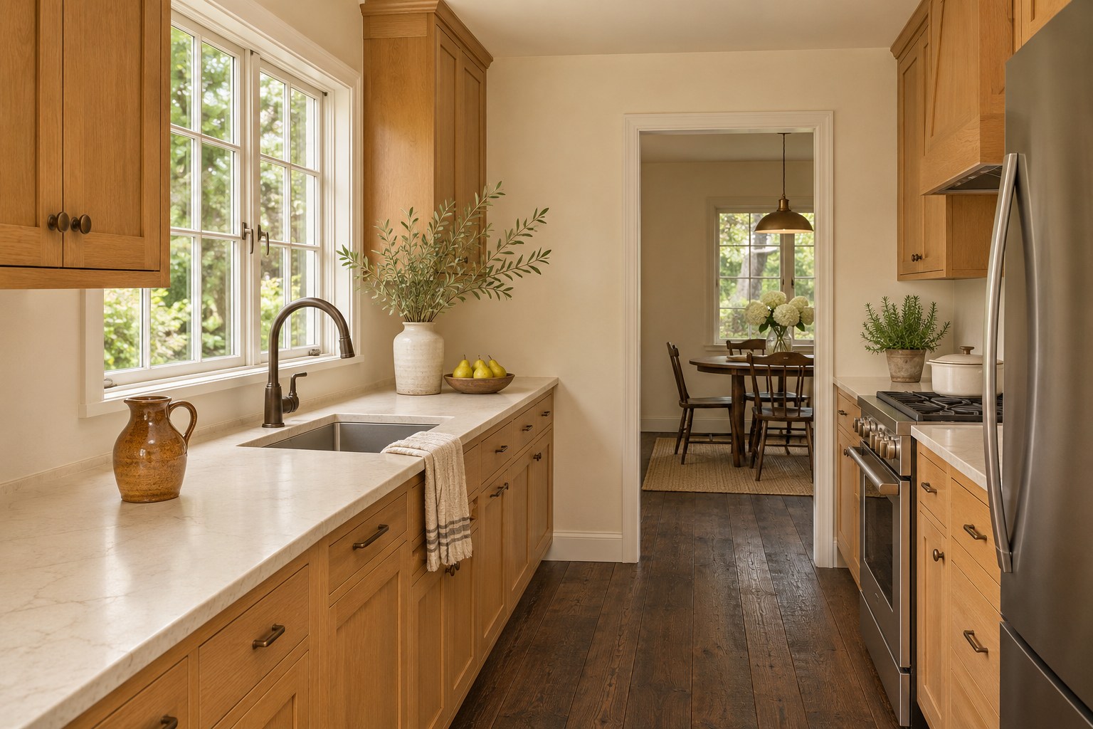
Warm ivory makes a useful wall color in a north-facing kitchen with honey oak cabinet fronts. The oak already carries a golden note, and a soft ivory with a restrained yellow undertone can bridge it to a cream quartz countertop. If the floor is dark oak, carry the ivory across the largest open wall so that the room has a bright plane above the deeper wood. A small band of wall above the counters will have a subtler effect.
Hold an ivory board against both the cabinet door and the cream quartz edge in daylight. Check the darker wall at the far end, too. In the evening, turn on your usual ceiling lights and look for the point where ivory becomes visibly yellow next to the wood. A gentler ivory may suit a kitchen with very golden cabinets.
2. Mushroom Cabinet Fronts With Honed Soapstone
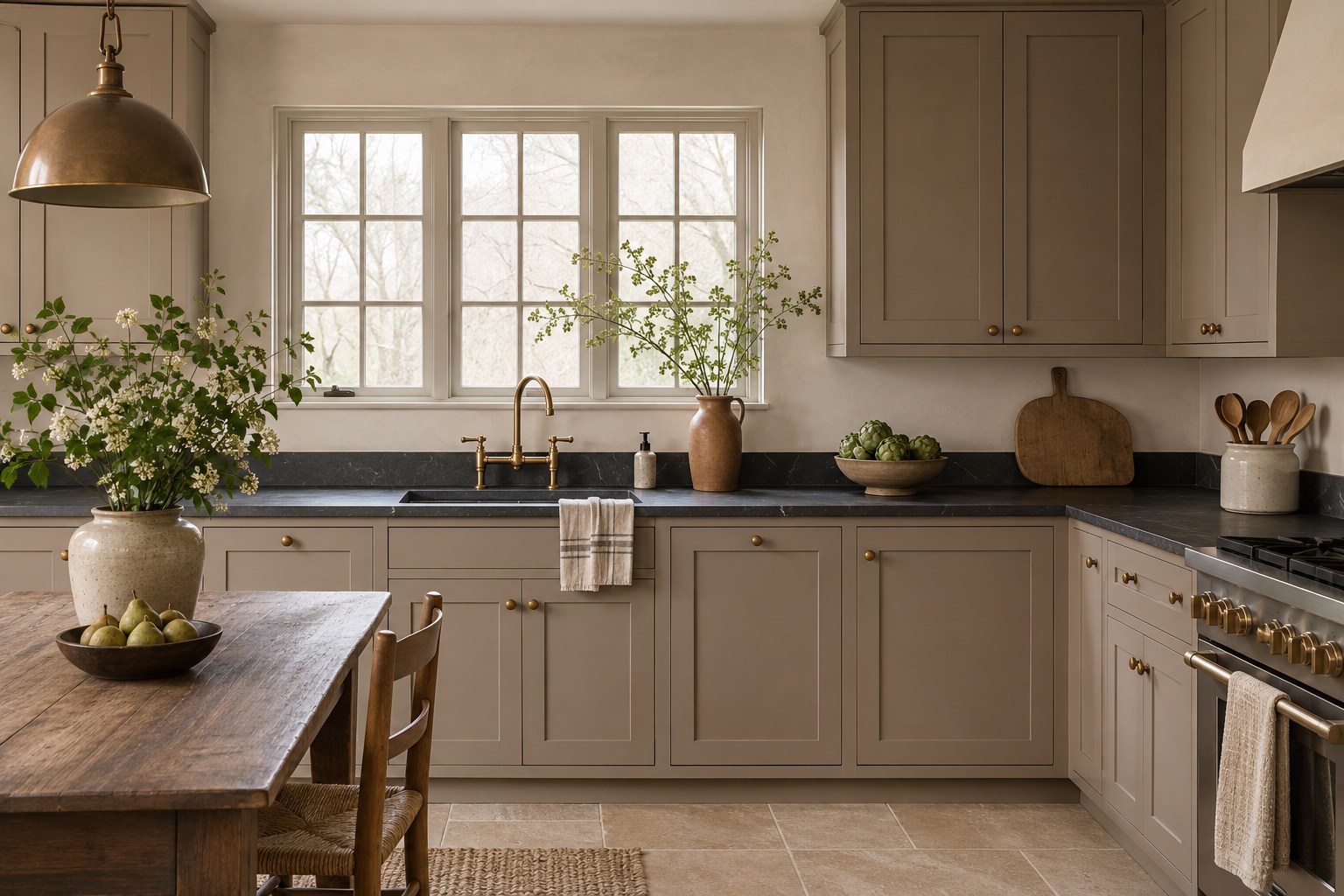
Mushroom fronts bring an earthy middle tone to a kitchen with charcoal soapstone. Use buff limestone or a similar warm beige floor tile to pick up the cabinet color at ground level. The countertop can stay a distinct dark line if the wall above it is a simple soft white. This is an especially workable combination when dark stone covers a long run and you want the cabinet faces to feel substantial without matching its depth.
Set a painted door sample upright against the soapstone with a piece of flooring at its base. In daylight, check whether the mushroom looks like brownish gray beside the floor or shifts toward mauve. Switch on the lights you actually use for dinner and see whether the stone and fronts still have a clear edge. A touch more brown can help the palette hold together.
3. Buttercream Upper Cabinets Above Walnut Bases
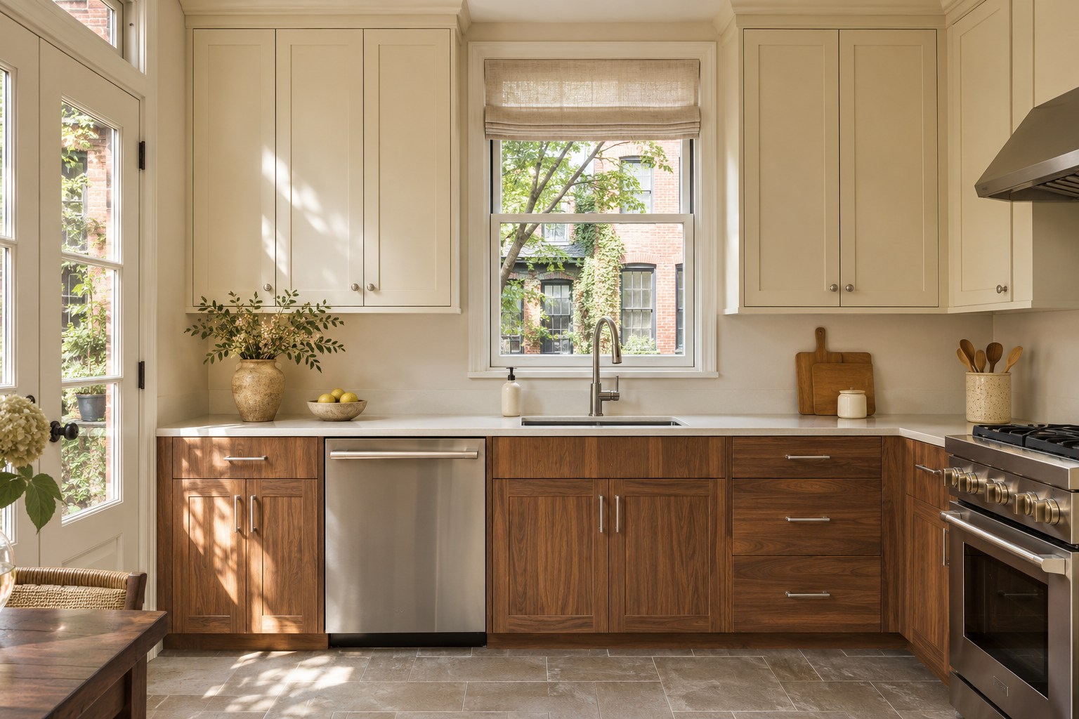
Pale buttercream upper cabinets put a little warmth near eye level in a kitchen with walnut base fronts. Pair both with a warm white quartz counter and gray-brown floor tile. Look for buttercream with a quiet yellow base so that the uppers read as a pale painted surface in a shaded room. The walnut already supplies strong color and grain. A single light counter surface leaves room for both cabinet finishes to register.
Stand a buttercream board at upper-cabinet height and look at it from the doorway in daylight. Place a second board on the wall nearest the window if the cabinets wrap a corner. In the evening, check the buttercream against the lit quartz and the walnut below it. Keep the version that still feels soft under your warmest everyday bulbs.
4. Pale Sage Walls With Linen-White Cabinetry
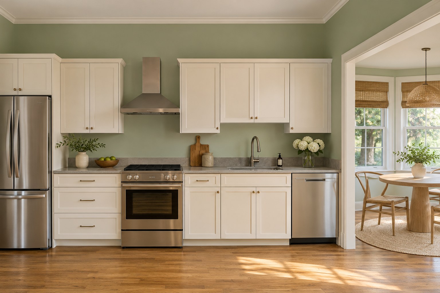
Pale sage can give the main wall a hint of color while linen-white cabinet fronts keep the kitchen open. Choose a gray-green that has enough yellow in it to connect with golden oak flooring and a warm gray counter. A limestone-look surface works here because its muted background leaves the green as the clearest hue. Keep the window wall and the breakfast nook in the same sage when you want the two spaces to feel continuous.
Test the sage above the counter and near a white cabinet door in daylight. Check it from the spot where you usually eat. After dark, see whether the wall pulls gray or yellow next to the cabinet white. If the same color will appear elsewhere, compare it with the options in our whole-house paint color guide.
5. Light Greige Walls and a Muted Navy Cabinet Run
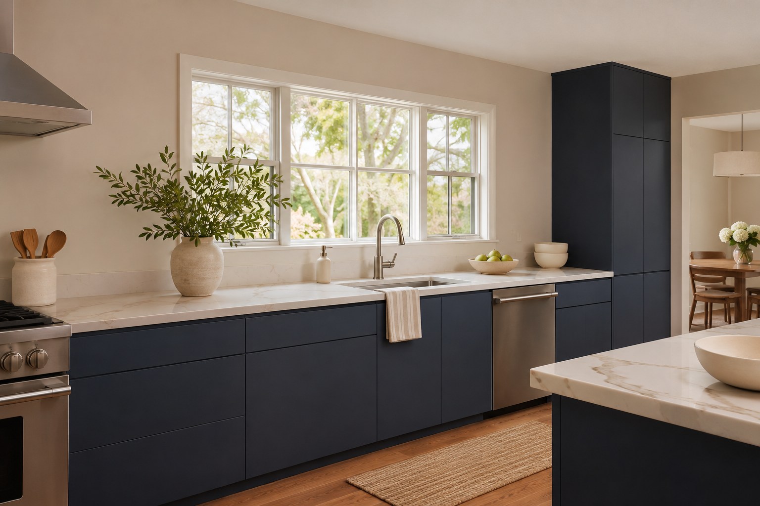
Light greige gives a muted navy cabinet run an easy background. Look for a wall shade that shares the warmth of a medium oak floor. Use white quartz with a fine taupe vein at counter height to connect the wall and floor across the dark doors. A navy with a softened blue base fits this combination especially well when the sink run has enough window light to keep the door details legible.
Hold the navy sample against the warm floor at the cabinet toe and against the countertop edge in daylight. Check the greige on a vertical board close to the window. In the evening, look from across the room and see whether the dark doors still show a readable blue tone. Compare another slightly lighter navy if that run spends much of the evening in shade.
6. Dusty Clay Walls With Blonde Maple Fronts
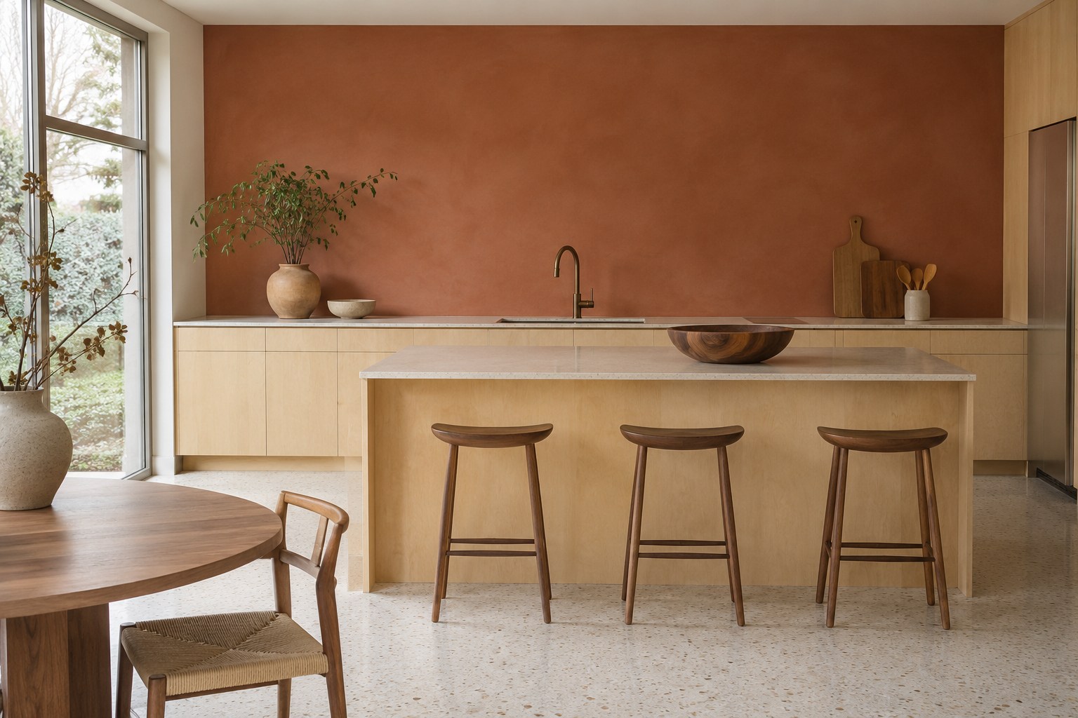
Dusty clay on the wall can pick up the quiet reddish tones in a blonde maple front without adding more wood grain. Use a pale sand quartz countertop and creamy terrazzo floor with understated tan aggregate. Together those surfaces give the wall some warmth at two different heights. Start on a broad stretch of wall above the splash surface, where you can see enough of the paint to judge its undertone.
Put the clay board beside a clear-finished maple sample in daylight and slide it near the corner, where the wall may read darker. Check the terrazzo at the same time because its aggregate can bring out pink in a muted clay. Under the evening lights, compare a dusty version with a slightly browner one. Pick the sample that still sits comfortably against the counter.
7. Warm Blush Walls With Dark Walnut Cabinetry
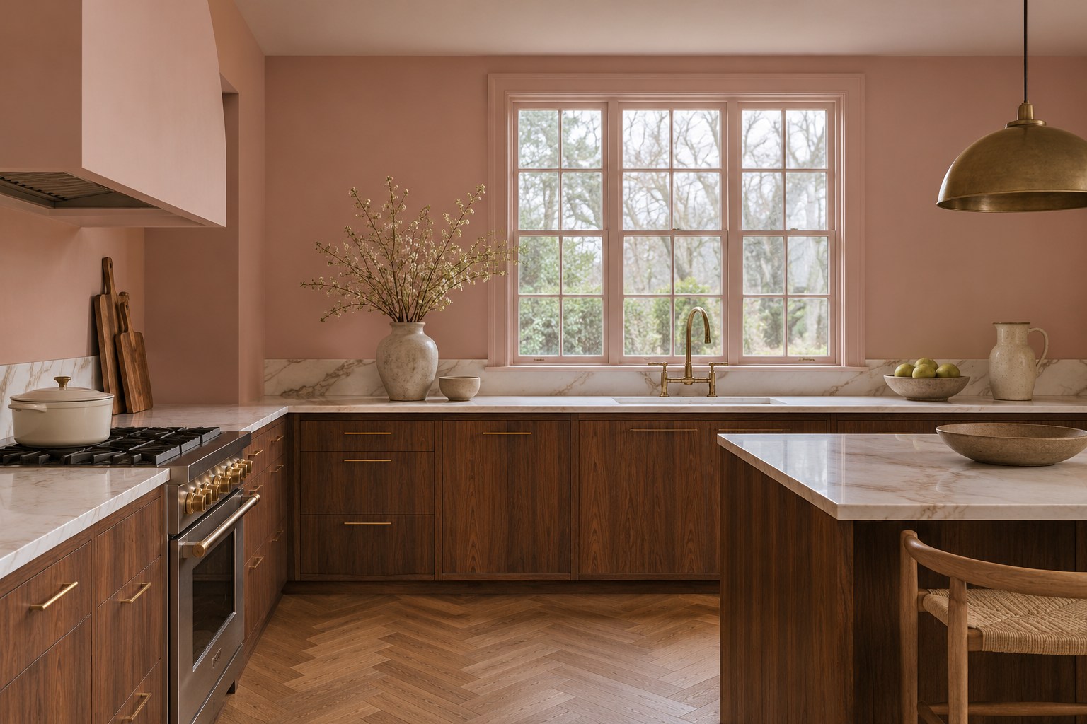
Warm blush can make a kitchen with dark walnut cabinet fronts feel welcoming. Try it on the wall behind the counter or on an open dining end where the color has room to show. A pale quartz counter with a subdued brown vein connects the light paint to the walnut. An aged oak herringbone floor supplies another warm wood finish with a different grain pattern, so the wall color can stay simple.
Place the blush board beside the walnut and quartz in daylight, then bring it to the wall that receives the least light. Look for a dusty beige-pink that stays even beside the stained wood. Turn on the evening lights and check the paint against the floor from a few steps back. Choose the warmer sample only if the room still feels balanced at dinner.
8. Oxide Red Paint on a Full-Height Pantry Bank
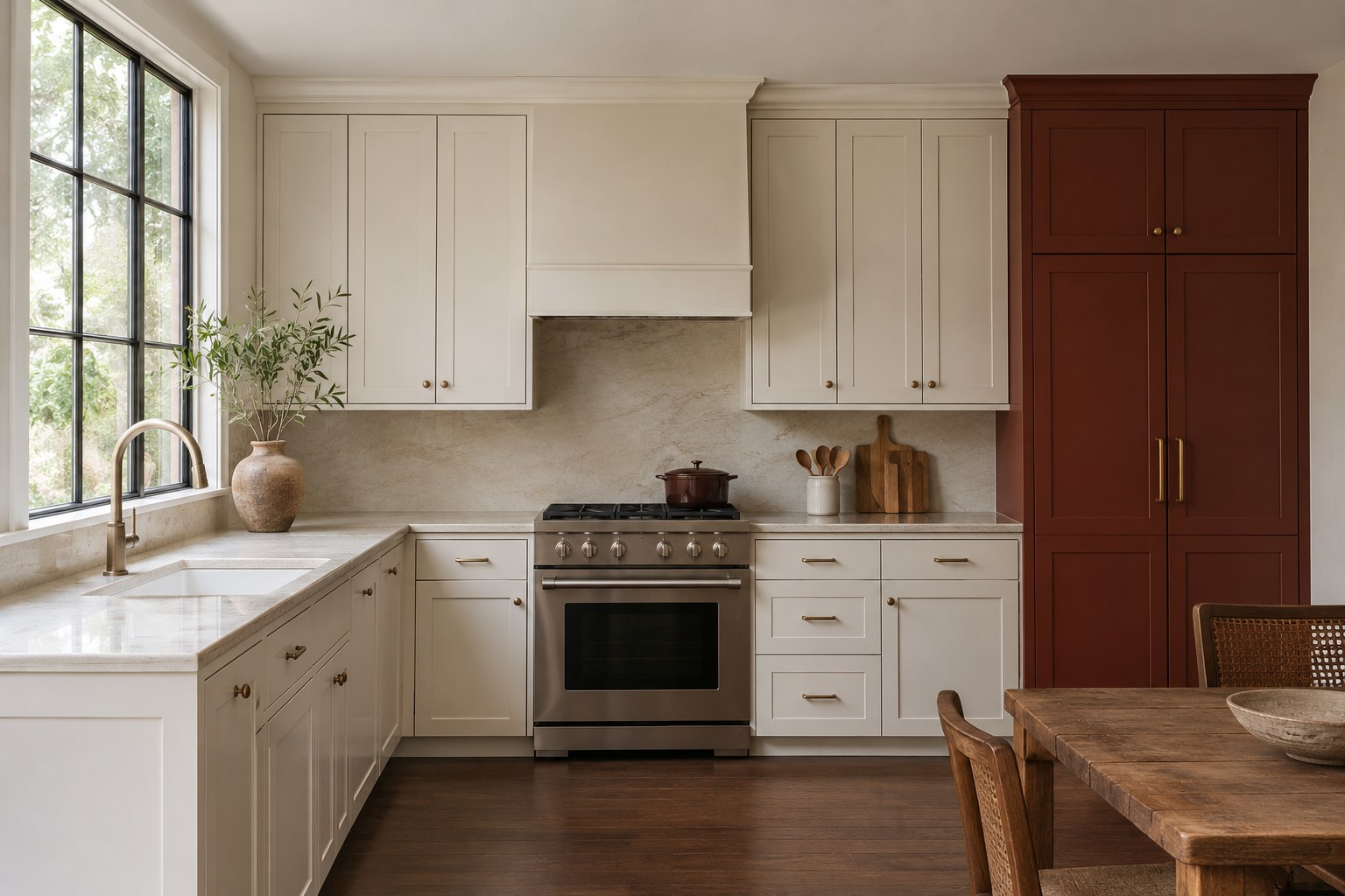
A tall pantry bank is a good place to try oxide red when the rest of the kitchen uses pearl-white cabinet fronts. The pantry gives that color a deliberate edge, and a pale cream quartzite countertop keeps the work areas quiet. Dark cocoa oak flooring already adds depth to the room, so a red with a brown base can sit comfortably beside it. An off-white wall leaves a small margin around the doors.
Tape a big oxide-red sample vertically across the pantry front at eye height in daylight. Set the pearl white and counter sample alongside it to see how much red the palette can carry. Check again in the evening with the lights near the pantry switched on. Choose the version that still shows the shape of the door trim from the doorway.
9. Muted Ochre Lowers Under Soft White Uppers
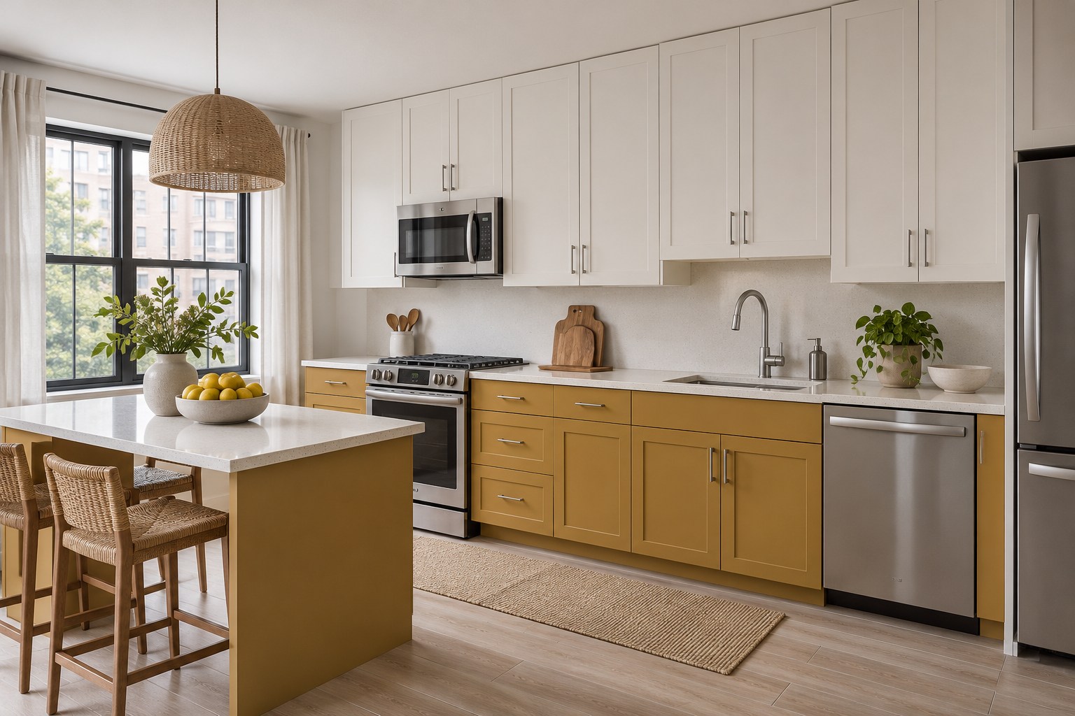
Muted ochre on the lower cabinets can tie a light wood-look porcelain floor to soft white upper fronts. Select a gold shade with a little earthiness and use warm white porcelain on the counter, where a few gray specks can keep the brighter surfaces from feeling flat. In a north-facing kitchen, this arrangement puts color on the part of the cabinetry you see as you walk in while keeping the top half pale.
Test the ochre near the bottom of an existing door in daylight, then stand up and check it against the counter from a normal working distance. After dark, switch on your under-cabinet lights and see how their warmth changes the gold below. For the adjoining wall finish, compare the palette with these neutral kitchen backsplash ideas.
10. Olive Paint on an Island Beside Natural Maple
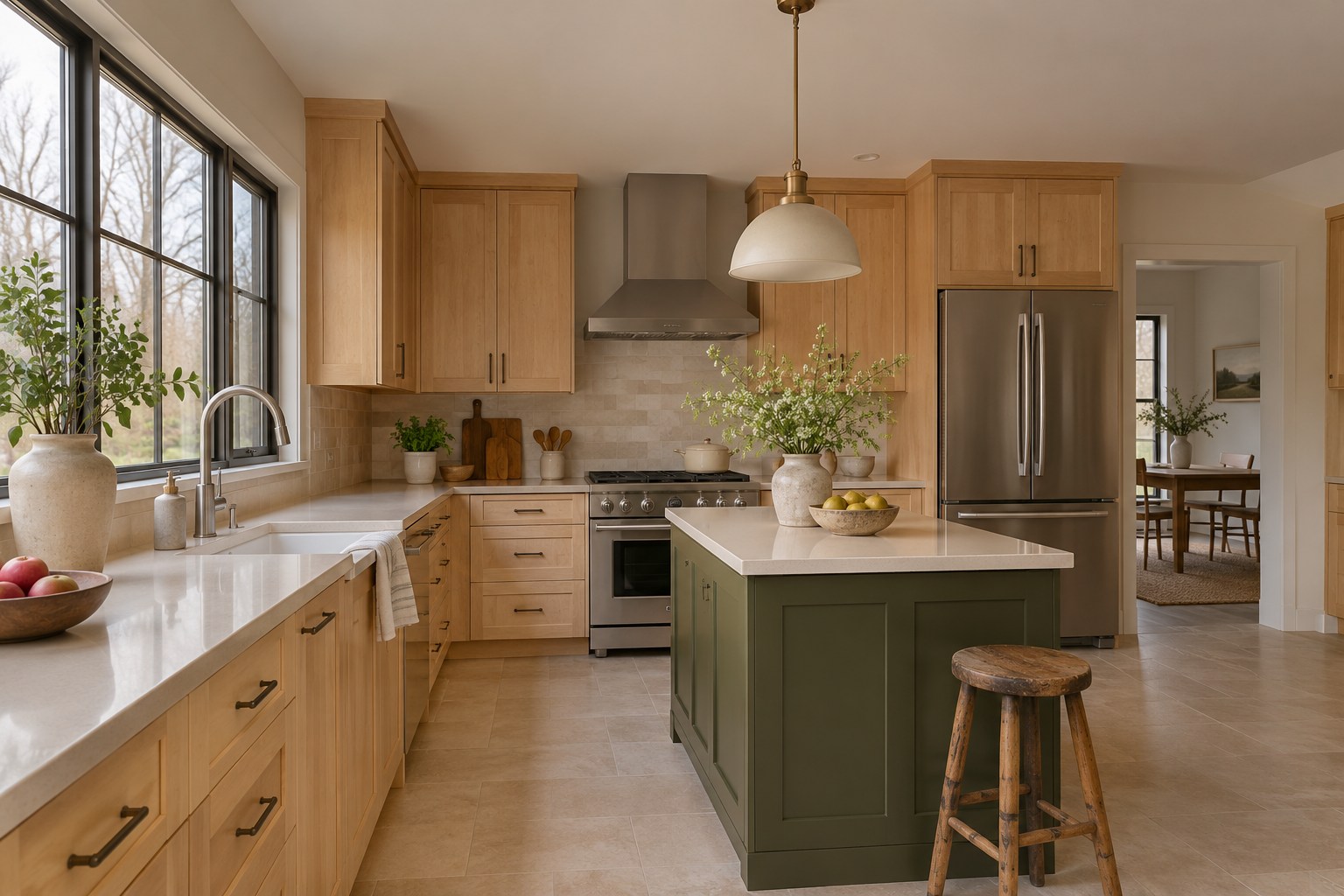
An olive island adds a defined color to a kitchen with natural maple perimeter fronts. Put the olive on the island doors and panels, then repeat the same warm cream quartz on the island and the perimeter. A pale limestone tile floor leaves room for the green to read as a deeper feature. The maple grain can stay visible across the longest cabinet run, where diffuse daylight makes its variations easier to see.
Look at the olive sample on both the aisle side and the window side of the island in daylight. Bring a small maple board to the island for a direct comparison. In the evening, stand where you usually enter the room and see how the green looks with the island lights on. Pick a shade you like on its darkest side.
11. Smoky Teal Island With Warm Gray Perimeter Cabinets
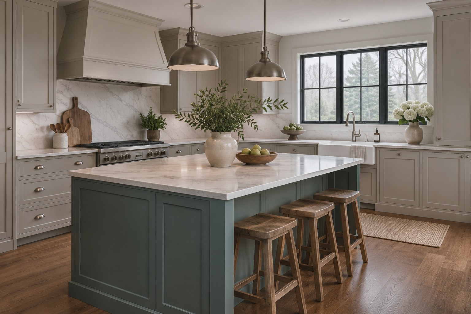
A smoky teal island can add color beside warm gray perimeter cabinet fronts. A creamy white quartz counter over both runs makes the difference between teal and gray easy to read. Use a medium brown oak floor with a clear grain so the blue-green has a warm surface nearby. The arrangement works particularly well when there is open floor between the island and the perimeter, where each cabinet color can show as its own area.
Put the teal and warm gray boards side by side against the floor and counter in daylight. Then look at them from the room that opens onto the kitchen, where the two runs may appear closer together. At night, check the teal with the island lighting you normally use. Make sure the sample still looks connected to the gray when those lights come on.
12. Powder Blue Base Cabinets With White Oak Uppers
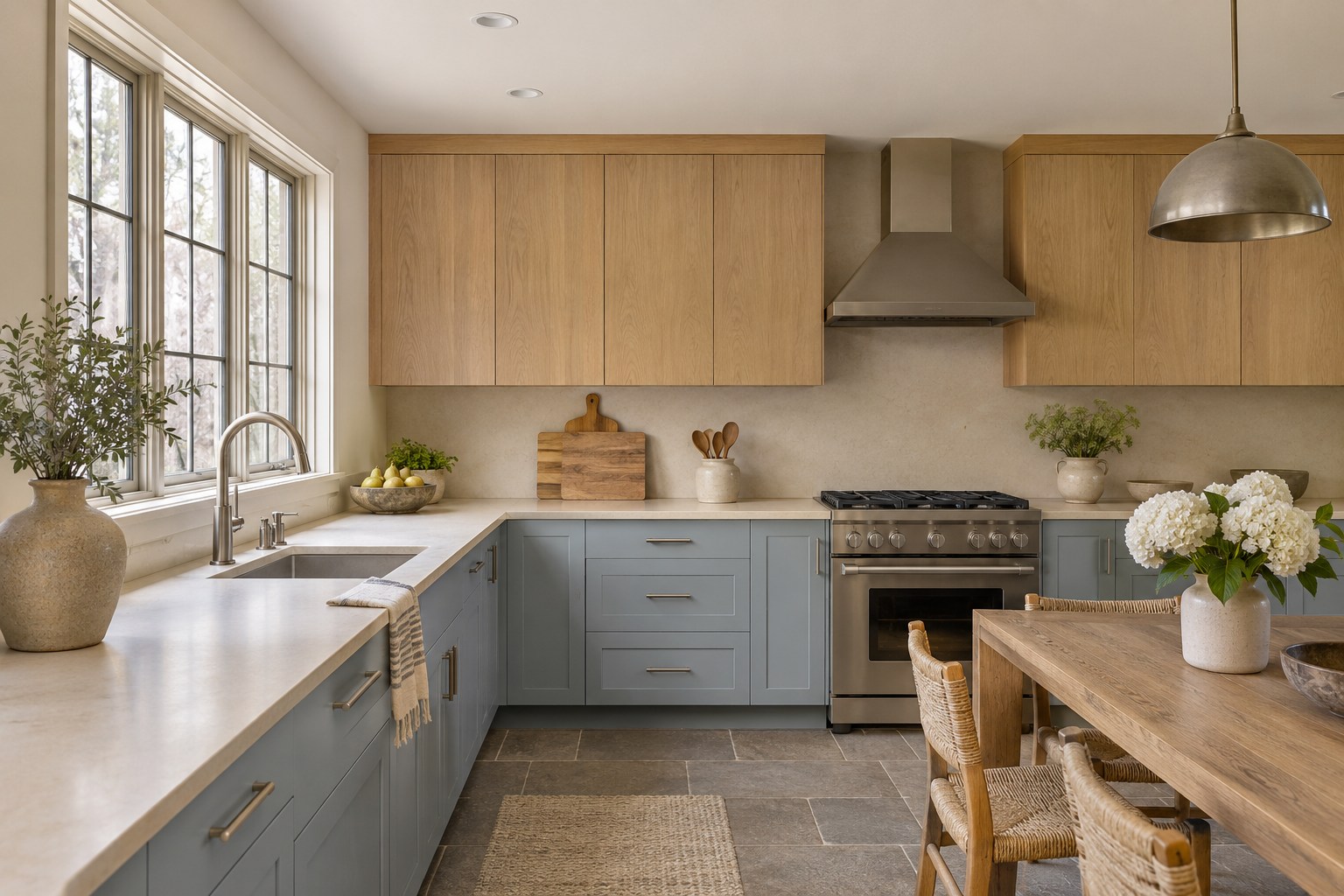
Powder blue base cabinets can work with natural white oak uppers even in cool daylight. Choose a blue with a soft gray cast and use pale cream quartz at the seam between the two cabinet finishes. A medium gray-brown limestone-look floor gives the blue a grounded neighbor. Keep the oak finish clear enough to show its grain across the upper cabinet fronts, where you will see it against the wall.
Place the blue board against the floor at the shaded end of the room in daylight. Hold another under the quartz close to the window and compare how the colors differ across the run. After dark, check the samples under your normal task lights. A sample that picks up a lavender cast near the floor may need a slightly greener or more muted replacement.
To compare the color in two spots, try a movable swatch on an Ampersand Gessobord 8 × 10 panel. Check the actual paint finish and adhesion on an offcut that matches your cabinet doors.
See the 8 × 10 sample panel on Amazon (paid link)
13. Deep Aubergine Lowers Under Pale Vanilla Uppers
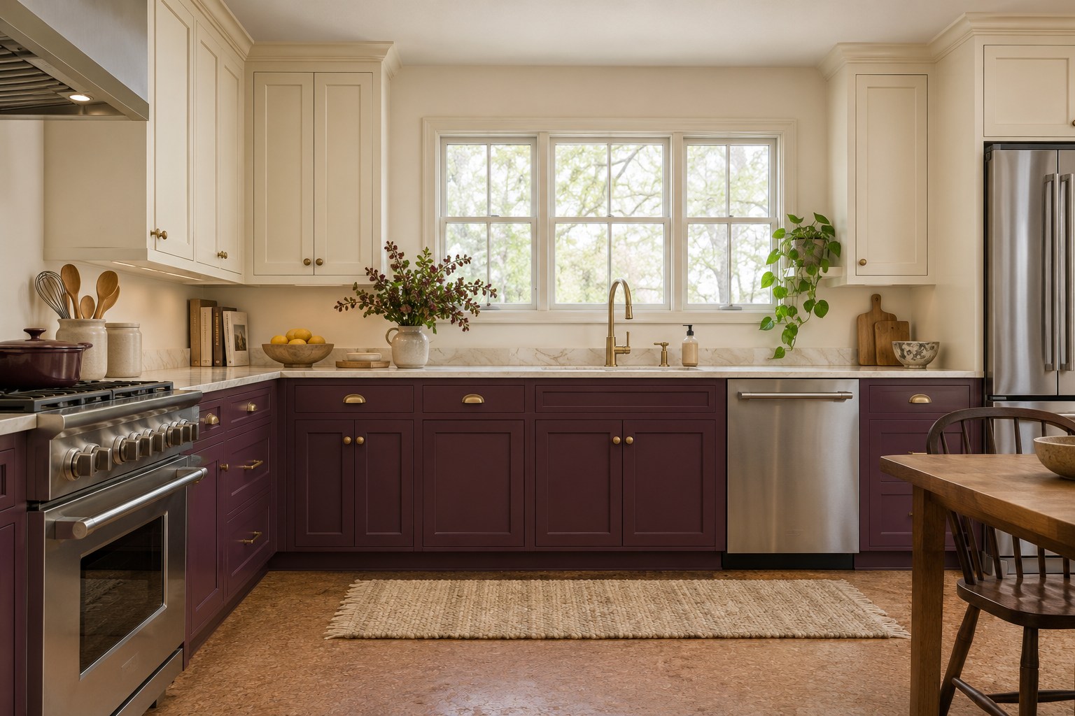
Deep aubergine makes a strong lower cabinet color when there is a pale vanilla above it. Use the purple on the base doors and drawers, then put a warm white quartz worktop between the two painted finishes. A cork-brown tile floor or a warm brown wood floor helps connect the deeper shade to the rest of the kitchen. Choose a purple with a brown or red undertone if you want it to read clearly against the pale uppers.
Set a large aubergine board against the cabinet base and hold vanilla above the counter in daylight. Look at the purple under a stretch of countertop that casts a shadow. In the evening, see whether you can still pick out its reddish undertone from the doorway. A slightly lighter sample may show more of the color on a shaded run.
14. Charcoal Bases With Light Taupe Upper Cabinets
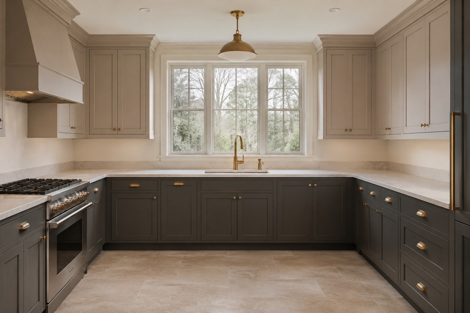
Charcoal lower cabinets and light taupe uppers suit a kitchen where you want the base run to feel grounded. Use parchment-colored quartz with a faint warm gray vein to connect the two fronts. A creamy limestone-look floor keeps the bottom half of the room light around the dark doors. Pick a charcoal with a soft undertone that sits naturally beside the taupe. Small cabinet samples can make both shades look more similar than they will across a wide run.
Tape the charcoal at door height and put the taupe near the upper fronts in daylight. Compare the two against the counter edge and floor tile. With your evening lights on, check how clearly you can see the seams and profiles on the charcoal doors. If those details disappear, try the next lighter depth.
On compatible surfaces, use small tabs of Scotch Delicate Surface Painter’s Tape to hold the samples at their actual cabinet heights. Follow the tape instructions for the finish and removal.
See the delicate-surface painter’s tape on Amazon (paid link)
15. Chocolate Cabinet Fronts Against Soft Cream Walls
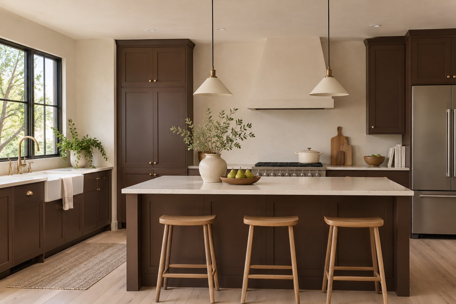
Dark chocolate fronts can feel inviting when soft cream walls occupy a generous part of the kitchen. Use the brown on both base and upper cabinet doors for a continuous shape. Pale white oak flooring and light ivory quartz give the deep paint two bright surfaces around it. A low sheen can help the brown sit comfortably beside the clear grain in the floor. Check cabinet style and paint together before committing to an entire room.
Put a full door sample beside the cream wall color and countertop in daylight. Check it against the oak so you can judge whether the brown carries too much red for your floor. After dinner, look at the sample from the entrance and beside the work surface. For more examples of painted fronts, see these kitchen cabinet color ideas.
16. Mineral Aqua on One Wall With Cream Inset Cabinets
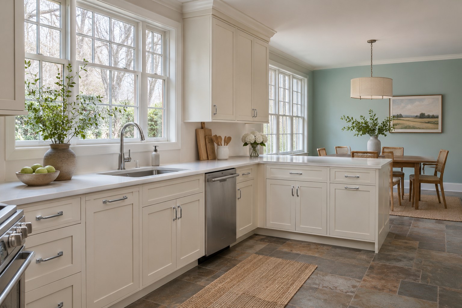
Mineral aqua works as a wall accent when cream inset cabinet fronts carry the rest of the kitchen. Try the paint toward the dining end, where its cooler note can show against a white quartz countertop and warm gray-brown slate-look floor. Pick an aqua with a touch of gray and enough color to show in a room with gentle north light. A single open wall lets you decide how much cool color you want before choosing a larger area.
Place an aqua sample at standing height near the dining table and another next to the cream fronts in daylight. Watch for a shift from blue-green to plain blue against the countertop. After dark, check the wall from your seat with the lights you use during meals. Keep the sample that still looks like part of the kitchen.
17. Warm Pewter Cabinetry With Parchment Walls
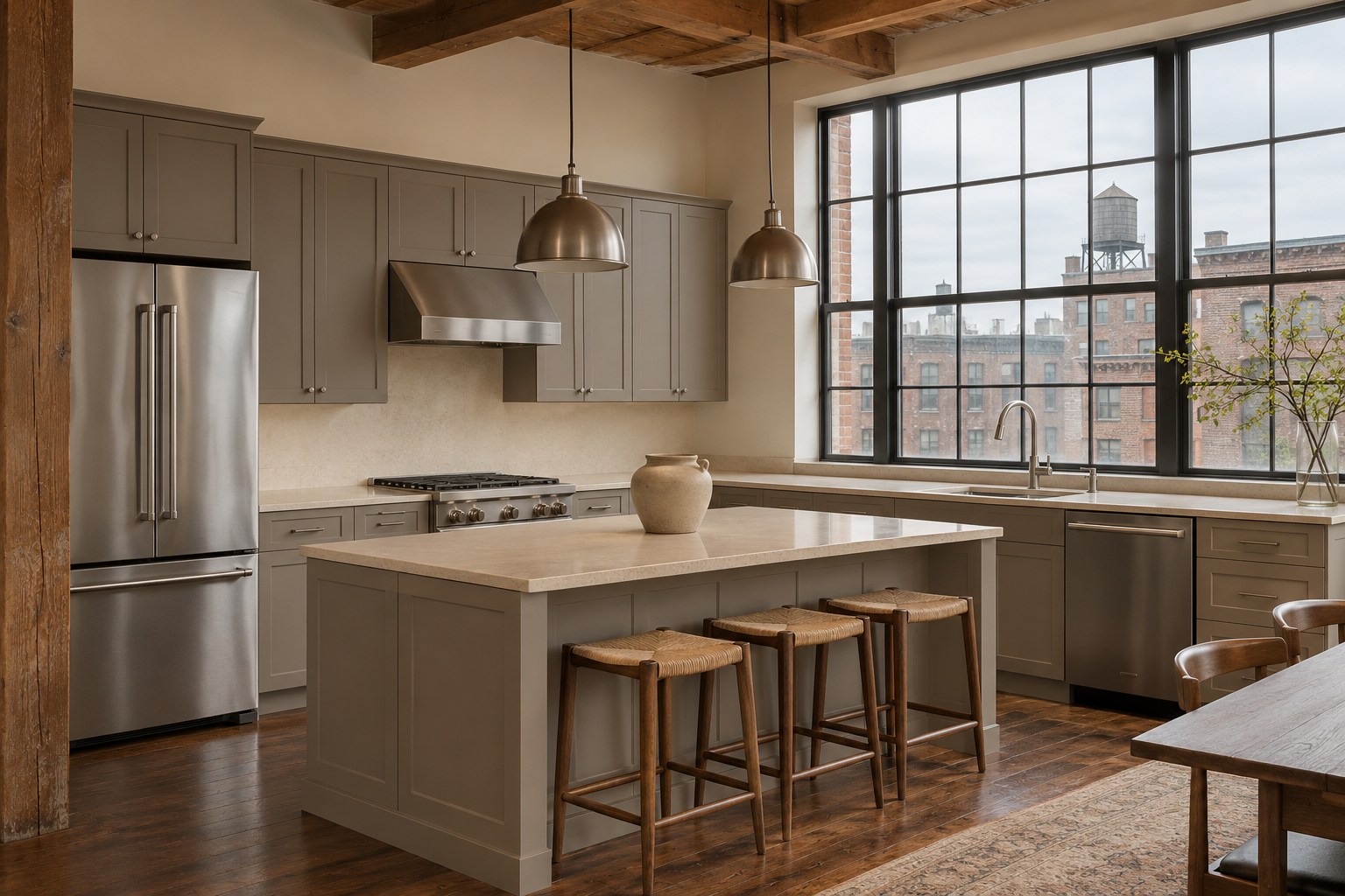
Warm pewter can be a useful cabinet color when you like gray and have a chestnut-stained floor. A sandy beige quartz countertop and parchment walls give the metal-like gray softer neighbors. Choose a pewter that picks up a little brown near the wood. The large stretches of cabinet fronts will carry the color, so try the same shade on a tall door and a small drawer sample before buying enough paint for the room.
Take the painted board to the brightest side of the kitchen in daylight and compare it with the parchment wall swatch. Move it beside the countertop to check how the two grays read together. In the evening, switch on your regular ceiling and under-cabinet lights and see whether a green cast appears next to the floor. Adjust toward a browner sample if needed.
18. Pale Apricot Paneling Above Marine Blue Cabinets
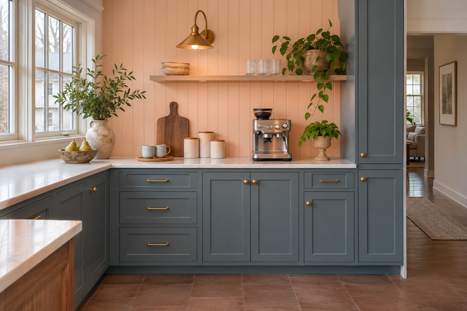
Pale apricot is a good small-area color for paneling at a dry coffee station. Put it above a warm white quartz worktop and pair it with muted marine blue cabinet fronts. A matte clay-brown porcelain floor gives the peach undertone something familiar to connect with. Let the pale paneling run to the top of the alcove or to a shelf, where the edge of the painted area has a clear reason to stop.
Stand an apricot swatch against the paneling and place the blue board against a lower door in daylight. Compare both with the counter in the corner that gets the least window light. In the evening, look at the apricot under the station’s task light and decide how much orange you want. These appliance garage ideas offer more ways to give a small station its own spot.
19. A Soft Cream Ceiling Over Lichen-Green Cabinetry
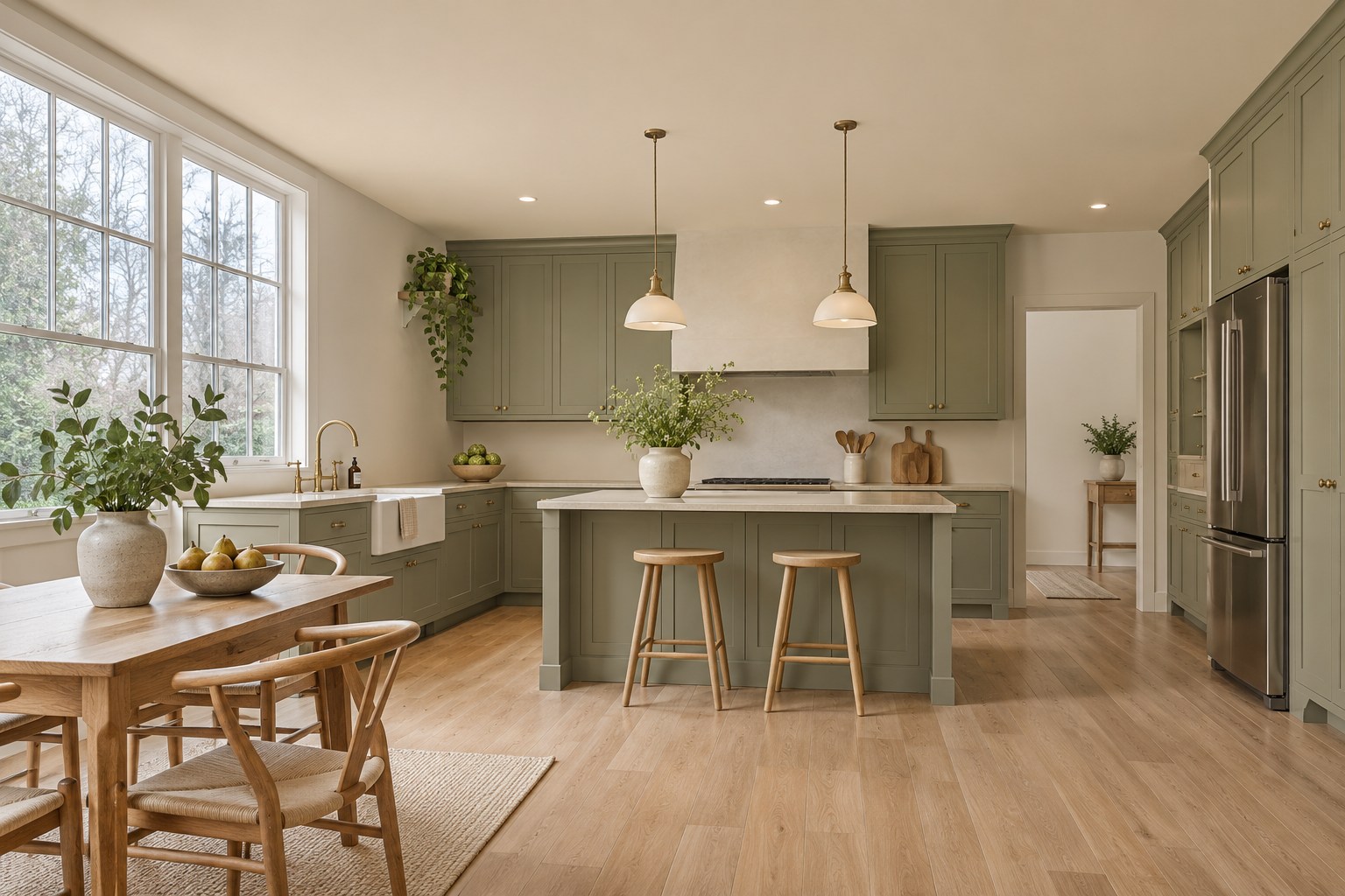
A soft cream ceiling adds warmth above lichen-green cabinet fronts without using up wall space. Keep the walls a slightly lighter ivory and use honed beige quartz on the counter. A blonde oak floor reflects a little warmth back into the room, which helps the cream and green read together from the kitchen entrance. Try this placement where you can see a clear stretch of ceiling between the upper cabinets and the window.
Check a cream test patch overhead in daylight and compare it with the same shade on a spare board against the wall. Look at the cabinet green and beige counter at the same time. Switch on the lights after dark and see whether the overhead cream turns yellower than you want. A slightly grayer cream can feel calmer if the room already has a lot of oak.
20. Coppery Tan Walls With Cream Cabinets and a Walnut Island
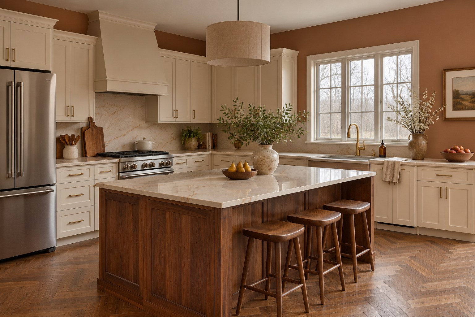
A coppery tan wall color gives warm cream cabinet fronts more depth. Use it above the backsplash and around the dining end, where a walnut island can repeat the wall’s brown note in natural wood. A cream quartz countertop with a few caramel veins and a medium brown oak herringbone floor fit this palette. Choose a tan with a softened earthy undertone so the walls feel quiet beside the floor pattern.
Set the tan board against the wall next to the cream doors and look at it near the walnut island in daylight. Compare the counter from the two spots where you prepare food most often. In the evening, stand where you can see both sets of fronts and check whether the wall starts to look strongly orange. A more muted brown can keep the room warm with less color.
21. Bone-White Fronts Above an Aged Brick Floor
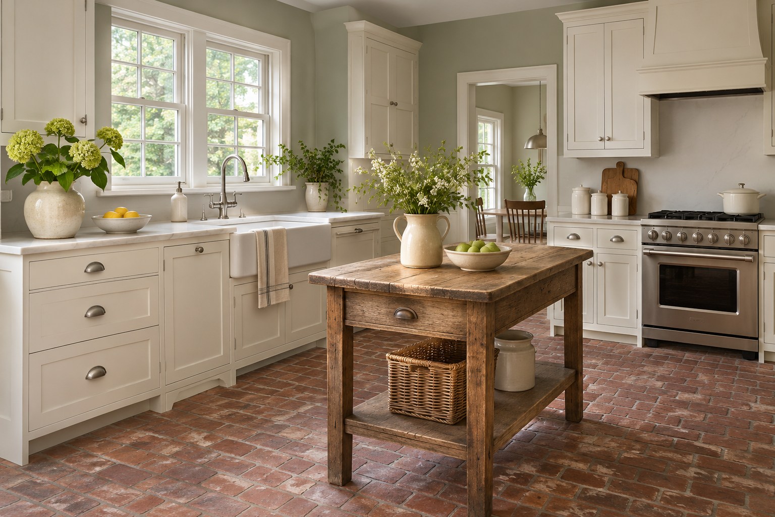
Bone-white cabinet fronts can help a kitchen with an aged brick floor and cool white quartz feel more connected. Choose a softened white with a touch of beige that sits between the red-brown brick and the pale countertop. A light green-gray wall gives the cabinet color enough contrast to show around the edges. Put the bone color on doors and drawers throughout the kitchen, where it will meet both the worktop and the floor.
Prop a bone-white board on a spare tile at the cabinet base in daylight. Check the same board against the cool quartz edge and look for the point where it starts to appear beige. Under the lights you use in the evening, see how much the brick changes the color on the lowest doors. Compare one lighter bone white if that area reads too creamy.
22. Dusty Plum Window Returns With Clear Birch Fronts
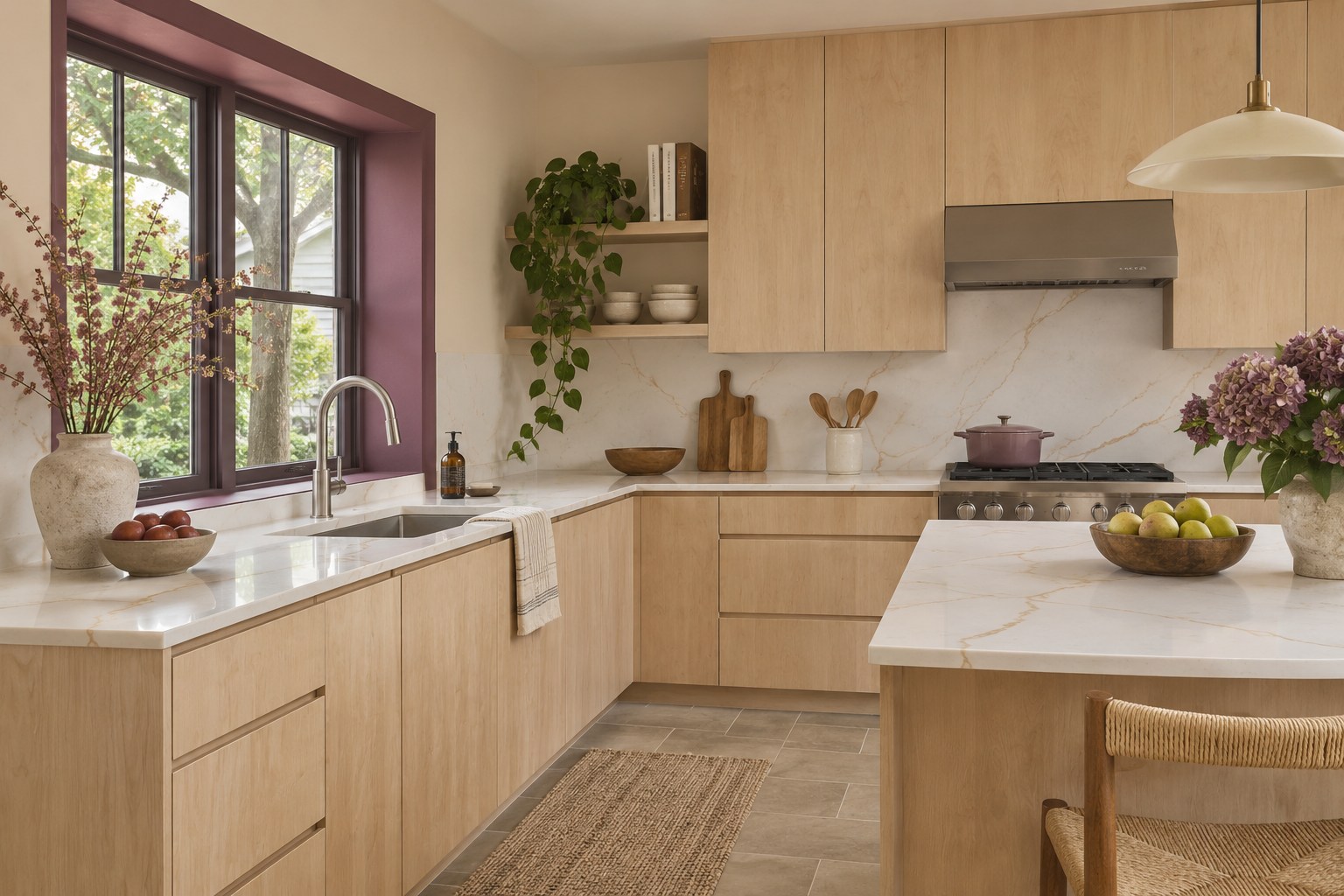
Dusty plum on the window returns gives a north-facing kitchen one carefully placed accent. Paint the vertical sides and top of a recessed surround and keep the main walls warm off-white. Clear-finished birch cabinet fronts, a pale taupe-veined quartz countertop, and muted taupe stone-look tile give the purple-gray room to show. This works especially well when you see the window from the doorway and can pick out the painted recess as a single shape.
Test plum on the left and right returns in daylight. Each side can pick up a different amount of light even around the same window. Compare both against the nearest birch front. After dark, turn on the lights near the sink and check the color from the doorway. A plum that still looks soft beside the quartz will be easier to live with.
23. Wine-Red Island End Panels With Charcoal Fronts
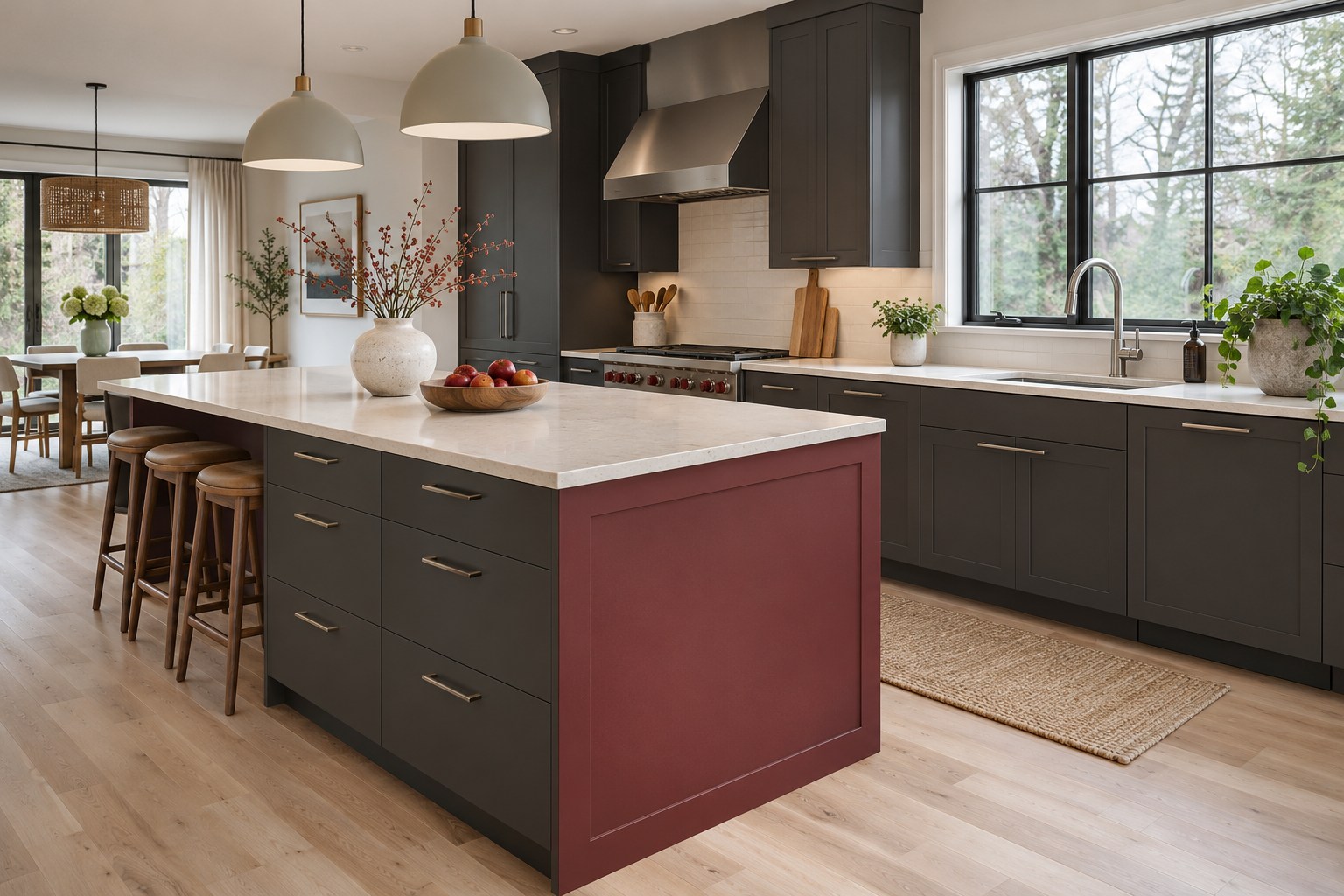
A muted wine-red panel can give the end of a charcoal island a warm focal point. Keep the island drawer fronts and the perimeter cabinet fronts a warm charcoal, then paint the flat end you see first as you enter. Pale cream quartz on both work surfaces and a light maple plank floor give the two deep paints clear edges. A brown-based red will usually feel more settled here than a very bright burgundy.
Put the wine sample on the end panel at waist height in daylight and move it down toward the floor to check the maple undertone. Look at it around the corner beside the charcoal drawers. In the evening, see whether the red still has a clear edge next to the dark fronts. Test a slightly brighter wine if both colors blend in that corner.
24. Sand-Colored Walls With a Cobalt Display Cabinet
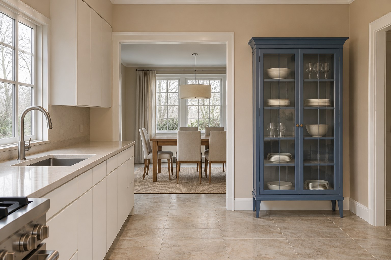
Sand-colored walls give a cobalt display cabinet a soft frame in a north-facing kitchen. Use the blue on one freestanding cabinet or the fronts of one shallow display unit, then keep the main cabinet fronts soft white. Pale beige quartz and light mottled beige porcelain floor tile repeat the warmth of the wall. Choose a moderated cobalt that lets the shelves and door profiles read clearly. This small placement can be easier to test than painting a long cabinet run.
Check a cobalt sample vertically near the display cabinet in daylight and compare it with the sand wall where they meet. Look at the sample from the dining threshold so you can see the floor and white kitchen doors together. After dark, use your usual evening lights and check whether the blue keeps its depth without turning violet.
When two palettes are close, return to the surface that will take up the most room. A quiet wall color can have a bigger effect than a saturated island, and a full cabinet run will show a shade more strongly than a drawer sample. Set your best board next to the floor and countertop one last time, then check it from the doorway in daylight and at dinner. Choose the one whose undertone feels right in both views. If you plan to paint the walls and doors in stages, keep a labeled sample of the finished paint so you can compare it when the next surface is ready.
Discover more from HomeTrendora
Subscribe to get the latest posts sent to your email.

