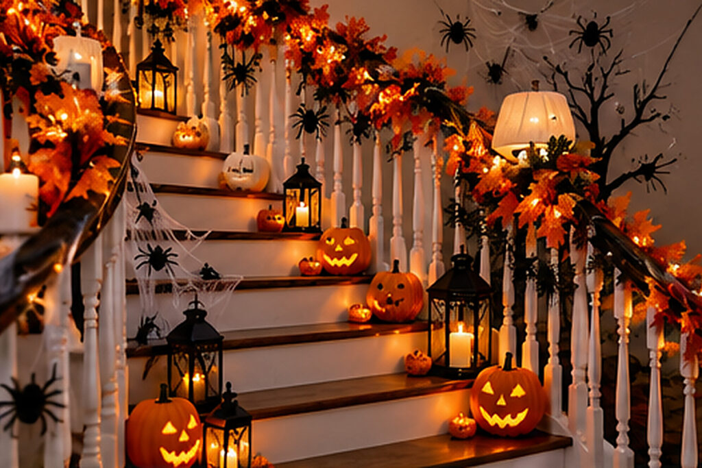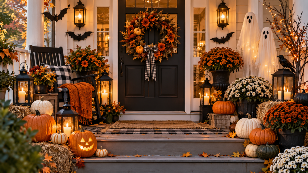
Halloween decorations can look scattered when every pumpkin, ribbon, and prop adds a new color. These 13 palettes help you choose a main color, one contrasting shade, and a small accent that reads from the doorway or after dark.
Start with something you already have, such as a dark door, a pale shelf, or a favorite bowl. Set the proposed colors together in that spot before adding more props. Then check which tones are still visible in the light you will use.
1. Use Pumpkin Orange, Cream, and Black at the Entry
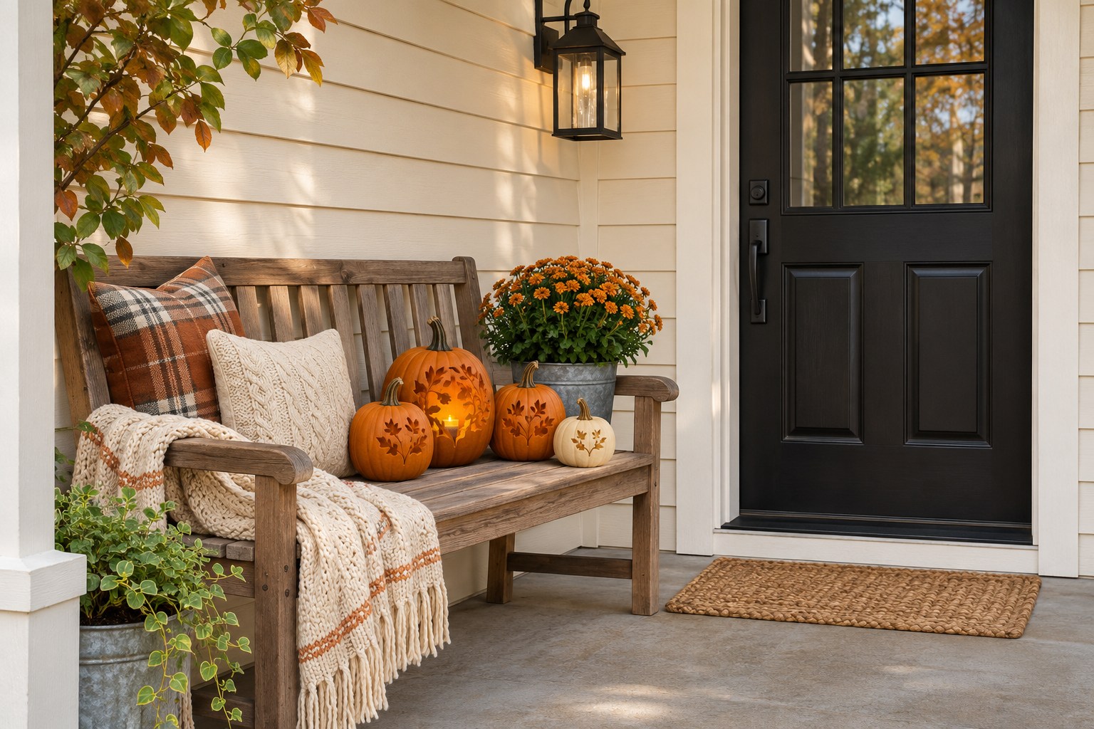
Use orange as the first color people notice and cream to show the shape of smaller pumpkins beside it. Let the door hardware, a dark planter, or the door itself bring in black. One group on a bench or off the side of the landing can make the color scheme easy to see without using the steps.
Look at the display from the sidewalk before you add another prop. Black will disappear earlier than cream at dusk, so put lighter objects where they can mark the edge of the group. These Halloween porch layouts show other places to put the cluster while keeping the approach clear.
2. Put Bone White Against Ink Black on a Shelf
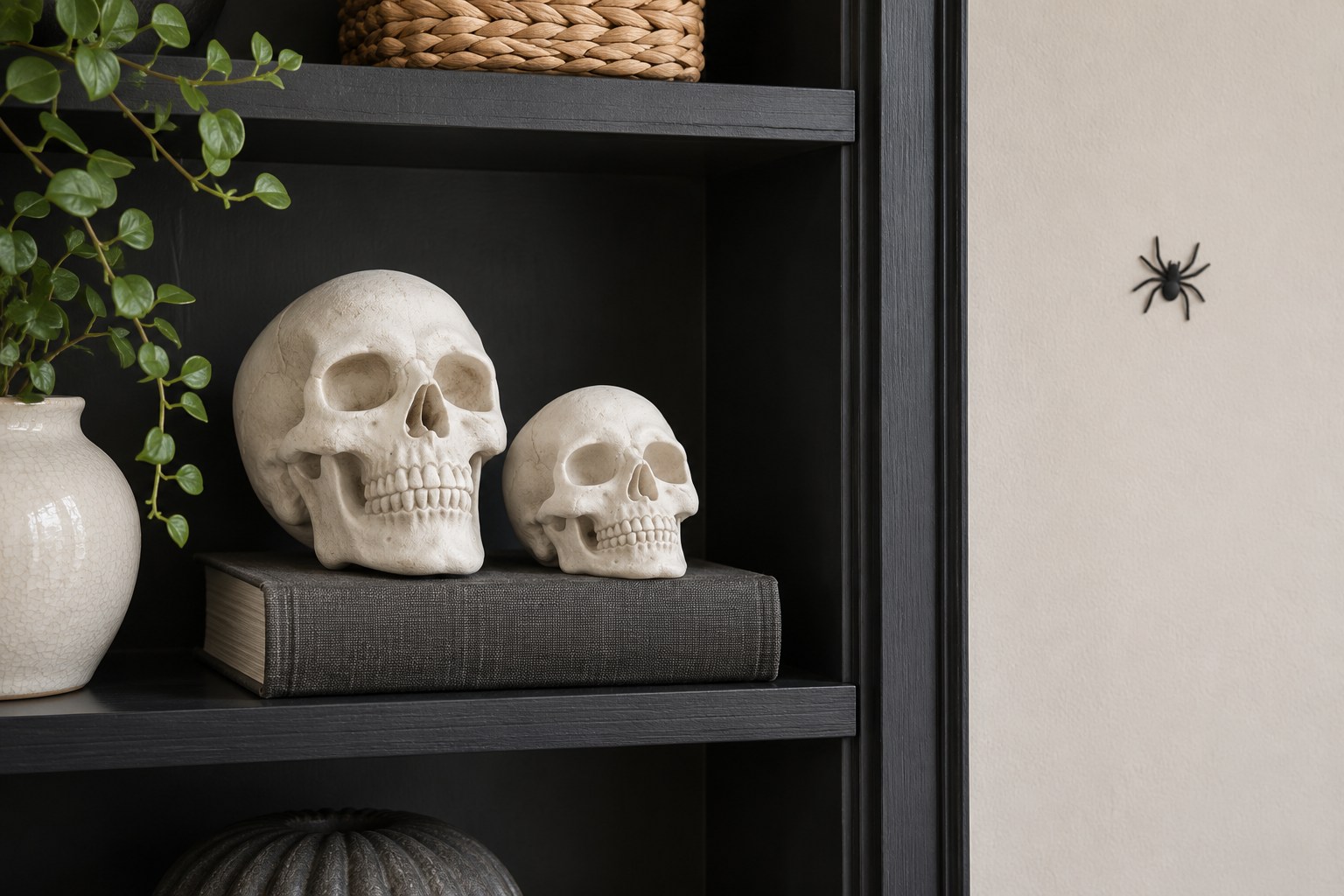
A bone-white skull shape becomes readable against a matte black shelf even when the rest of the display is simple. Use one large skull and one smaller shape or a pale vessel. A little dark gray between the black and white can help the shadows show up.
Keep a single spider silhouette or web detail away from the skull’s outline. Look at the shelf in your usual evening light. If all the dark objects blend together, leave them in place and move one pale object closer to the edge of the shelf.
HOMETRENDORA PLANNING BUNDLE
Plan the room before adding more decorations.
Leave room for everyday life as you decorate. The Home Design Book includes room-planning guidance, a fillable planner and a budget tracker to help you decide what fits, what to reuse and what to buy.
160-page PDF + fillable room planner + Excel budget tracker
Bonuses included with your eBook purchase.
GRAB 10% DISCOUNT
Coupon code: HOMETRENDORA10
Use this code at Payhip checkout.
3. Balance Plum With Copper on a Witch Shelf
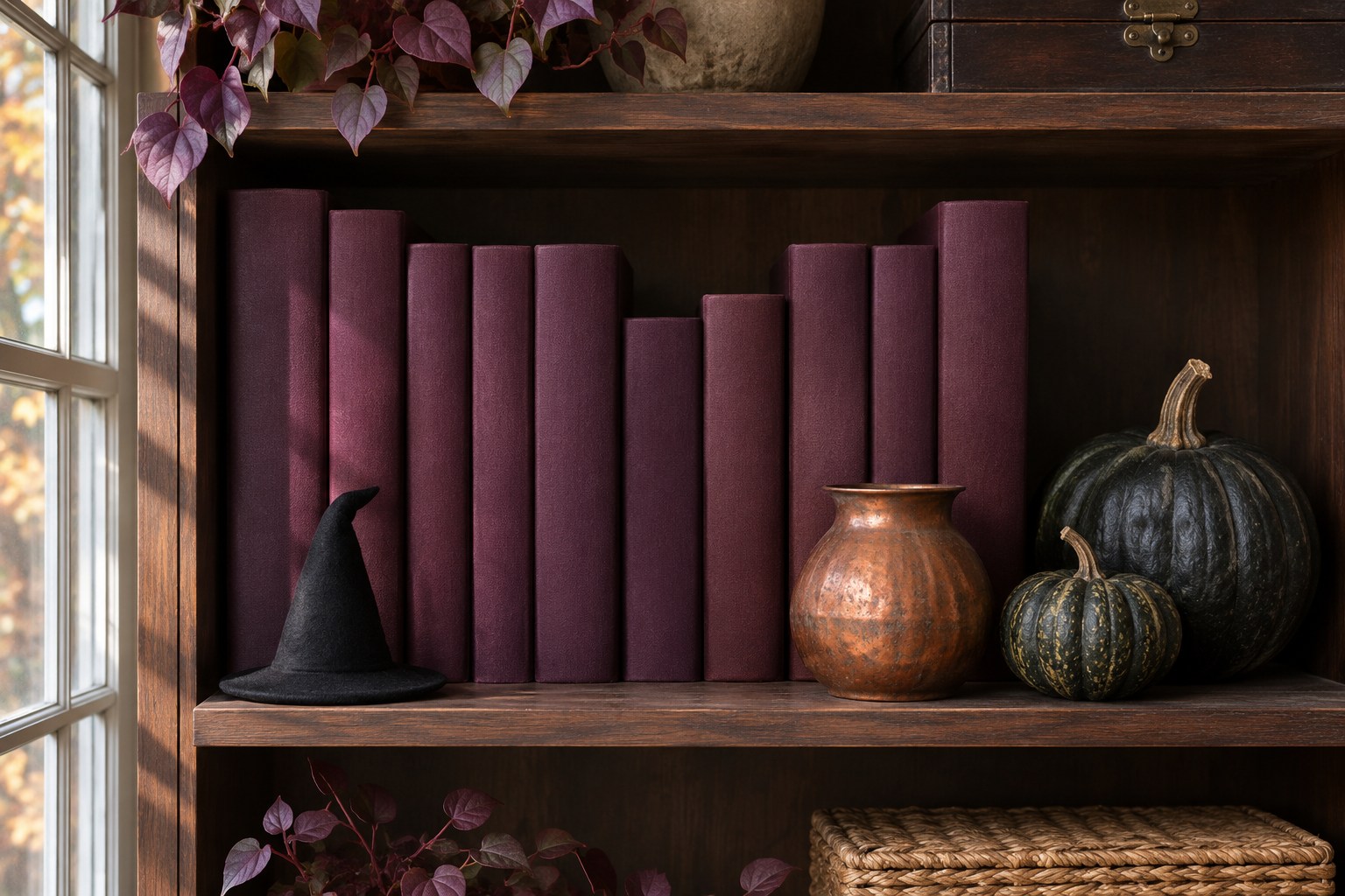
Use deep plum across a shelf and add a small copper piece near the front. Plum makes a black hat or cauldron feel different from a straight black-and-orange display. The copper can be the warmest tone while old books, plain fabric, or a gourd carry the main color.
Check the shelf from the room entrance. If black and plum read as one color, add a muted tan book or a little cream next to the hat. These gothic Halloween decor ideas show how a lighter object can make a darker display legible.
4. Use Warm White, Bark Brown, and Russet for Ghosts
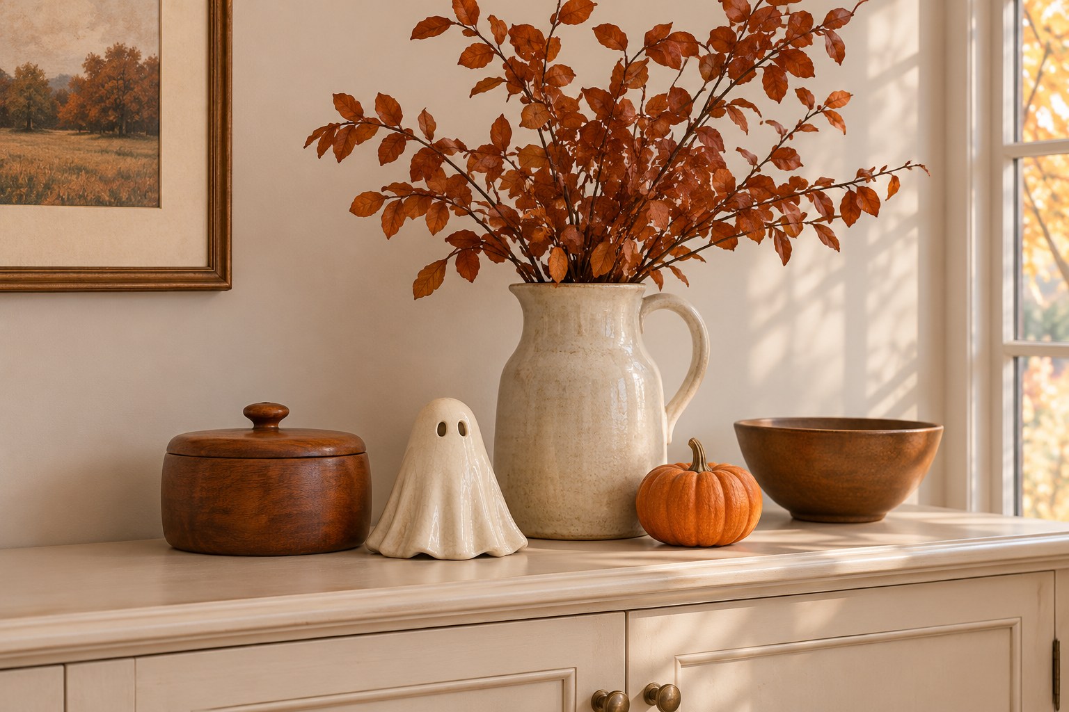
A warm-white ghost can look at home on a sideboard that already has brown wood. Add a few russet leaves or a small pumpkin and give the ghost a plain spot in front of the wall. Keep enough space between the pale shape and any off-white vase so you can see both.
Try the display in a dimmer part of the room. A white outline can still read there when the warm colors feel darker. Use a stable vessel for the stems and place them behind or to one side of the ghost rather than across its face.
5. Set Dusty Mauve and Smoke Gray Around One Doll
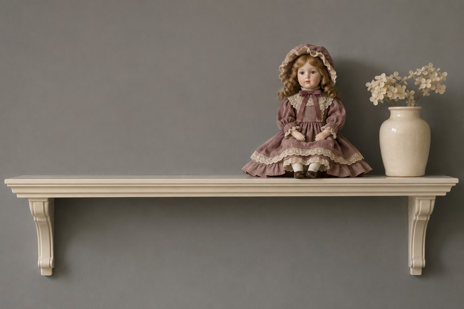
A vintage-style doll can carry a dusty mauve dress against a smoke-gray wall. Give it one place to sit securely and keep the rest of the shelf quiet. Cream or aged white can be a small third tone that makes the gray and mauve easier to distinguish.
Stand back and decide whether you can still read the shape of the doll. If the dress and wall have a similar depth, put a plain pale cloth underneath it. One detail, such as an old ribbon or a spare book, can connect the display to the room without adding more figures.
6. Use Moss Green and Black for a Witchy Corner
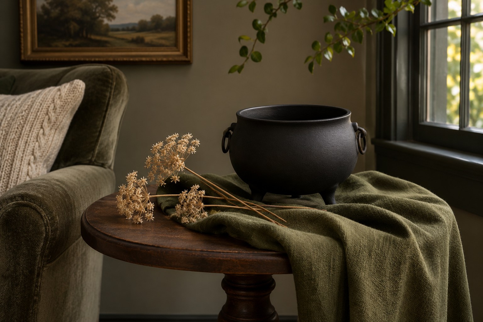
A little moss green can give a black cauldron-shaped bowl a distinct edge. Use green on a larger surface such as a folded cloth or the shelf backing, and put a little warm ivory at the edge. An empty bowl and one small shape nearby can be enough to carry the idea.
Compare the fabric with the black after dark. Dark olive and black may look nearly identical on a shelf with little light. Choose a slightly paler moss or let the lighter accent take up more of the visible surface.
7. Pull Burnt Orange From a Patterned Wall
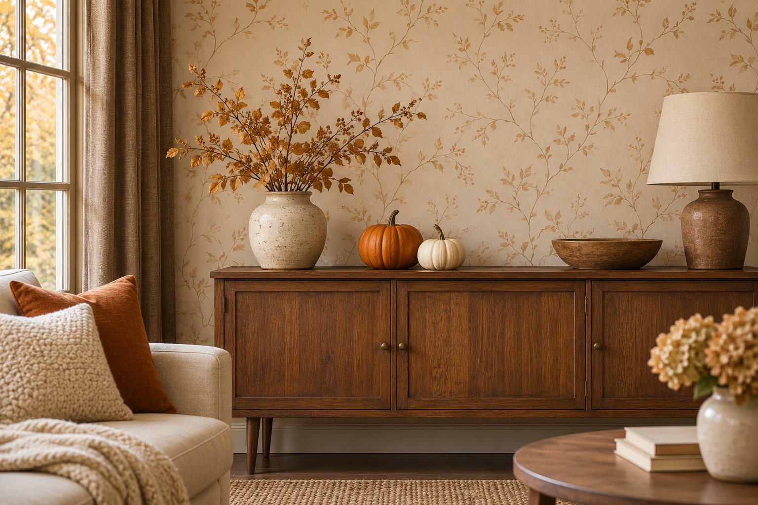
If the wallpaper already contains brown, cream, or orange, pull just one of those colors into the Halloween display. A burnt-orange pumpkin can make a quiet wall pattern easier to notice. Add one cream shape with a different height and keep the tabletop simple around them.
Look from farther away before choosing the last object. A tiny pumpkin can disappear against a dense wall print, even in a matching color. Try a larger solid shape or move it forward onto the table so the pattern remains visible behind it.
8. Use Rust and Charcoal Around One Oversize Pumpkin
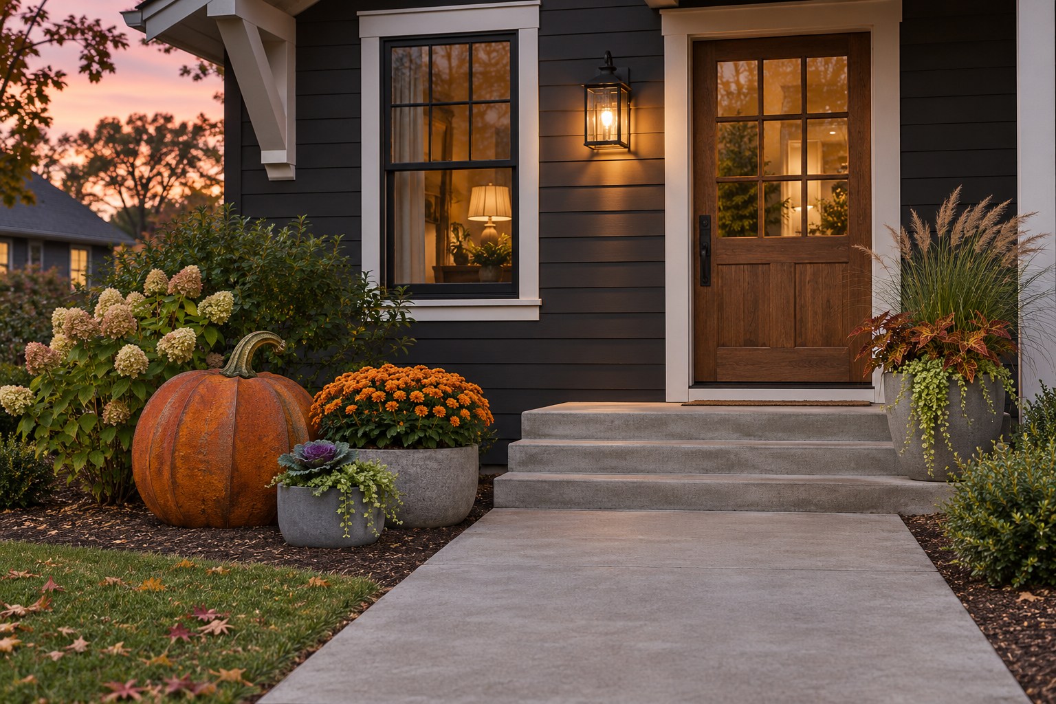
Let one oversized orange pumpkin carry the color against charcoal siding. Put gray or muted brown at its base and keep the decoration well off the route to the door. A rust shade can look richer against gray than a bright orange if you already have other colors on the porch.
Check the edge of the prop at dusk. Pick a place where it will stay visible without blocking the steps, handle or landing. A smaller pumpkin with the same palette works if the side of the doorway is too narrow for a larger display.
9. Pair Black Flatware With Ivory and Persimmon
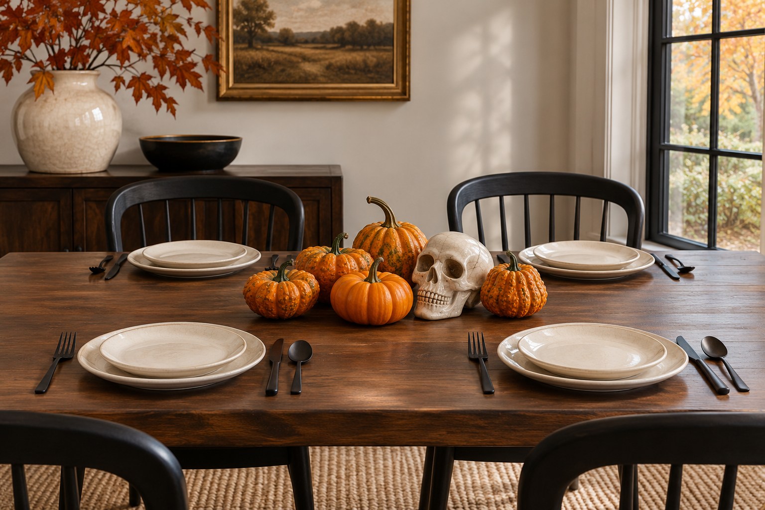
Use ivory dinner plates as the main color and let black flatware define the place settings. Add persimmon in a low center grouping with space to move serving dishes. A single bone-white accent can relate to the plates and add the Halloween shape without raising the centerpiece.
Sit at the table and check the view of the person opposite you. If the gourds look like one long orange line, break the group into two smaller clusters and let the tabletop show between them. Keep the largest black pieces at the edges where each setting has room.
10. Pair Blush and Champagne Gold on a Mantel
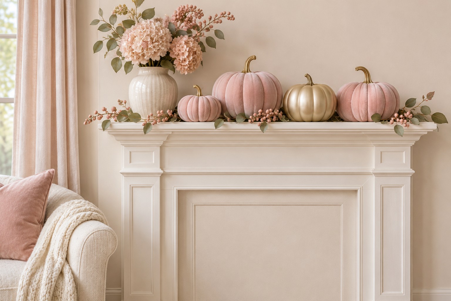
Blush pumpkins and champagne gold can give a mantel a soft Halloween palette. Put the gold on one larger object or a small plain frame and use cream as the background color. The gold should catch enough light to show its warmer edge beside the pink.
Compare two pinks from the main seat. If both fade into the wall color, make one pumpkin a little deeper or move it in front of a cream surface. For other combinations with the same quiet colors, see these pink Halloween decor ideas.
11. Use Raspberry Pink and Brushed Gold in a Tray
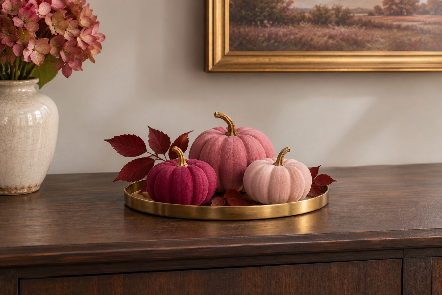
A brushed-gold tray gives three shades of pink a clear boundary on a console. Try one raspberry pumpkin, one medium rose, and one light blush. Add a small amount of dark foliage so the bright pink has an edge and the tray remains easy to move.
Look down from where you stand and then view the tray from across the room. The lightest item can disappear against a shiny edge. Swap its position with the raspberry one if you need a darker line at the front. Leave clear space around the tray for the things you set down every day.
12. Borrow Dusty Rose and Gold From a Masquerade Palette
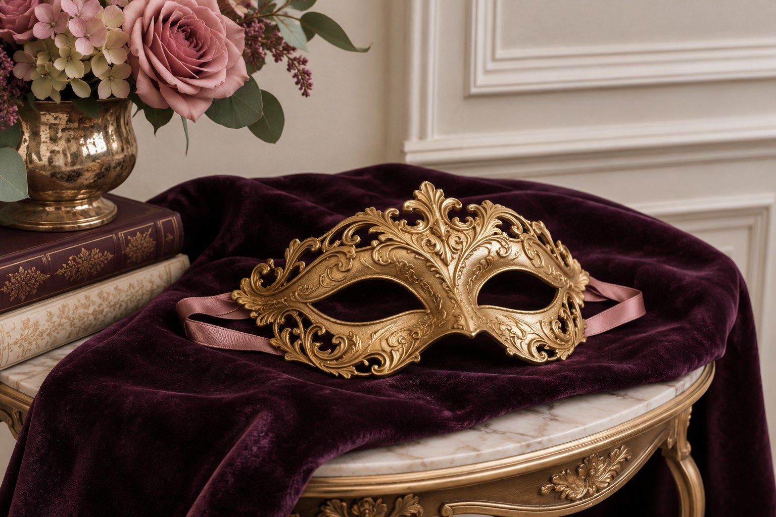
A dusty rose ribbon and a gold mask can bring the feeling of a masquerade to a small Halloween display. Lay the mask flat on a console and set it against a deep eggplant textile. Keep the ribbon close to the mask so the pink reads as one simple accent.
Check the color of the fabric around the gold in evening light. Eggplant can become almost black, which may make the gold much brighter. Use a matte finish for one of the two surfaces if their reflections draw attention away from the overall color scheme.
13. Bring Bright Candy Colors to a Single Bowl
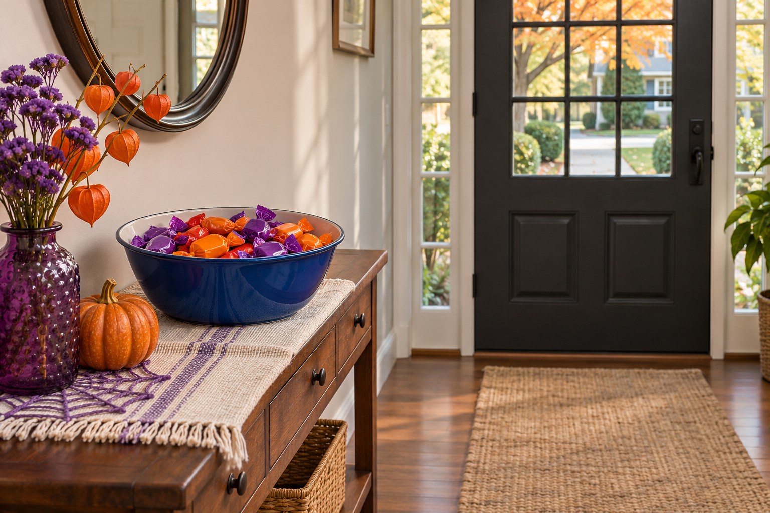
A blue bowl can give brightly wrapped candy a defined spot near the door. Use violet and orange in two small decorations beside the bowl so the packaging supplies the rest of the color. Put the bowl on a stable console where people can reach it without standing in the door’s swing.
Check the view with your porch and hall lights on. Bright wrappers may be visible even when the little decorations are hard to see. If the nearby window needs a similar color cue, these Halloween window ideas give you places to put one without crowding the bowl.
Pick one palette and repeat its main color in two places you can see together. Save the accent for the part of the display you want people to notice first. Check it again after dark and move the lightest shape if the outline gets lost.
Discover more from HomeTrendora
Subscribe to get the latest posts sent to your email.