
Earth-tone colors take cues from sand, clay, wood, leaves, and stone. They can be light enough for a whole room or dark enough to define one useful piece of furniture. Start with the finish you see every day. A gray stone fireplace calls for a different partner than a pale wood floor or a cream countertop.
These 11 colors each have a room and a finish to try beside them. Compare real paint and material samples in the light where you’ll use them. Look at the largest surfaces first, then decide where you want a little more warmth, contrast, or depth.
1. Pair Pale Sand With White Oak
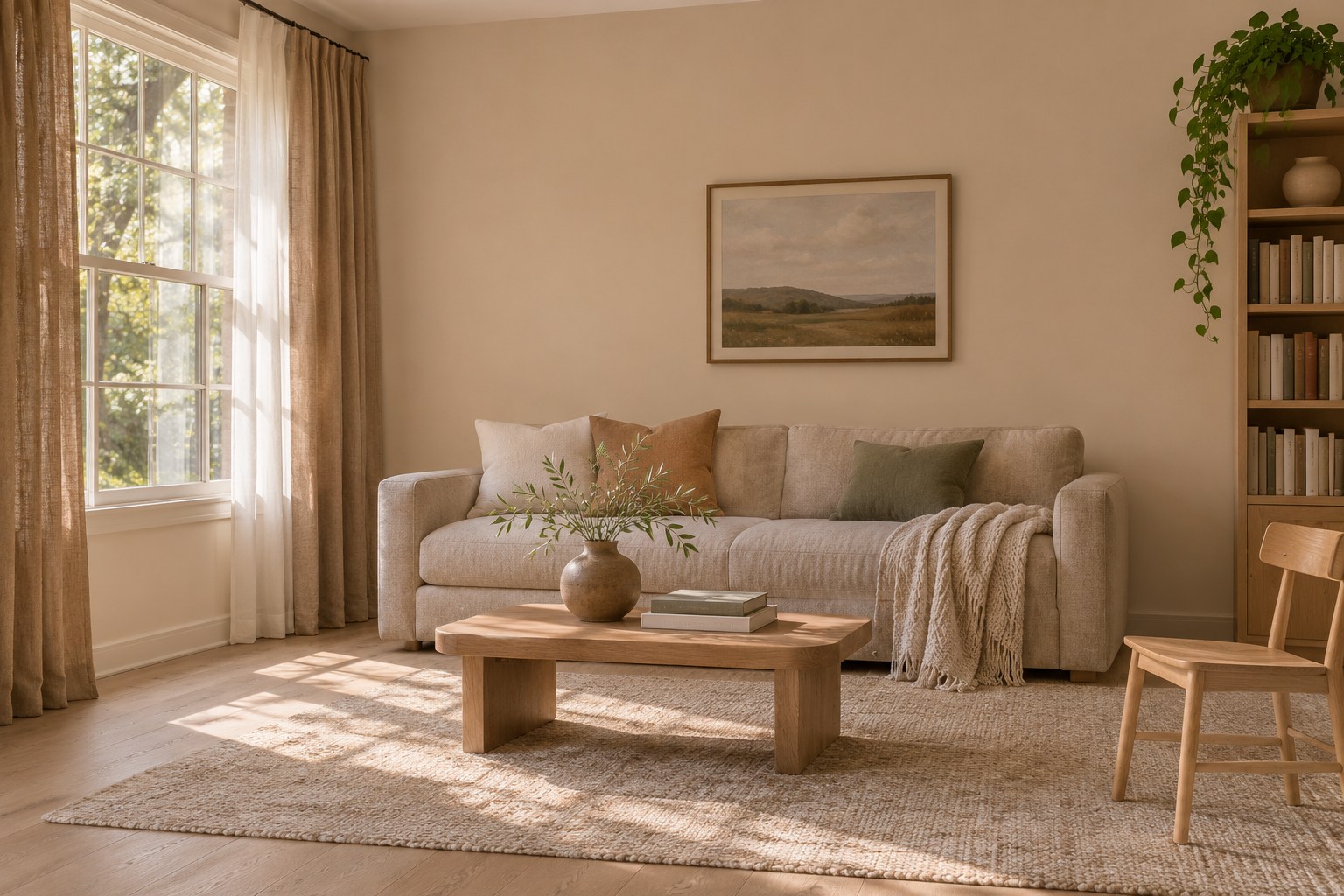
Pale sand is a warm, light beige that can pick up the softer notes in a white oak floor. Try it on the largest stretch of wall you see as you enter. Hold a sample directly above the baseboard and check it where the floor turns into shadow. A shade that feels just warm enough in daylight can look more yellow under a lamp.
Use a soft off-white for the window trim if you want to see a distinct edge. A darker natural linen curtain can bring a little more weight beside the lighter wall. The whole-house paint color guide gives you options for carrying a light neutral through connected rooms. Move the sample to another stretch of floor if its grain or finish looks different beside the window.
2. Set Mushroom Taupe Beside Soft Cream
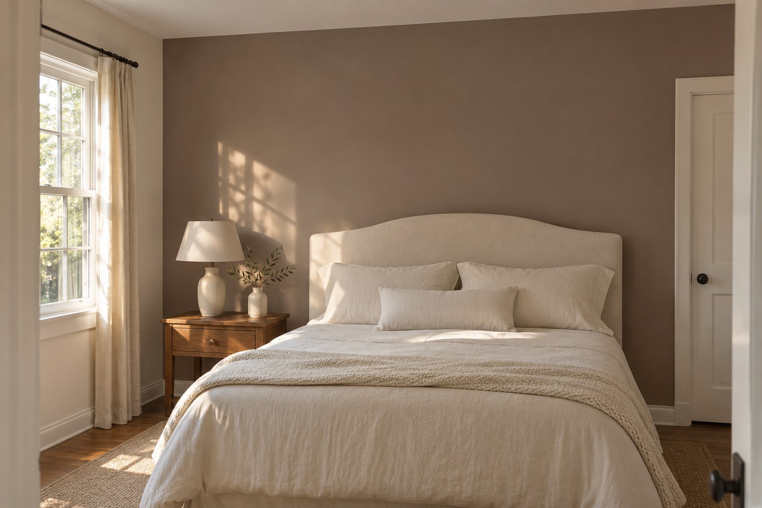
Mushroom taupe has enough gray to look quieter than a straight tan and enough brown to work with cream. Use it behind a cream headboard to give the fabric an edge you can see across the room. Look for a midtone sample that leaves a clear difference between the wall and your bedding.
Put the fabric and paint sample beside each other under the bedside lamp. Some taupes can pick up a pink or violet cast beside yellow cream. If that is too pronounced for the room, compare a more neutral sample. A medium wood nightstand can add warmth without changing the two largest color areas.
3. Bring Terracotta to Counter Height
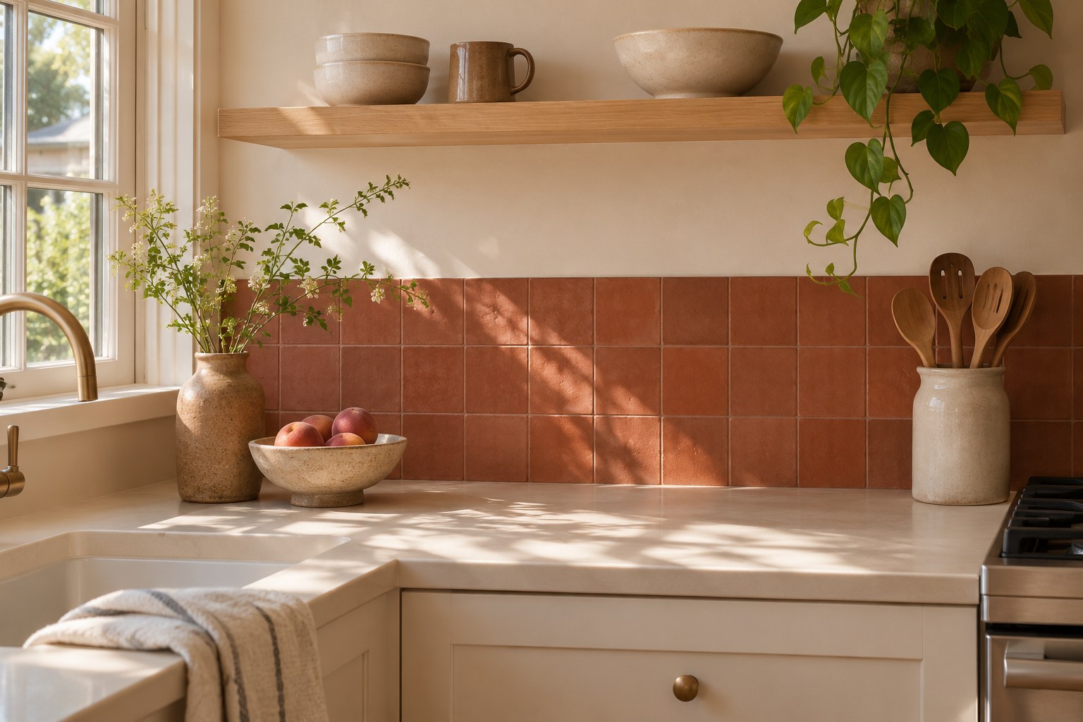
Terracotta brings the red and orange of fired clay into a palette. Give it a clear area, such as a short backsplash behind a kitchen counter. Use a few samples together to see whether they read as a soft clay color or a louder orange. Warm white cabinets and a cream counter leave room for the tile to show its variation.
Check how much color the grout adds and look at the tiles in the light you use while preparing food. The same shade can feel stronger in a long band than it does on a single sample. These Southwestern bathroom ideas show other ways to bring terracotta into a room with tile.
4. Use Rust With Cool Gray Stone
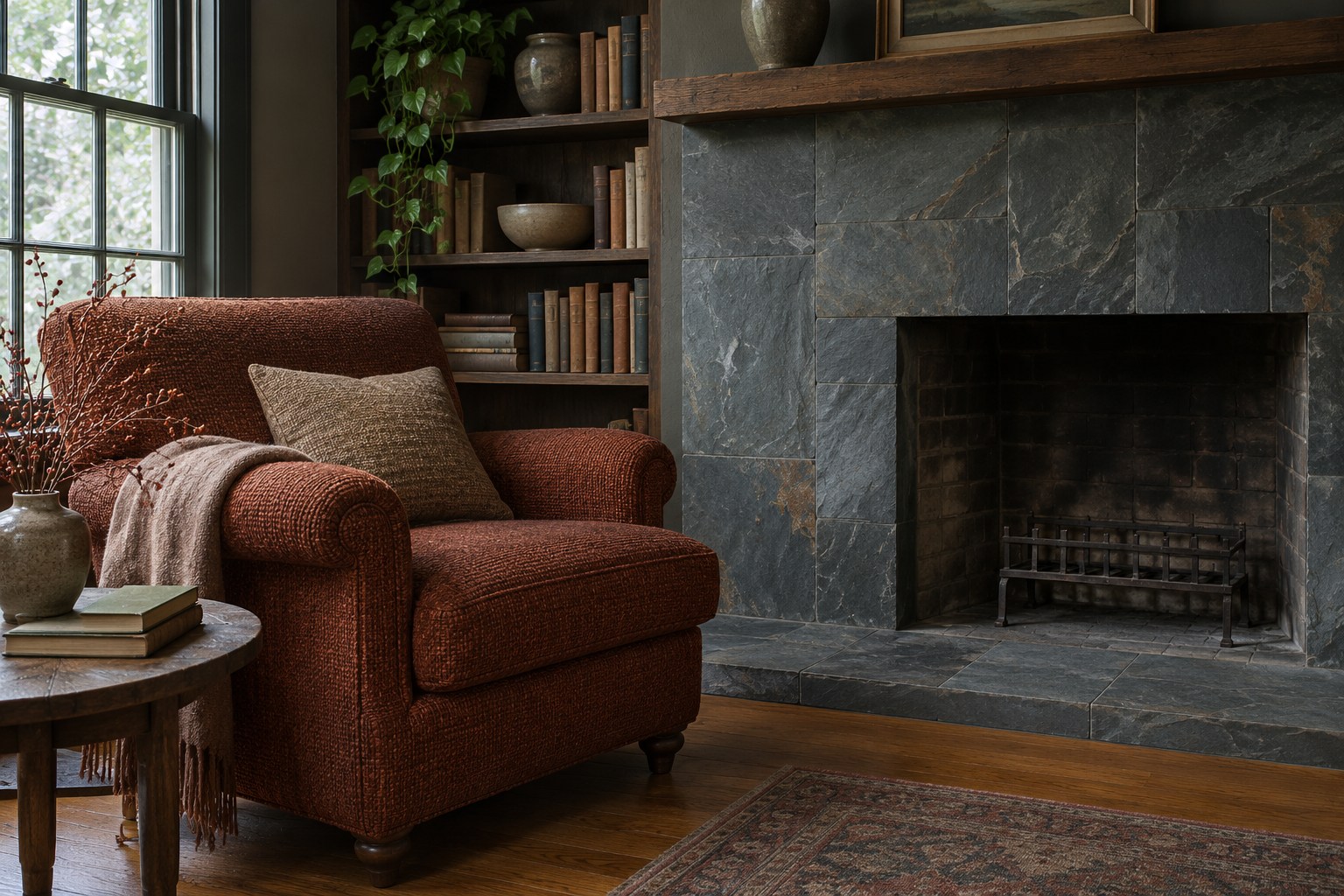
Rust is a deeper reddish orange that can warm up a room with cool gray stone. Use it on one chair or a substantial cushion next to a slate fireplace. The gray gives the rust enough contrast to show its brown-red undertone. In a room with pale gray flooring, try it close to the floor before deciding where the color belongs.
Look at your sample in the part of the room where you plan to use it. A heavily textured rust fabric can look darker where the weave falls into shadow. Keep the biggest surrounding textile plain if you want the chair to read clearly. A cream rug or medium oak piece can soften the transition between the warm textile and stone. A small piece of rust fabric on a light cushion can help you judge the color before committing to an entire chair.
5. Give Ochre a Small Area With Daylight
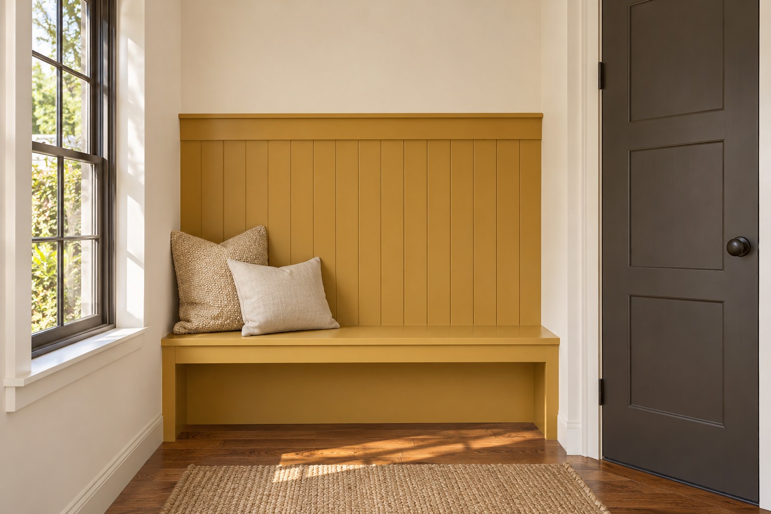
Ochre gives you a muted yellow with an earthy depth. Try it on a short panel behind a bench or on an inside surface you see when you arrive. In daylight, the patch can look golden without taking over the whole wall. Keep its edges easy to see beside cream walls or a dark neutral door.
Compare samples at the height where you plan to use the color. Look at it with the nearest wood in view. If the oak is already strongly golden, a quieter ochre can make the two surfaces easier to distinguish. A small patch gives you a chance to live with the color before putting it across a larger area. Look at the panel with the nearest door in its usual position, since the angle of daylight may shift.
6. Balance Olive With Warm Putty
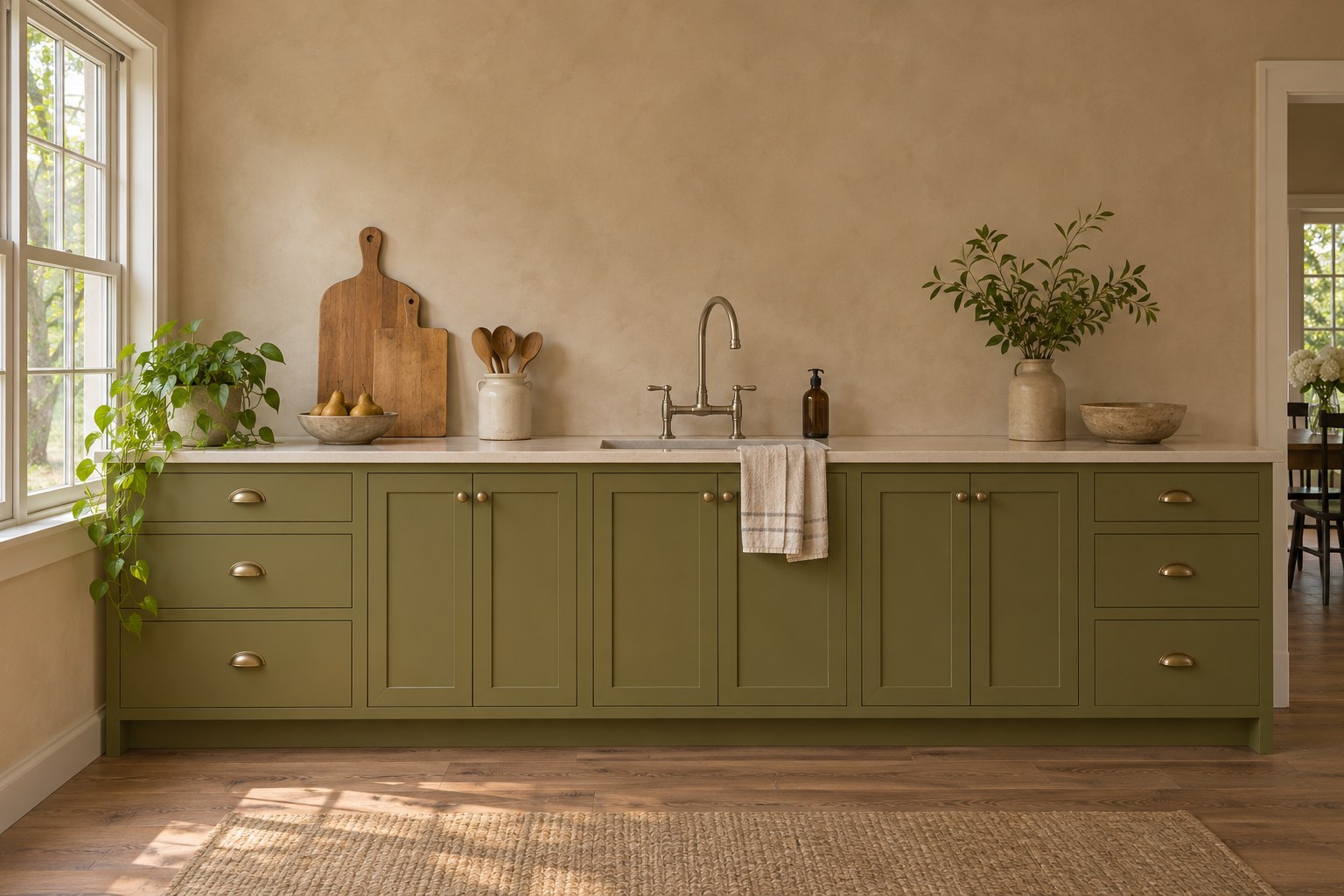
Olive green carries some yellow or brown warmth. On lower kitchen cabinets, it can feel settled beside a putty-colored wall with a similar warmth and a lighter value. Hold the olive sample upright near the counter. Put the putty sample above it so you can check where the two meet in daylight and under task lighting.
Use the counter as a check on both colors. If the wall begins to look pink beside olive, or the cabinets look too yellow, try one different sample at a time. These cabinet colors from real kitchens show how muted greens change beside different fixed finishes.
7. Use Moss Green Beside Dark Wood
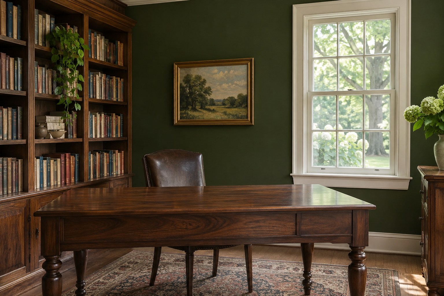
Moss green can be a useful darker wall color in a room with walnut or another deep brown wood. Look for a soft green with enough coolness to separate from the wood in the light you get. Put a sample behind the desk or chest and stand where you usually enter. You should still be able to pick out the outline of the furniture.
If the two surfaces blend together in the evening, try a lighter moss or bring one pale element into that part of the room. Cream window casing, a linen shade, or a lighter desktop accessory can help define the edges. Let the green cover one well-lit plane first if you are unsure how the room will feel. A pale window covering can give the wall and furniture a more readable edge in the part of the room that gets the least light.
8. Give Cocoa Brown a Pale Border
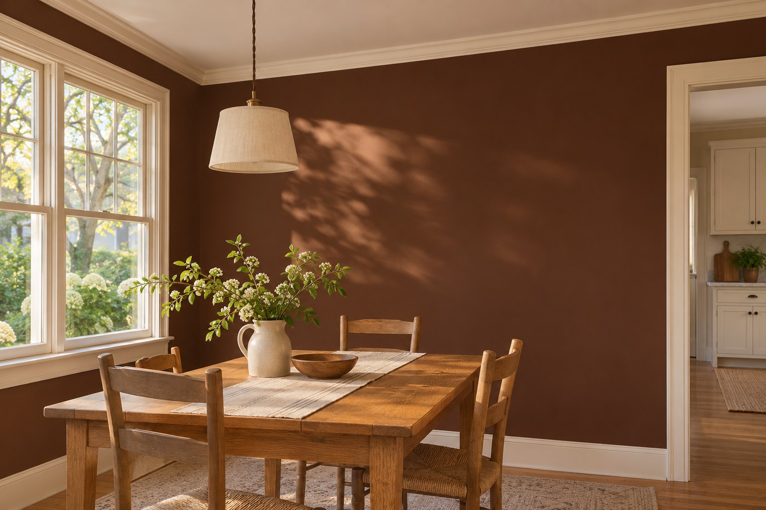
Cocoa brown gives a dining area or reading nook a deep background. Try it on one wall and keep a lighter edge at the ceiling or baseboard if you want the room shape to stay visible. Soft cream trim can define the edge of cocoa brown while keeping warmth in the palette. Look at the whole corner from an adjacent room.
Test a sample behind the largest piece of furniture. If the table is dark wood too, try a lighter chair or a pale shade on the light you already use. See where the shadows fall at the time of day you sit in the room. Deep brown can feel different above a broad window than it does in a recessed corner.
9. Soften Slate Blue With Wheat Linen
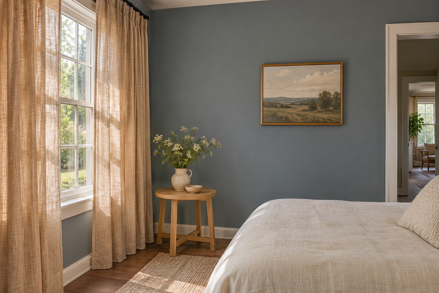
Slate blue-gray brings the coolness of stone into a palette. In a bedroom, pair it with wheat-colored linen to add some warmth at the window. Keep a sample near the curtain so the two get the same daylight. A more muted blue lets the fabric show its slightly golden color without making it look too bright.
Compare the sample near pale wood furniture and against your bedding. If the slate color goes nearly gray after dark, decide whether you still like it in evening light. A warm fabric can soften the shift. Keep the larger surfaces simple so the contrast between the blue-gray wall and the linen remains the part you notice.
10. Try Plum Brown Beside Natural Maple
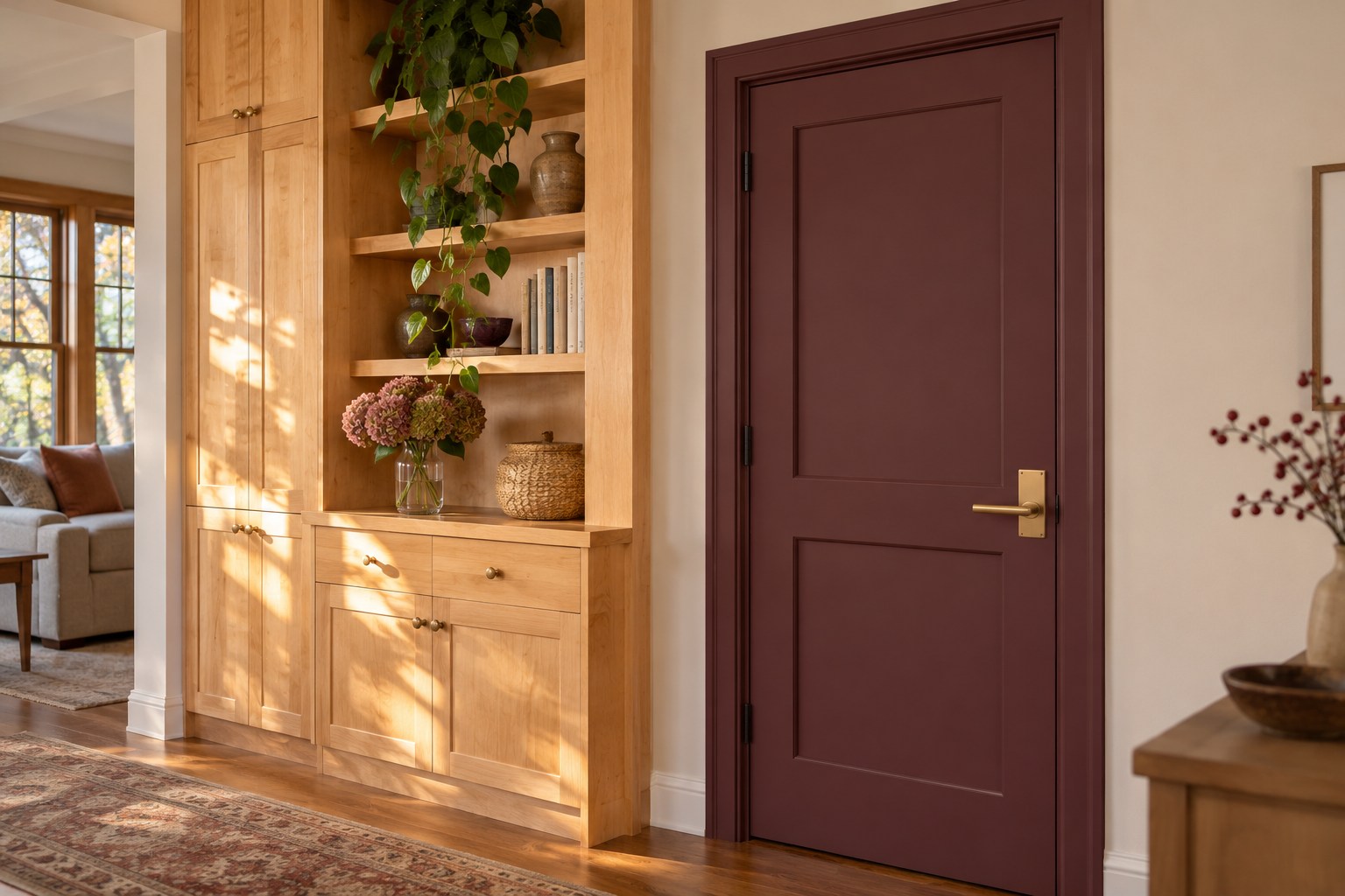
A plum brown has a little red or violet mixed into the brown. Try it on a door or a shallow wall section to see how much of that undertone comes through. Natural maple can be a useful neighbor because its lighter surface shows the depth of the paint. Sample the two materials beside each other before choosing any hardware.
Check the color with the door open. You may see one face beside pale maple and the other against a darker room. If the paint looks stronger than you want, compare a brown with less purple in it. A restrained version keeps some warmth without overwhelming a small transition. Let a low-sheen sample dry before checking it, especially if the adjoining maple has a soft satin finish.
11. Ground Light Clay With Iron Charcoal
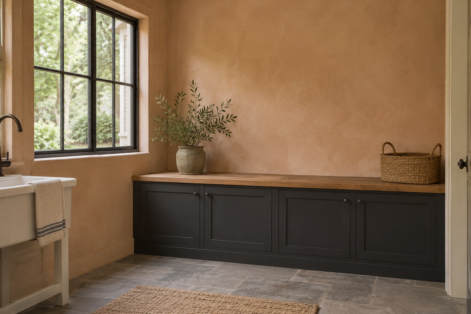
Iron charcoal gives a light clay room a deeper mineral note. Put it on a low cabinet or sturdy bench where the weight of the dark color makes sense. Let the pale wall continue above it. A gray stone floor or a plain wood top can give the room another texture without adding a strong new hue.
Check the charcoal against your wall sample in the corner where the piece will sit. One shade may read cool and almost blue, while another looks closer to black. Pick the one that gives a clean edge without making the light clay appear too orange. If the area is shaded, test it beside the light you will normally use. If there is already a dark floor grille or handle nearby, compare the charcoal against it before you add another dark finish.
Choose the earth tone that works with the floor, wood, or stone you plan to keep. Try it in a small area and look again when the room changes from daylight to lamplight. If the two finishes still look good together, carry the color to a larger surface or repeat it in one nearby room.
Discover more from HomeTrendora
Subscribe to get the latest posts sent to your email.

