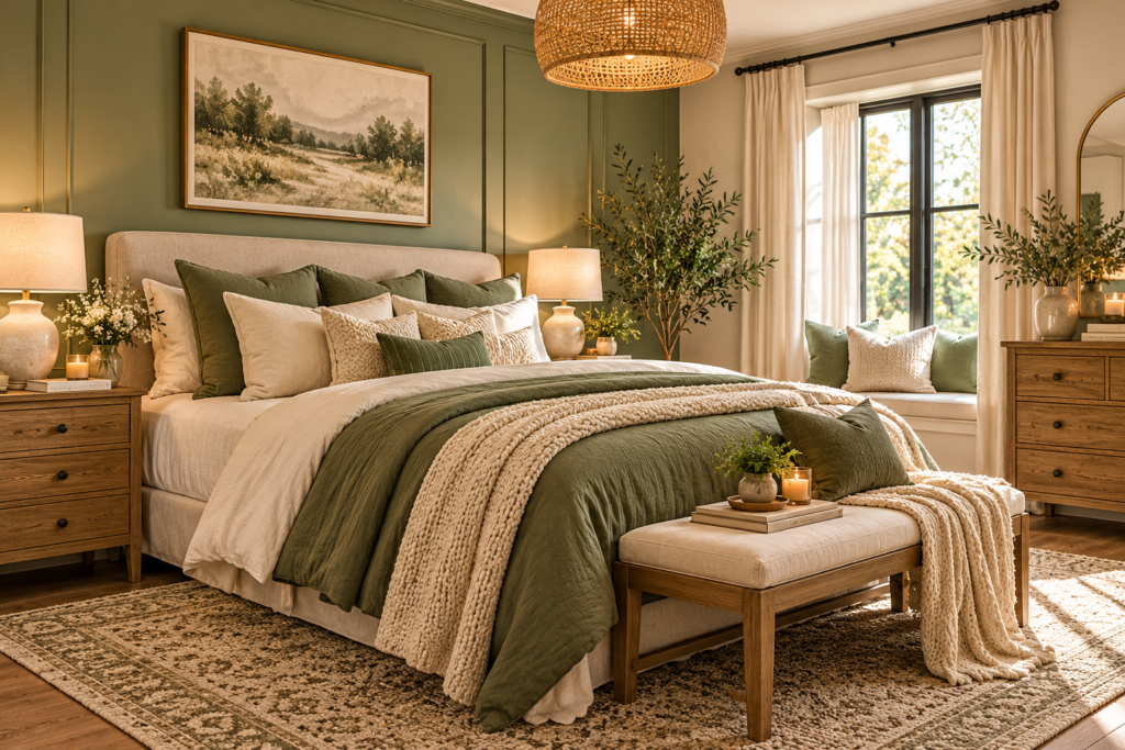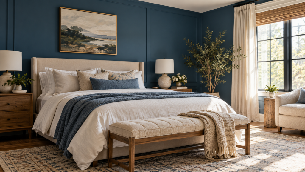
Burgundy and green can feel heavy in a bedroom when both colors compete for the largest surfaces. Decide where each color should live: on the walls, on the bed, or in a useful piece of furniture. A wine-colored bed against a green wall creates a different room from burgundy walls with one green chair, even when the same two fabric swatches started the plan.
These burgundy and green bedroom ideas explore that relationship through paint, upholstery, bedding, wood, and small architectural details. You can try the pairing with removable textiles or build a whole-room scheme around it. Choose the depth of each color in the room’s actual light, then give the eye a few quieter places to rest.
1. Lay Burgundy Bedding Against a Muted Green Wall
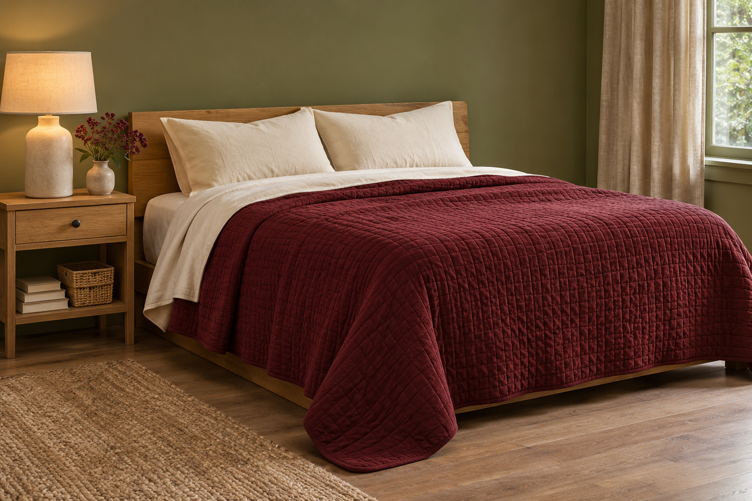
Start with a broad muted green wall behind the bed, then put burgundy across the duvet or quilt. The wall becomes the background, while the bed gives the wine color a clear shape in the center of the room. Soft ivory sheets showing at the fold keep the two large areas from merging into one dark mass.
Choose a bedding texture you want to use every night, such as a softly washed cotton or a lightly quilted cover. You do not need matching burgundy pillows, curtains, and lamps. A pair of warm-white pillowcases and a plain wood bedside table can leave the main relationship easy to see.
If this is your first attempt at the combination, try the bedding before committing to paint. Spread the fabric against a large green sample and look at it in daylight and under the lamps you use at bedtime.
2. Put a Green Upholstered Chair in a Burgundy Corner
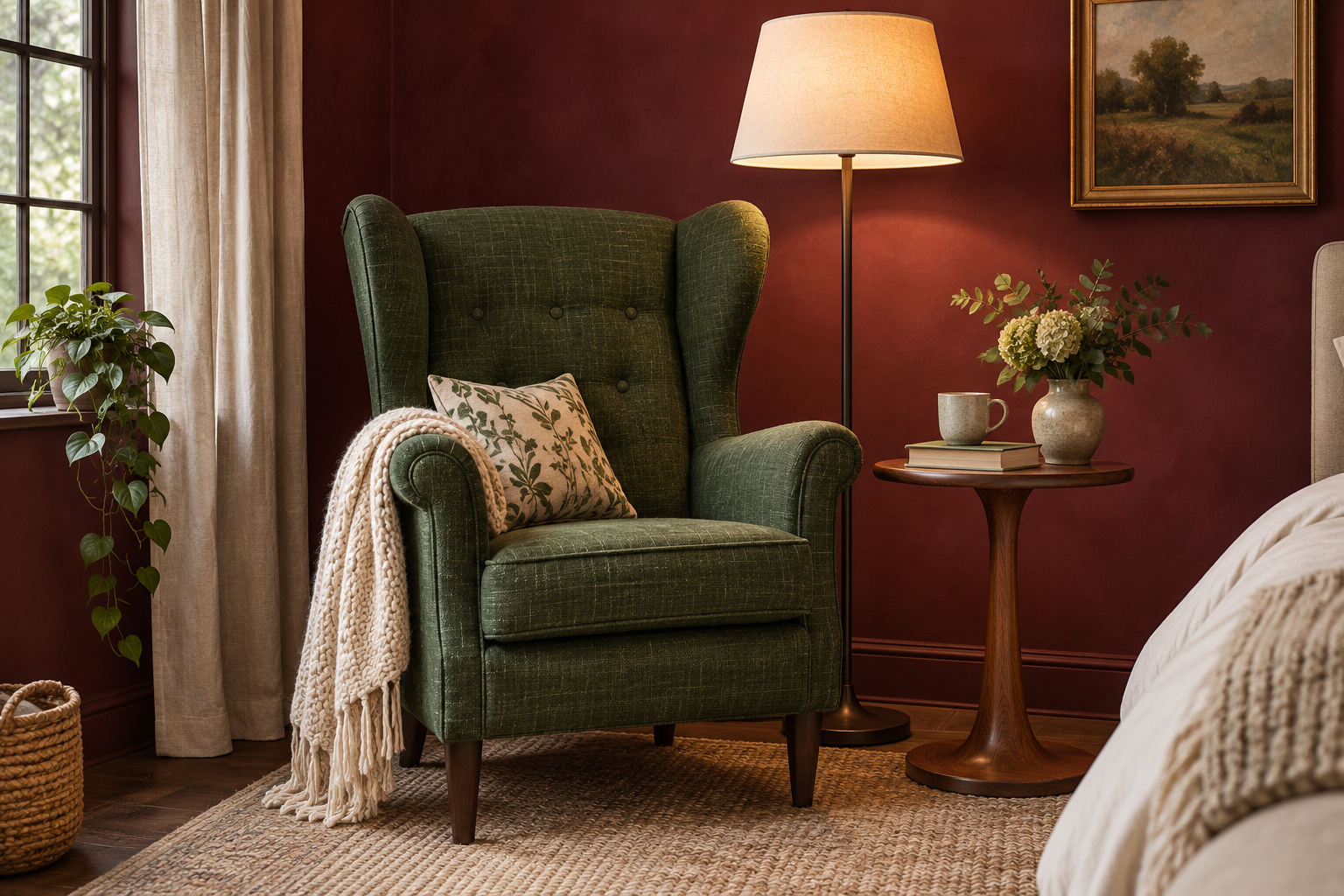
A useful reading chair gives green a substantial place in a burgundy bedroom without putting both colors on the bed. Position it in a corner with room to sit down, turn toward the room, and reach a small table. Measure the chair’s full width and depth, including the arms, rather than judging its footprint from a front-facing photograph.
A dark green chair with a linen-look weave creates a quieter contrast against wine-colored walls than a glossy fabric would. Rounded wood legs can connect it to a bedside table or dresser. Leave the bedding fairly plain so the corner feels like a place to use, not a second display competing with the bed.
Test the actual upholstery sample or listing color beside your wall sample. Product photos and screen colors can suggest a direction, but they cannot confirm exactly how the two will look together in your light.
For a similar reading corner, this dark green linen-look chair measures 29.25 inches wide by 33.75 inches deep; compare the full footprint with your bedside route before ordering.
Explore the dark green reading chair (paid link)
3. Separate a Dark Headboard From the Wall With a Pale Edge
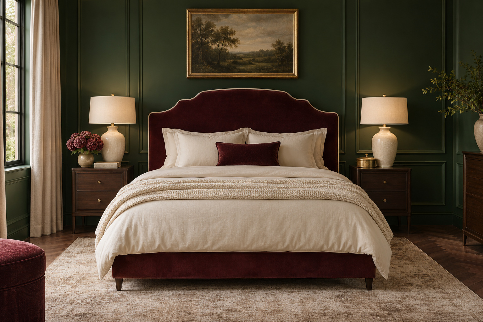
A burgundy upholstered headboard can disappear against a deep forest-green wall if both surfaces are similarly dark. A pale border gives it a readable outline. Try a headboard with narrow cream piping, a light wood frame, or a slim strip of warm-white wall visible around the upholstery.
Keep the other finishes deliberate: a pair of substantial bedside lamps, simple ivory bedding, and one restrained brass detail can give the room a more formal feel. Avoid adding several different metallic finishes just to make the scheme feel luxurious. The clear shape of the bed does more than a collection of shiny accessories.
Look at the headboard from the doorway as well as from beside the bed. The pale edge should define the silhouette without becoming the strongest stripe in the room.
4. Choose a Green Botanical Wall and Plain Wine Bedding
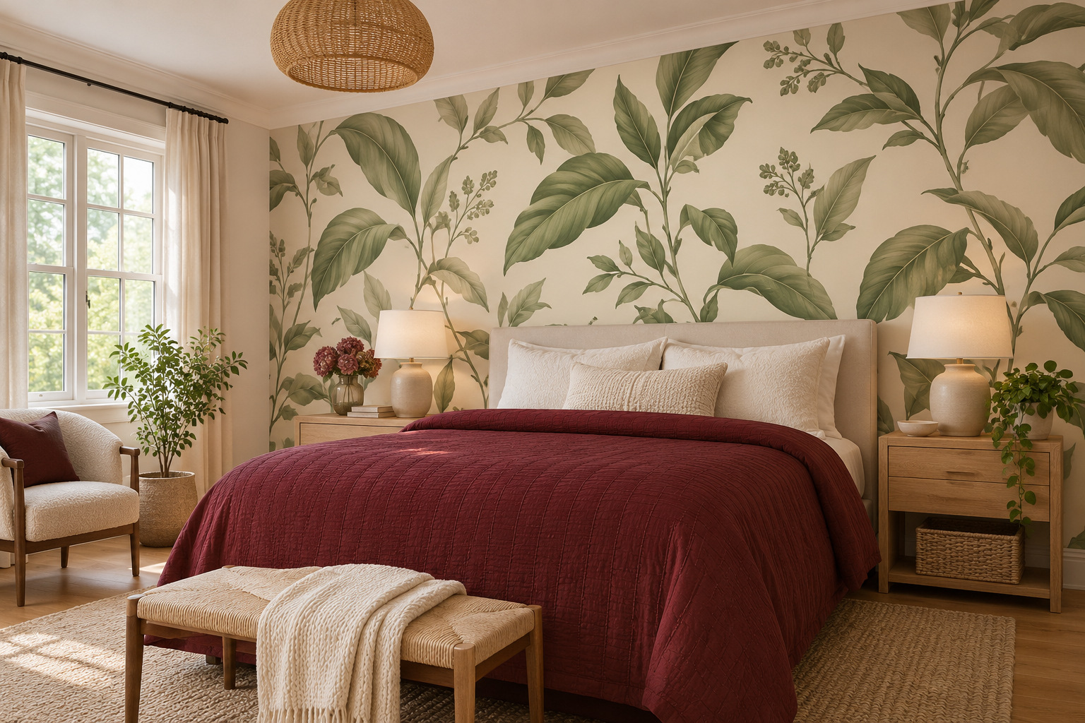
An original botanical wallpaper can give green movement across the wall, while plain wine-colored bedding keeps the bed calm. Choose the print before adding other patterns. A leafy design with an open pale ground feels different from dense foliage on a dark background, and the amount of visible wall will change the whole balance.
Keep the duvet or coverlet mostly solid. A small textured stitch is enough interest when the wall already carries a repeated motif. Pull one quieter color from the paper for the bedside lamps or curtains, rather than trying to match every leaf shade around the room.
Order a sample large enough to judge the repeat beside the actual bed width. A small swatch can show the colors but hide how busy the pattern becomes across a whole wall.
5. Let Walnut Carry the Space Between the Two Colors
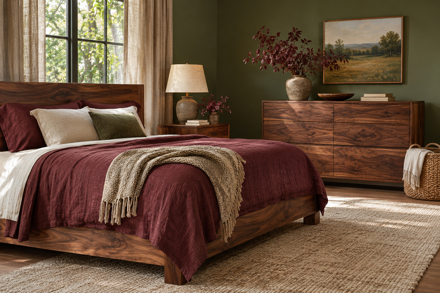
Use a substantial walnut bed, dresser, or bedside pair as the third element between green and burgundy. Visible timber grain gives the palette a material connection, especially when the green is mossy or olive and the burgundy leans toward brownish wine. Keep enough of the wood uncovered to appreciate that relationship.
A flax rug, cream linen shade, and simple woven basket can extend the natural materials without adding another strong color. Choose a few useful pieces rather than scattering small wood accessories over every surface. The bed frame or dresser should make the clearest statement.
If you prefer a lighter green for the large surfaces, these sage green and cream bedroom ideas offer a quieter starting point. Burgundy can then enter through one substantial textile instead of changing the whole room at once.
6. Use a Two-Color Stripe as the Bridge
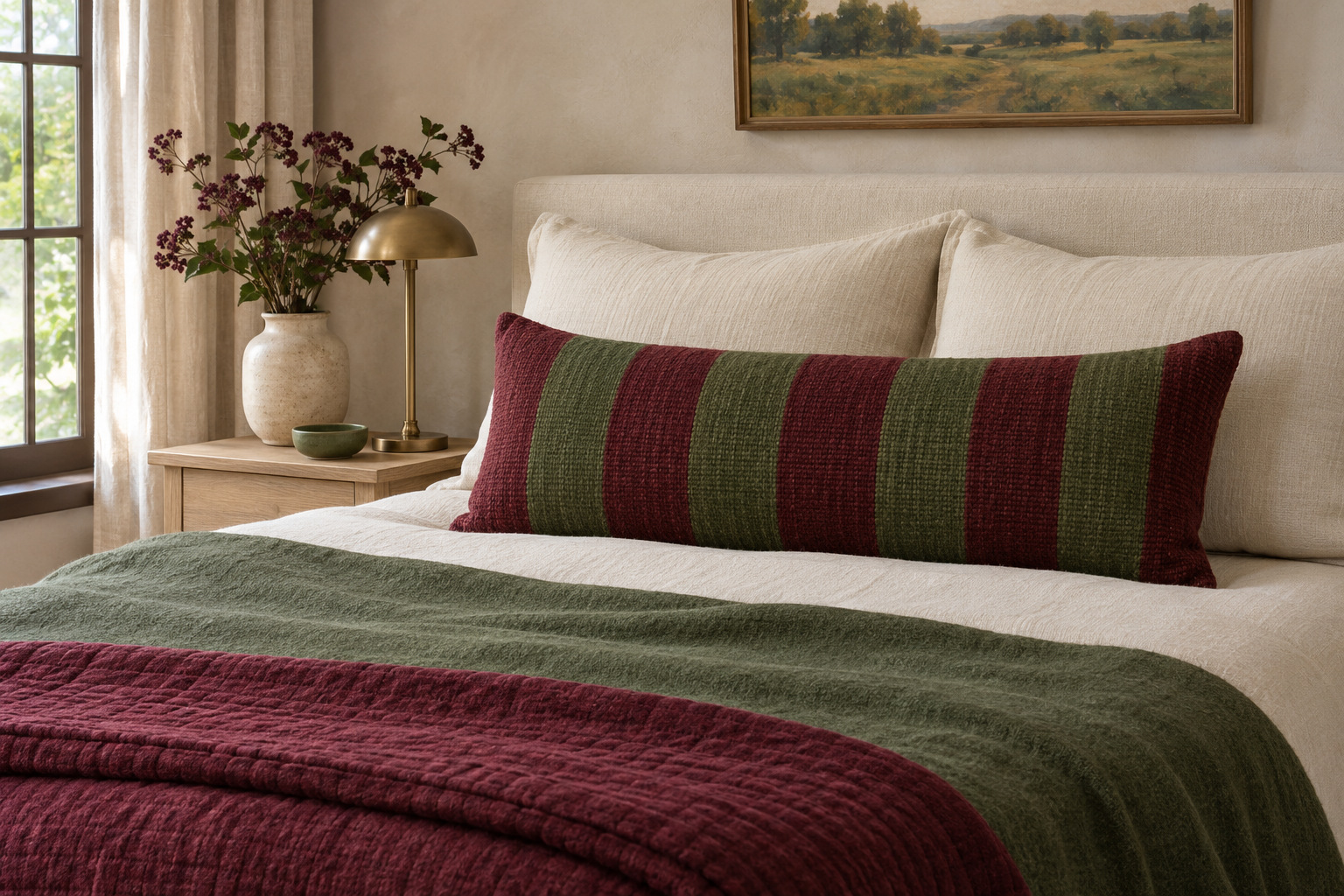
A woven stripe containing both burgundy and green can make the pairing feel intentional before you buy any larger pieces. Use it on a lumbar pillow, a bench cushion, or one folded throw. Keep the surrounding bedding plain enough that you can read the two colors in the repeat.
Look at stripe width as well as color. Broad bands have a stronger presence from the doorway, while a very fine stripe may blend into a third color at a distance. Put the sample where the finished textile will actually sit before deciding how much pattern you want.
Repeat each color once elsewhere in the room: perhaps a muted green wall and a burgundy quilt. The striped piece then connects two existing decisions instead of becoming the reason to add several unrelated accents.
7. Give Burgundy a Clear Boundary Below Green
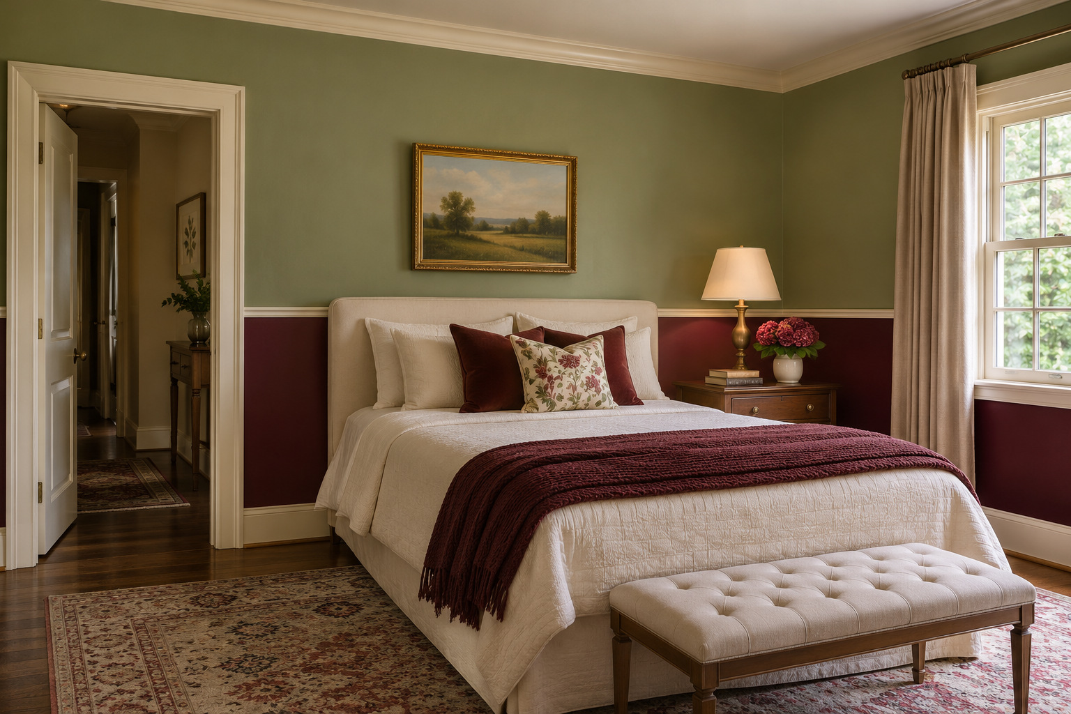
Use an existing chair rail or a carefully planned horizontal paint break to place burgundy on the lower wall and green above it. The boundary gives both colors an architectural role. A consistent line around the room looks more settled than isolated color blocks scattered behind furniture.
Choose the height in relation to the actual bed, window trim, and doors. Test the line with removable painter’s tape suited to the surface before painting, then stand back to see where it crosses the furniture. Follow the paint and tape instructions rather than assuming every finish can be masked the same way.
Keep the trim in one coordinating color if several doorways interrupt the walls. That repeated edge can make the two-color treatment feel continuous even when only short sections of wall remain visible.
8. Make the Curtain Lining the Quieter Second Color
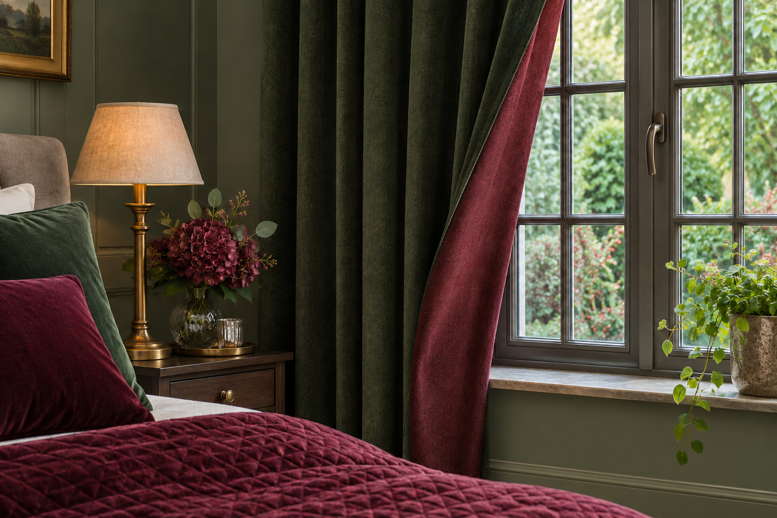
Curtains offer a smaller way to bring the second color into a bedroom. A deep green curtain with a muted burgundy lining can reveal the wine color when the leading edge is gently folded back. The outside fabric still reads as one large surface when the panels are closed.
Check the lining construction with the maker before ordering. A separate colored lining is different from a reversible curtain, and the two fabrics may have different care requirements. If you want to show a contrast edge, confirm that the finished heading and hem suit that use.
Keep the fold restrained and clear of window controls. A small reveal is enough to connect with burgundy bedding or a chair cushion; you do not need to tie the panel into an oversized bow to show both colors.
9. Use a Warm Pale Rug Under a Dark Bed Group
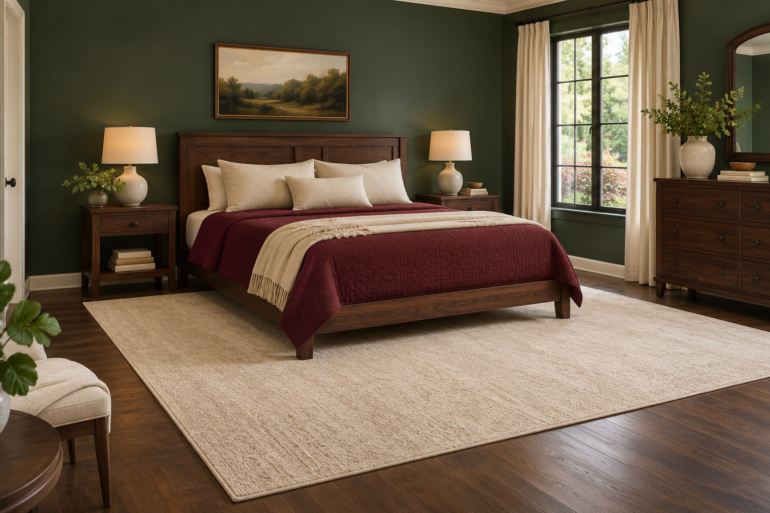
A pale oatmeal or warm-ivory rug can create a light boundary beneath a dark bed, burgundy coverlet, and green wall. Choose a size in relation to the full bed and the places your feet land. A tiny rug disappearing under the frame will not give the darker furniture the same visible outline.
Check door movement, bedside furniture, and the rug’s pile before buying. The rug should work with the room’s normal routes, not force you to step around a curled corner. Use a suitable pad when recommended for the rug and flooring.
Keep the pattern quiet if the bedding or walls already have one. A subtle woven texture can give the floor interest while leaving the burgundy and green as the room’s main color relationship.
10. Paint the Inside of a Bedside Shelf a Contrasting Color
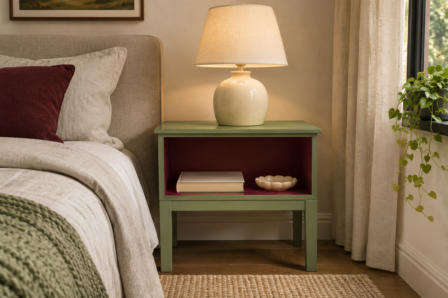
Give a green bedside cabinet a burgundy interior, or reverse the two colors inside one open shelf compartment. The contrast appears in a useful little space while the outside of the furniture stays calm. It is especially effective when the shelf holds only a bedtime book and a small tray.
Measure the compartment around the objects you actually keep there. Leave enough height to remove a book easily and enough depth that the tray sits fully supported. Store cables neatly through a suitable existing route, keeping chargers and outlets accessible rather than painting or covering electrical fittings.
For a furniture-painting project, follow the coating instructions for the existing surface and let the finish fully cure before returning objects. A contrasting interior should make the shelf easier to notice and use, not become a reason to overfill it.
11. Let a Green Canopy Reveal Burgundy on the Inside
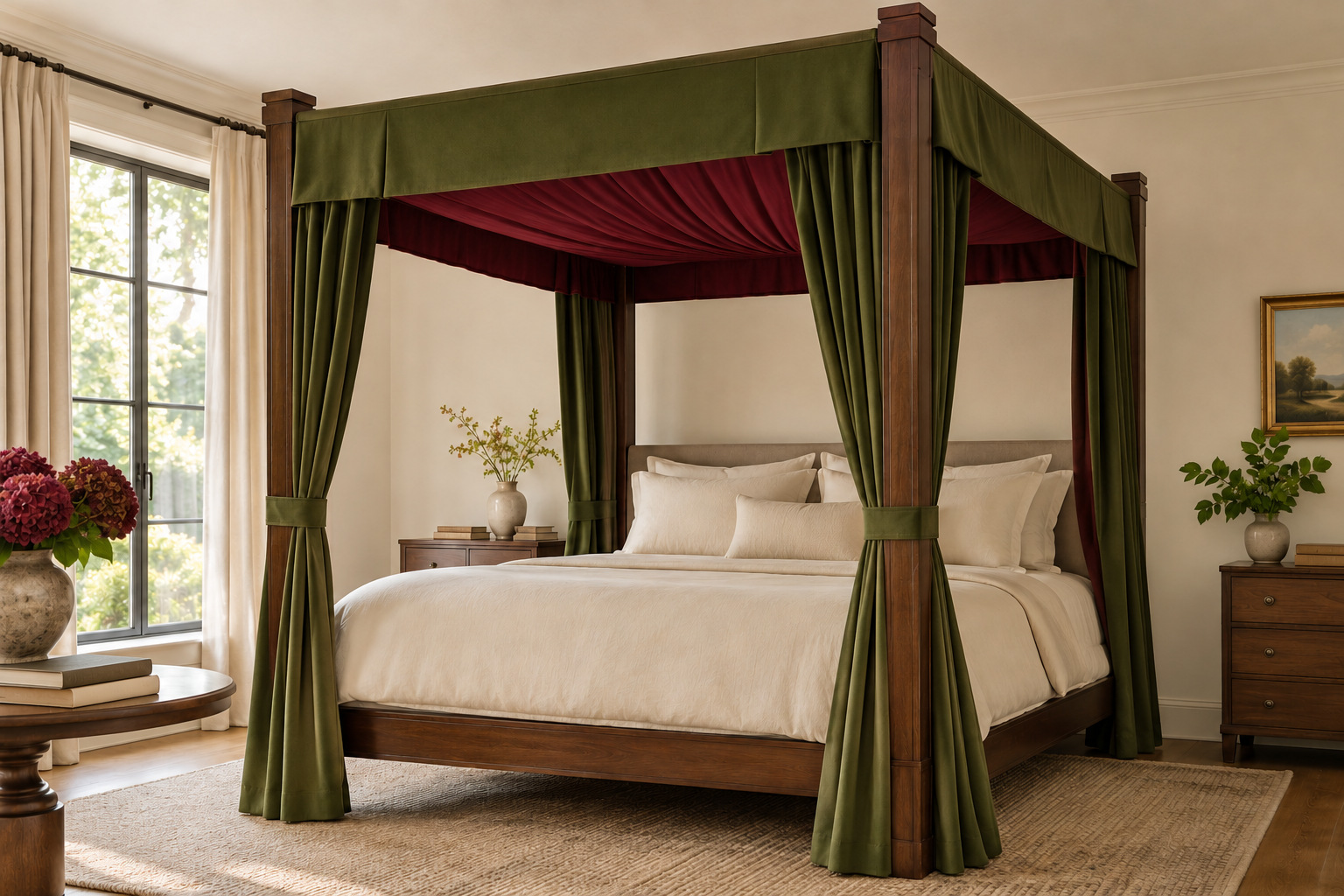
A purpose-built canopy bed can hold the two colors on different faces of the same textile feature. Think muted green on the outer surface and wine-colored fabric visible on the inside of a tailored canopy. Plain pale bedding gives the overhead colors room to feel deliberate.
Use a canopy system and fabric arrangement designed for that bed. Draping cloth from an improvised ceiling attachment is a different project, and a photograph cannot establish that a fixing is suitable. Keep fabric clear of fans, lighting, heaters, and any route where it could be pulled.
Start with fabric samples held in their intended orientation. Color overhead often looks different from color laid flat on a table, so judge the underside from the pillow position as well as from across the room.
12. Use Burgundy on the Ceiling Above a Soft Green Room
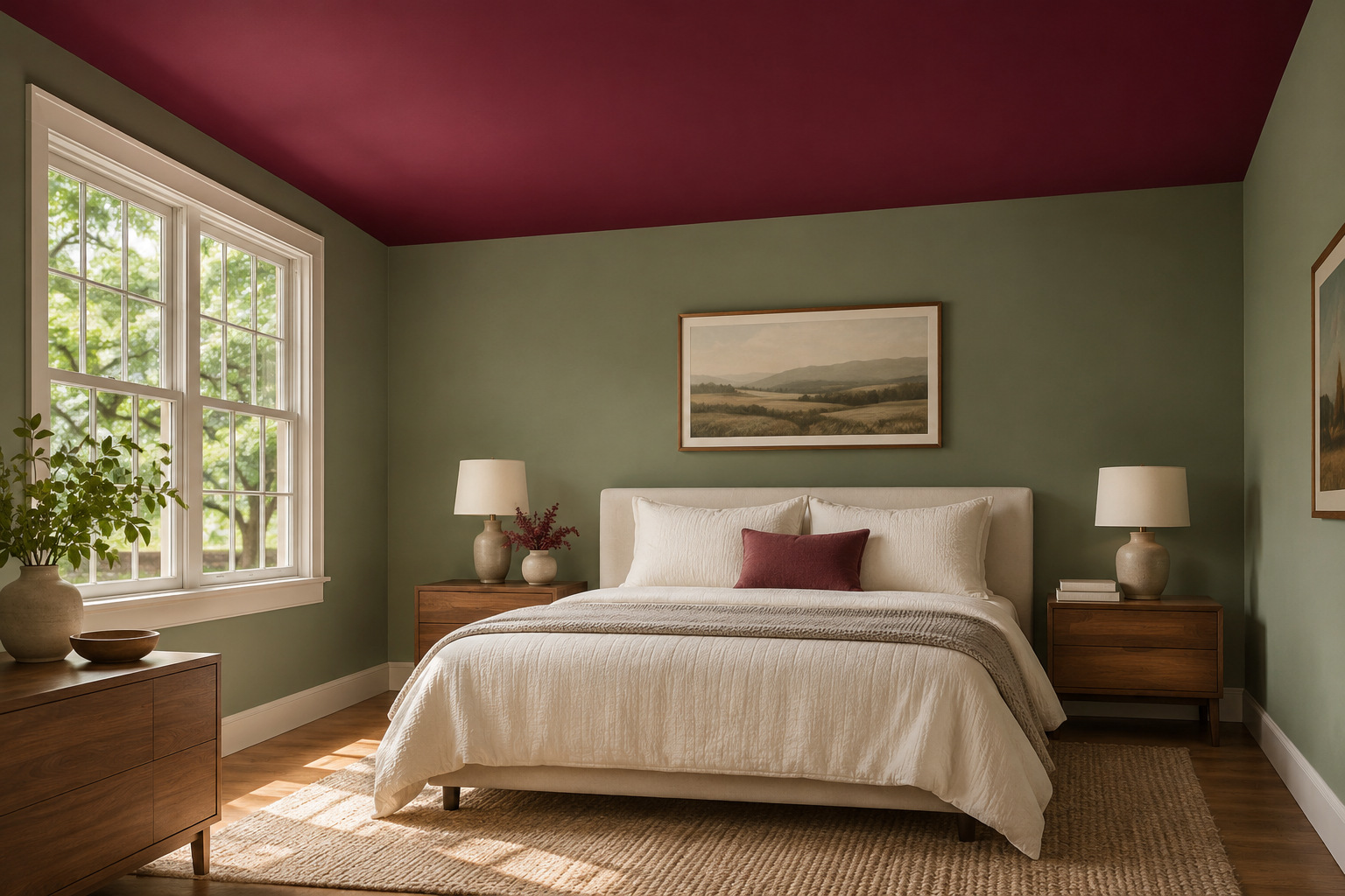
A burgundy ceiling changes the room’s color balance without turning every wall dark. Pair it with a softer green on the vertical surfaces and warm-white bedding so the upper plane becomes the main accent. A simple ceiling shape is easier to read than one interrupted by several competing trim colors.
Test the actual paint on an appropriate sample surface held overhead. Look at it during the day and with the bedroom lights on; a wall sample alone will not show the same angle of light. Keep a clear reference for the trim color beside it.
If the sample feels heavier than you want, keep burgundy on a smaller surface such as a quilt or headboard. The idea is to find a color balance you enjoy from bed, not to commit to the largest possible painted area.
13. Repeat Both Colors in One Large Artwork
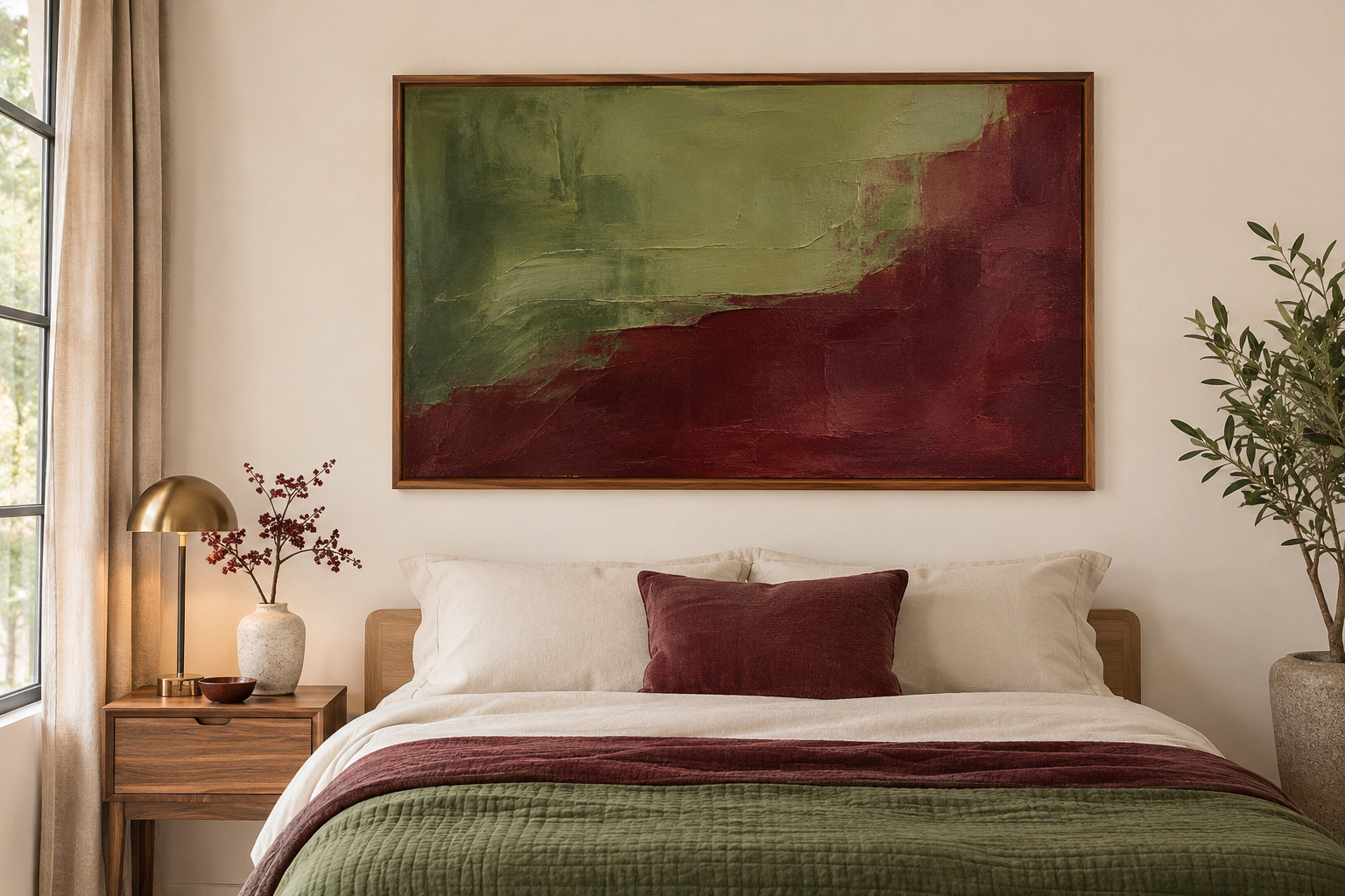
One original artwork with broad areas of muted green and burgundy can connect the palette on a pale wall. Choose an image you want to live with, then use its colors as references for textiles. The fabric does not have to match the print exactly to belong in the same room.
Keep the composition readable from the doorway. A single larger piece can feel calmer than several small prints with unrelated frames, particularly when the bed already has patterned fabric. Plan the frame and secure hanging method for the wall and artwork weight.
Leave enough blank wall around the frame to distinguish it from the headboard. A warm wood or simple dark frame can repeat another material in the room without adding a third bright color.
14. Give a Dressing Alcove Its Own Reversed Palette
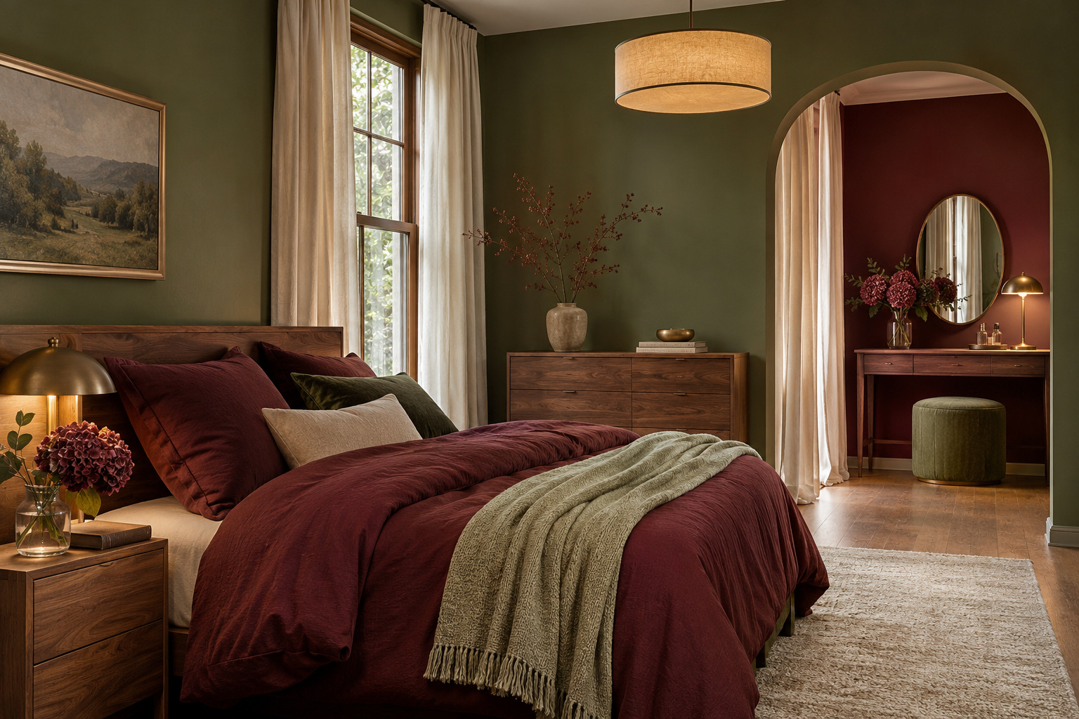
If the bedroom includes a real dressing alcove, reverse the color roles there. Green walls around the bed can lead into a burgundy-backed dressing area with one green stool. The change marks a useful zone while both spaces still belong to the same room.
Keep the shared details consistent: the same wood finish, pale curtain fabric, or hardware can connect the two areas. Make sure the stool tucks away and drawers can open fully. Color should help define the dressing space without disguising a poor furniture fit.
Check clothes and skin tones in the lighting at the mirror before choosing the final wall finish. Try the samples in the actual alcove rather than assuming the color will look the same as it does beside the bed.
15. Keep a Rented Room Pale and Put Both Colors on the Bed
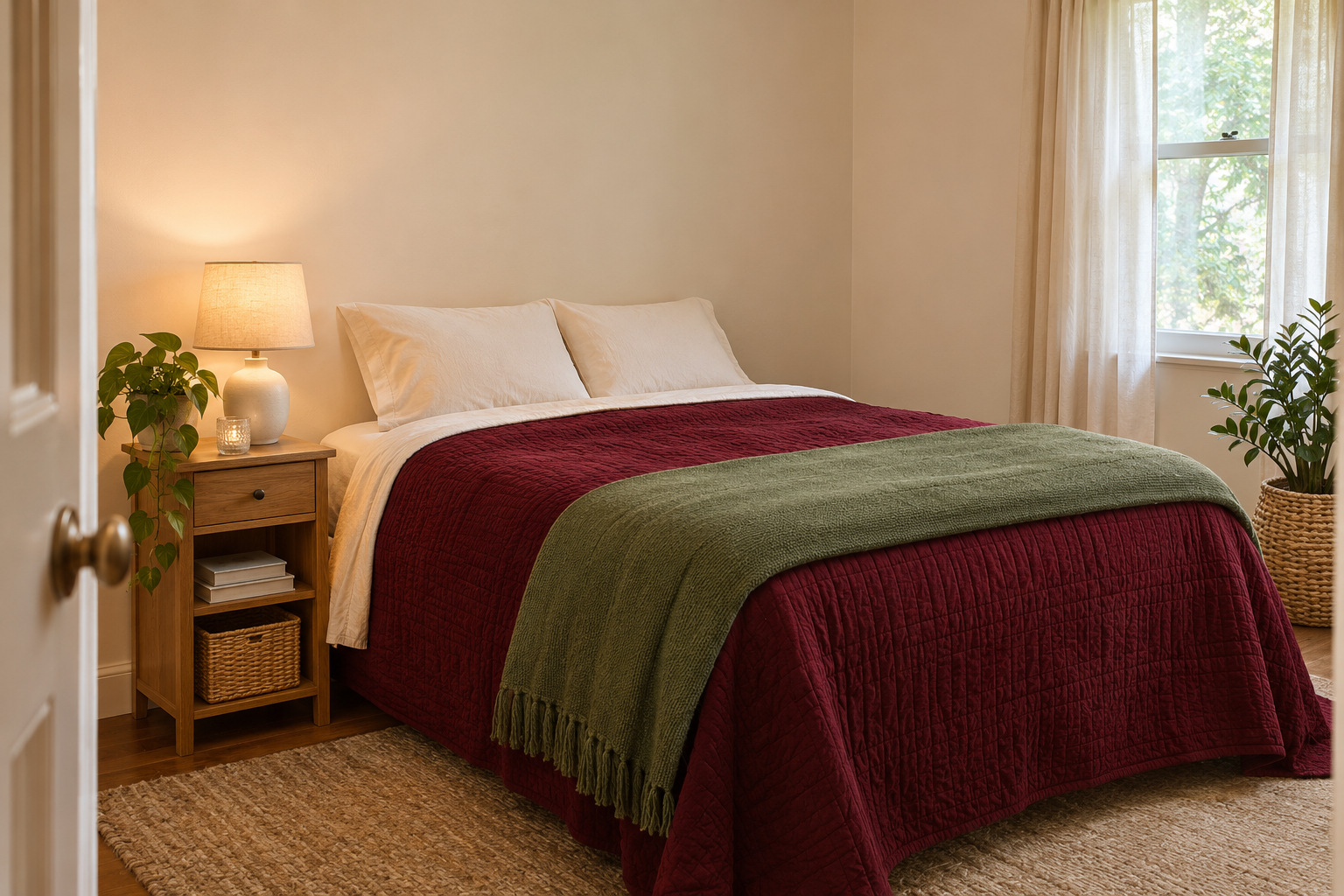
You can try the combination without painting. Keep the existing pale walls and use a burgundy quilt, a muted green blanket, and plain warm-white sheets. Fold the green textile so it forms a clear band across the lower bed rather than adding a pile of matching cushions.
Choose removable pieces that work with your current bed size and care routine. A second pillowcase set or a small bedside shade can repeat one color if the room needs more connection, but start with the two main textiles first. Leave rented fixtures and finishes as agreed with the property owner.
Take a photo from the doorway after making the bed. It will help you judge whether both colors are visible and whether you want more green, more burgundy, or simply more of the pale background.
Choose one large surface for the leading color, then decide what job the second color should do. Bedding, a useful chair, a defined paint break, or a small shelf interior can each make the pairing feel complete. The right balance is the one that works with your room’s light, furniture, and everyday routine.
Discover more from HomeTrendora
Subscribe to get the latest posts sent to your email.