
White trim and a bright ceiling can break up a room when you want one paint color to feel cozy. These 19 color drenching ideas help you decide where to repeat the color and whether your ceiling should match the walls or use a softer tint.
Color drenching carries one hue across several surfaces, often the walls, trim, and doors, with the ceiling or built-ins included where they suit the room. Use the floor, counters, or largest piece of furniture as your starting point. Sample the actual finish on both a vertical and an overhead plane, then compare the colors in daylight and under the lights you use at night.
1. Wrap a Bright Living Room in Deep Charcoal
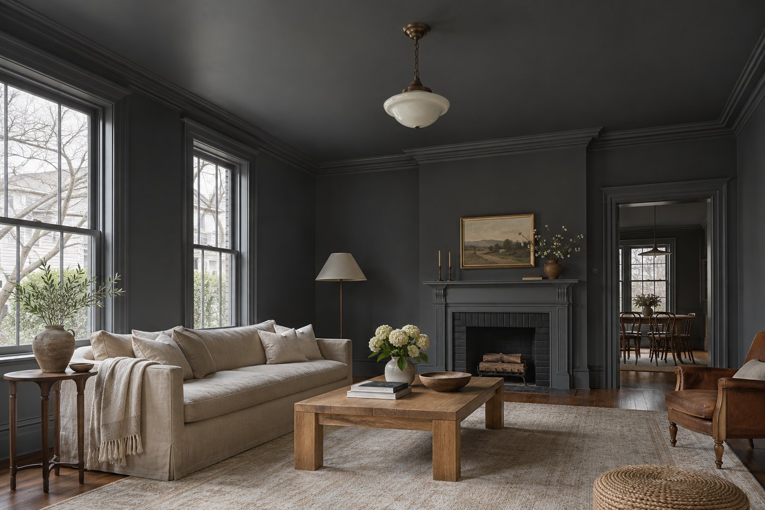
Deep charcoal can feel quiet in a living room with tall windows, pale upholstery, and a floor that brings some warmth. Carry the same shade across the walls, window casing, and crown so the windows read as openings in the room. Use a flatter finish on the large planes and a soft satin on the molding. Side light will pick up the profile of the crown while the paint color continues across it.
Paint two movable sample boards in the intended finish. Stand one near the sofa and hold the other overhead where the ceiling will be. Compare them in morning light and with the lamps you use at night. If the corners look nearly black, start with a slightly lighter charcoal and borrow seating and lighting ideas from these luxury living room ideas.
For a swatch you can move, paint a FoamPRO color tester board with the charcoal you plan to use and label the sheen. Compare it upright by the window and held flat near the ceiling, then repeat under your evening lights.
See the paint tester board on Amazon (paid link)
2. Soften a Terracotta Bedroom With Linen and Oak
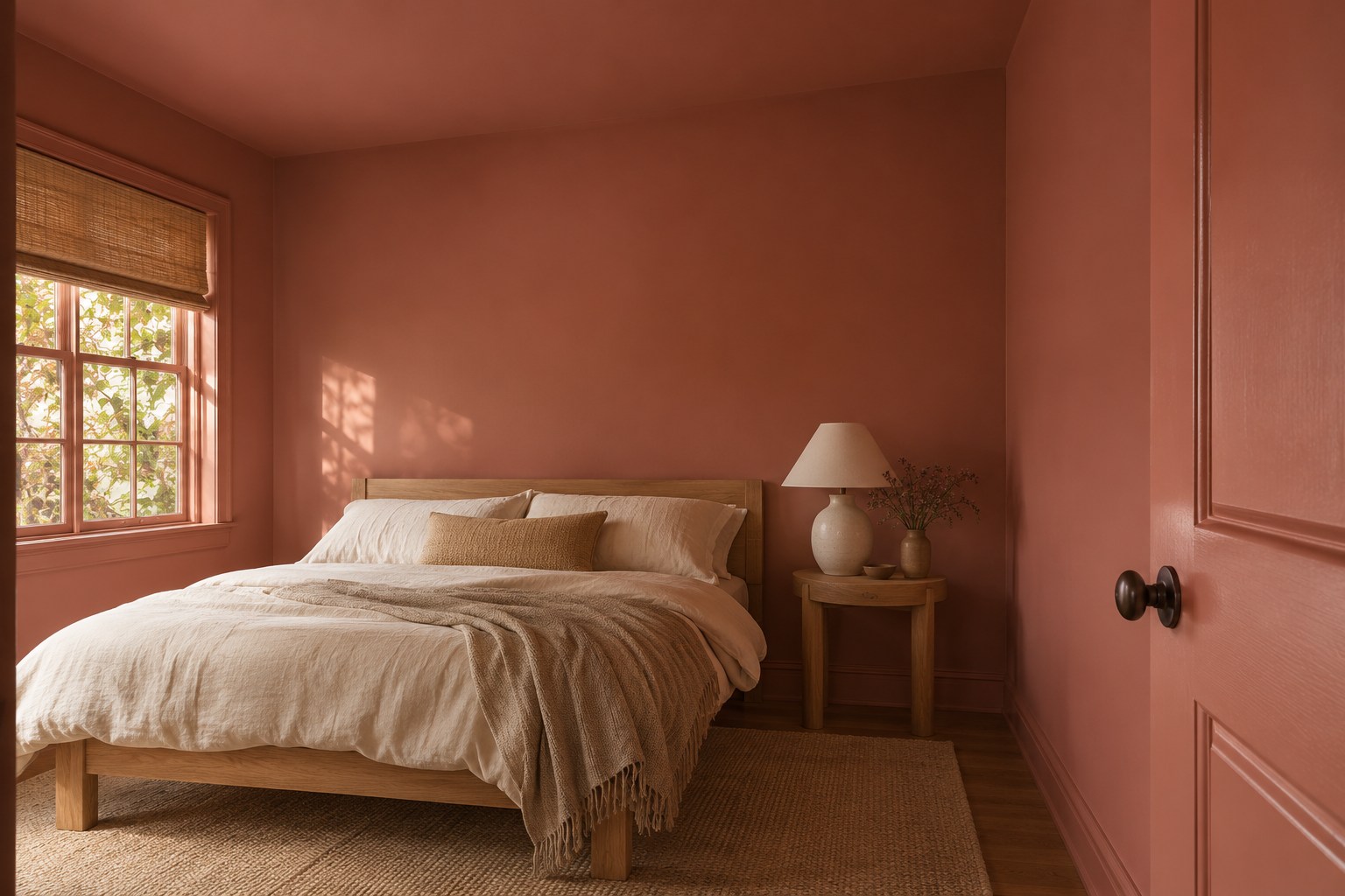
A muted terracotta with a pink-brown undertone feels especially good beside light oak and rumpled ecru linen. Take the clay color from the wall onto the ceiling and baseboards, using a flat ceiling finish and a satin formulated for the door and trim. In a modest bedroom, painting the door too can quiet the pale outline that might otherwise compete with the bed.
Try two clay samples behind the headboard and near the window. Some turn noticeably orange in late-afternoon sun. A soft brown note will stay closer to the color of fired clay, while brighter versions may suit a room with more cool daylight. Use warm-white bedding or a plain flax coverlet to leave room for the paint to set the mood.
3. Repeat Sage Across Kitchen Walls and Cabinetry
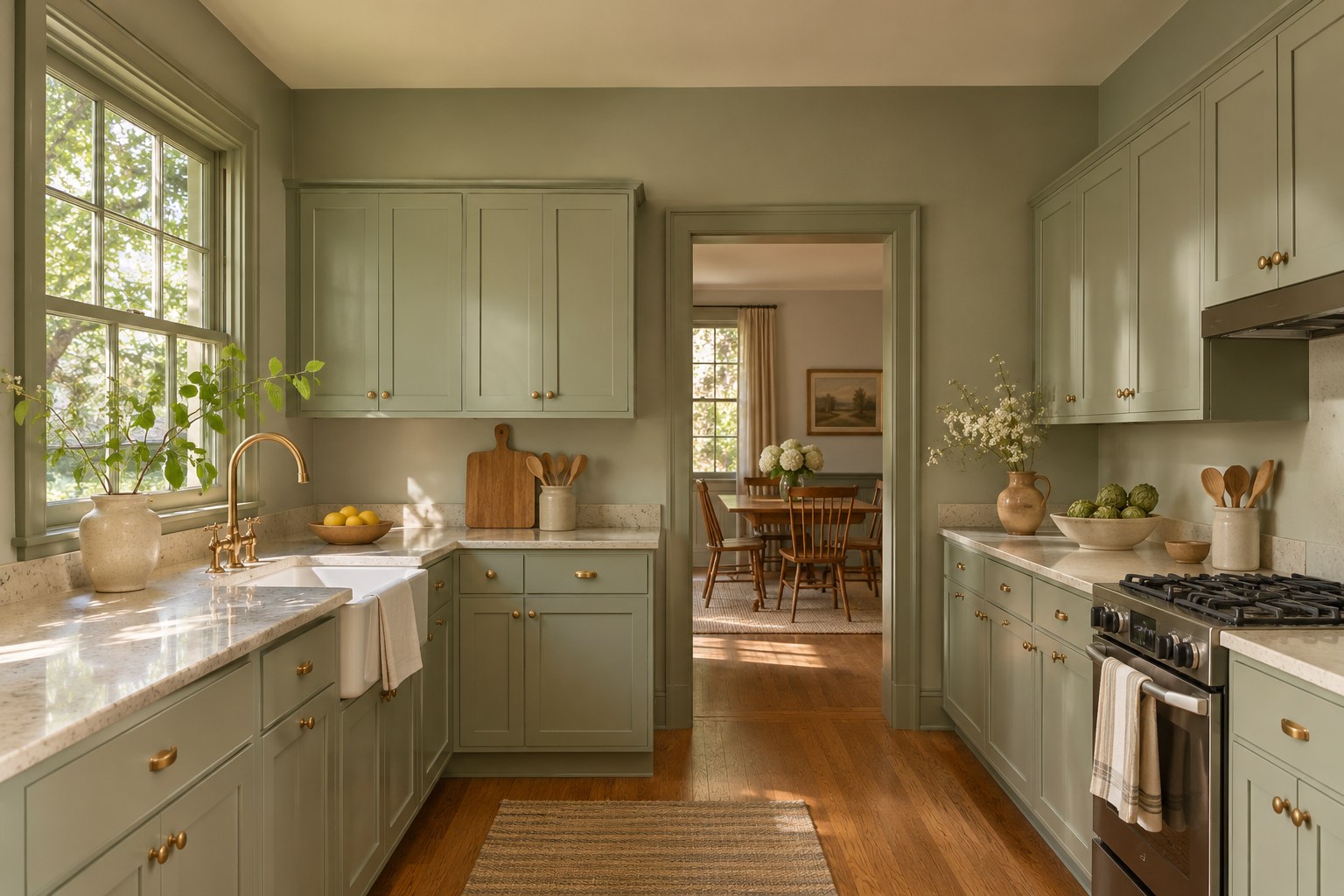
Sage can bring a kitchen together when the cabinets and painted walls read as the same green at a glance. Start by setting a muted sage sample beside the countertop and flooring. A grayer green can sit comfortably beside creamy stone and warm oak. Pale sage in a related tint works overhead if the kitchen receives little daylight.
Ask for a coating and prep system suited to your cabinet fronts. Sample the wall finish and the cabinet finish beside each other, because the smoother door surface can catch much more light. Small brass knobs or pulls will warm up the color without covering much of it. If the wall between your counters and cabinets needs attention too, compare these neutral kitchen backsplash ideas.
4. Pair Dusty Pink With Brass in a Powder Room
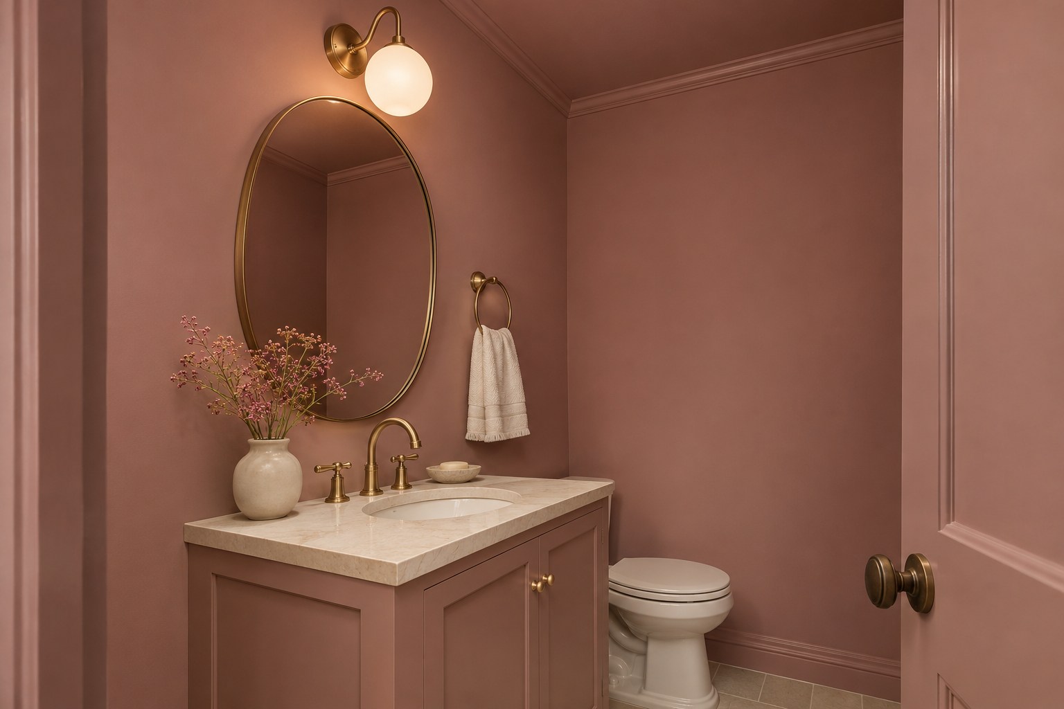
Dusty pink with a brown undertone can give a small powder room the feeling of a finished space. Carry it over the walls, door casing, and ceiling so a narrow room has fewer visual breaks. Paint the vanity in the same color using a suitable cabinet coating, then let a pale stone top show some relief against the pink. A warm brass mirror frame can bring out the earthy part of the color.
Check a sample at face height with the vanity lighting on. A pink that seems restrained in daylight may read closer to peach beneath a warm bulb. Take a hand towel and the hardware finish with you when you compare shades. A clean ivory usually gives muted rose enough contrast without drawing attention away from the whole room.
5. Carry Navy Through a Home Office and Its Bookcases
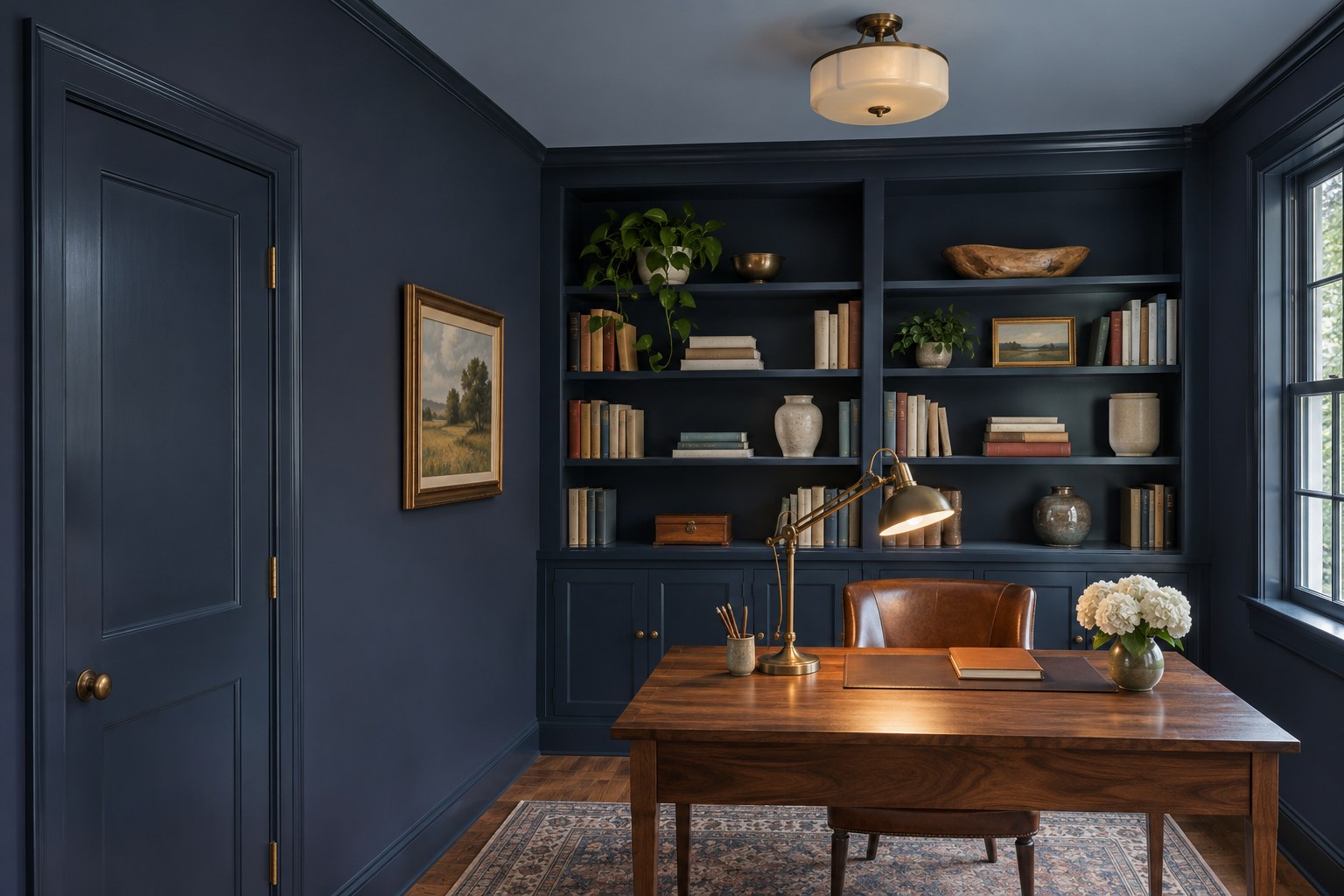
Navy works well in a home office with a walnut desk or other warm wood at the center. Repeat the ink color on the walls, bookcase frames, door, and casing. Use a matte or eggshell wall finish and a satin coating appropriate for the painted millwork. If an overhead sample feels too dense, try a quieter, lighter blue in the same family on the ceiling.
A clean finish change makes the trim read even when the paint color stays the same. Identify the actual casing edge, let the first finish dry as directed, and follow the tape and coating instructions when protecting the adjacent surface. Leave the desktop wood and aim a lamp at the work area. Check the navy while sitting at the desk, where the shelves may appear darker than they do from the doorway.
A 2-inch Wooster Shortcut angled brush can help you reach the inside shelf corners and cut in at the trim. Try a short section where the matte wall finish meets the satin built-ins and inspect the edge after both finishes dry.
See the 2-inch angled brush on Amazon (paid link)
6. Drench a Dining Room in Warm Cream
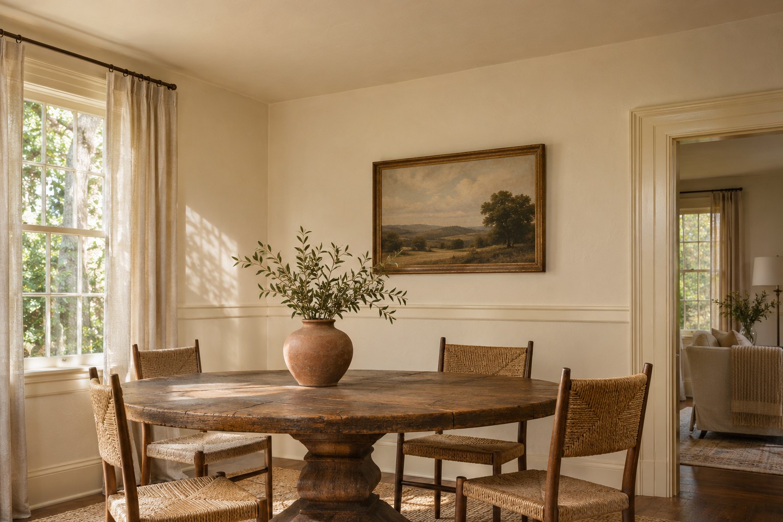
Warm cream gives a dining room a gentle field of color for dark wood and dishes. Use one cream on the walls, ceiling, and plate rail. A matte wall and flat ceiling let the room stay soft, while a little extra sheen on the rail brings out its shape. A coarse linen curtain and dark pedestal table supply a stronger contrast than another paint color would.
Cream can take on yellow, pink, or gray depending on what surrounds it. Prop samples near the floor and next to the chair fabric, then put a plate on the table and check the color while the dining light is on. A cream with enough warmth to suit the wood can still look clean beside a pale table setting.
7. Frame a Reading Nook in Forest Green
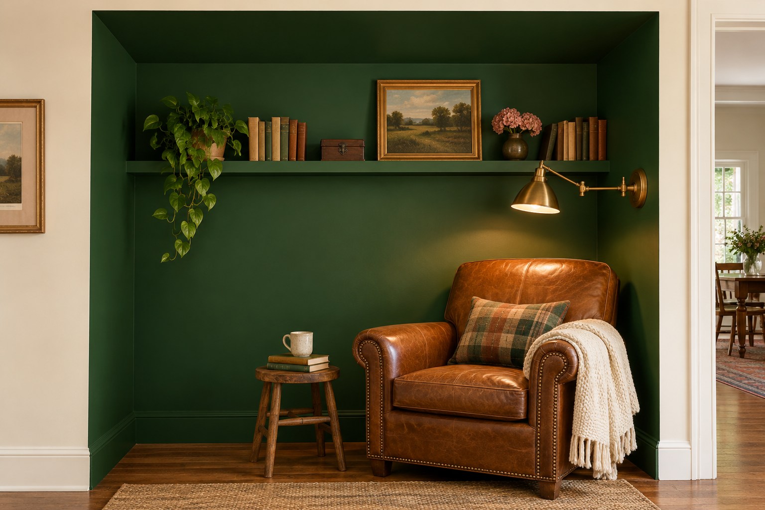
Paint the back, inside returns, and small overhead plane of a reading alcove in forest green. Carry the color onto a built-in ledge or cabinet face inside the opening. The surrounding room can keep its existing paint, using the actual edge of the recess as the transition. A chair in saddle leather or a wool blend will give the green a soft, warm counterpart.
Set a reading lamp where it lights the page and check a paint sample with the light on. At close range, a green that looks nearly black may lose the green undertone that made you choose it. Try a shade with a softer green undertone if the nook has very little daylight. Leave a little open ledge space so the color is visible between the books.
8. Give a Nursery a Soft Powder-Blue Envelope
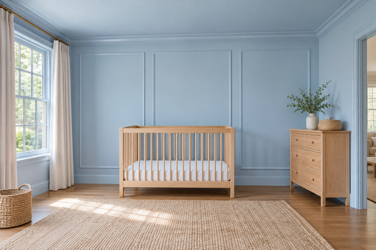
Powder blue can surround a nursery without fixing it to one decorating theme. Use the same pale shade on the walls and ceiling and a softly satin version on the trim and door. Choose a blue with a little gray in it if a bright sky blue feels too sharp next to the maple or oak furniture. A woven rug will add warmth close to the floor.
Stand a sample near the dresser and hold one against the ceiling above your usual view of the room. Warm lamps and the shaded sides of molding can pull a very pale color in different directions. Keep the wall scheme simple enough for future bedding and curtains to change. Place the stronger color in one easy-to-move piece, such as an upholstered reading chair.
9. Let Chocolate Brown Settle Into a Study
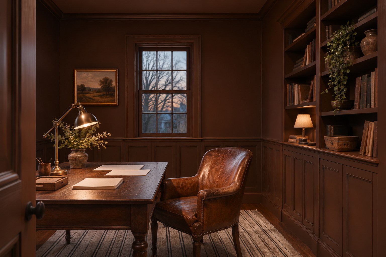
Chocolate brown can suit a study where a leather chair, a wood desk, and a low shaded lamp already set the tone. Keep the walls matte and use the same brown in satin on low paneling or cabinet fronts. The flatter upper wall will look quieter, while the panel edges catch side light. Continue a flat version onto the ceiling if the room has enough light at the desk.
Compare brown samples next to the chair and near the darkest part of the floor. A red-brown can make cognac leather look richer, while a cool brown may read close to charcoal in the shade. Give the desk its own task light and choose a rug with enough lighter yarn to keep the walking area legible.
10. Connect an Entryway With Pale Gray
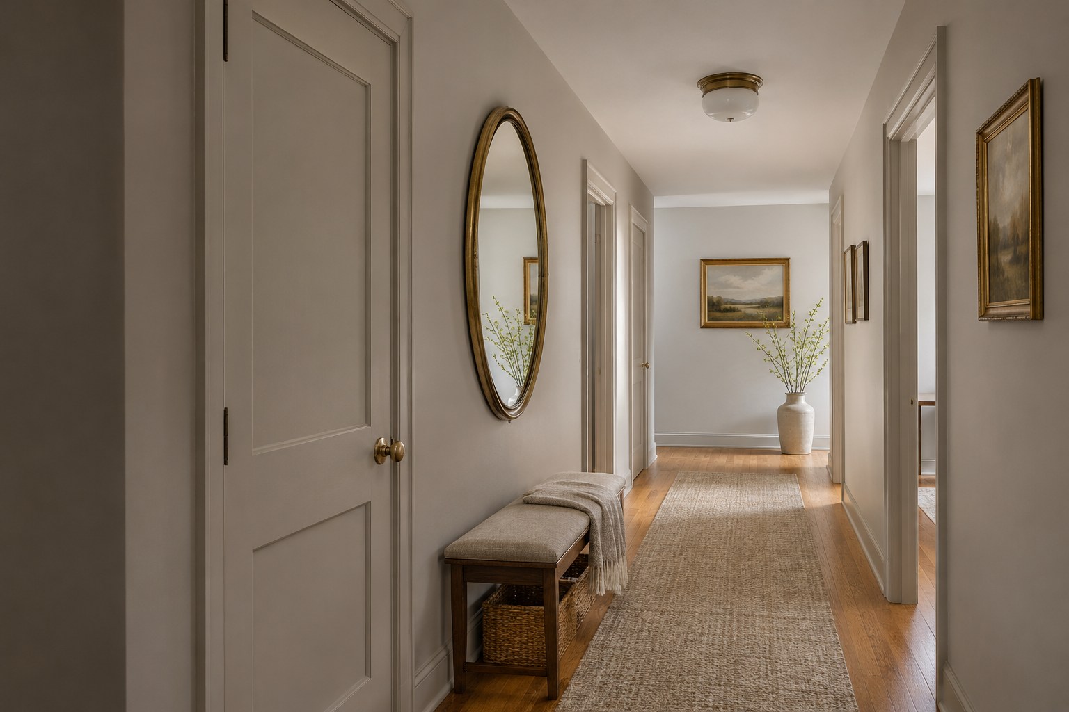
Light warm gray can connect an entry with several doors and a narrow view into the house. Use it on the walls, closet doors, and casings so the first thing you notice is the runner or the light ahead. Continue with the same gray overhead, or choose a pale companion shade if the hall has a low ceiling. A modest sheen on painted doors helps their profiles catch the light.
View two gray samples beside the floor and at the doorway to the next room. Honey oak can bring out cool blue notes in one gray and beige notes in another. A mirror can help you see how the color looks across the hall. For a consistent approach beyond the entry, use these whole-house paint color ideas to compare adjoining rooms.
11. Warm a Guest Bedroom With Burnt Orange
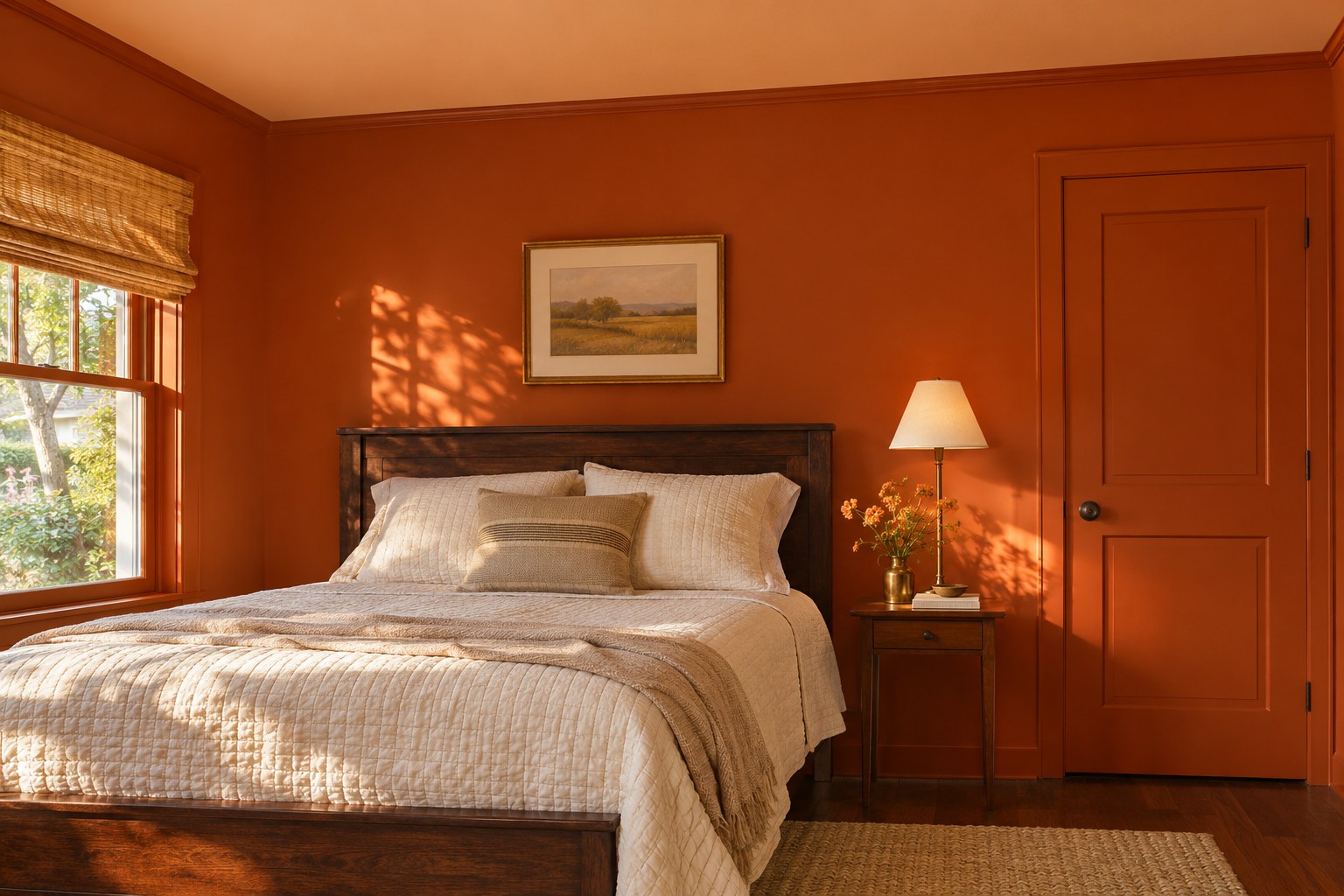
Burnt orange can give a seldom-used guest room a warm point of view. Choose a baked orange with enough brown to sit comfortably beside a dark wood bed. Carry it from the walls onto the door and casing, and try a paler apricot from the same warm family on the ceiling. A cream quilt will show a clean edge against the wall.
Take an orange sample to the bed wall and look at it with the bedside lamp on. If warm light makes it feel vivid, compare a less saturated swatch of the same general hue. A small cotton rug and a straightforward nightstand keep the room easy for guests to use. Save the lightest textile for the bed, where it gives the orange the most breathing room.
12. Take Gray Lavender Through a Bathroom
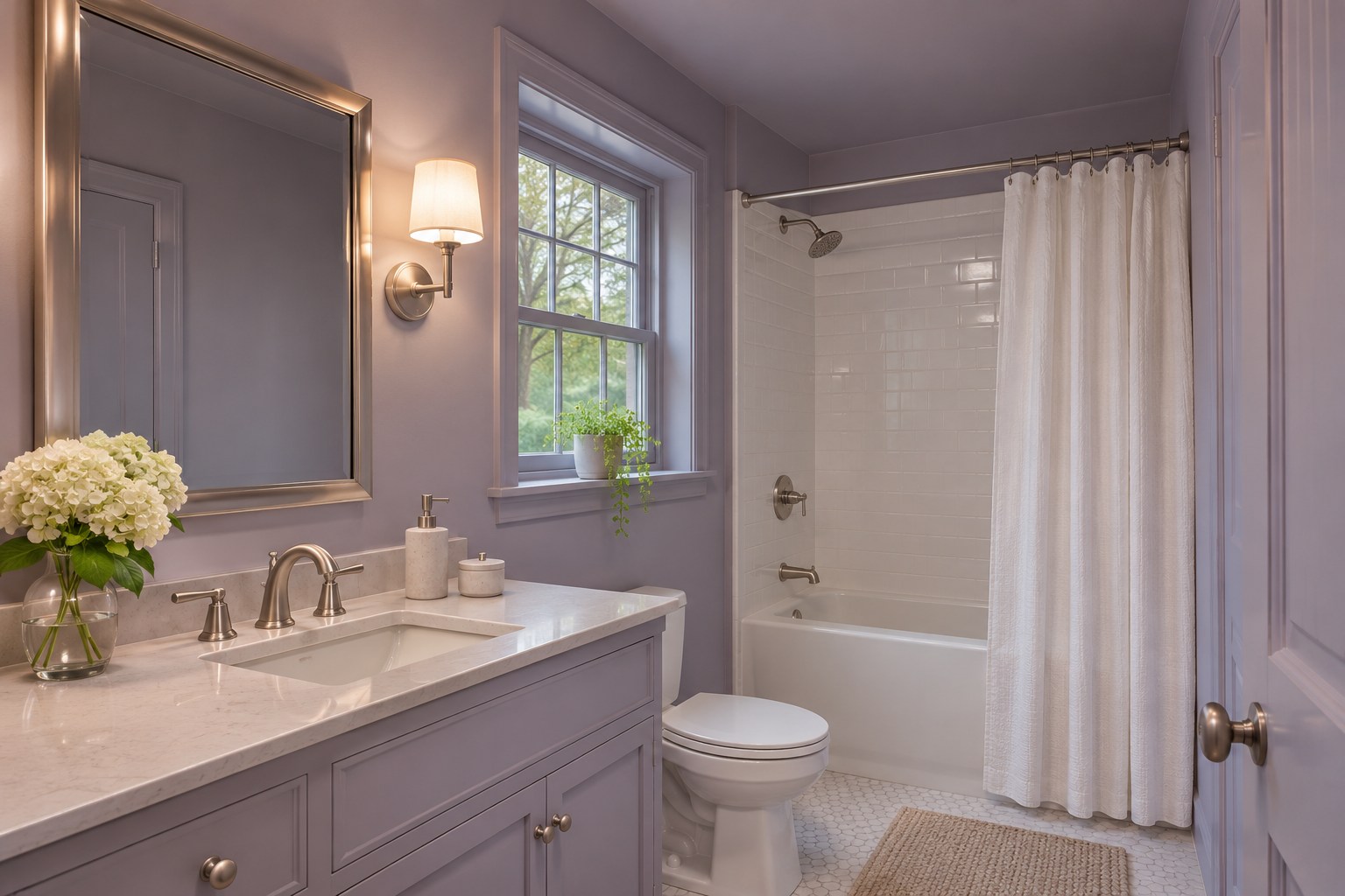
Gray lavender can give a bathroom a restrained touch of color alongside white tile and brushed nickel. Use a paint designed for bathroom conditions on the appropriate walls and ceiling, then pick a suitable cabinet coating in the same lavender for the vanity. Leave the tiled bathing area as its own practical surface and carry the lavender onto the painted window recess for continuity.
Hold a sample directly next to the tile and check it under the vanity fixture as well as in daylight. Gray lavender can look silvery in one view and more purple in another. Compare it against the counter and existing grout before selecting towels. An ivory or crisp white hand towel can help you see which undertone is working with the fixed finishes.
13. Blend Olive Into Mudroom Lockers and Trim
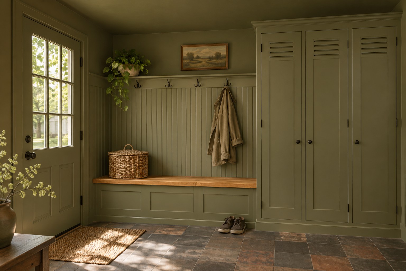
Earthy olive makes sense in a mudroom with a wood bench and practical tile. Repeat it on the walls, beadboard, bench fronts, and locker doors so the many pieces read together. A finish designed for frequently cleaned walls will serve the entry, while a durable trim or cabinet coating can take care of the higher-touch painted fronts. Keep the natural bench seat visible.
Test olive against a section of flooring near the entry, where daylight and dirt are easiest to see. A yellow-green may sit well beside clay and oak, while a gray-green can soften dark slate. Choose hardware that you can distinguish in dim light. A little sheen at the locker edges can give them enough definition without a second color around each door.
14. Calm a Home Gym With Dusty Blue
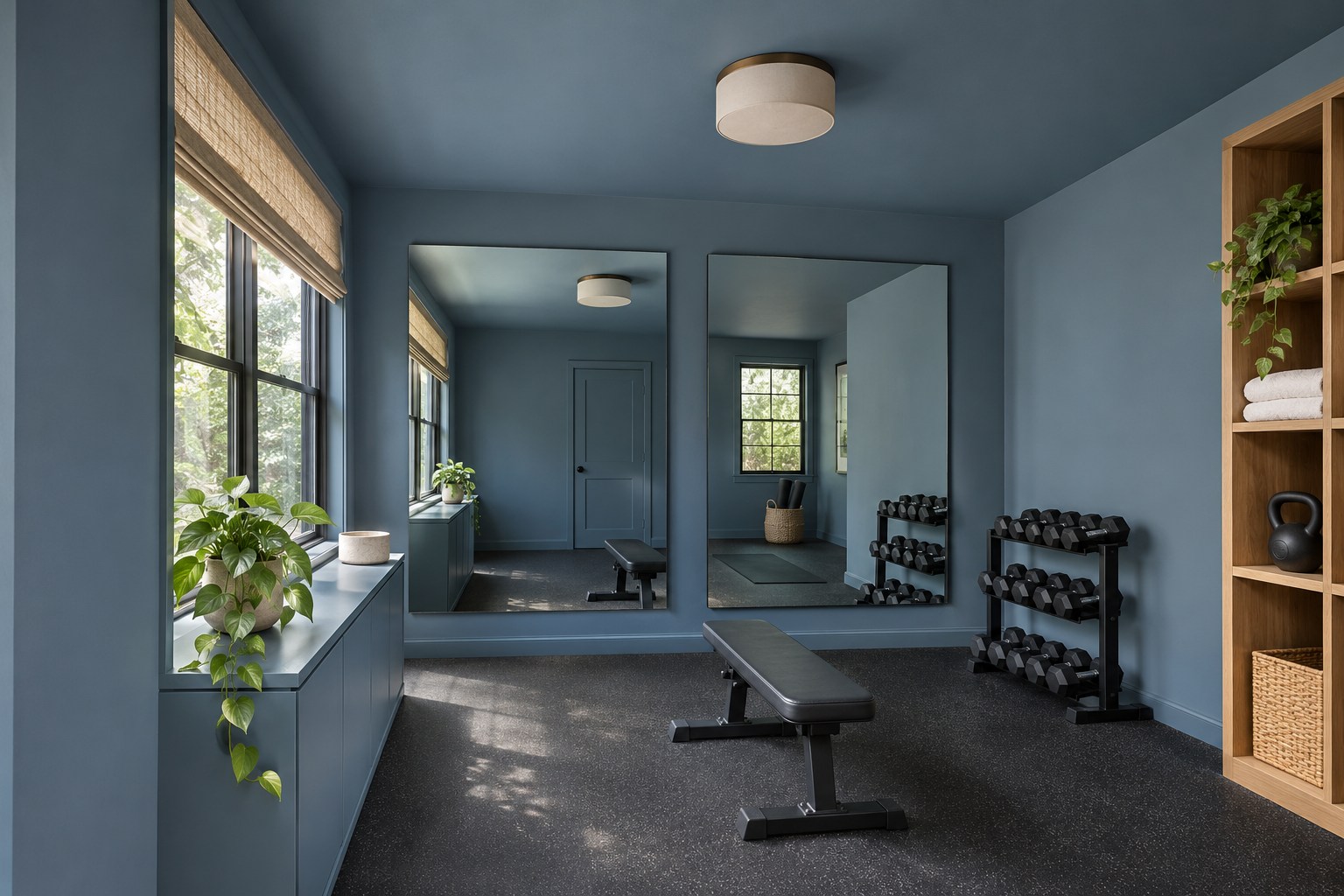
Dusty blue gives a home gym a steady backdrop for dark flooring and equipment. Carry the blue onto the ceiling, baseboards, and a painted cabinet for towels. Leave the rubber floor dark so the room keeps a practical surface underfoot. If the room has a mirror, look for a clear section of blue above or beside it to keep the drench visible.
Check a paint sample from the spot where you usually work out, with the lights in their normal positions. A mirror may double a window reflection or a bright spot from a fixture, making the painted wall appear cooler than it does from the door. A muted blue and a low-sheen wall finish will keep the area feeling calm. Warm wood storage can soften the edges of the equipment zone.
15. Give a Primary Bedroom Depth With Slate Blue
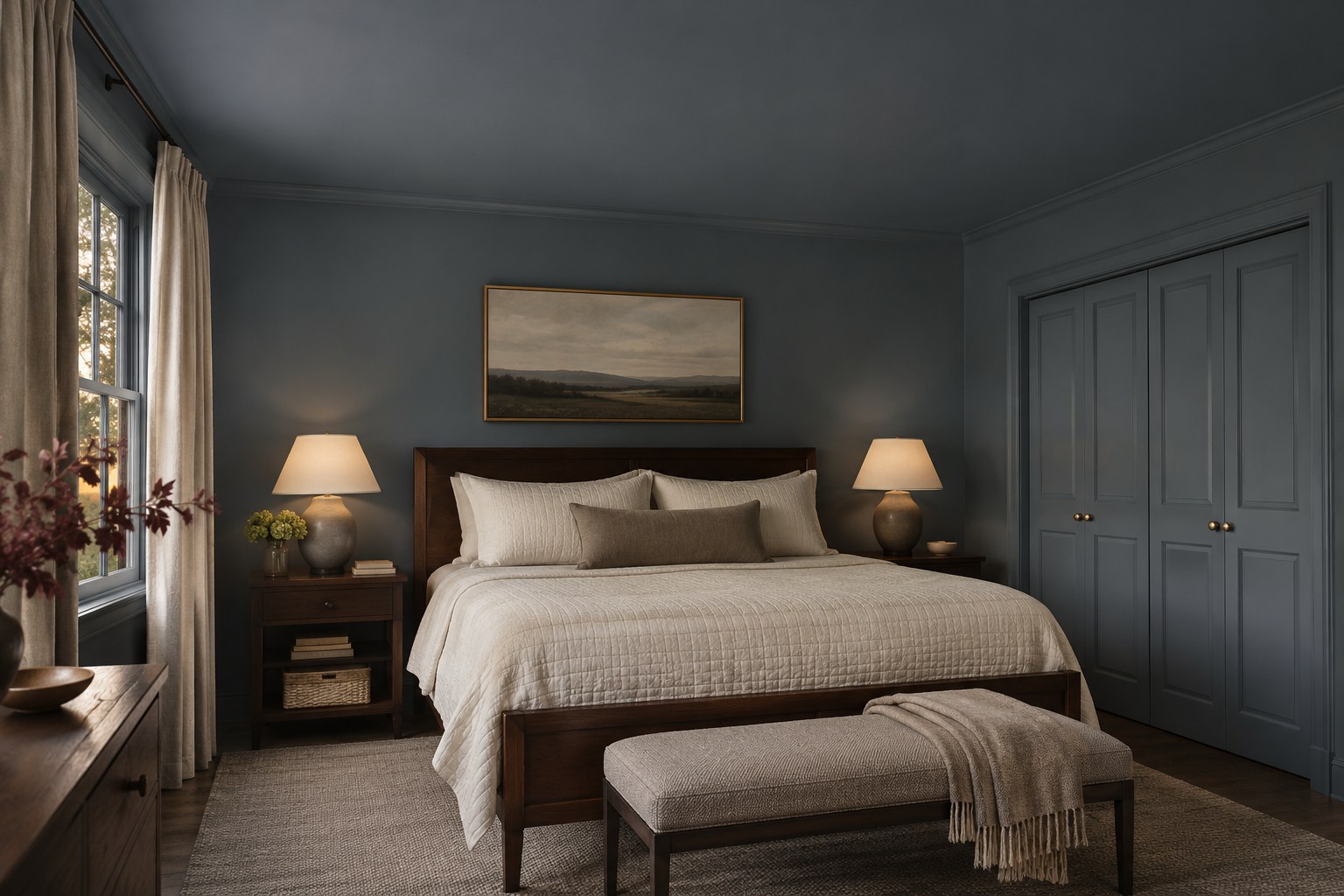
Slate blue-gray can give a primary bedroom the enclosed feeling of a good hotel room. Take the color over the ceiling as well as the walls, and use a satin version on the closet doors and window casing. The sheen change makes the doors easier to read at an angle. Dark walnut and unbleached linen bring some warmth into the blue.
Test a piece of slate blue at the wall behind the bed and another at the ceiling, then walk into the room while your bedside lamps are on. A cooler slate can shift toward violet in low light. If that feels too cool against the linens, try a blue-gray with a softer green note. Let the bedding be your lightest surface so the painted ceiling feels intentional.
16. Keep a Media Room Soft in Warm Taupe
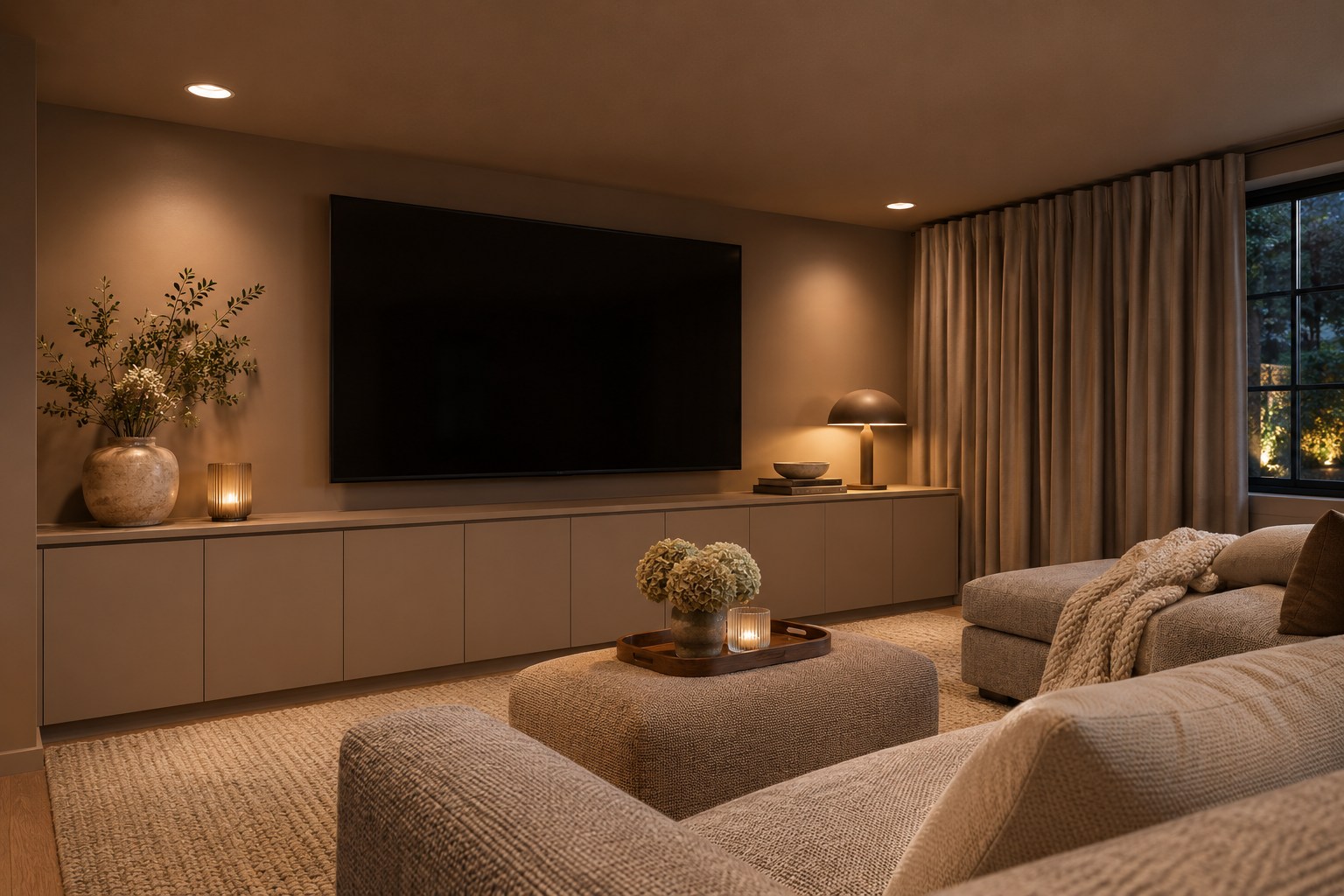
Warm taupe gives a low-ceilinged media room a soft, even background. Use a flat or matte finish on the walls and ceiling near the screen to limit sharp reflections from those surfaces. Paint the low cabinet a similar taupe and choose a shade of curtain in the same family. A woven sofa keeps the room comfortable when the screen is off.
To test the room after dark, put a taupe sample beside the screen and look at it from the center seat. Switch on the lamps you use while watching and check for bright spots in the screen itself. If a lamp reflects directly, reposition it or change the shade. A lower-sheen paint and better light placement solve different parts of the same problem.
17. Use Mint to Link a Sunroom’s Windows and Walls
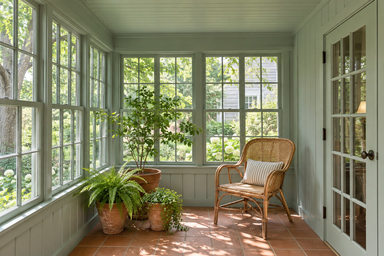
Mint can tie together the many window frames in an enclosed sunroom. Choose a toned-down green with enough gray to stay soft in strong light. Repeat it across the painted wall boards, interior casing, and ceiling. Use a finish designed for the framing material and preserve the operating hardware and seals. Terracotta tile and a cane chair make the pale green feel warmer.
Set a sample near the sunniest window and another low against the floor. A mint that looks gentle in a shaded corner may turn chalky in direct sun. Check it again when the afternoon light reaches the tile, especially if the floor has a strong orange cast. A warm-striped cushion can pick up that floor color and keep the furnishings connected to the painted room.
18. Pull Caramel Through a Home Library
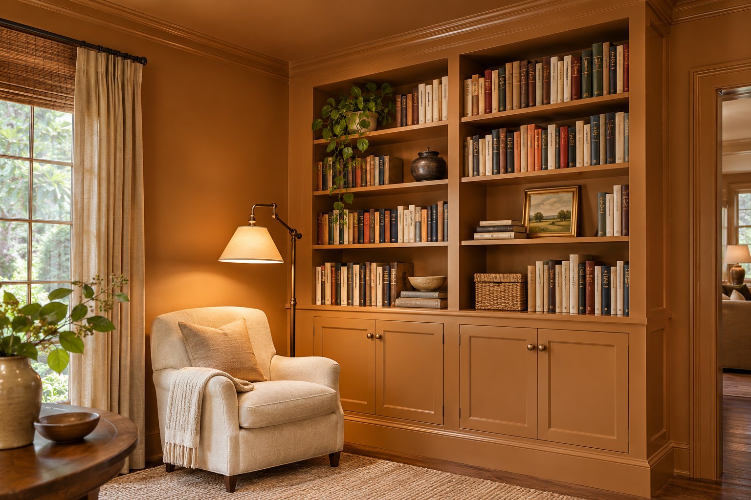
Caramel can turn a home library into a warm place to spend the evening. Paint the walls and ceiling in a muted golden brown, with a satin version on the shelves and trim. Let the book spines and a pale chair create a clear break in the color. Position a shaded reading light beside the chair and leave some blank space at the end of each shelf.
Test caramel behind both pale and dark book covers. Yellow undertones often become stronger when a nearby lamp is on, while a brown base can keep the shelf faces from looking overly golden. A few open spots will show the painted back and help you judge the finish. These living room shelf styling ideas offer ways to balance the books with the space around them.
19. Layer Soft White Through a Bedroom
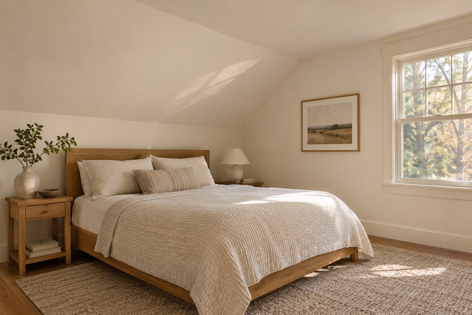
Soft white is a full-room color choice when you repeat its undertone on walls, trim, and ceiling. Choose a warm white that looks settled beside your floor, then compare a matte wall finish with a slightly brighter sheen on the woodwork. A flat finish helps a sloped ceiling feel calm as the light moves across it. Use the same white in the casing to make the slope and window feel connected.
Lay a paint sample against the linen bedding and view both from the doorway. A cool white can turn a warm oak floor noticeably orange, while a very creamy white may read yellow near bright sheets. Let the wool rug, woven duvet, and oak grain supply the room’s texture while the paint holds the envelope together.
Set your paint samples against the finishes that will stay, then decide how far the color should go. Matching the trim is often the simplest way to give the room continuity. Check the ceiling separately, especially if the room has little daylight or a low ceiling. Once the shade holds up in both day and evening light, choose the finish that fits how each surface is used.
Discover more from HomeTrendora
Subscribe to get the latest posts sent to your email.

