A shallow shelf can make your Christmas village look crowded before you turn on a single house. These 18 ideas help you choose a backdrop that fits behind the houses and gives the lit windows room to stand out.
Start with the deepest house, then include any plug, mount, or backing in your measurement. Test a small sample from the place you usually look at the village, with the windows lit and the room at its regular evening brightness. Follow the lighting manufacturer’s instructions and keep decorative materials away from flames and heat, including a working fireplace.
1. Set Ivory Houses Against a Matte Midnight-Blue Sky
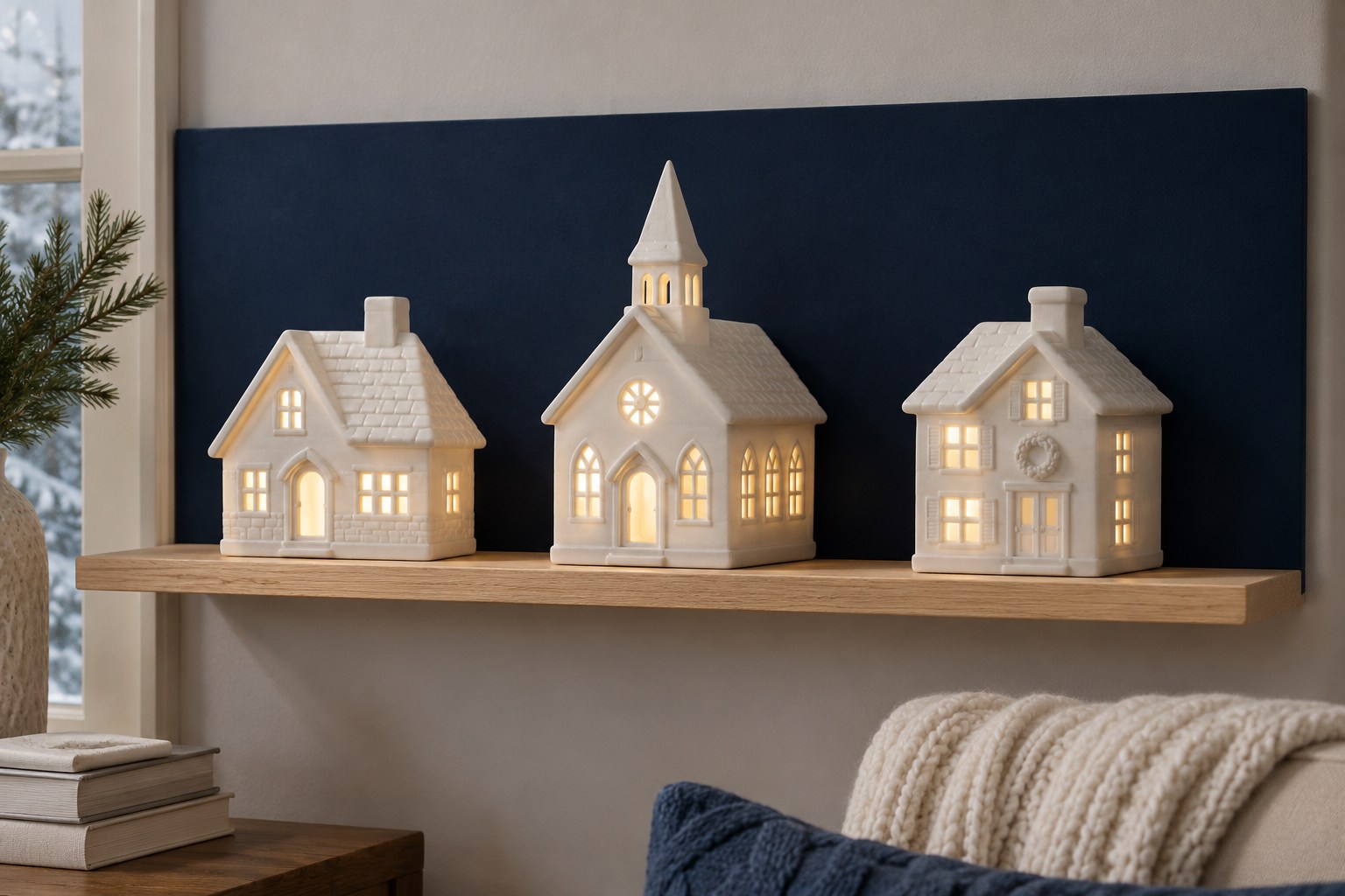
Midnight blue gives ivory roofs and glowing windows a crisp outline, even when the shelf has room for only a single row of houses. Start with a sample of matte blue card and stand it behind your lightest building. Switch on the house at the time you usually display it. Look at the roof as well as the windows. A shade a little lighter than midnight blue can help if the back corner already gets very little room light.
Measure the house from its front edge to the deepest part of its base, including any rear connector that needs space. Add the backing and its support to that depth before cutting a full-width piece. With the panel installed, leave a strip of bare shelf in front of the buildings.
2. Use Warm White to Separate Colorful Roofs
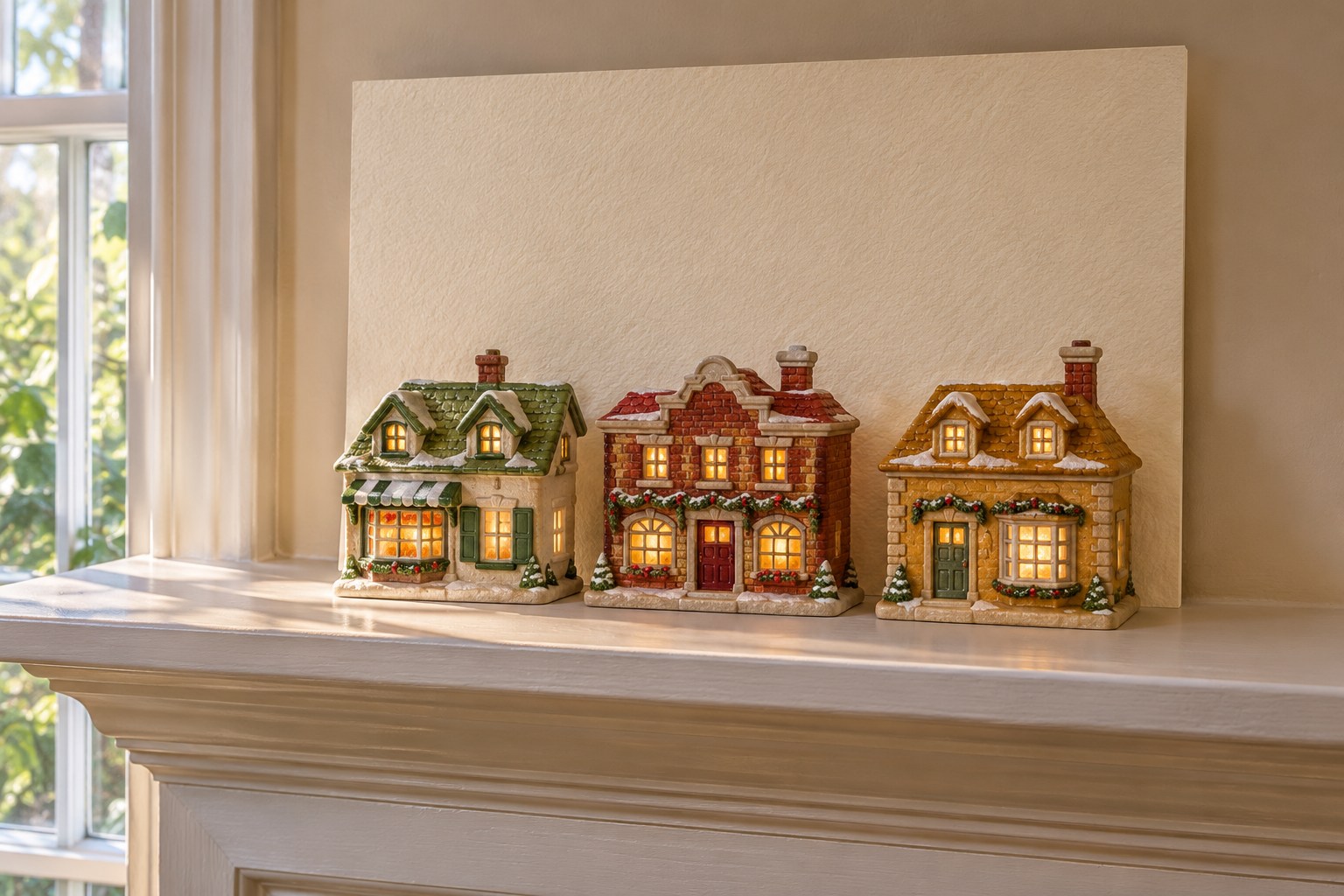
Warm white can pick out red chimneys, green roofs, and ochre window trim on a mixed collection. Set two pieces of paper behind one house, one cream and one closer to clean white. Turn on its window lights and see which background lets you distinguish the trim from across the room. Cream suits many older painted facades. A quieter off-white can also tie together houses that have different paint finishes.
Choose a rigid matte sheet or a paper covering fixed flat to one. Trim it to fit the back of the shelf and try the largest house in front before fitting the others. For more ways to arrange mixed pieces by location, see Christmas village display ideas for mantels, shelves, and tables.
3. Print a Soft Pine Line Behind the Roofs
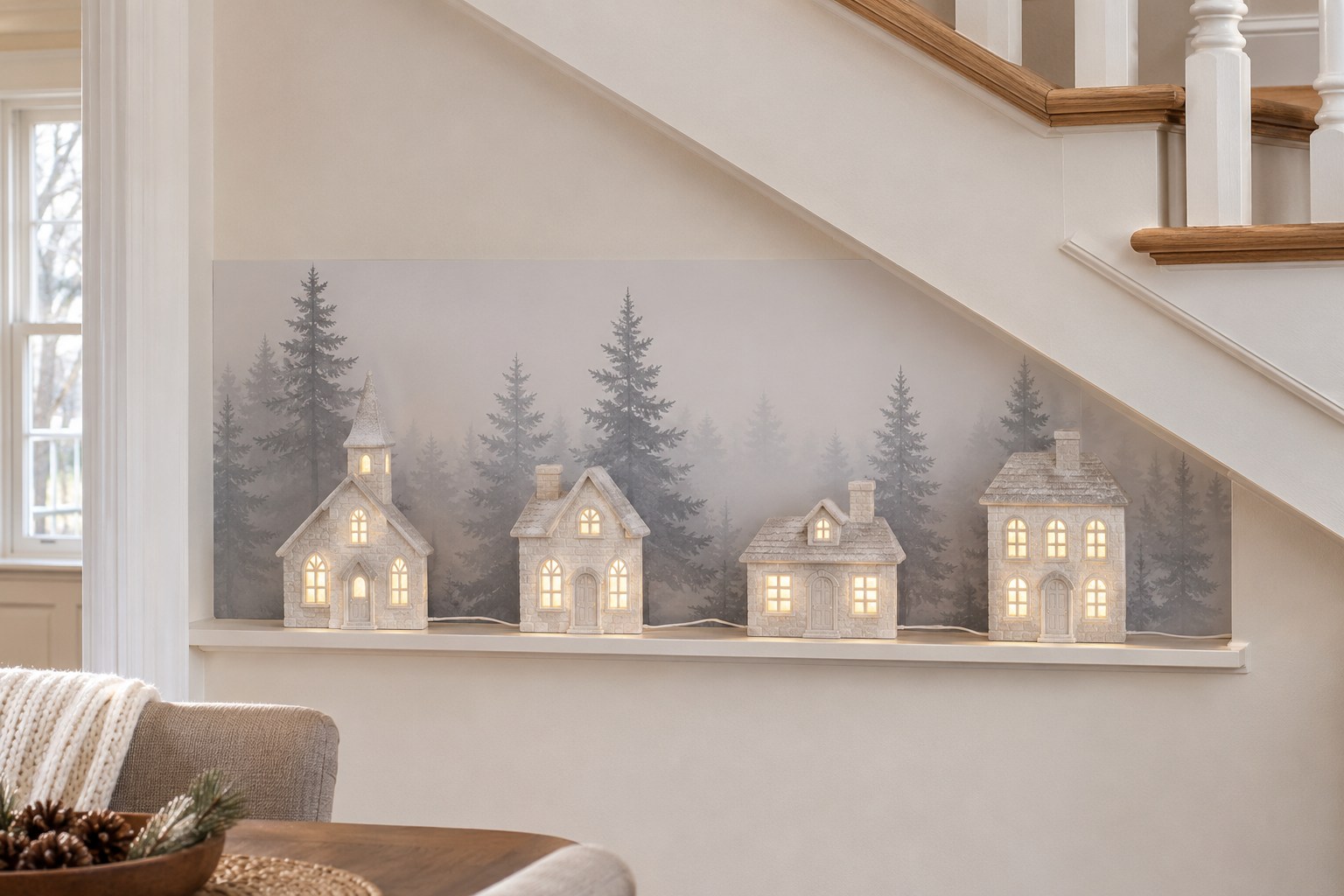
A low row of printed gray pines suggests a forest beyond the village. Look for a print with pale gaps between the trees and enough open sky for the roofs. Lay a paper sample behind two of your houses and move one of them sideways. A gap that reveals just one or two tree shapes reads as a view between buildings. Compare the effect with the houses lit and the room at its usual evening brightness.
Keep the woodland image on one thin sheet and mount it flat to a firm backing. If the trees read as broad dark stripes behind the facades, try a smaller crop or a lighter print. Keep the lowest tree line visible through at least one gap so the design feels continuous.
4. Turn a Birch Print Upright Behind the Village
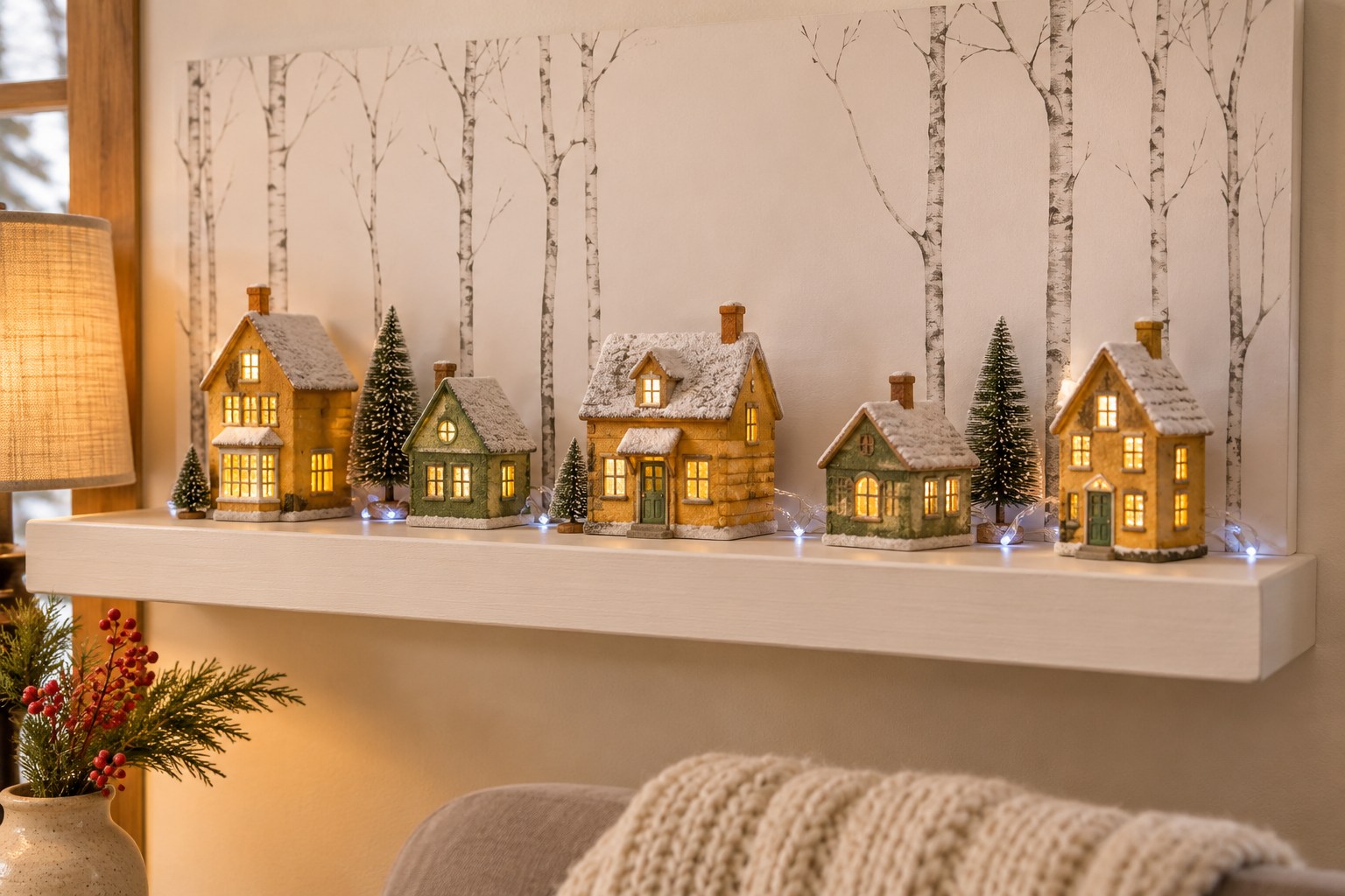
An upright birch print gives low cottages a taller background without adding a second row of trees to the shelf. Choose fine gray trunks on a soft off-white ground. Hold up a sample behind the village and move the cottages until the closest trunk falls in a gap. A little separation between the printed trunks and the edges of roof peaks helps both shapes read clearly.
A single printed sheet works well in a bookcase with a shallow back recess. Mount the paper flat on a slender board and check the combined depth against your largest cottage. Try a view from one end of the shelf as well as from straight ahead. Keep the print high enough to show branches or open sky above the roofs.
5. Use a Cut-Paper Skyline to Extend a Town
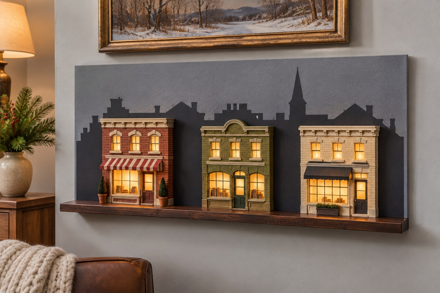
A cut-paper skyline can make three little storefronts feel like part of a longer street. Draw simple roof peaks on charcoal paper, cut the shapes, and attach them flat to a slate-gray backing board. Let one paper roof rise between two actual shops and another show beyond the end of the village. Switch on the houses and adjust them until the silhouette reads clearly from across the room.
Use an offcut to test whether the paper edge stays flat once attached. A flat seam gives you more placement options on a short shelf because the houses can sit close to the backing. Keep any added mounting thickness in the depth measurement. The lit shop windows will stand out most when the paper buildings have simple, quiet outlines.
For a similar skyline, cut the individual roof shapes from Astrobrights Eclipse Black cardstock.
See the black cardstock on Amazon (paid link)
Try one shape against the slate-gray backing to see how much contrast it has with the houses lit.
6. Bounce Window Light Off a Satin Champagne Panel
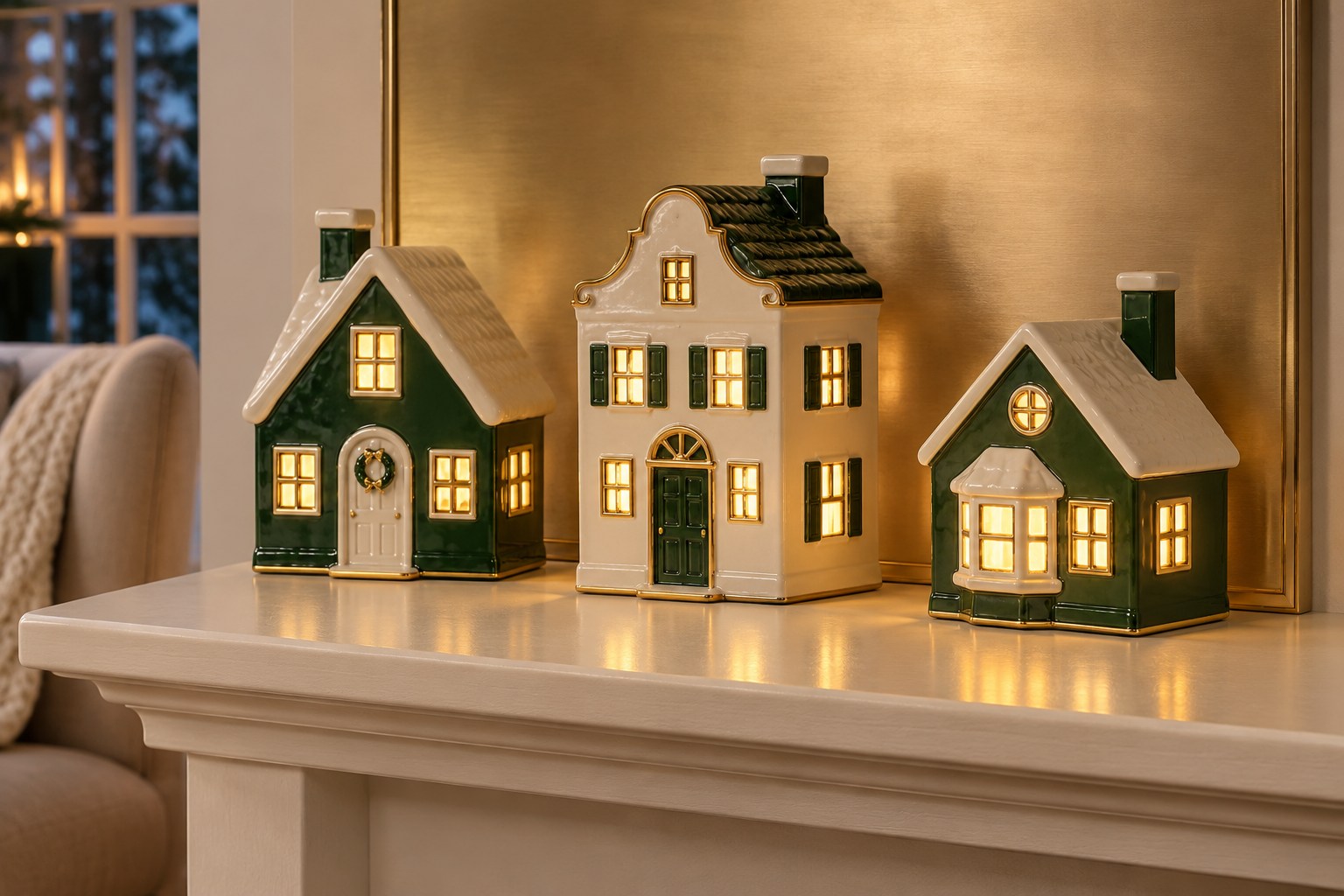
A satin champagne backing picks up the warmth of lit village windows and carries a little light into the space between houses. Place a small sample behind one building, then look at it from the main seat. If you see a bright patch from a lamp or a window, shift the angle of the test piece or choose a softer satin finish. A subtle reflection works especially well behind simple green and cream porcelain houses.
Fix the paper or foil finish flat to a slim rigid panel with a suitable adhesive and finish the edges before fitting it. Leave all bases completely on the shelf. You can repeat the soft metallic tone in a Christmas coffee table arrangement with room left for mugs.
7. Reflect a Few Windows in a Narrow Mirror Panel
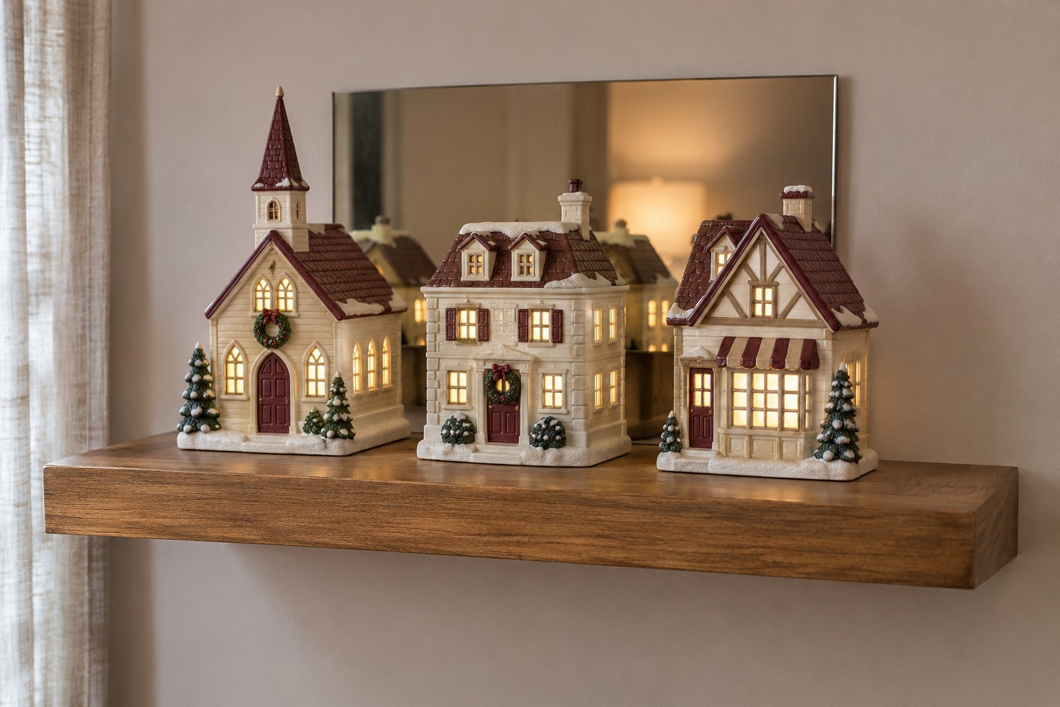
A narrow mirror can catch a few lit windows behind the front row and make the display feel deeper. Test one small panel before backing the whole shelf. The best position is usually a place where you can see a second line of warm dots without seeing a lamp bulb or a busy room reflected behind the roofs. Try the view from your regular seat and from the doorway.
Choose a lightweight mirror panel with mounting instructions for your surface, and count its mount in the available depth. Secure the panel as directed so it stays stable behind the houses. Slide one building slightly forward within its safe shelf footprint to change which windows appear in the reflection. Leave enough space to lift each house without brushing the panel.
8. Bring a Red Gingham Panel Behind Plain Houses
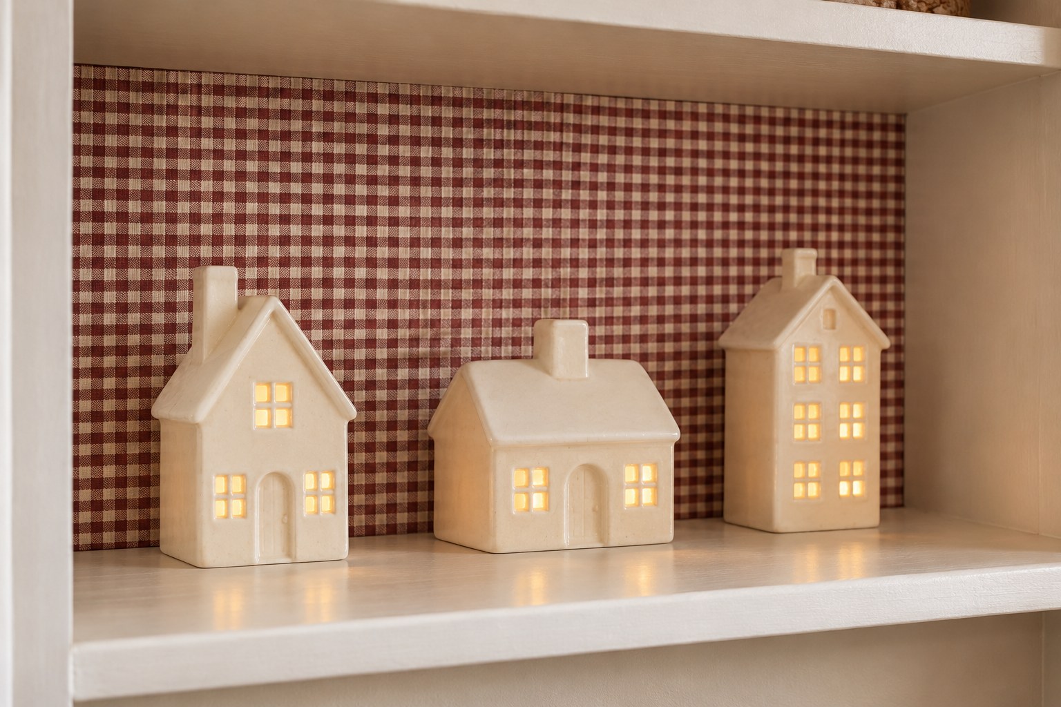
Small red gingham is a good backdrop for plain cream houses with simple roof shapes. Hold a sample behind your smallest piece first. A close, muted check gives you texture between the buildings and lets the window light stay legible after dark. Set the busiest part of the pattern above the roofline and look at the houses from several feet back. The village still needs a clear outline at that distance.
Wrap one thin, stiff panel with the fabric and secure it flat to the rear. Check the extra thickness where the fabric folds around the corners before fitting it behind your houses. Use the house maker’s lighting and clearance guidance and place the panel away from fireplace heat. A fully supported row of two or three buildings can carry the pattern.
9. Add a Kraft-Paper Street Behind Gingerbread Houses
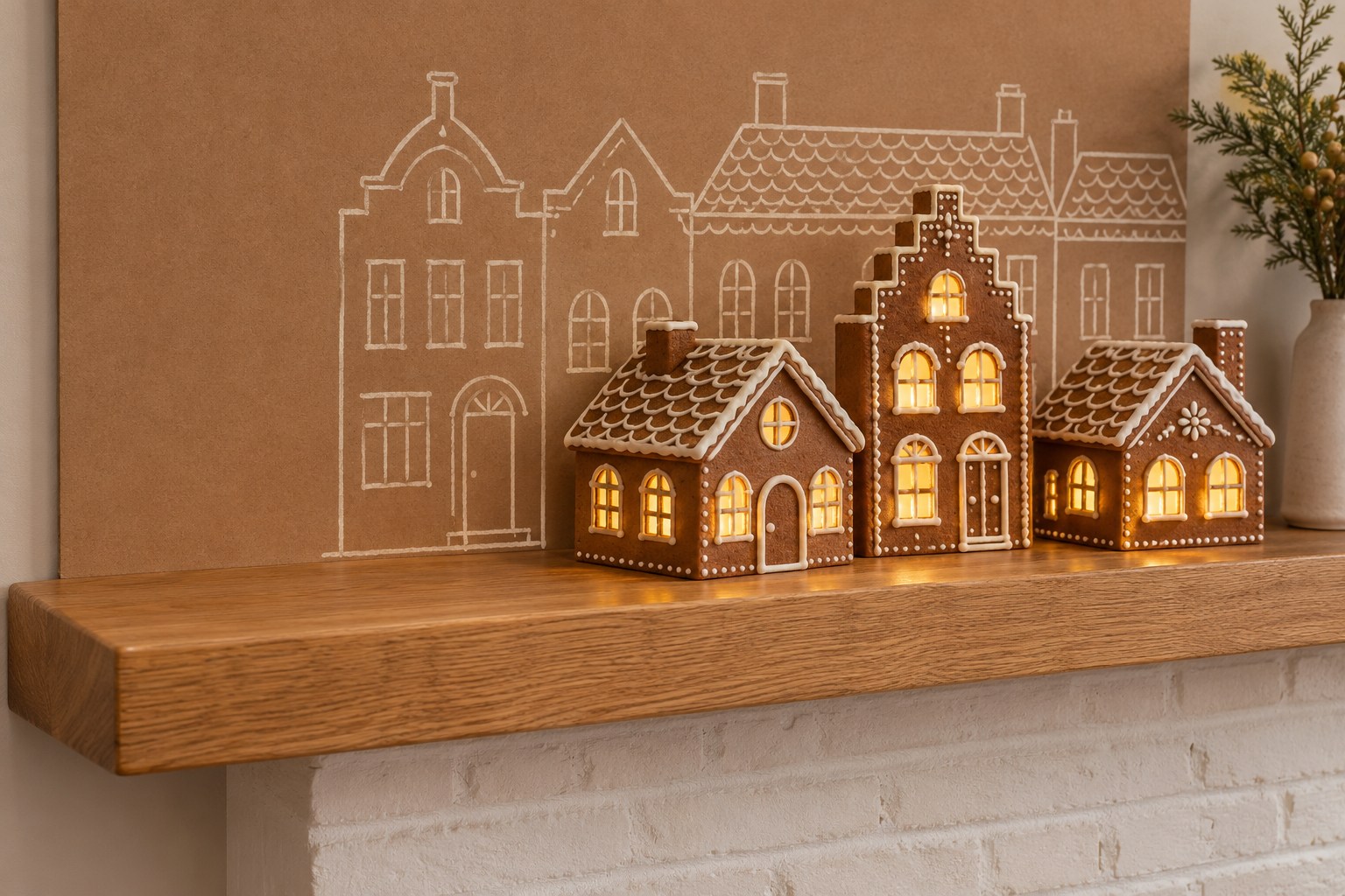
An off-white streetscape drawn on kraft-colored paper echoes the warm brown of gingerbread-style houses. Sketch a few low roof peaks in pencil and use a matte light-colored marker to finish just the outlines. Leave an opening where the tallest house sits. Between two lower pieces, draw a small front door or a roofline just high enough to be seen when the houses are lit.
Make a short test strip before you draw across the whole backing. Warm room lighting can make the cream lines blend into the brown, so check the sample in place during the evening. Mount the drawing flat on a thin, stable panel. Keep enough room at the front for every house base and for the grip you need when lifting one out.
10. Let a Soft Olive Shelf Back Do the Work
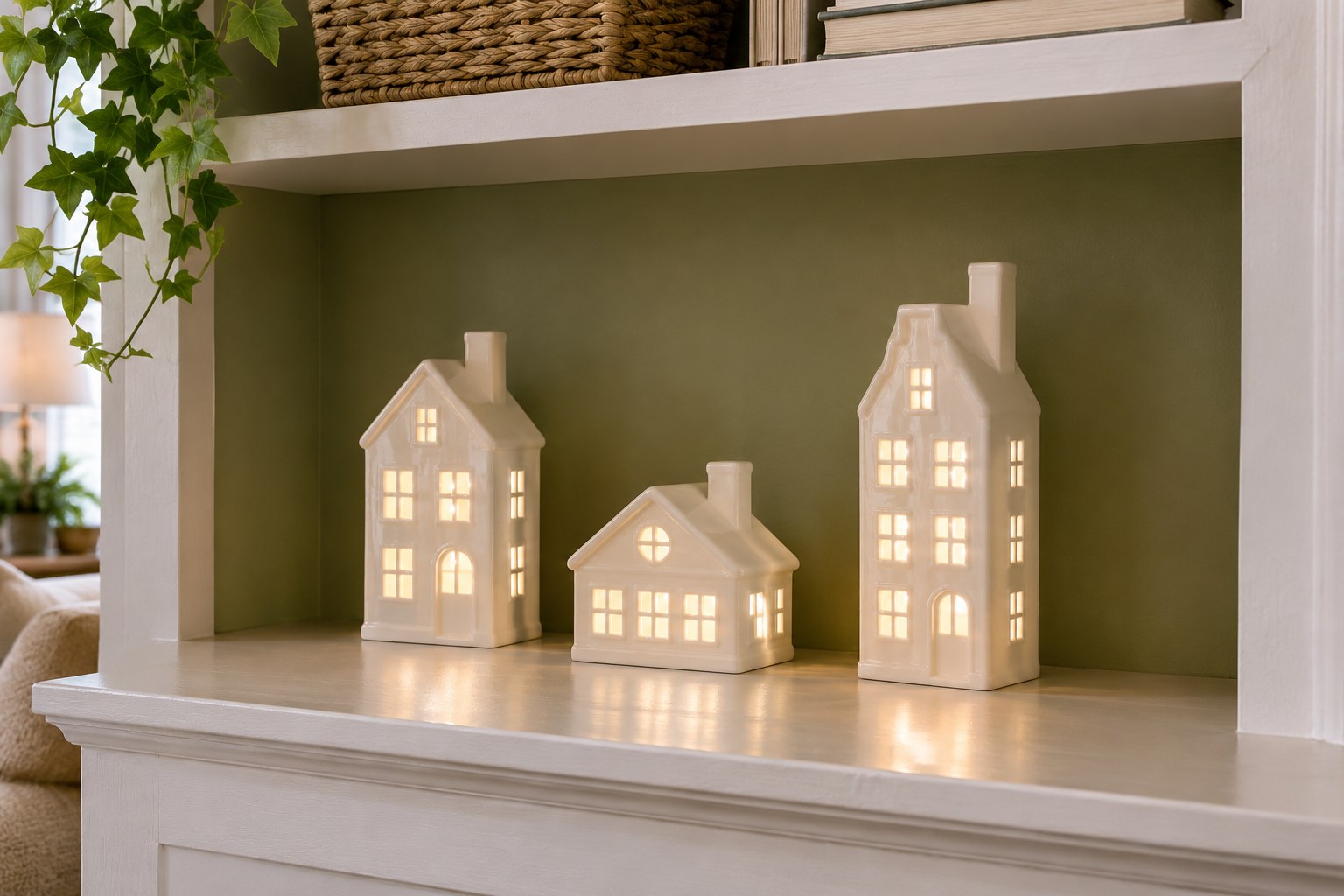
If the shelf already has a muted olive back, set a small row of white glazed houses against it and see how the windows read before adding a board. Olive puts some color behind the houses without using extra depth. Leave a visible band of green between them and keep tall chimneys apart. A small gap near the edge of the bay can make the whole row feel more deliberate.
For a bare wood or pale shelf, try a removable olive insert cut to fit the recess and secured appropriately to the shelf surface. Compare the olive at night and in daylight before committing. If the bay still needs to hold everyday things, see these Christmas shelf styling ideas for everyday bookcases.
11. Blend a Mauve-to-Cream Dusk Sky
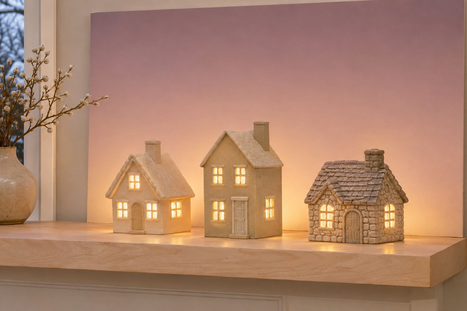
A pale mauve sky that fades to cream can make golden windows feel warmer in a neutral room. Keep the lightest part of the gradient near the roofline and let the deeper shade gather toward the top. Stand the tallest house in front of the sample and look at its upper edge. A stronger tint above the roof can help the pale building stand out when the room is bright.
Print the gradient on one piece of matte paper and fit it to a slim backing board. Test it in evening light before trimming the final edges. Overlap the lower edge visually with the houses so the fade looks continuous. Leave room to take each house off the shelf and reach any manufacturer-provided light switches or connectors.
12. Stipple a Few Stars Across a Blue Panel
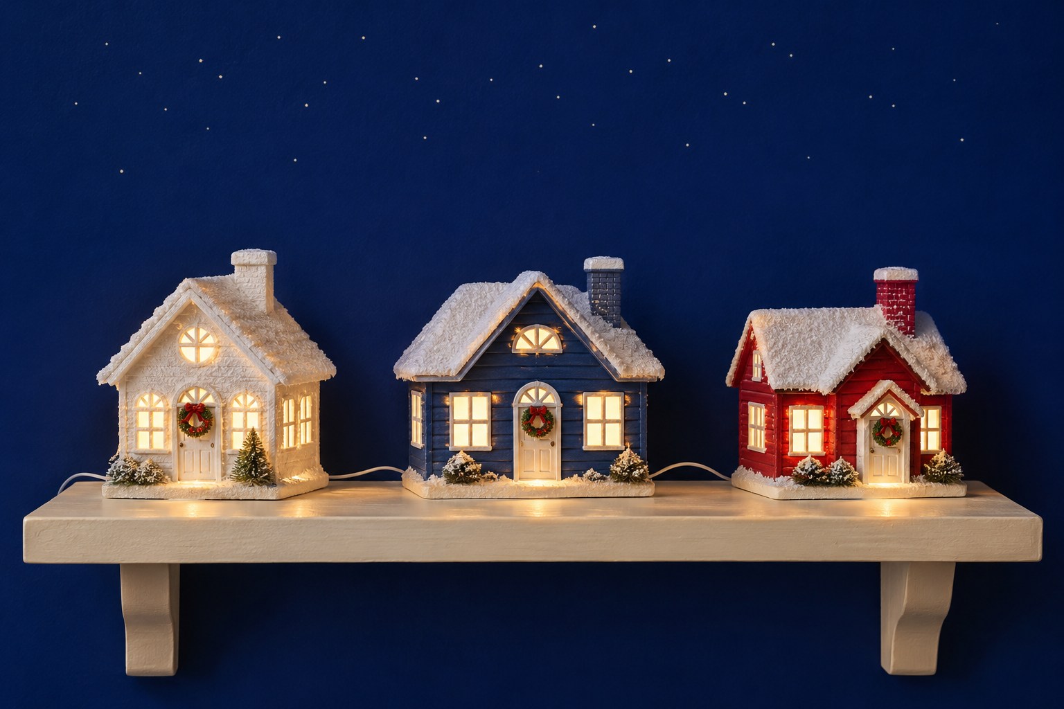
A few ivory dots on matte cobalt give a shallow village a night sky with very little visual clutter. Place two or three sample dots high on a piece of blue card and sit back from the shelf with the windows lit. Keep the marks small enough that the windows are brighter than the stars. A slightly uneven spacing can feel more like a sky than a row of evenly spaced dots.
Use one slim panel behind the houses and leave most of its lower half blue. That clear band will help the roofs and chimneys keep their outlines. Test the panel with the room lamps on and again at your usual evening setting. If the dots pull attention away from the windows, use fewer or keep them farther above the tallest chimney.
13. Frame the Houses With a Flat Evergreen Print
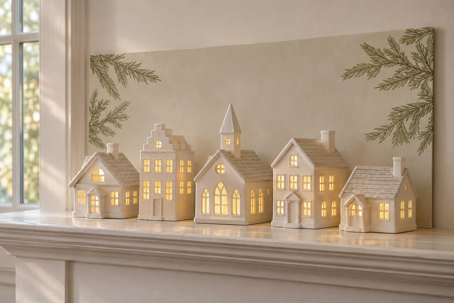
A flat evergreen print can frame a village even when real branches would take up too much shelf space. Put the branches at the outer edges of the panel and leave the center quiet so the lights and roofs show. A pale sage print with a cream middle works well with unpainted wood, bone-colored ceramic, or a small group of white houses.
Start with a panel that extends a little beyond the outer buildings, then measure the shelf before choosing its final width. A cropped branch can continue visually beyond the edge and keep the frame from looking too formal. Look at the scene from the doorway and from your seat. If a printed branch interrupts the outline of a chimney, move the house a little inward while keeping its base fully supported.
14. Catch Side Light With Thin Vertical Ridges
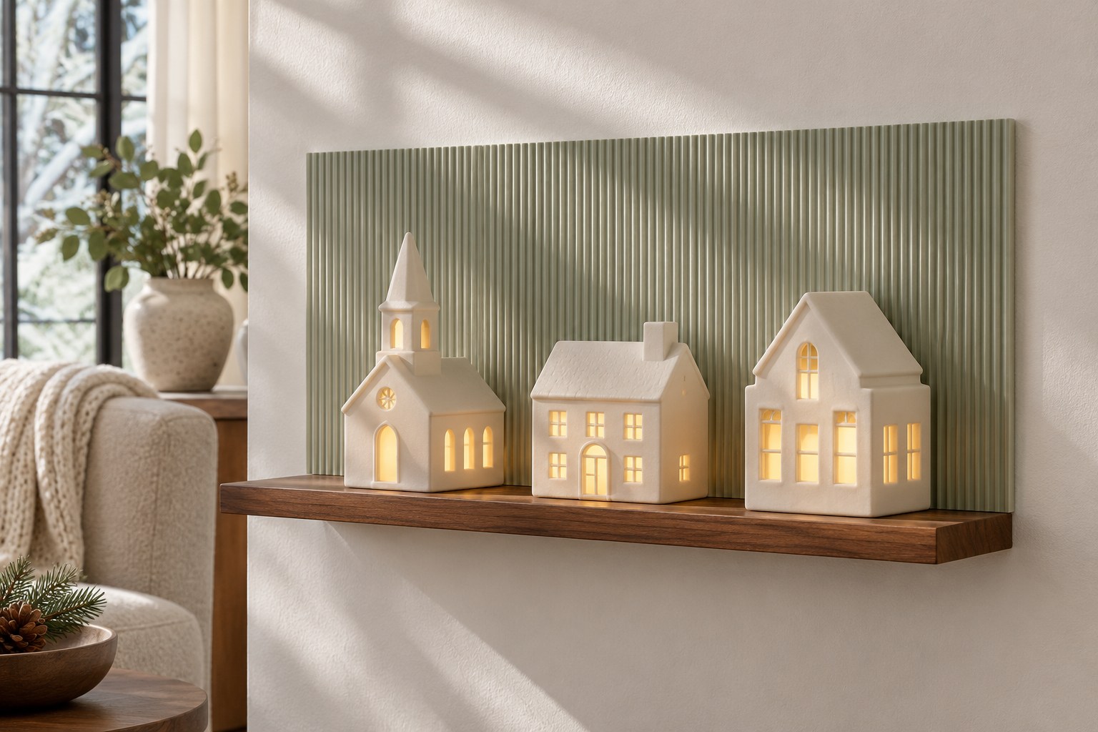
A very shallow ribbed backing catches side light and creates thin shadows behind smooth ceramic houses. Try a pale gray-green card with small ridges and turn the sample until the lines run upright. A nearby window or lamp can reveal the texture during the day, while the warm village windows draw the eye after dark. The effect is clearest behind houses with quiet surfaces and simple rooflines.
Measure the thickest part of the backing, including the ridges and its mounting method, before you cut the board. Check the depth with your largest house in place and keep its full base within the shelf. Compare a view from the end of the ledge with one from straight ahead. Small shadows in the panel should remain visible between the houses.
15. Run Pale Wood Grain Along a Long Mantel
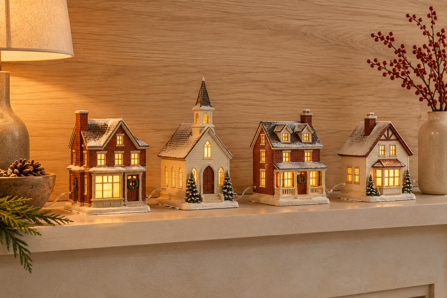
Horizontal pale wood grain can make a short row of buildings look connected across a long mantel. Test a quiet oak pattern behind one brick-red house and one cream house. Fine grain gives both colors an even field, and a long continuous line can link houses spaced farther apart. Leave some of the wood visible above the roofs and at either end.
Use a thin veneer-look sheet on a stable board, or select a flat insert with that finish already applied. Fit it along the back and check the thickness at any seams. Leave enough room for the widest house to stand completely on the shelf. Evening light brings out warmer notes in the grain, so compare the sample with the houses lit before choosing a finish.
16. Let a Printed Snow Path Lead Between Houses
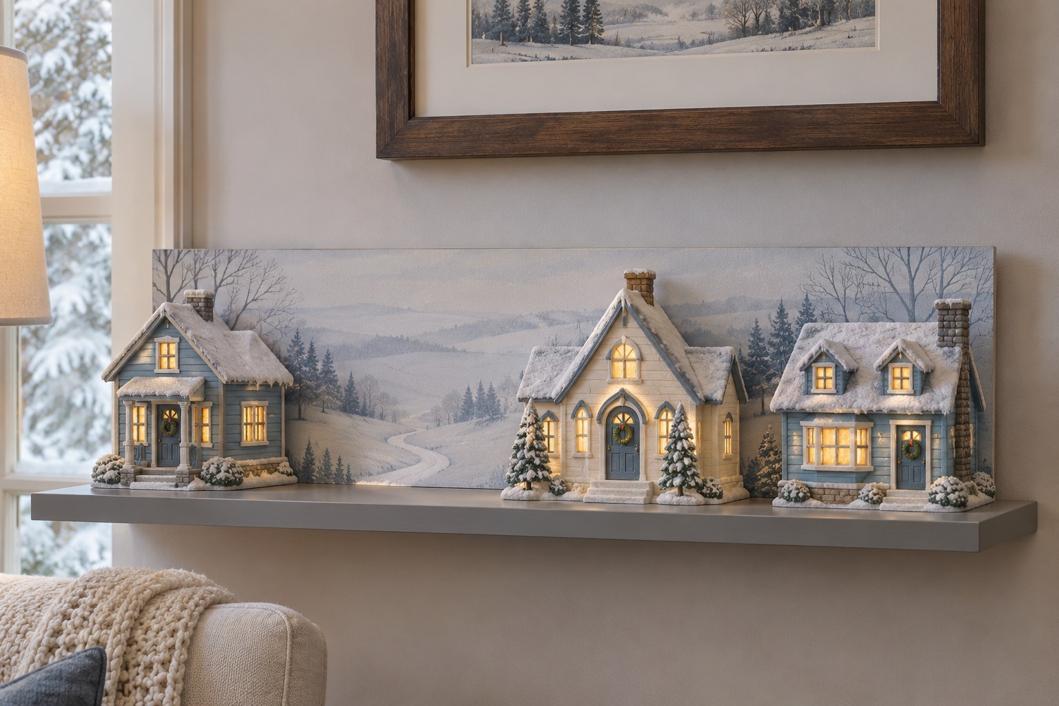
A printed snow path creates a sense of distance between two houses on a ledge that has very little actual depth. Pick a simple scene with a path that narrows as it curves toward a pale horizon. Fit the print behind the village and align the wide end with a gap between two low buildings. The path should be visible from the seat you use most often.
Test the alignment with one house removed, then put it back and shift it a little at a time. A small move can reveal the path without widening the whole arrangement. Print on a matte sheet so room light stays even across the image. Keep all bases fully supported and let the painted foreground supply the impression of open snow.
17. Hang a Quiet Delft-Blue Pattern Behind White Houses
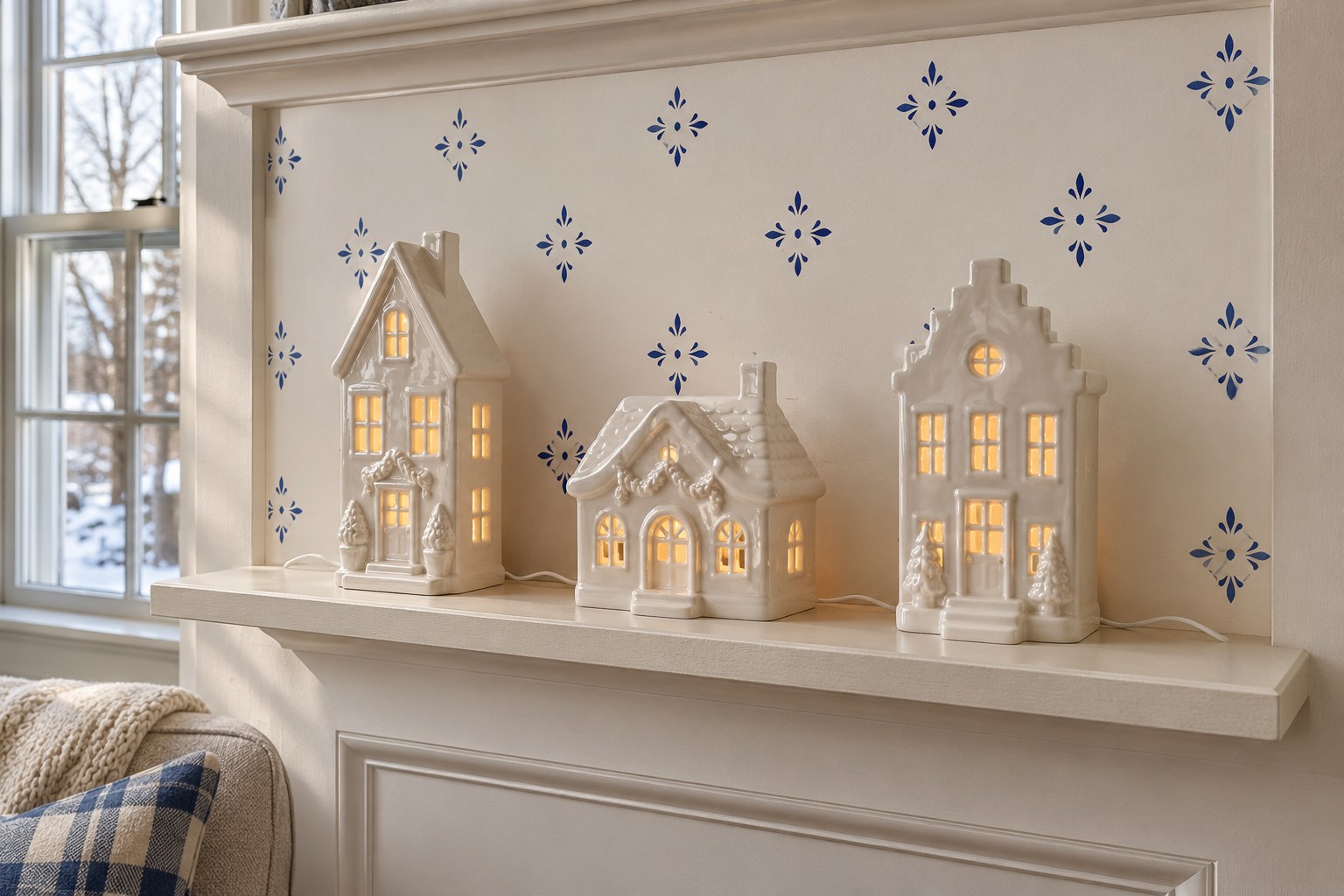
A soft Delft-blue motif gives white glazed houses a patterned background with a little color. Try a sparse diamond or leaf print on off-white paper. Set a low house against a sample and look for a light area behind each lit window. If a dark mark crosses a chimney or door line visually, slide the sample sideways until the outlines are easy to follow.
Use a tile-inspired print on a thin, flat board so you can fit it to a shallow shelf. Position the panel so its largest motif shows above or between houses. Check it after dark with the village lights on and the room set the way you usually use it. A matte finish makes it easier to distinguish the pattern from the shine of glazed ceramic.
18. Give Adjacent Shelf Bays Two Coordinated Backdrops
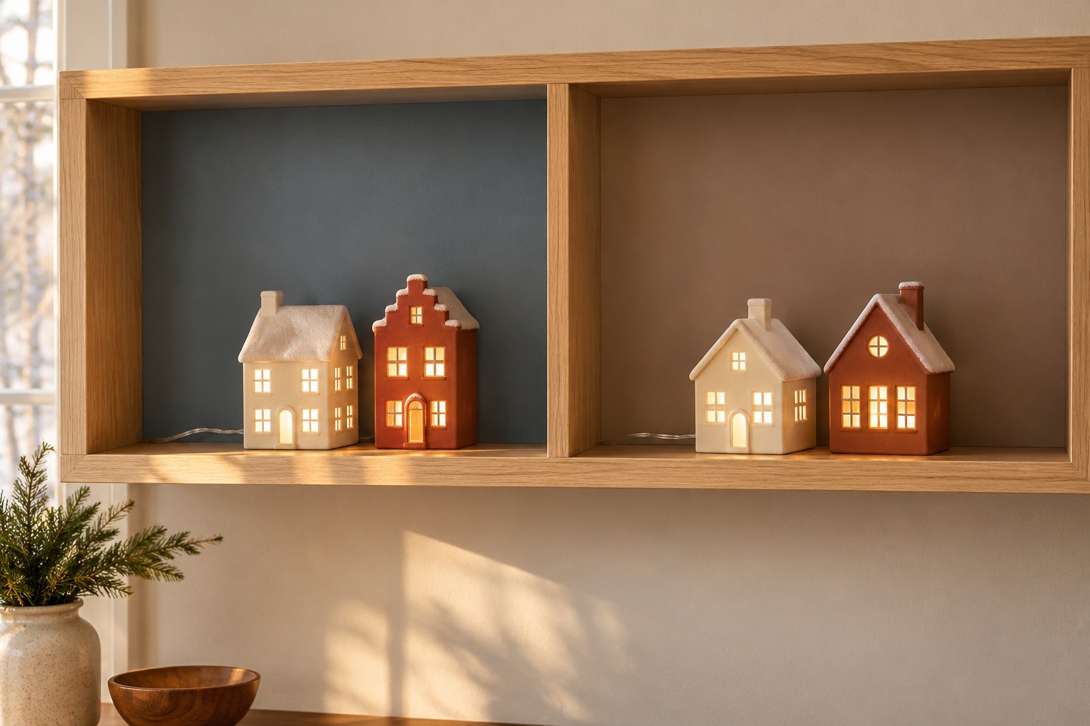
Two adjacent bays can carry one village with a different backdrop in each. Use muted slate blue behind ivory houses and warm taupe behind clay-red or cream buildings. Repeat the same warmth of window light across both bays so the two sides feel connected. In each bay, set the tallest roof toward the outer end to leave the center divider with a little breathing room.
Measure the bays separately before cutting the panels. Shelves with the same width can still have different depths once you account for the largest house in each. Fit each insert and look at both scenes together from the doorway. If one bay reads darker, make a small change to the panel color or use fewer houses so more of its background shows.
Set two backdrop samples behind the same lit house and compare the roof outline, window glow, and bare shelf space. Once a finish works with the house you already own, cut the panel to the shelf, fit the rest of the row, and check that every base is supported. A single good gap between two houses can reveal enough of the background to give the whole scene depth.
Discover more from HomeTrendora
Subscribe to get the latest posts sent to your email.