Quick-Pick Table
| Idea # | Name | Layout | Effort | Cost |
|---|---|---|---|---|
| 1 | Symmetrical Four-Frame Grid | 2×2 grid | Easy | $ |
| 2 | Salon-Style Floor-to-Ceiling | Full wall | Moderate | $$$ |
| 3 | Large Anchor with Satellites | Anchor-led | Easy | $$ |
| 4 | Triptych as a Vertical Stack | Vertical trio | Easy | $$ |
| 5 | Diptych Pair Above the Sofa | Pair | Easy | $$ |
| 6 | Matching-Frame Grid | Strict grid | Easy | $ |
| 7 | One Long Gallery Band | Single row | Easy | $ |
| 8 | Picture Ledge Layers | Ledges | Easy | $$ |
| 9 | Clock-or-Mirror Centerpiece | Centerpiece | Easy | $$ |
| 10 | Staircase-Slope Stagger | Stepped | Moderate | $$ |
| 11 | Mixed Vintage Frames and Plates | Salon mix | Moderate | $ |
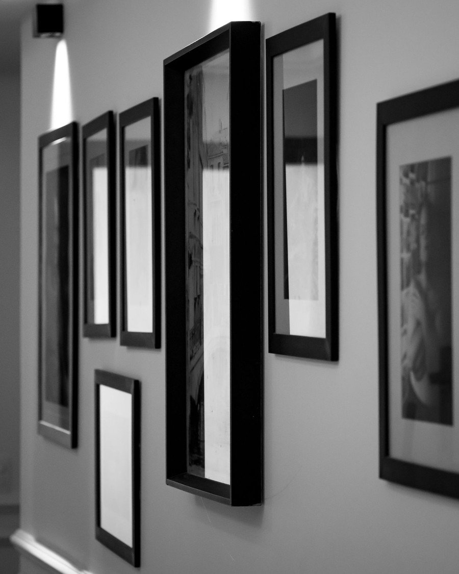
| 12 | Black-and-White Statement Wall | Tall frames | Easy | $$ |
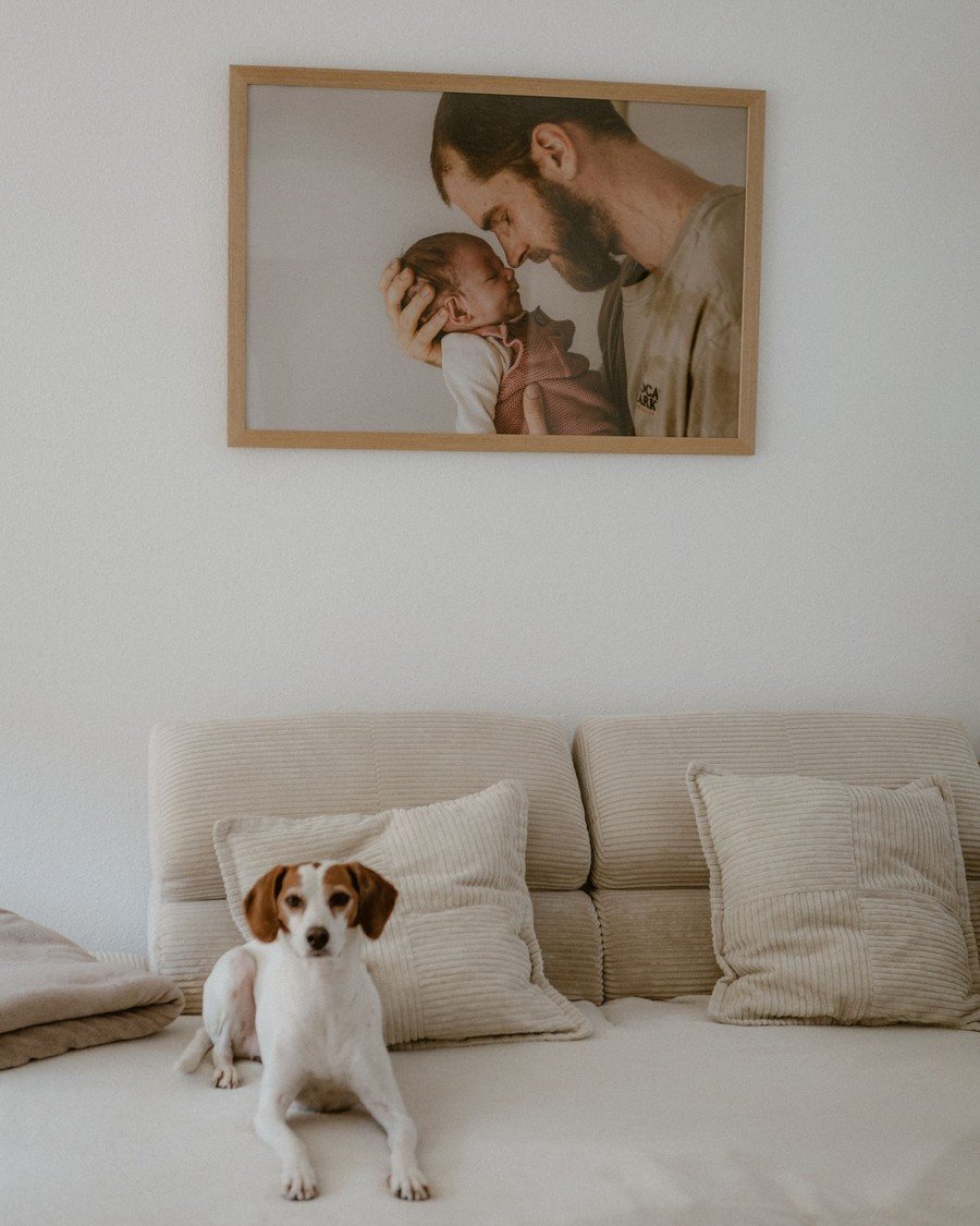
| 13 | Family Portrait Story Wall | Single hero | Easy | $$ |
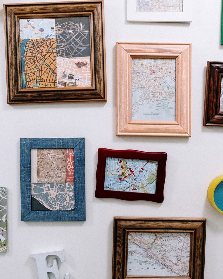
| 14 | Travel Map Wall | Cluster | Easy | $ |
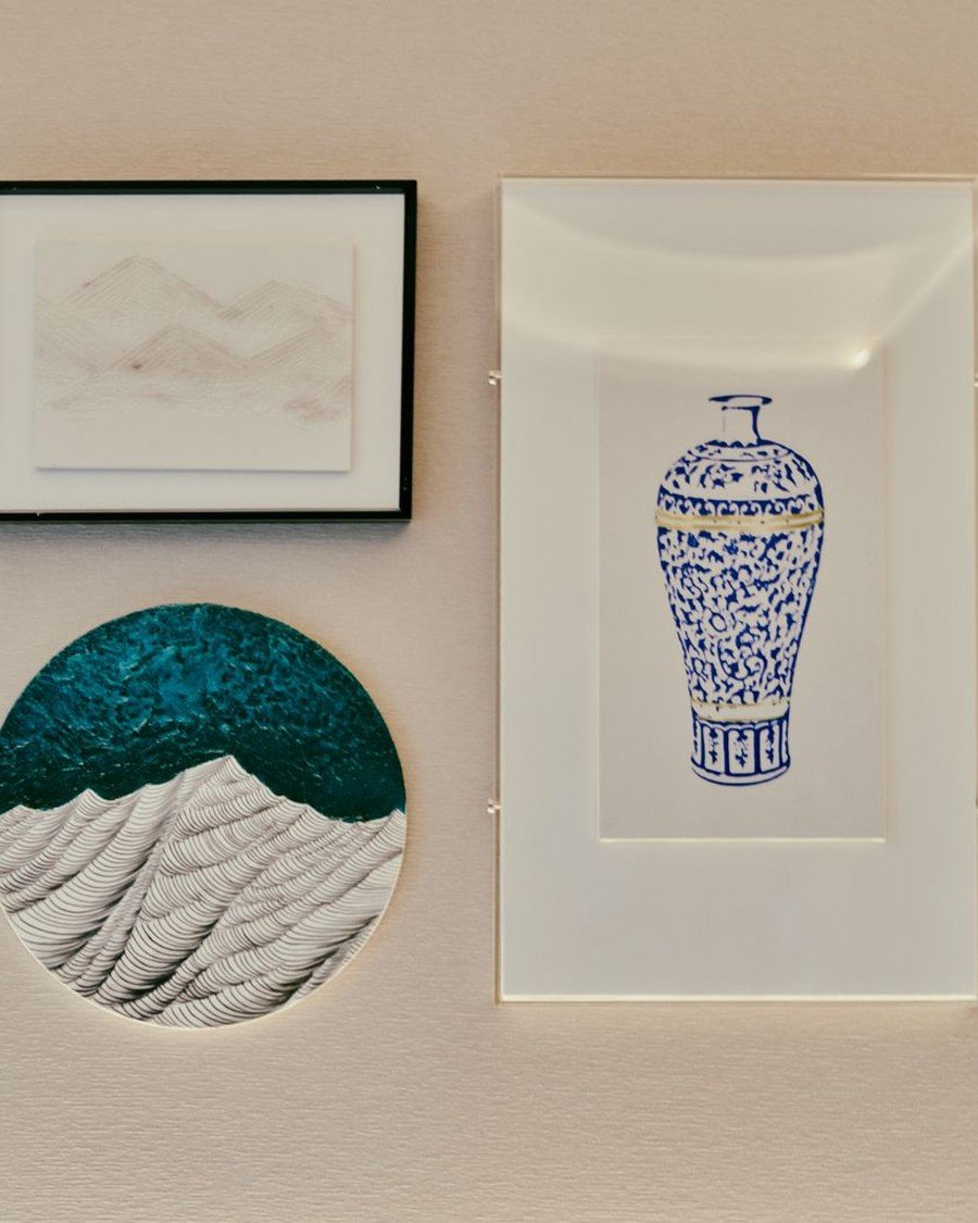
| 15 | Art and Object Trio | Trio + object | Easy | $ |
| 16 | Corner Reading-Nook Gallery | Corner | Easy | $$ |
| 17 | Gallery Cluster for an L-Shaped Sofa | Cluster | Easy | $$ |
| 18 | Wide Multi-Panel Art | Multi-panel | Easy | $$$ |
| 19 | Gallery with String Lights | Lit cluster | Easy | $$ |
| 20 | Gallery Wall with Plants | Cluster + green | Easy | $$ |
1. Symmetrical Four-Frame Grid Above the Sofa
Layout: 2×2 grid | Effort: Easy | Cost: $ | Best for: Above a sofa or loveseat
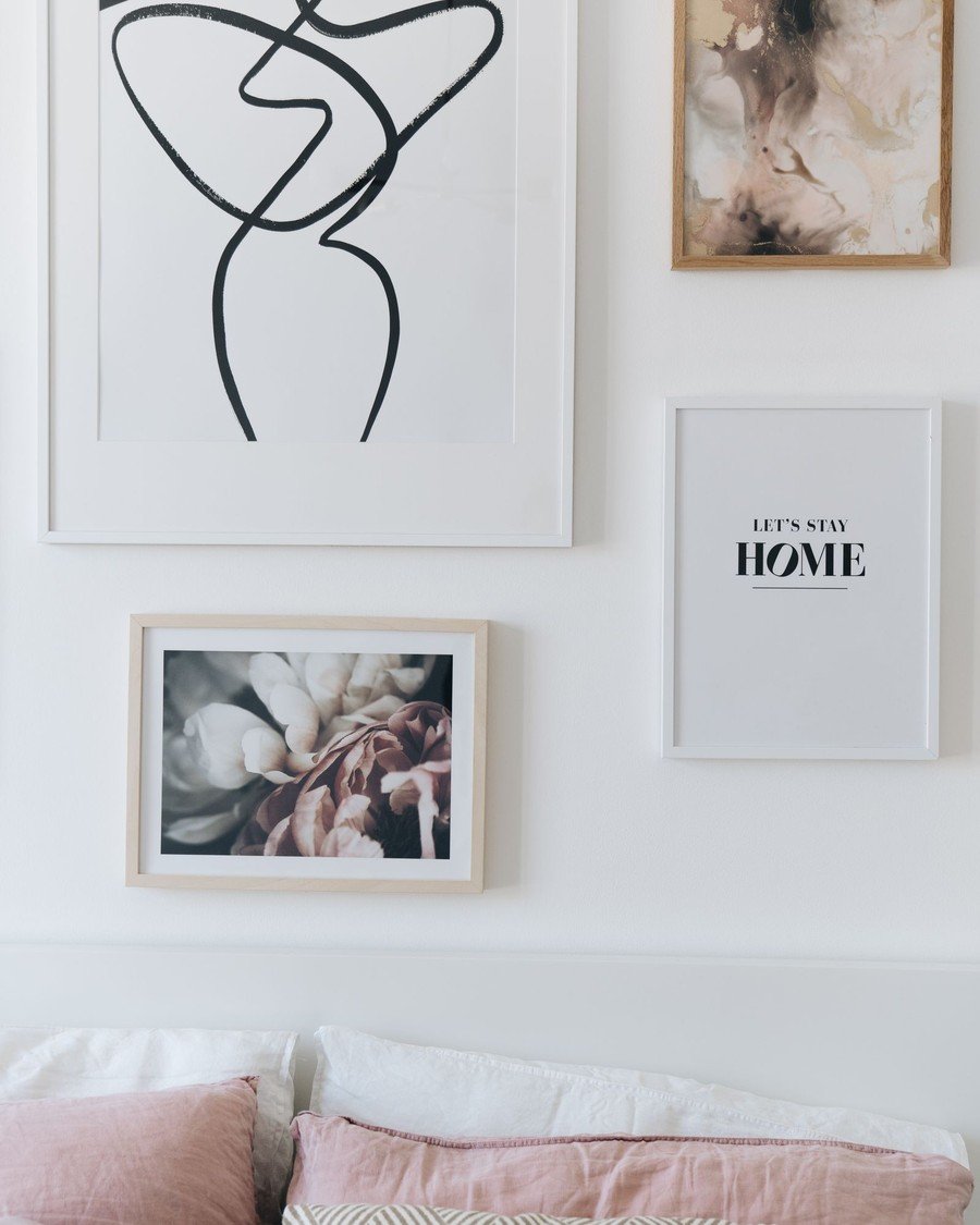
What to hang: Four prints in matching frames — in the photo, two large and two small prints balance each other above the sofa. Pick one theme: botanicals, line art, or family photos all work.
How to do it:
- Make the grid about two-thirds as wide as the sofa below it.
- Mark the grid’s center at 57 inches from the floor.
- Hang the top-left frame first, then level the rest against it.
- Keep every gap even — 2 to 3 inches on all sides.
- Leave 6 to 8 inches between the bottom frames and the sofa back.
Pro tip: Use the same mat width on all four frames — a shared mat makes four unrelated prints read as one set.
Avoid this: Do not center the grid on the wall if the sofa is off-center. Center it on the sofa — that is what your eye compares it to.
2. Salon-Style Floor-to-Ceiling Wall
Layout: Full wall | Effort: Moderate | Cost: $$$ | Best for: Big blank walls and collectors
What to hang: Fifteen to twenty-five frames, filled edge to edge from near the floor to near the ceiling. The style comes from the historic Salon exhibitions in Paris, where paintings hung frame-to-frame. Of all the living room gallery wall ideas in this guide, this is the boldest — and the most forgiving, because every new find has a place to land.
How to do it:
- Start at eye level in the middle of the wall, not at the top.
- Hang your largest pieces first, spaced across the whole wall.
- Fill downward and upward with medium frames, keeping gaps at 1 to 2 inches.
- Plug the leftover holes with your smallest frames and postcards.
- Stop about 6 inches from the floor and 4 inches from the ceiling.
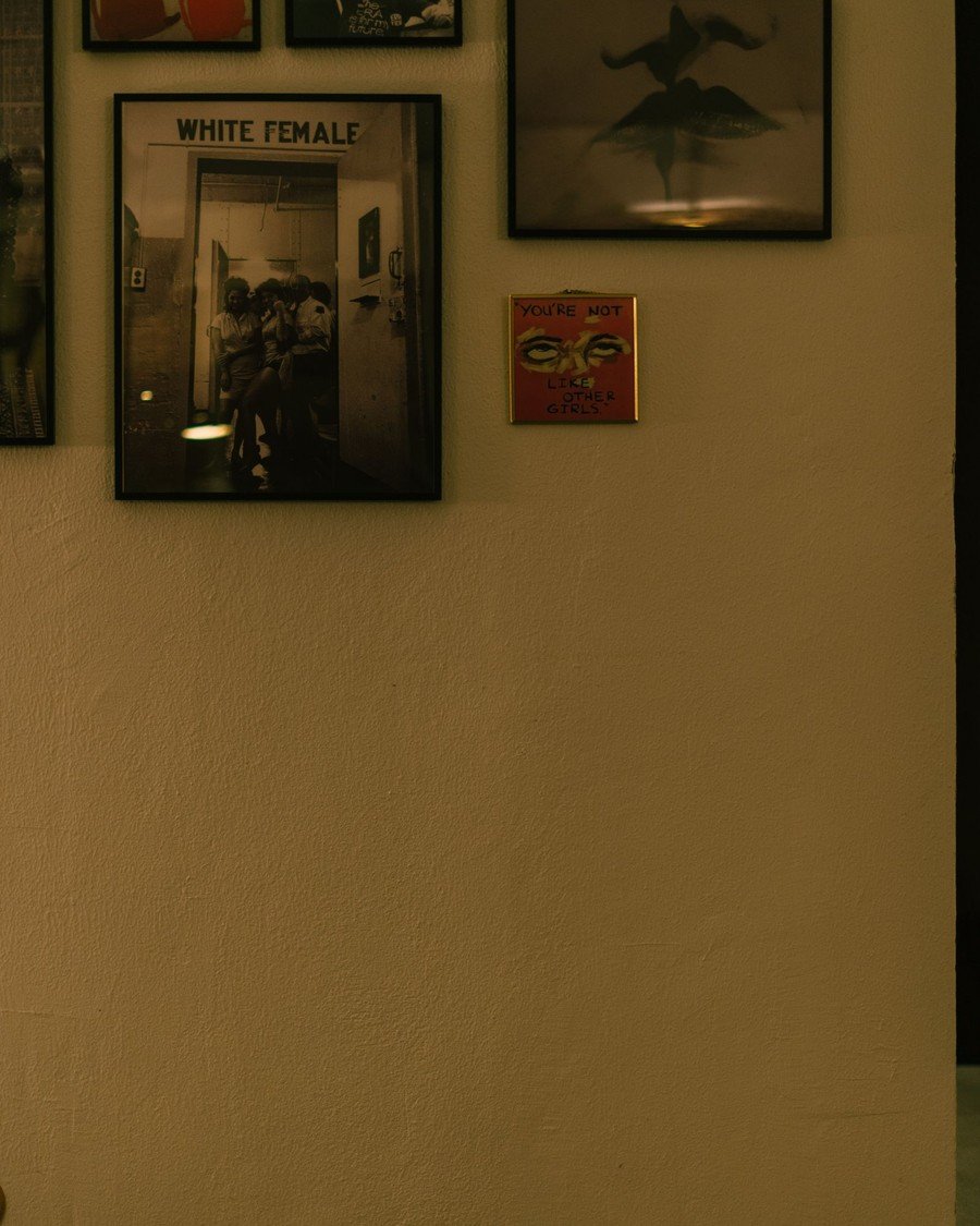
Pro tip: Keep frames in one finish family — dark wood and black, as in the photo — so a dense wall reads as texture, not clutter.
Avoid this: Do not hang the lowest row where chair backs and vacuum cleaners will knock it. Behind furniture, keep frames above the furniture line.
3. Large Anchor Piece with Smaller Satellites
Layout: Anchor-led | Effort: Easy | Cost: $$ | Best for: One statement artwork you love
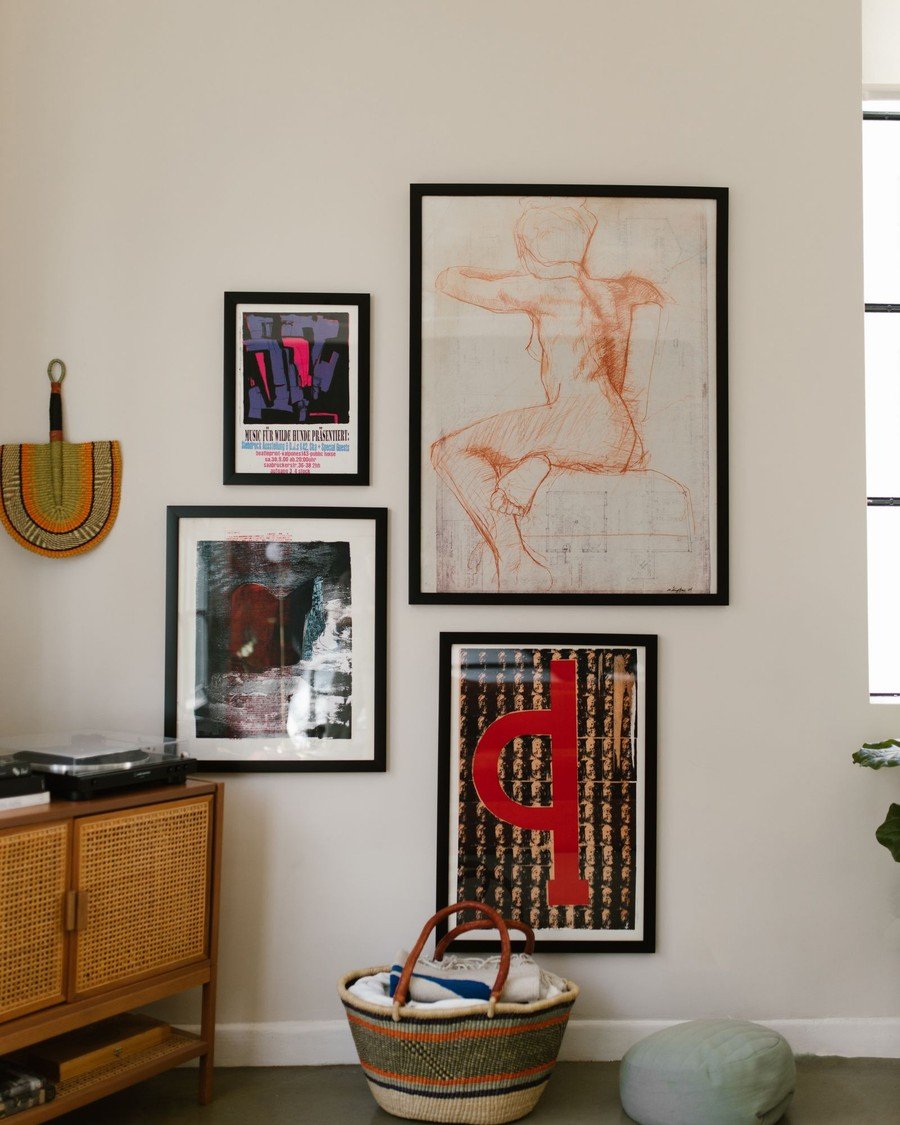
What to hang: One oversized piece — the figure sketch in the photo — with three to five smaller frames orbiting it. If you are still shopping for that statement piece, start from these living room wall art ideas and build the satellites from prints you already own.
How to do it:
- Hang the anchor first, centered at 57 inches.
- Let the anchor take about two-thirds of the arrangement’s width.
- Add satellites on two or three sides, never all four — asymmetry keeps it relaxed.
- Keep satellite gaps uneven but close: 2 inches near the anchor, 3 inches at the edges.
- Repeat one color from the anchor in at least one small frame.
Pro tip: A leaning anchor on a cabinet, like the photo, counts too — hang the satellites and let the big piece rest. It is the easiest version to rearrange.
Avoid this: Do not let a satellite exceed half the anchor’s width. The moment two pieces compete, the wall loses its hierarchy.
4. Triptych as a Vertical Stack
Layout: Vertical trio | Effort: Easy | Cost: $$ | Best for: Narrow wall strips and pillars
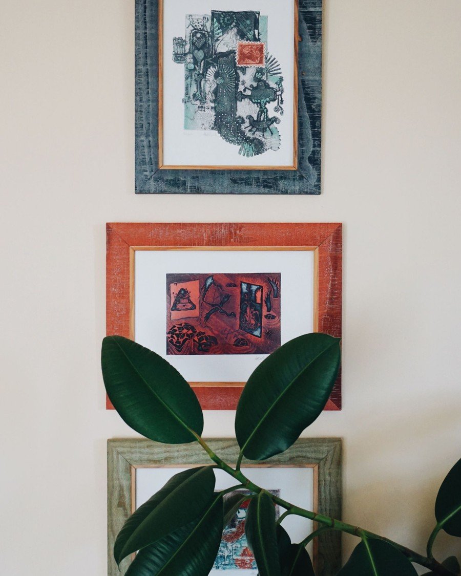
What to hang: One artwork split across three frames, or three prints from one series, stacked vertically — as in the photo, where three framed pieces climb a narrow wall beside a rubber plant.
How to do it:
- Choose three frames of identical size and finish.
- Plan a total stack height of about 60 to 72 inches.
- Hang the middle frame first, centered at 57 inches.
- Add the top and bottom frames with even 2-inch gaps.
- Align all three on one vertical center line — use a plumb line or laser level.
Pro tip: A vertical stack pulls the eye upward, which makes a low ceiling feel taller. It is the best trick in this list for basement living rooms.
Avoid this: Do not mix three unrelated subjects. A triptych only works when the three frames are clearly one image or one series.
5. Diptych Pair Above the Sofa
Layout: Pair | Effort: Easy | Cost: $$ | Best for: Calm, uncluttered rooms
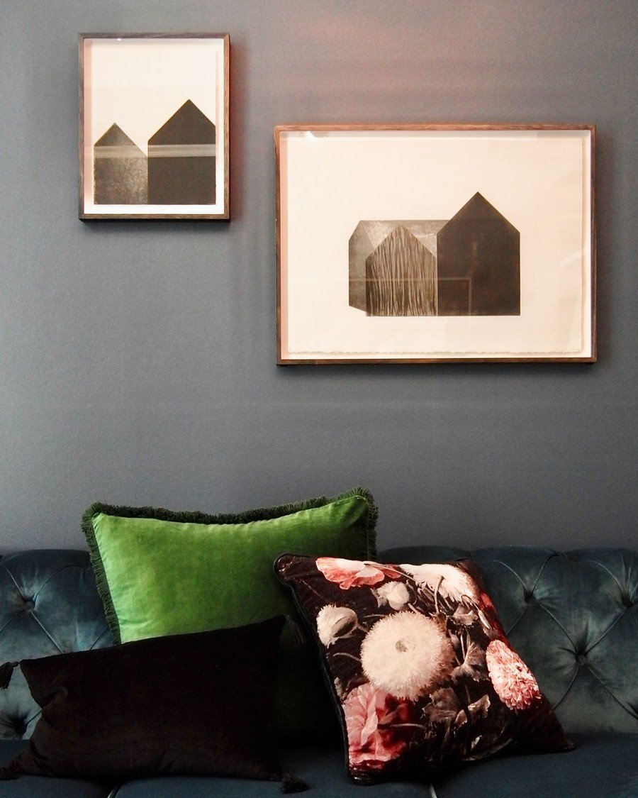
What to hang: Two same-size frames from one series — the photo shows two house prints in matching frames over a teal sofa. Two halves of one landscape, two botanicals, or two black-and-white photos all work.
How to do it:
- Measure the pair as one unit: together they should span about two-thirds of the sofa.
- Mark the pair’s combined center at 57 inches.
- Hang the left frame, then set the second 2 to 3 inches beside it.
- Keep the bottom edges level and 6 to 8 inches above the sofa back.
- Check from the doorway that both frames read as one picture
Pro tip: Buy the pair as a printed set rather than two singles — the paper tone and mat color will match exactly, which is what sells the effect.
Avoid this: Do not split a diptych across the room or onto two walls. Apart, each half looks like a mistake; together, they look designed.
Grids and Symmetry
If loose clusters make you nervous, grids are your friend. These living room gallery wall ideas use rows, bands, and ledges to keep every edge honest. A strict grid also calms a busy backdrop — over patterned paper from our living room wallpaper ideas, a tidy grid stops the wall from fighting itself.
6. Matching-Frame Grid
Layout: Strict grid | Effort: Easy | Cost: $ | Best for: Photo sets and print series
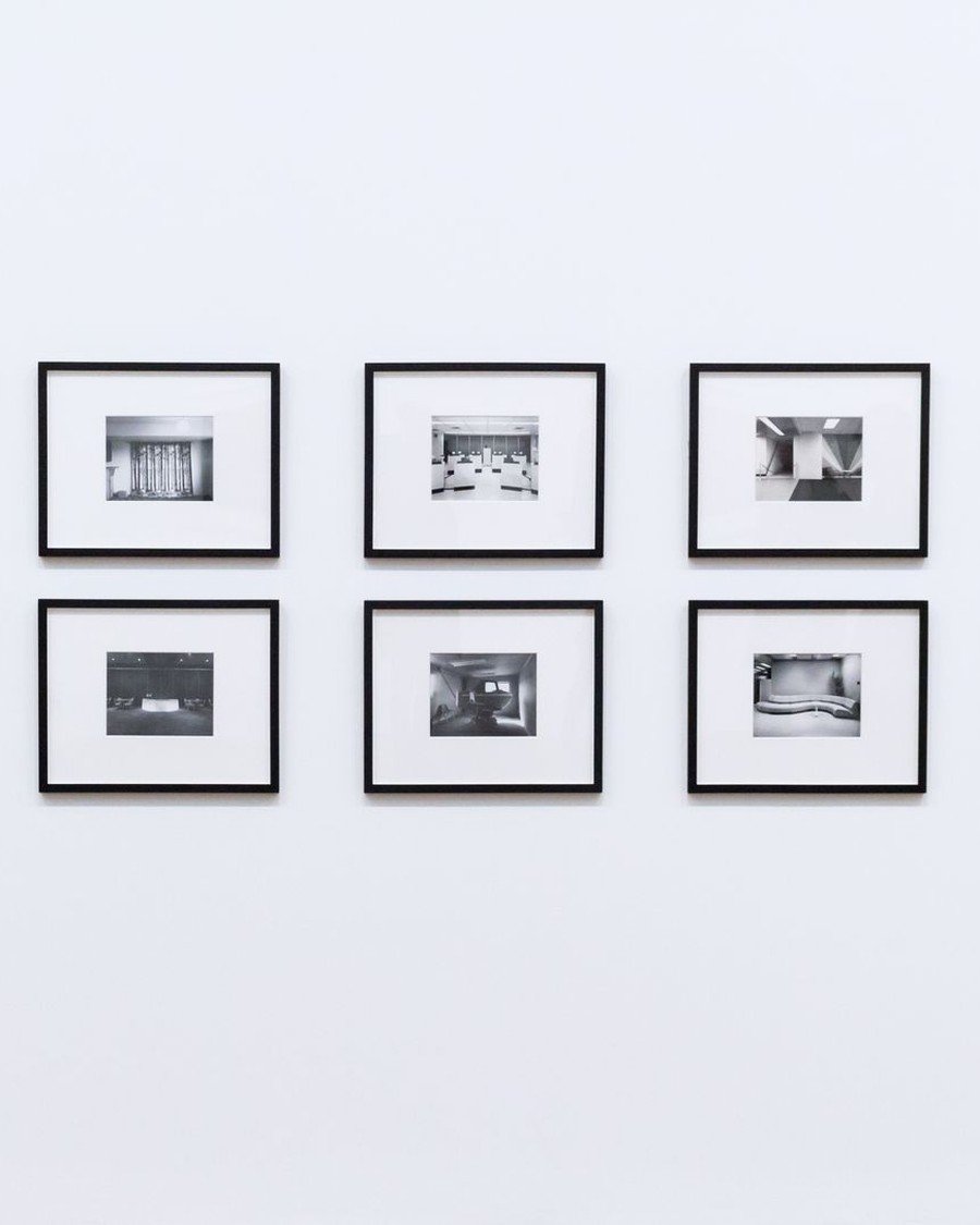
What to hang: Six or nine identical frames in even rows and columns, like the black-and-white set in the photo. Of all the living room gallery wall ideas here, this is the most foolproof, because the frames do the styling for you — the art can be anything.
How to do it:
- Buy every frame in one order, one size, one finish — no mixing batches.
- Choose a grid: 2 rows of 3 suits most sofas; 3 rows of 3 suits tall walls.
- Mark a rectangle on the wall with painter’s tape before drilling anything.
- Hang the center frame first, then work outward with a spacer — a 2-inch wood strip never lies.
- Keep photos in one treatment (all color or all black-and-white) for a true grid feel.
Pro tip: Print all photos with the same white border inside the mat. Uneven borders are the one thing that breaks a grid’s spell.
Avoid this: Do not eyeball a grid. One frame 1/4 inch low is invisible in a cluster and glaring in a grid — measure every hook.
7. One Long Gallery Band
Layout: Single row | Effort: Easy | Cost: $ | Best for: Low walls and above long furniture
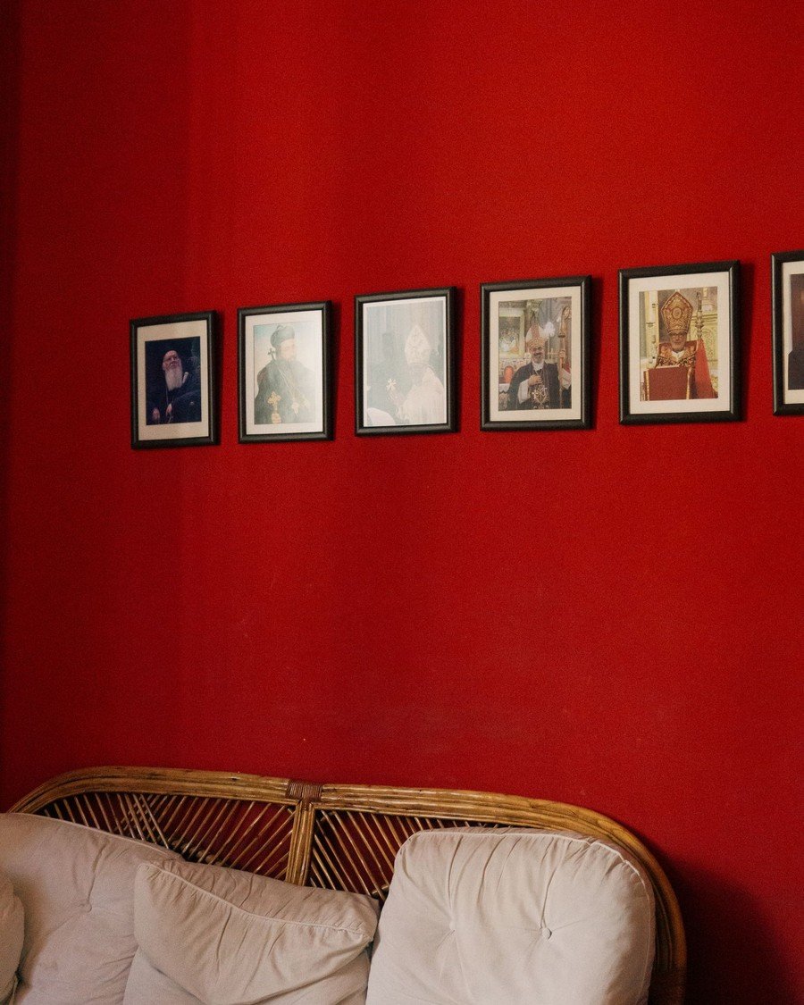
What to hang: Five to eight small frames in one straight row — the photo runs six family photos along a red wall above a rattan couch. A second row can be added later at the same spacing.
How to do it:
- Snap a chalk line or run painter’s tape at 57 inches for the row’s center.
- Hang the middle frame first, then work outward in both directions.
- Keep gaps identical — 2 inches is the classic band spacing.
- Start and end the band a few inches inside the furniture’s edges below.
- Mixing frame colors is fine here; the straight line does the organizing.
Pro tip: A band is the fastest gallery to extend — when a new photo earns a spot, add one frame to either end and the design still holds.
Avoid this: Do not let the row drift upward as you go. Check every third frame against the tape line, not against its neighbor.
8. Picture Ledge Layers
Layout: Ledges | Effort: Easy | Cost: $$ | Best for: Anyone who rearranges often
What to hang: Nothing — you lean it. Two shallow picture ledges hold frames standing in overlapping layers, as in the photo, where portraits and prints share one wooden ledge.
How to do it:
- Mount the first ledge so frames on it center near 57 inches.
- Add a second ledge 12 to 16 inches above or below the first.
- Stand the largest frames at the back, smallest at the front.
- Overlap frames by about a quarter of their width for the layered look.
- Anchor each ledge into studs or with rated drywall anchors — a loaded ledge is heavy.
Pro tip: Ledges are the only gallery you can restyle in five minutes with zero new holes — swap the front row seasonally and the wall feels new. It is the easiest refresh in this whole list of living room gallery wall ideas.
Avoid this: Do not use deep book shelves as ledges. Frames slide on deep shelves; a true picture ledge has a lip that locks the frame’s base.

9. Clock-or-Mirror Centerpiece Grid
Layout: Centerpiece | Effort: Easy | Cost: $$ | Best for: Small walls that need one idea, done well
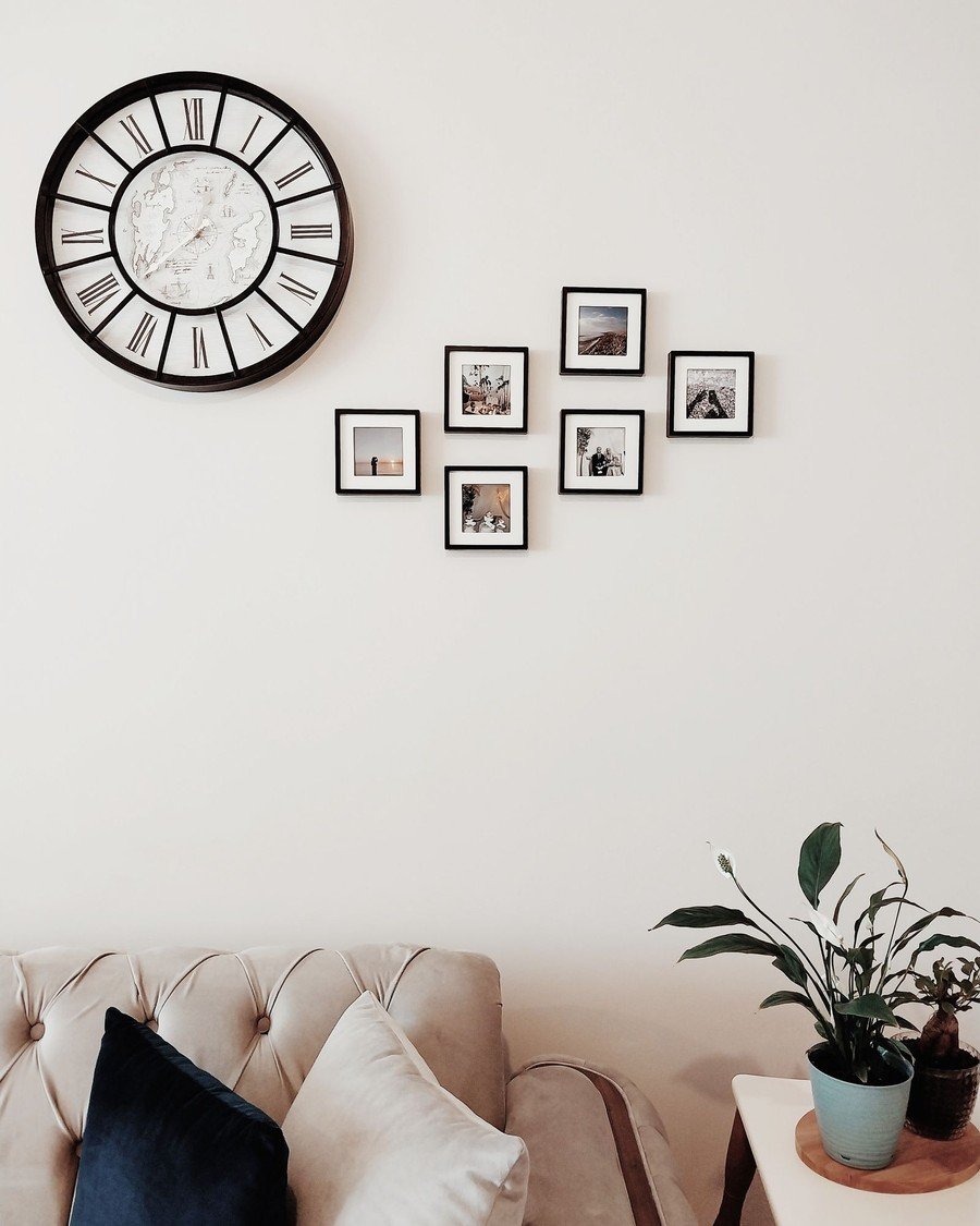
What to hang: One big round piece — the photo uses an oversized wall clock — with four to six small frames orbiting it. A round mirror does the same job and bounces light instead of telling time.
How to do it:
- Hang the clock or mirror first, dead center at 57 inches.
- Place two small frames on one side and two on the other, roughly mirrored.
- Add one or two below if the furniture line allows it.
- Keep the small frames in one finish so the centerpiece stays the star.
- Leave at least 3 inches of breathing room around the centerpiece.
Pro tip: Choose small art that echoes the centerpiece’s shape — round frames or circular subjects around a round clock feel quietly deliberate.
Avoid this: Do not add a second large piece. One centerpiece is a design; two is an argument.
10. Staircase-Slope Stagger
Layout: Stepped | Effort: Moderate | Cost: $$ | Best for: Walls beside stairs or under sloped ceilings
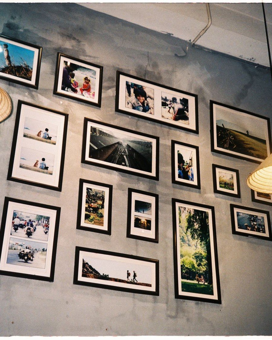
What to hang: A stepped arrangement that climbs like stairs — in the photo, dozens of travel photos stagger upward across a grey wall. Use it on the wall your staircase runs along, or to echo a sloped ceiling in a loft-style living room.
How to do it:
- Chalk a diagonal guide line that follows the stair slope, about 57 inches above each tread.
- Hang the largest frame at the lowest, widest part of the wall.
- Step each next cluster up along the line, keeping gaps at 2 inches.
- Let frame tops follow the slope, not the ceiling — the diagonal is the design.
- Finish with the smallest frames at the top of the climb.
Pro tip: Paper templates earn their keep here — a slope hides mistakes until all twenty frames are up, so test the full climb in paper first.
Avoid this: Do not run frames into the handrail’s swing space. Keep every frame at least 6 inches clear of the rail and of passing shoulders.
Eclectic Living Room Gallery Wall Ideas
Eclectic living room gallery wall ideas break the matching-frame rule on purpose: mixed finishes, mixed eras, and objects beside art. The secret is one shared thread — a color, a subject, or a story — so the mix looks collected, not random.
11. Mixed Vintage Frames and Plates
Layout: Salon mix | Effort: Moderate | Cost: $ | Best for: Thrift-store hunters and traditional rooms
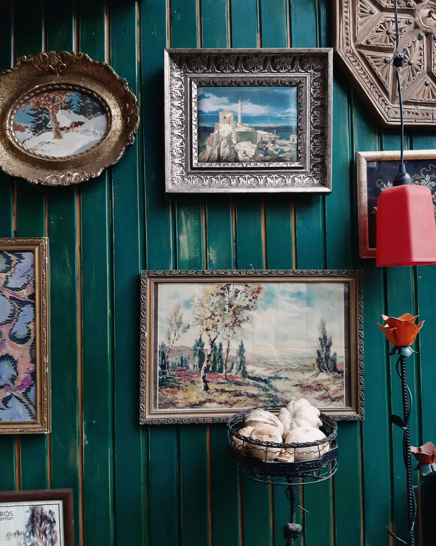
What to hang: Ornate second-hand frames in gold, silver, and dark wood, mixed with decorative plates — exactly the layered look in the photo, where gilded frames and a painted plate share a green paneled wall. This is where eclectic living room gallery wall ideas start: the flea market, not the frame shop.
How to do it:
- Collect frames first, art second — vintage frames come in odd sizes, so fit art to frames.
- Hang the most ornate frame at the center; it sets the wall’s temperature.
- Add plates on plate hangers between frames to break the rectangles.
- Keep gaps tight, 1 to 2 inches — density is what makes vintage mixes look rich.
- Repeat each finish at least twice so no frame looks lost.
Pro tip: A coat of the same wax or gilt cream on tired frames unifies a thrifted haul without erasing its age.
Avoid this: Do not hang a plate on a picture hook. Use a proper plate hanger rated for its weight — plates fall harder than frames.
Black and-White Statement Wall
Layout: Tall frames | Effort: Easy | Cost: $$ | Best for: Modern rooms and photography lovers
What to hang: Black-and-white photographs or prints in tall black frames, run in a loose line like the gallery wall in the photo. One palette, many subjects — the monochrome treatment ties strangers together.
How to do it:
- Convert color photos to black-and-white before printing — phone editors do it in one tap.
- Use tall formats (roughly 12×18 inches and up) for the gallery feel.
- Hang in a rough line at 57-inch centers, letting heights vary slightly.
- Keep frames black and mats white on every piece, no exceptions.
- Leave wider gaps — 3 to 4 inches — so each photograph breathes.
Pro tip: Mix matte and glossy prints inside the same frames. The slight sheen difference adds depth that a single finish cannot.
Avoid this: Do not sneak in one color photo “for pop” unless it is large and deliberate. One small color print in a monochrome wall just looks like an error.
13. Family Portrait Story Wall
Layout: Single hero | Effort: Easy | Cost: $$ | Best for: The wall above the main sofa
What to hang: One oversized family portrait as the hero — the photo shows a large framed portrait of a father and baby above the sofa, with the family dog in on the scene. It is the most personal of all the living room gallery wall ideas in this guide. Add smaller frames around it as the family grows.
How to do it:
- Print the hero portrait big: at least 24×36 inches for a standard sofa wall.
- Hang it centered above the sofa at 57 inches, 6 to 8 inches above the back cushions.
- Frame it simply — thin wood or black — so the faces carry the wall.
- Add two to four smaller family photos per side over time, keeping the hero centered.
- Update one small frame every year; the wall becomes a timeline
Pro tip: Choose a candid shot over a posed studio portrait. Candid photos hold up emotionally for the decade a hero print stays on the wall.
Avoid this: Do not hang the hero so high that faces sit above standing eye level. Portraits connect when the eyes in the photo meet yours.
14. Travel Map Wall
Layout: Cluster | Effort: Easy | Cost: $ | Best for: Travelers and storytellers
What to hang: Framed maps of the places that made you — the photo mixes city maps in wooden, painted, and playful frames. Of all the living room gallery wall ideas in this guide, this one starts the most conversations, because every frame comes with a trip attached.
How to do it:
- Collect maps from trips: transit maps, park maps, and old atlas pages all frame well.
- Mix frame finishes freely — travel walls are meant to look gathered over years.
- Cluster the maps in a loose rectangle above a sofa or console.
- Add one small photo from each trip beside its map.
- Leave one empty frame space for the next trip — the wall should always be unfinished.
Pro tip: Mark each map with a tiny dot or heart at the exact spot something happened — a proposal, a wrong turn, the best meal. Guests will ask, and that is the point.
Avoid this: Do not frame glossy tourist maps under glass without a mat — the glare makes them unreadable. A mat or matte-finish print fixes it.
15. Art and Object Trio
Layout: Trio + object | Effort: Easy | Cost: $ | Best for: Small walls and entry-side corners
What to hang: Two framed prints plus one flat object — the photo pairs two prints with a round woven wall hanging. A small mirror, a shallow basket, or a ceramic disc plays the same role: it breaks the grid and adds texture.
How to do it:
- Hang the larger print first, at 57 inches.
- Place the object beside it, slightly overlapping the print’s visual line.
- Add the second print below or beside the object to complete the triangle.
- Keep all three within one arm’s-width rectangle so they read as a group.
- Echo the object’s material somewhere in the room — a basket, a cushion, a rug.
Pro tip: Odd numbers and triangles are the stylist’s whole secret. Three pieces arranged as a triangle look finished at almost any size.
Avoid this: Do not choose an object heavier than its hanger’s rating. Woven discs are light; ceramic plates and mirrors need rated hooks.
16. Corner Reading-Nook Gallery
Layout: Corner | Effort: Easy | Cost: $$ | Best for: The dead corner by the window
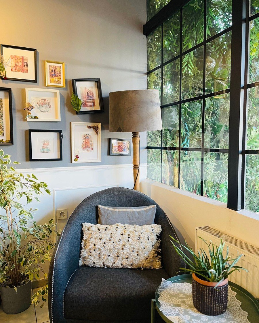
What to hang: A small cluster of frames low over a reading chair — the photo wraps an armchair corner with art, a floor lamp, and plants. Finish the nook with one of these living room accent chair ideas and the corner becomes the best seat in the house.
How to do it:
- Place the chair first, angled into the corner, then plan the wall around it.
- Hang the cluster lower than usual — center it near 54 inches, closer to seated eye level.
- Let frames turn the corner onto the side wall by one or two pieces.
- Keep the lowest frame at least 12 inches above the chair back.
- Add the lamp last, checking that its shade does not hide a frame.
Pro tip: Choose art you enjoy at arm’s length — maps, illustrations, and detailed prints reward the close viewing a reading chair gives them.
Avoid this: Do not hang a heavy frame directly above where a head rests. Over seating, use lightweight frames and two hangers each, always.
Above-the-Sofa Living Room Gallery Wall Ideas
The wall above the sofa is where living room gallery wall ideas earn their keep — it is the wall every guest faces. These five handle the special rules of sofa walls: lower hanging heights, wider spans, and art that survives being seen from three feet away.
17. Gallery Cluster for an L-Shaped Sofa
Layout: Cluster | Effort: Easy | Cost: $$ | Best for: Sectionals and corner sofas
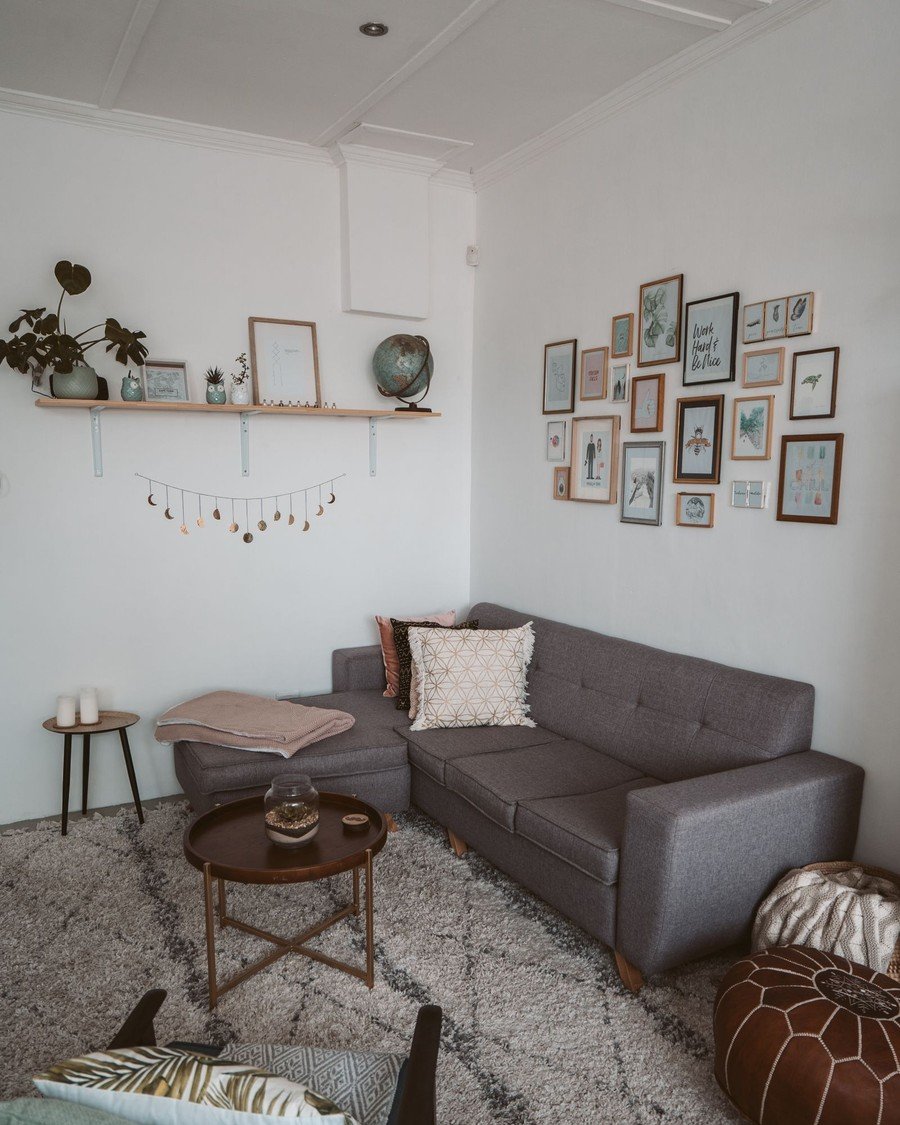
What to hang: A loose cluster that turns the corner with the sofa — the photo shows a grey sectional with a mixed cluster on the wall and a styling shelf beside it. An L-shaped sofa has two “above” walls, and the cluster should claim both — it is one of the few living room gallery wall ideas designed for two walls at once.
How to do it:
- Hang the cluster’s biggest frame over the sofa’s longest run first.
- Let the arrangement bend around the corner with two or three smaller frames.
- Keep the whole cluster within the sofa’s footprint plus about 6 inches each side.
- Hold bottom edges 6 to 8 inches above the sofa backs on both walls.
- Balance the far end with one frame as strong as the first — corners sag visually without it.
Pro tip: Photograph the corner from the room’s entrance before drilling. Corner clusters lie to you up close and tell the truth from the doorway.
Avoid this: Do not treat the two walls as separate galleries. One cluster, one story — split clusters make a sectional look like two rooms arguing.
18. Wide Multi-Panel Art Above the Sofa
Layout: Multi-panel | Effort: Easy | Cost: $$$ | Best for: Long sofas and wide walls
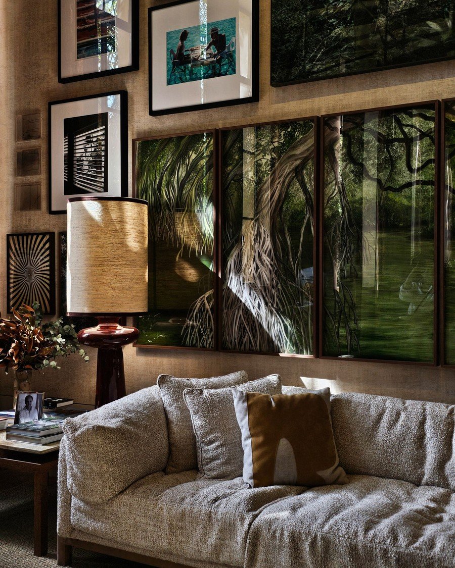
What to hang: One artwork printed across three or four panels, hung as a single wide image — the photo’s tree canopy spans the whole beige sofa, with smaller framed prints continuing the wall at the sides.
How to do it:
- Order panels so the full image spans about two-thirds to three-quarters of the sofa.
- Hang the center panel first, centered at 57 inches.
- Add side panels with tight, even gaps — 1 to 2 inches keeps the image readable.
- Level panel tops, not bottoms; the image line matters more.
- Add small framed prints beyond the panels only if the wall continues past the sofa.
Pro tip: Multi-panel sets are the fastest “gallery” of all — one purchase, one decision, and the spacing is the only skill involved.
Avoid this: Do not spread panels with wide gaps to “fill” a wall. Past about 3 inches, the image breaks and the panels look like strangers.
19. Gallery with String Lights and Sconces
Layout: Lit cluster | Effort: Easy | Cost: $$ | Best for: Evening rooms and low-light walls
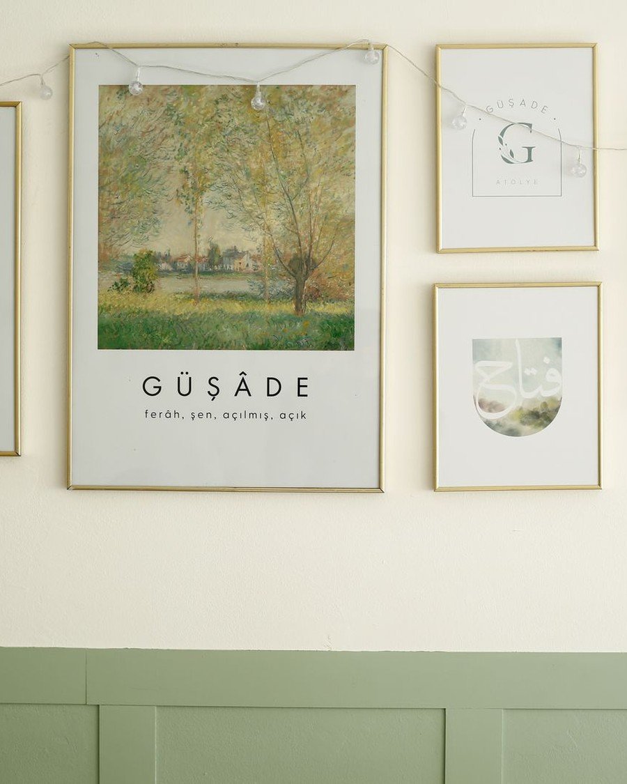
What to hang: A normal cluster — then light it. The photo threads warm string lights through a poster-led gallery; plug-in sconces flanking the arrangement do the same job with a more grown-up finish.
How to do it:
- Hang the gallery first, completely, before any lights go up.
- Weave a string-light strand along the top edges of frames, or mount sconces at the cluster’s outer edges.
- Hide cords behind the largest frame and run them down the wall’s edge.
- Use warm-white bulbs (2700K) — daylight bulbs make art look like a shop display.
- Put the lights on a timer or smart plug so the wall glows on schedule every evening.
Pro tip: Light from the side, not the front. Sconces at the edges rake across frames and give prints a museum glow without glass glare.
Avoid this: Do not drape lights over paper prints in direct contact for months — LED strings run cool, but check any strand that feels warm and replace it.
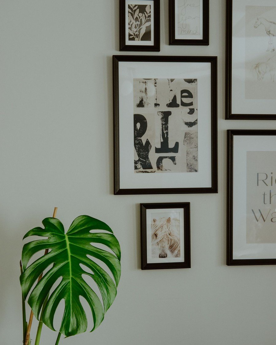
20. Gallery Wall with Plants
Layout: Cluster + green | Effort: Easy | Cost: $$ | Best for: Bright rooms and plant people
What to hang: Frames plus living green — in the photo, a monstera leaf leans into a black-framed cluster and softens every edge. Among living room gallery wall ideas, this is the one that keeps changing for free, because the plants keep growing.
How to do it:
1.Hang the frame cluster first, leaving one or two deliberate gaps at the edges.
- Fill a low gap with a tall floor plant whose leaves reach into the arrangement.
- Add a trailing plant on a high shelf or wall planter at the cluster’s top corner.
- Match pot colors to frame finishes — black pots with black frames, terracotta with wood.
- Leave 6 inches between leaves and glass; trapped moisture spots prints over time.
Pro tip: Photograph the wall every few months. Plants quietly unbalance a gallery as they grow, and a photo shows the drift before your eye notices.
Avoid this: Do not hang a watering-heavy plant above paper prints. One overflow ruins the frame below it — use self-watering pots or faux stems up high.
Living Room Gallery Wall Ideas: FAQ
What is the best height for a gallery wall?
Center the arrangement at about 57 inches from the floor — the height museums use, because it matches average standing eye level. For a cluster, that means the center of the whole group sits at 57 inches, not the center of every frame. Above furniture, the furniture rule below wins instead. That 57-inch center holds for nearly all living room gallery wall ideas, whatever the layout.
How far above a sofa should a gallery wall hang?
Leave 6 to 8 inches between the sofa’s back and the lowest frame. Closer looks connected; higher looks like the art is escaping. This single measurement is where most living room gallery wall ideas succeed or fail, because the eye always judges the art against the sofa, not the wall.
How many frames do I need to start?
Five to nine frames make a confident first gallery. Fewer than five reads as a few pictures, not a gallery. Odd numbers group more easily than even ones, and you can always grow the wall later — most layouts in this guide are designed to expand.
Should all my frames match?
Match them for grids and pairs; mix them for salon and eclectic walls. If you mix, repeat each finish at least twice and keep one thread — a shared mat color, a subject, or a palette. The matching question decides which family of living room gallery wall ideas your wall belongs to, so choose it before you buy.
Can I hang a gallery wall without drilling?
Yes — adhesive strips, picture ledges, leaning frames, and tape-up prints cover every layout in this guide (see ideas 8, 24, 26, and 27). Strip-hung living room gallery wall ideas are genuinely renter-safe when you respect weight ratings and cure times, and they come down without a trace.
How do I keep frames level and evenly spaced?
Plan with paper templates, hang the anchor first, and space frames with a physical spacer — a 2-inch wood offcut or a folded card — instead of a tape measure you have to re-read each time. Check level after every frame, not at the end; small errors compound across a wall.
Start Hanging Tonight
Pick one idea from the table, gather the frames you already own, and give yourself one hour. The living room gallery wall ideas above cover every wall, budget, and lease, so there is no wrong first choice — only an unfinished one. The most personal living room gallery wall ideas are never bought as a set; they are built, one frame and one memory at a time. Start with the anchor tonight, and let the wall grow from there.