Burgundy changes character with the surface it covers. On a sofa, it can look soft and inviting; on painted trim, it becomes a precise outline. Across a whole wall, the same color needs a little more thought about daylight, upholstery, and the wood already in the room.
Rather than starting with a paint name, decide how much burgundy you want to live with. These 15 living room ideas move from a single substantial accent to more enveloping palettes. Use the illustrations as color relationships, then compare actual fabric and paint samples in your own room. No screen image can show exactly how a finish will look beside your flooring and evening lights.
1. Start With a Burgundy Sofa Against Warm White
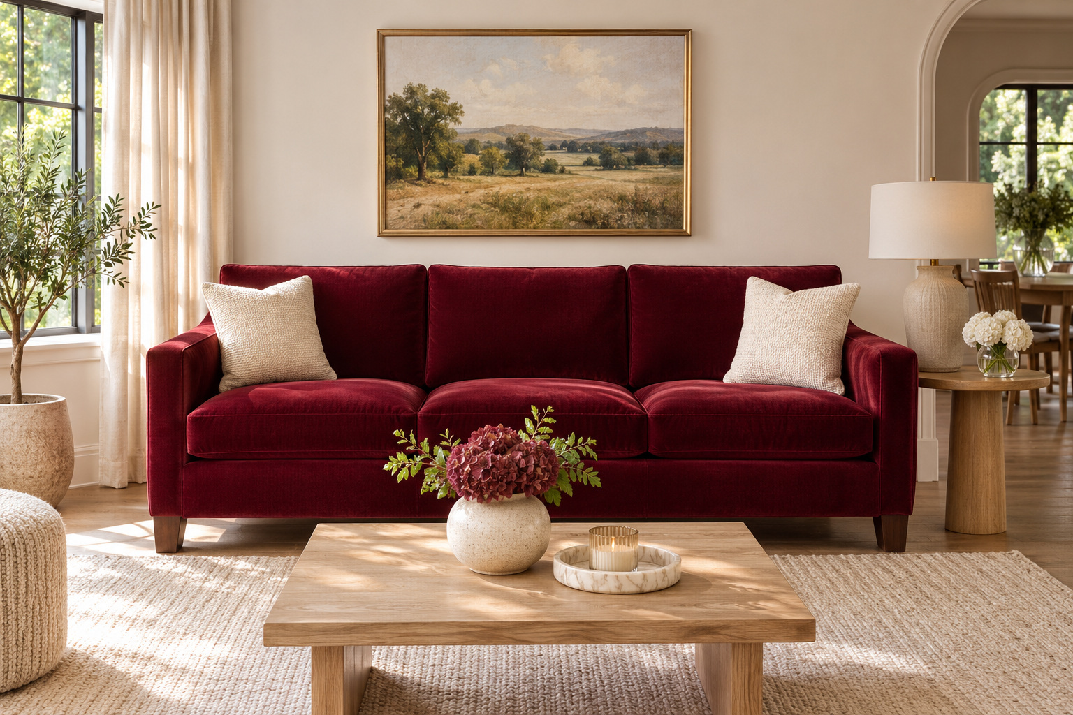
Let a burgundy sofa provide the largest block of color, with warm white walls giving its outline room to show. A simple silhouette makes the upholstery the focus; a few cream cushions can connect the seat to the background without covering most of the red.
Add a low wood table and a rug with a little variation in its weave. Those quieter materials give the sofa company without introducing another strong color. Before choosing the fabric, bring a generous sample beside the wall and floor. Some burgundies lean purple, while others have a browner character, and that difference matters more across a full sofa than on a tiny swatch.
2. Use Burgundy Below a Picture Rail
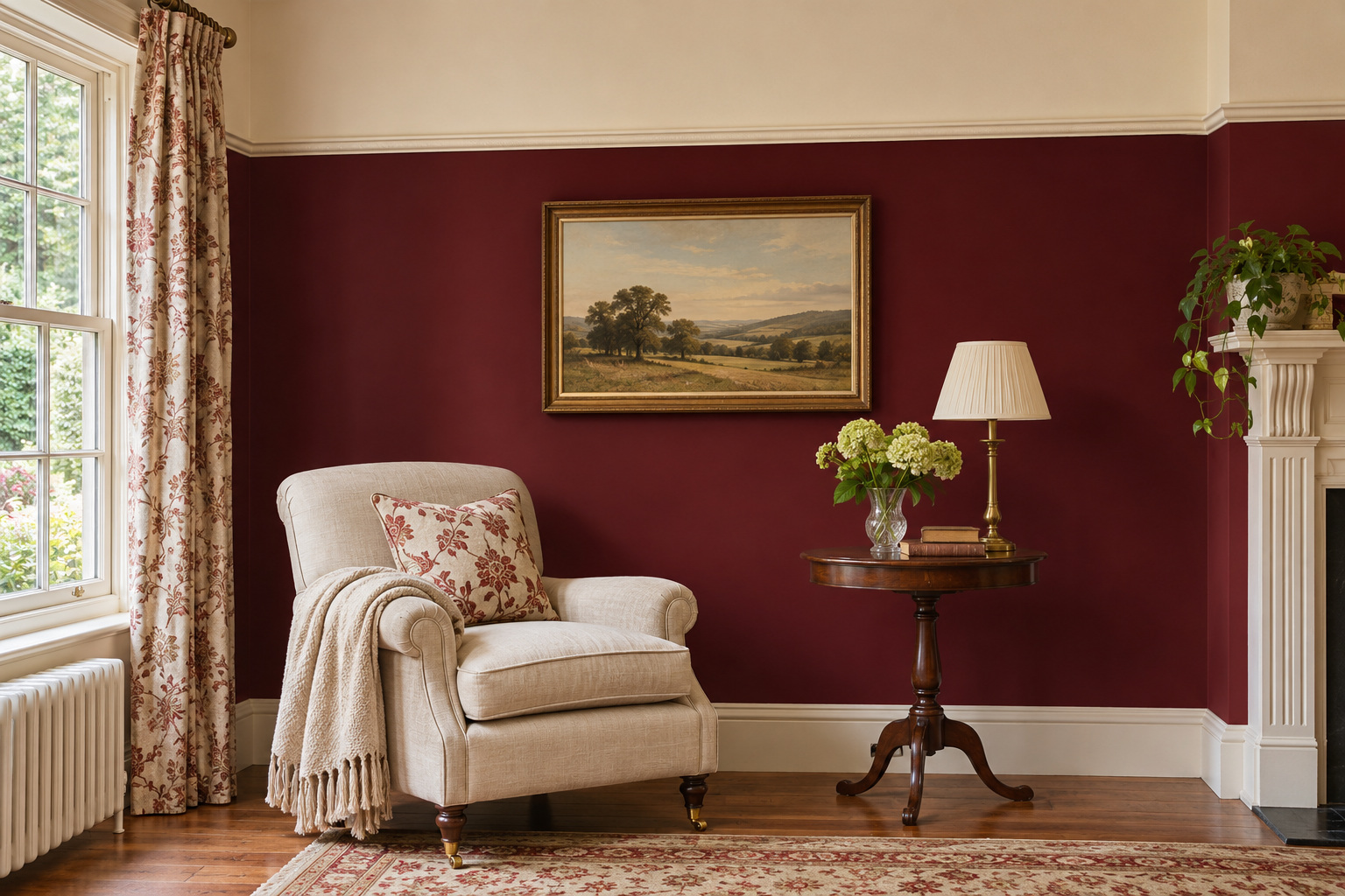
A horizontal division can make a deep color feel deliberate without carrying it over every surface. Paint the wall beneath an existing picture rail burgundy, leaving the upper wall and ceiling a warm pale shade. The line gives the room a defined proportion rather than a collection of separate accent patches.
Place a light upholstered chair near the darker wall so its shape remains visible. Keep the rail treatment consistent around the room where the architecture allows. Test the burgundy against both the upper-wall sample and the trim; an unrelated bright white can become a much sharper contrast than you intended. This approach suits a room where you want substantial color while keeping some pale wall area.
3. Paint Only the Window Recess
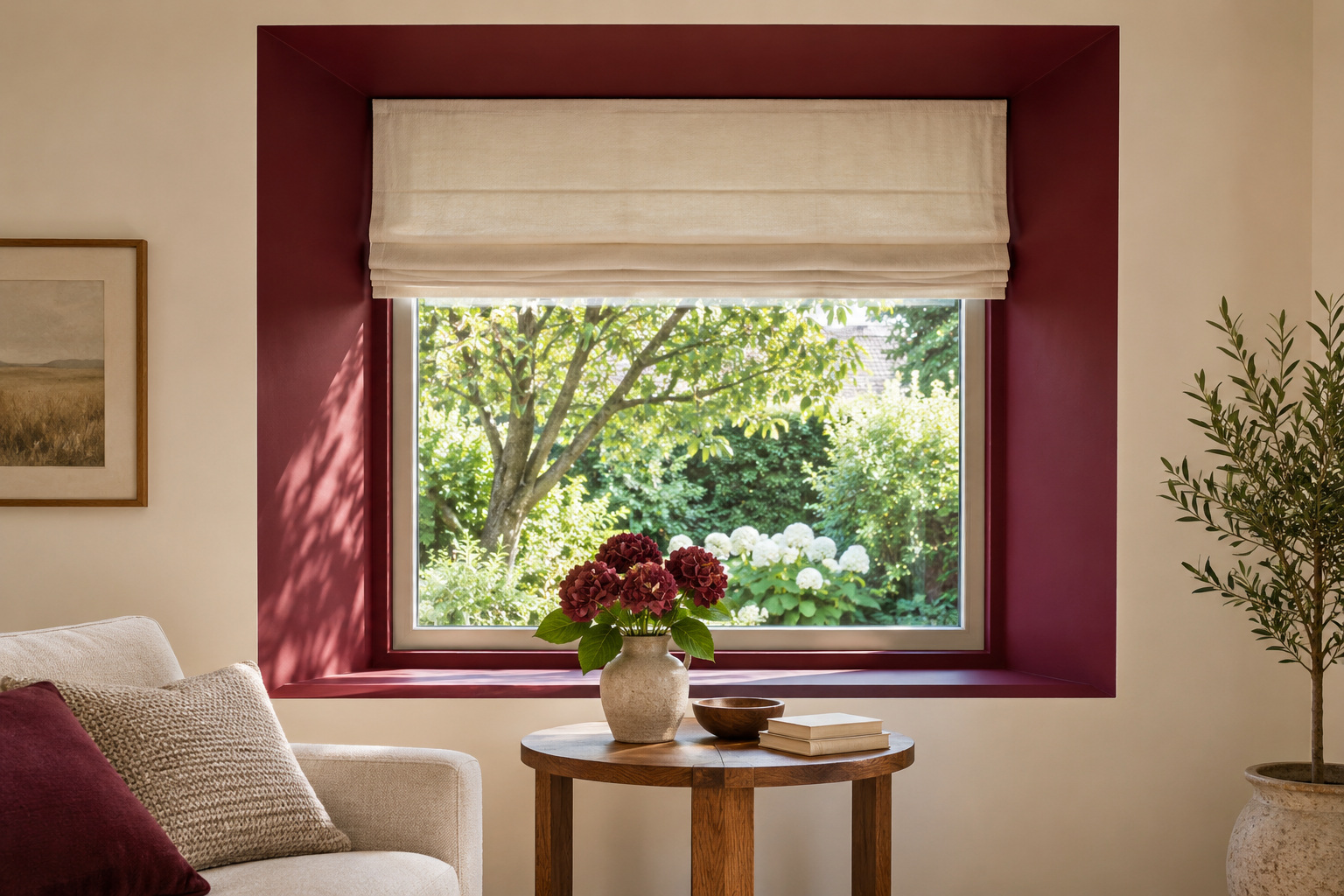
A deep window recess can hold burgundy like a frame around the view. Keep the main wall neutral, then use the red on the inner sides and upper reveal, stopping cleanly at the architectural edge. The result is a concentrated color decision that changes as daylight moves across it.
Leave the window hardware accessible and choose a finish appropriate to the surface. A plain Roman shade can sit inside the recess without competing with the painted outline. If the room has a shallow window rather than a meaningful reveal, a narrow painted trim treatment may be more convincing. Work with an existing boundary instead of adding a floating rectangle simply to use the color.
4. Balance Wine-Colored Walls With Pale Oak
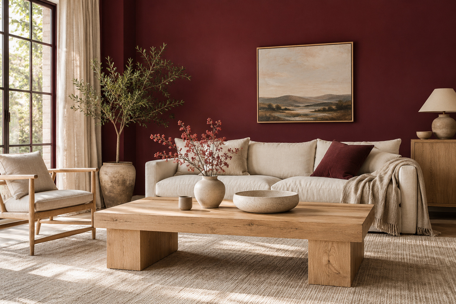
Pale oak gives a wine-colored wall a lighter, textured neighbor. Use it through a substantial piece such as a coffee table, a low cabinet, or a pair of open-frame chairs. The contrast comes from the broad material surfaces, so a few tiny wood accessories will not have the same effect.
Keep upholstery in a warm light neutral and allow the wood grain to stay visible. A red that looks right beside one oak sample may look too purple or too orange beside another, so compare the actual finishes together. Avoid adding several competing wood stains at once; a clear relationship between the wall and the main oak piece gives the room a more settled foundation.
5. Pair Burgundy With a Dusty Blue Chair
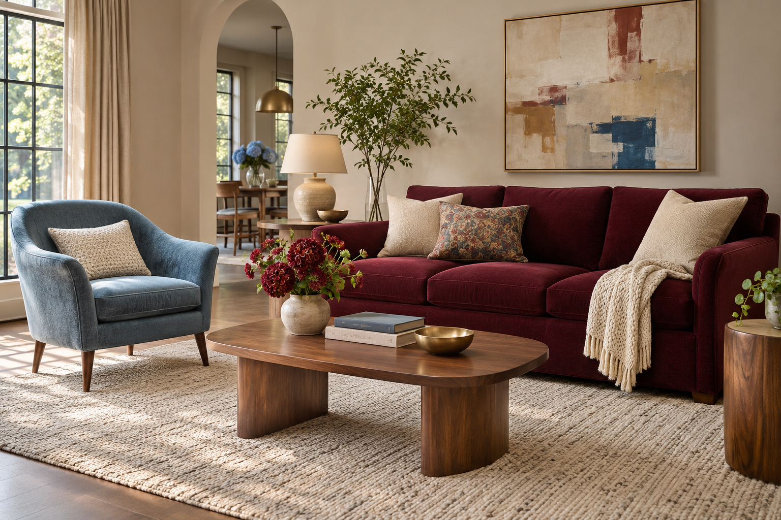
A dusty blue chair can introduce a cooler note beside burgundy without turning the living room into a bright primary-color scheme. Choose a blue with enough softness to sit comfortably against the red, then separate the two with a pale rug or a natural wood table.
Give each color a clear role. A burgundy sofa and one blue chair are easier to compose than several small red and blue objects spread around the room. Repeat only a trace of blue in the artwork if the combination needs another connection. Look at the fabrics together under the lights you use in the evening, when the balance may feel quite different from a daytime showroom.
6. Let a Burgundy Rug Anchor Light Upholstery
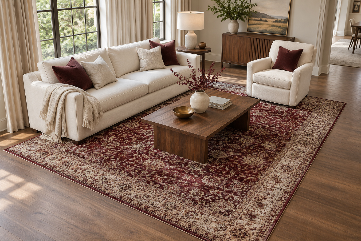
If the walls and sofa are staying pale, introduce burgundy through a rug that is large enough to connect the main seats. A gently patterned rug breaks up the color and can bring cream or brown into the same surface, making the new red feel related to the furniture.
Try the arrangement with the front feet of the main seating on the rug, checking the actual room rather than following a size rule in isolation. Keep a clear route around the coffee table. With the red mostly at floor level, a plain curtain and quieter cushions help the rug remain the anchor rather than one more pattern competing for attention.
7. Use Rose and Burgundy at Different Depths
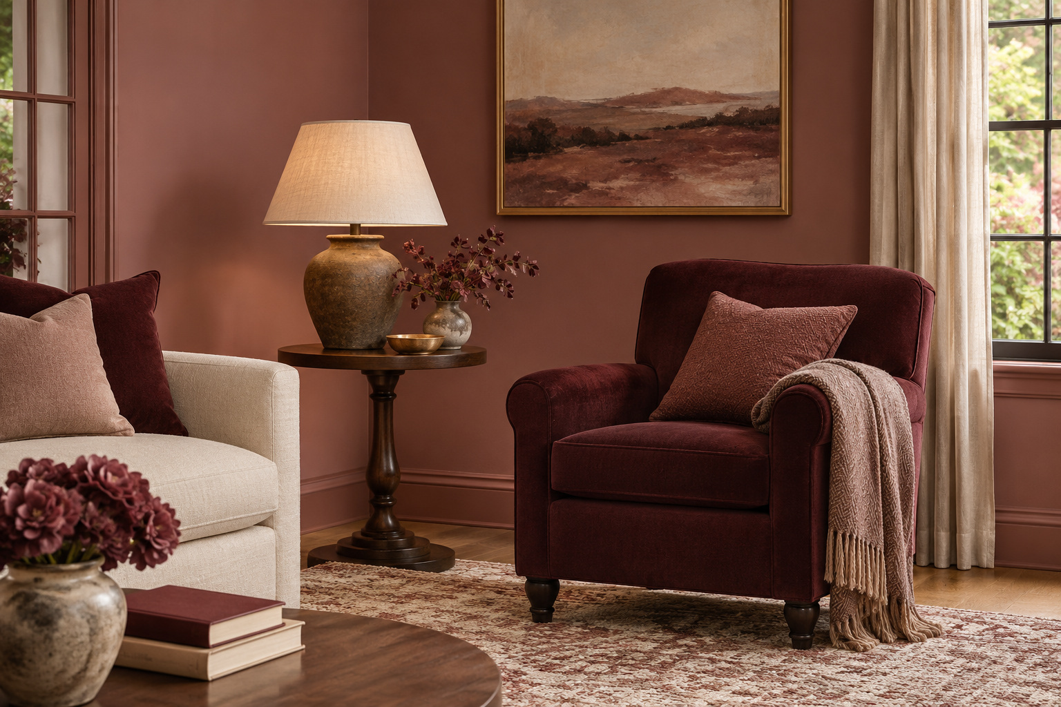
Rose and burgundy work best as distinct depths rather than two almost-matching reds. Try a muted rose wall behind a deeper burgundy armchair, with cream upholstery elsewhere. The lighter background makes the chair feel intentional while keeping the room from becoming uniformly dark.
Keep the pink earthy or softened if you want a quieter result. A small linen lampshade and dark wood table add different textures without needing another strong hue. Compare the samples side by side; a cool pink and a very brown burgundy can still work, but the relationship should be chosen rather than assumed. Let one of the two colors occupy noticeably more space.
8. Frame a Cream Room With Dark Red Trim
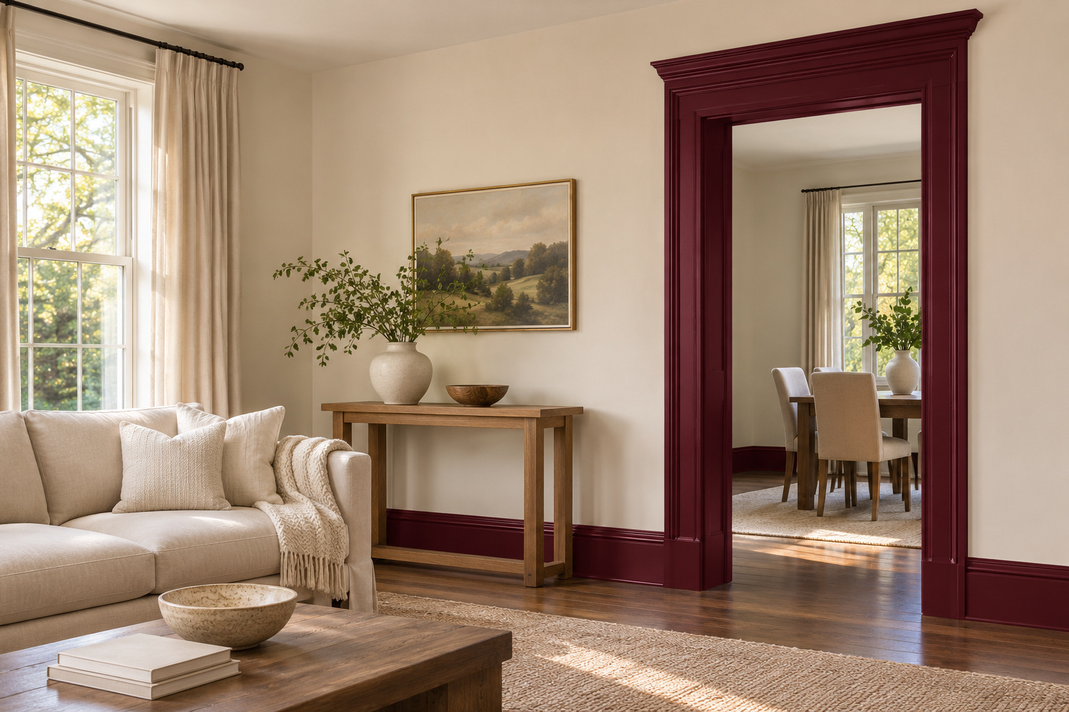
Burgundy trim can change a familiar cream living room while leaving the large wall surfaces light. Use the color on a coherent architectural element, such as a door casing and its matching baseboard, rather than picking out unrelated details around the room.
A finish change can make the outline more noticeable, so test both the shade and sheen before committing. Keep nearby furniture simple enough for the newly defined edges to read. This is a focused paint refresh with a clear stopping point, useful when a whole red wall feels like too much. It also lets the room’s existing cream upholstery and wood furniture continue to do most of the visual work.
9. Give a Reading Corner a Wool-and-Wine Palette
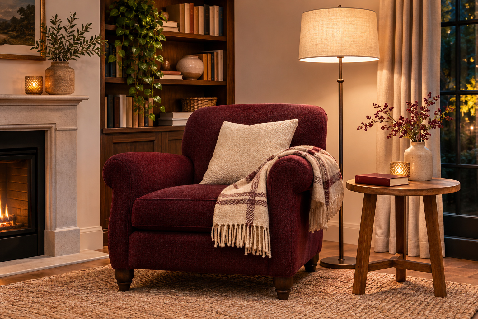
A reading corner can carry burgundy through the things you touch: a wool-covered chair, a soft cushion, and a folded throw. Keep the color concentrated around the seat, with a warm wood side table holding a book and a lamp where you can use it.
The comfort comes from the chair’s proportions, reachable surface, and well-placed light as much as the color. Leave room to put your feet down and move out of the chair easily. A plain woven rug and a quiet wall keep the corner from feeling like a separate themed room. Choose a throw that adds another texture rather than hiding the upholstery you selected.
10. Set Burgundy Beside Muted Olive
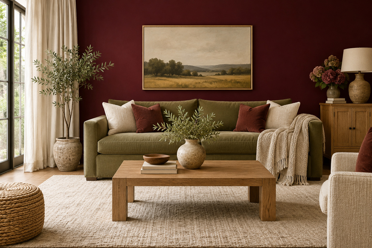
Muted olive can make burgundy feel grounded rather than theatrical. Try an olive sofa against a burgundy wall, then use warm white through the rug and curtains to give the colors some separation. The green should feel like a substantial part of the room, not a token leaf in a vase.
Natural oak or a dark, quiet wood can connect the pair. Avoid introducing several brighter reds and greens through small accessories, which can pull the room toward a holiday palette. Choose upholstery and paint samples together, and look for a balance that still feels appropriate throughout the year. One color can lead while the other acts as a measured counterweight.
11. Create a Formal Room With Walnut and Aged Brass
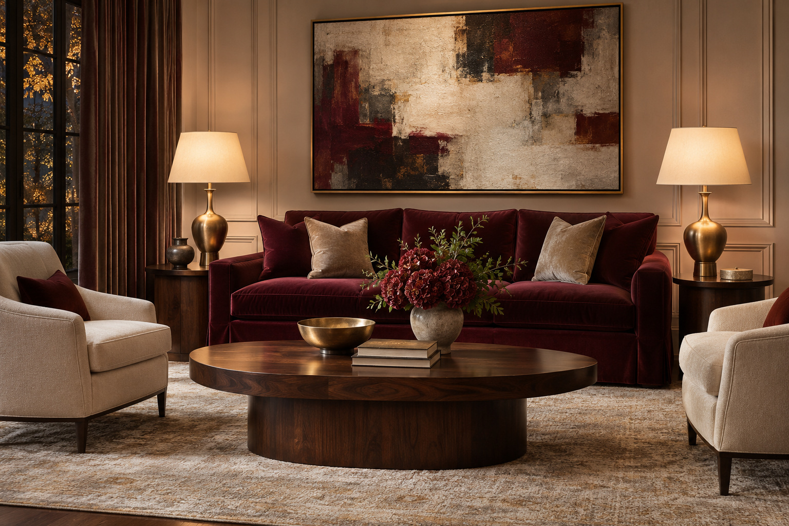
Burgundy can support a formal living room when the surrounding composition is controlled. Use a tailored red sofa, a substantial walnut table, and a pair of refined brass-finished lamps to establish a few clear shapes. Light upholstery opposite the sofa keeps the seating group from reading as one dark block.
Let the material finishes supply the richness. An ornate object on every surface can make the room feel crowded rather than elegant. Choose one generously scaled artwork and leave some of the table visible. The aim is a considered arrangement of useful furniture, with burgundy giving depth and the wood and metal providing a quieter variation in surface and light.
12. Use a Burgundy Curtain as a Large Soft Surface
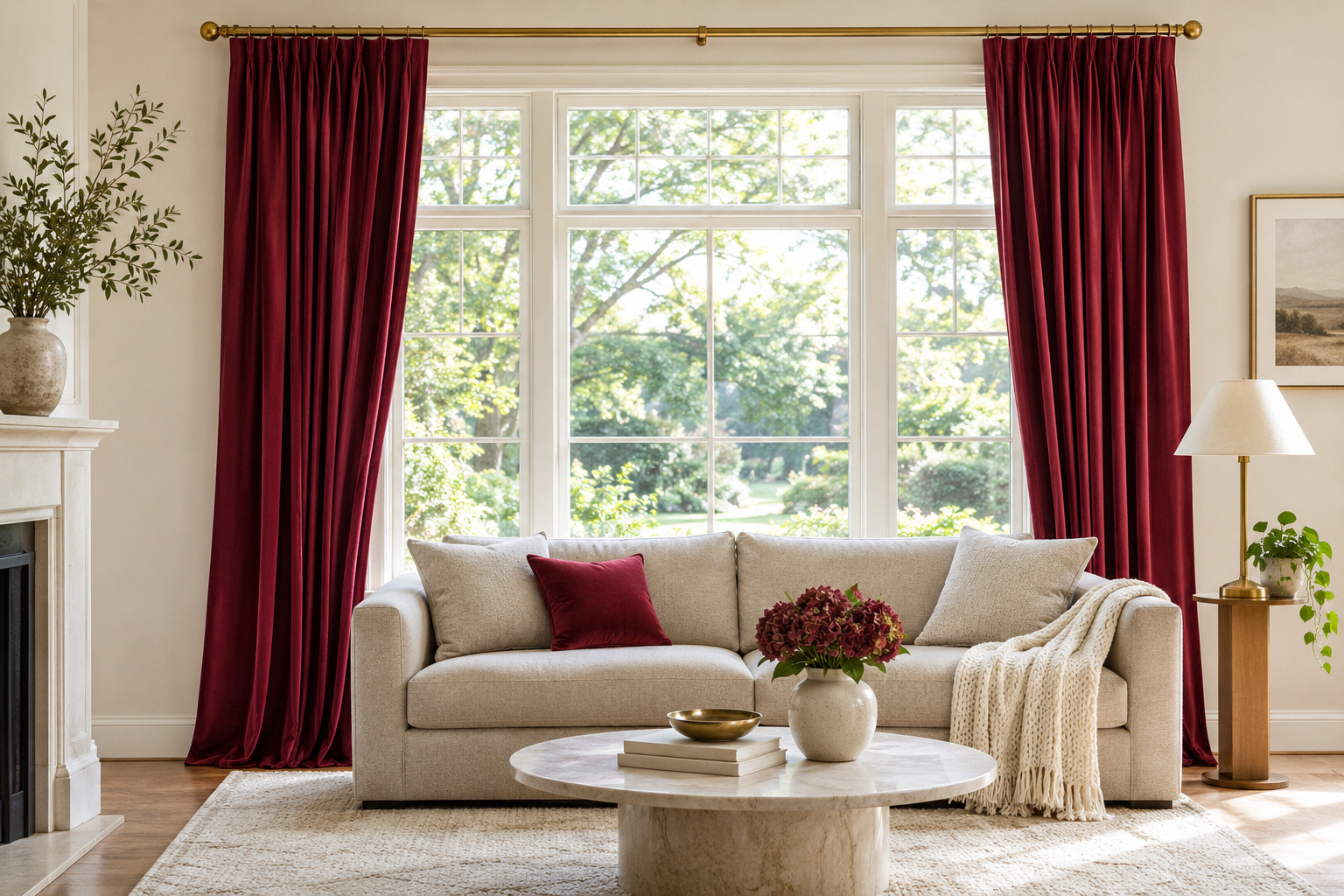
Curtains introduce burgundy vertically, making them an alternative to painting a wall. A pair of plain, softly draping panels can bring color to a neutral living room while leaving the window itself clearly defined. Their folds give the red variation that a flat sample cannot show.
Choose the fabric for how it hangs and how you need the window to work. Check that the panels can open fully enough for your daylight needs and do not interfere with heating equipment. Repeat a small amount of the color in a cushion if you want a connection across the room. Keep the largest neighboring surfaces quiet so the curtain fabric remains the main red element.
13. Paint the Back of a Display Cabinet
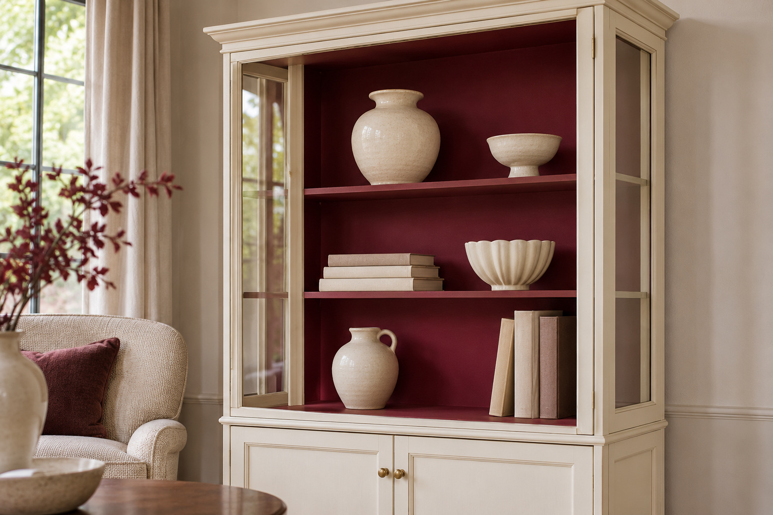
A display cabinet can hold a small burgundy backdrop within an otherwise neutral room. Paint its interior back panel burgundy and let the shelves share the color for a unified recess. A lighter outer frame gives that darker interior a clear boundary. Pale ceramics and a few books will show clearly against it.
Edit the contents before judging the paint. A crowded shelf can hide the very backdrop you introduced, while a few well-spaced groups make the depth visible. Check the cabinet maker’s guidance and use a coating appropriate to the existing surface. This idea suits a living room where you want to try the color in a bounded piece of furniture before changing a larger area.
14. Let Terracotta Bridge Burgundy and Natural Wood
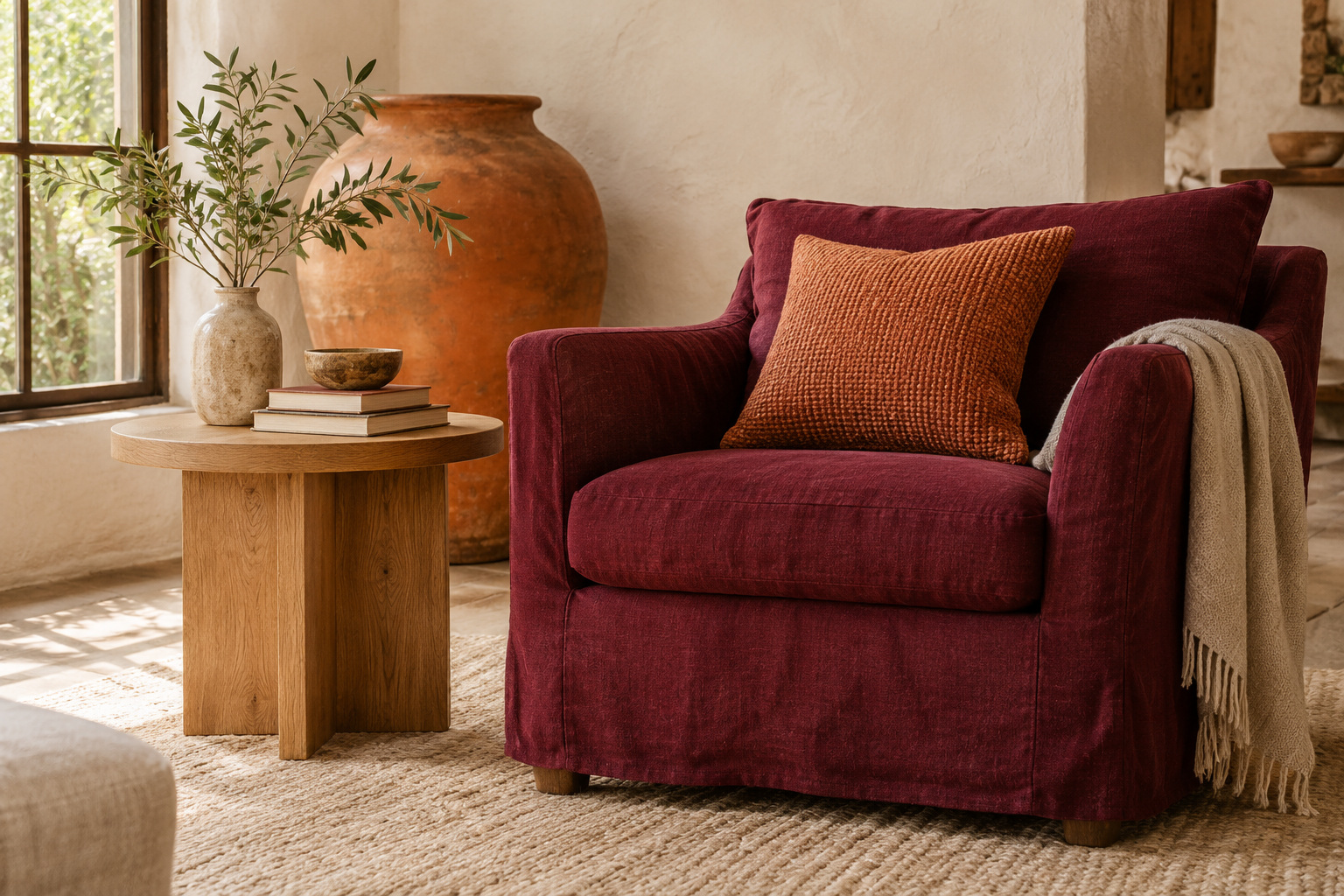
Terracotta can connect a deep red accent with the warmer tones in natural wood. Use it in a meaningful surface such as a large woven cushion or a clay vessel, then repeat its earthy character through a quiet rug. A burgundy chair can sit beside those materials without becoming the room’s only warm note.
Keep the terracotta distinct from the burgundy so the relationship looks layered rather than mismatched. A rough clay surface, a visible wood grain, and a soft fabric give the eye different textures to read. This approach is especially useful when the room already has warm timber and you want the new red to feel at home beside it.
15. Carry Burgundy Around a Fireplace Wall
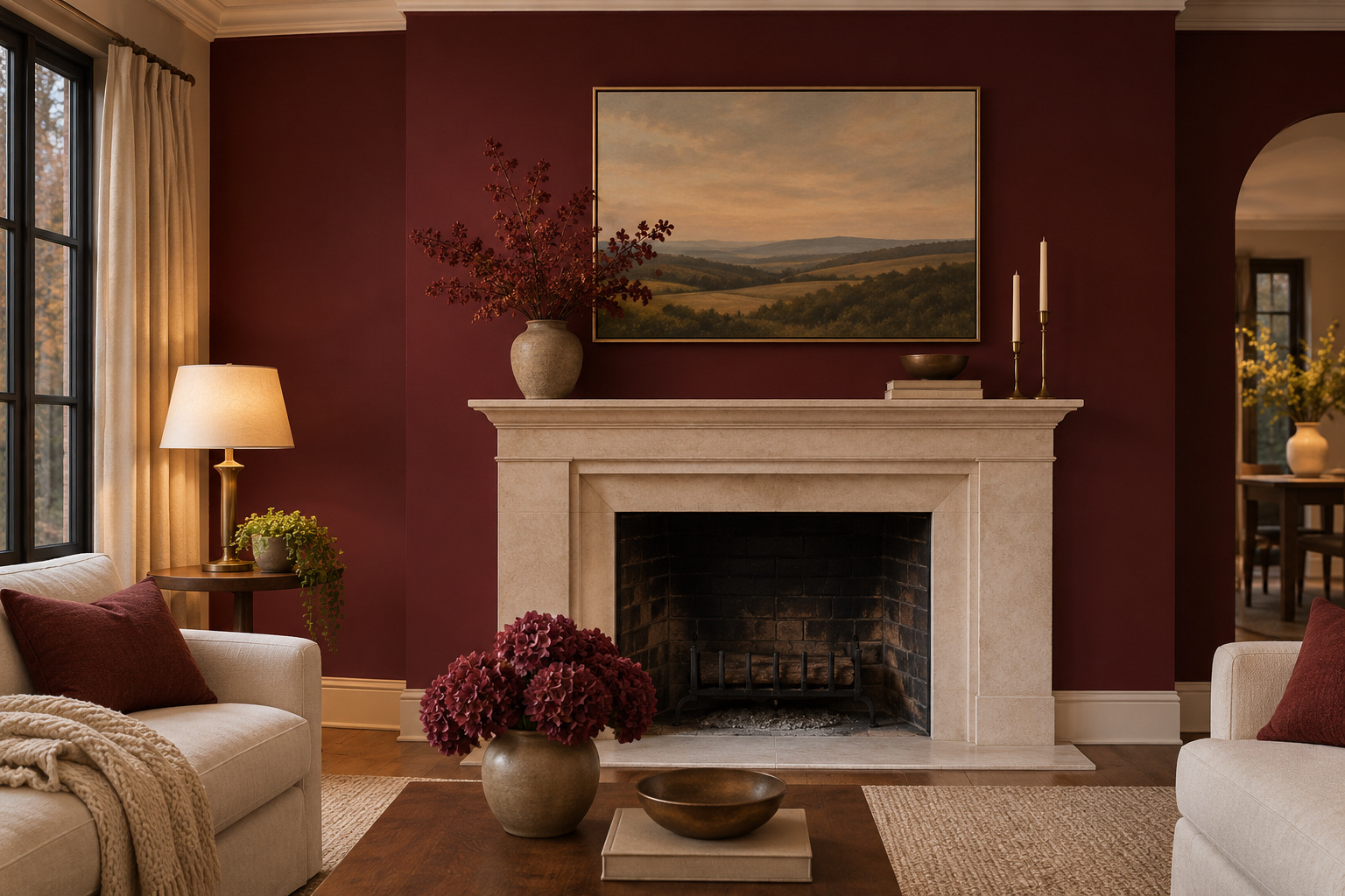
A fireplace wall can give burgundy an architectural boundary. Use the color on the surrounding wall plane, keeping the actual firebox and any required noncombustible surround unchanged. A pale mantel or light stone hearth can offer a useful outline between the red wall and the opening.
Arrange the seating so this wall belongs to the room rather than feeling like a backdrop added afterward. Keep mantel objects low and limited, with one substantial piece of art above if the space allows. Confirm that any coating and decorating work suits the existing fireplace construction; the color idea does not require painting heat-exposed surfaces. Judge the wall with both daylight and your usual evening lighting.
Choose the burgundy surface that best fits what you want to change. A sofa, a rug, a curtain, and a painted wall each give the color a different role. Once that decision is clear, compare the neighboring materials in the actual room and leave enough quiet space for the red to read. A convincing palette usually comes from those relationships rather than from adding more matching accessories.
For a more enveloping paint approach, our color drenching ideas explain how a single color can continue across several room surfaces.
Discover more from HomeTrendora
Subscribe to get the latest posts sent to your email.