A pillow that looks lovely on its own can seem wrong once it lands on the sofa. These 18 sofa pillow combinations start with the upholstery, then use color, pattern size, and texture to give the cushions a reason to sit together. Some need only a pair; others suit a little more layering.
Keep a seat open while you experiment. Compare the covers with your actual sofa in daylight and under the lamps you use at night. Check cover measurements, insert requirements, material, and care labels separately. A fabric’s appearance alone cannot tell you how it will feel or how it should be washed.
1. Pair Olive Velvet With a Plain Oatmeal Weave
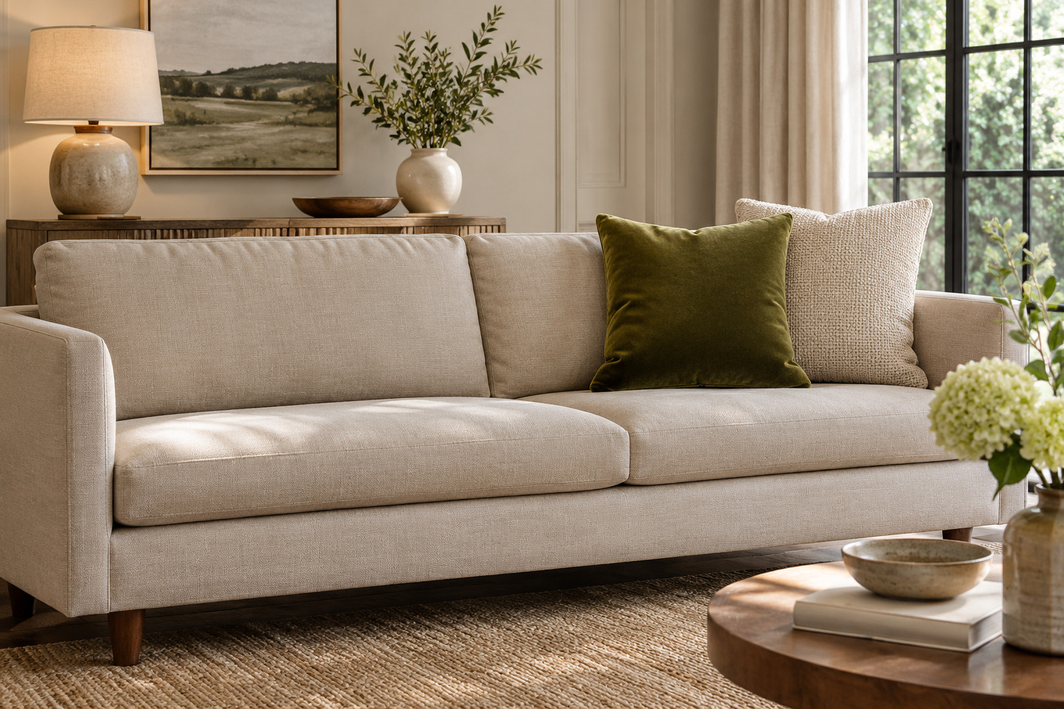
Set an olive velvet square beside a plain oatmeal woven pillow on a light, fairly simple sofa. The olive supplies depth, while the paler weave leaves a quiet patch between it and the upholstery. Turn the velvet in the room light to see how its pile changes the color.
Try the pair at one end first and sit down before repeating it at the other. Keep the oatmeal cover relatively plain so the difference in texture stays clear. If your sofa is already olive, use a lighter woven companion to keep the cushions from disappearing into the back.
These are covers only; compare the 18-inch size and the maker’s insert-fit guidance with the cushions you already own.
See the olive velvet covers (paid link)
2. Bring Cobalt and Ivory to a Beige Sofa
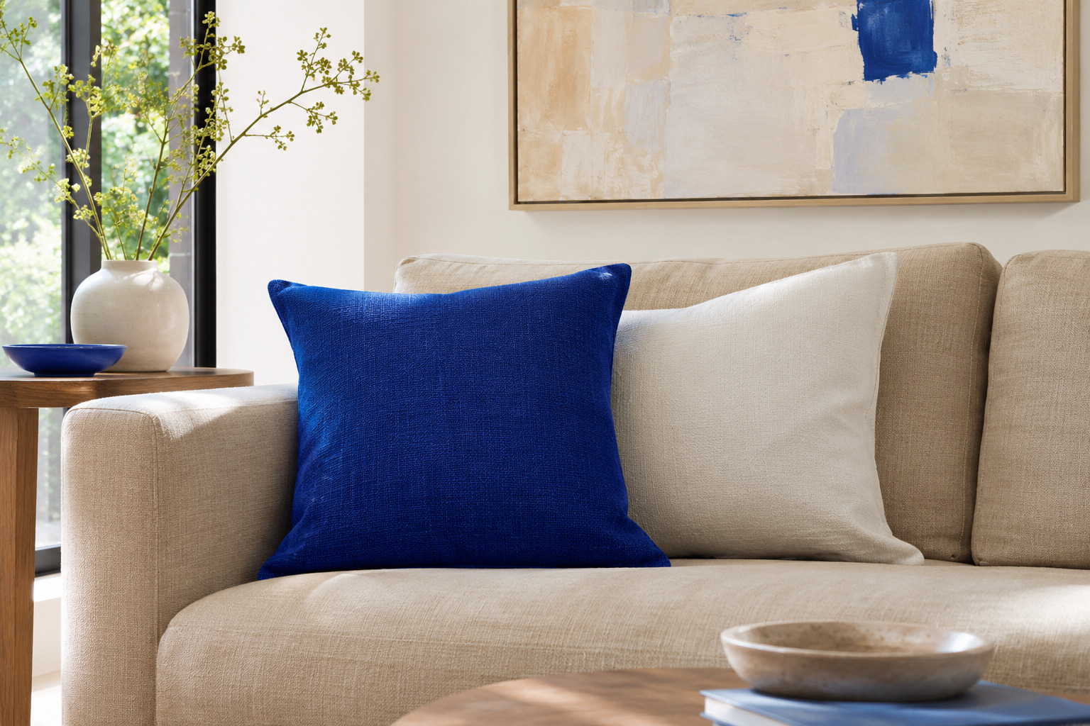
Put a clear cobalt-blue pillow beside a quieter ivory one on beige upholstery. Leave a little beige visible between the pillows and the arm so all three colors remain part of the arrangement. A small blue detail in artwork can connect the pair with the rest of the room.
Compare the ivory with the actual sofa before buying another cover. A very cool white may stand apart from warm beige, which can be a deliberate choice if you like a crisper look. Keep other bright cushion colors out of the first trial so you can judge the blue’s effect.
3. Mix a Fine Stripe With a Large Botanical
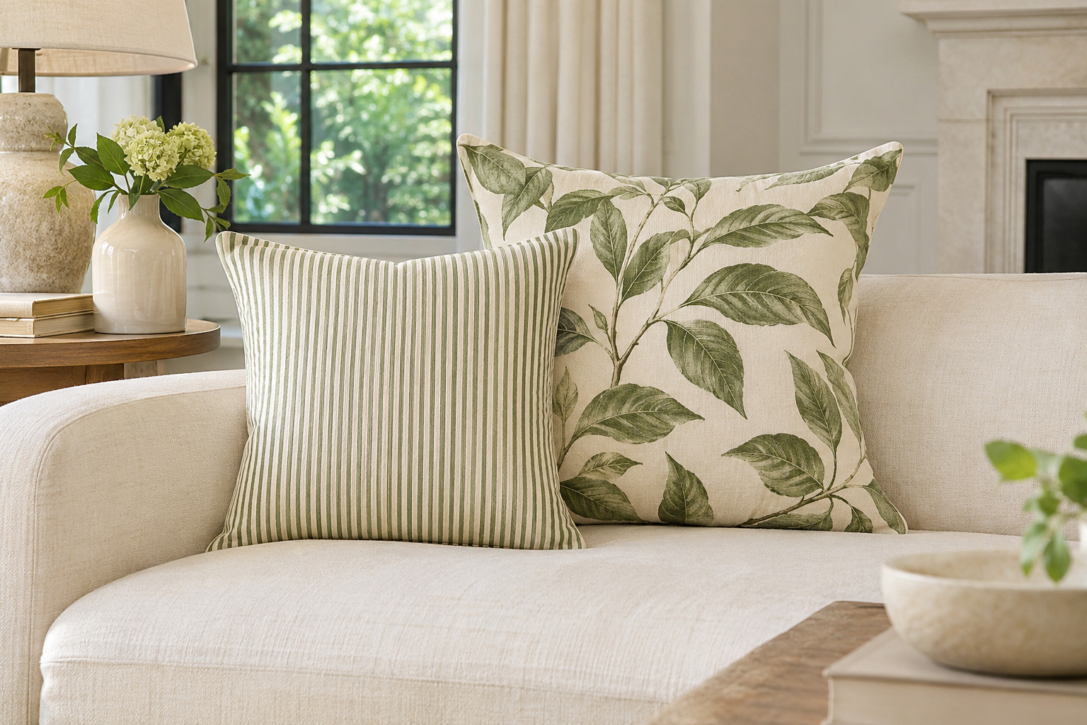
Choose a striped cover with a small repeat and place it beside a botanical with much larger leaves or flowers. Pick one color that appears in both. The difference in scale lets the patterns do separate jobs instead of competing as equally busy surfaces.
Check the full cushion fronts, since a small swatch can miss the largest part of a print. Let a plain section of the sofa act as the pause between the pair. If the upholstery is also patterned, compare everything from the doorway and start with just these two pillows.
4. Layer Flax Linen and a Small Clay-Colored Lumbar
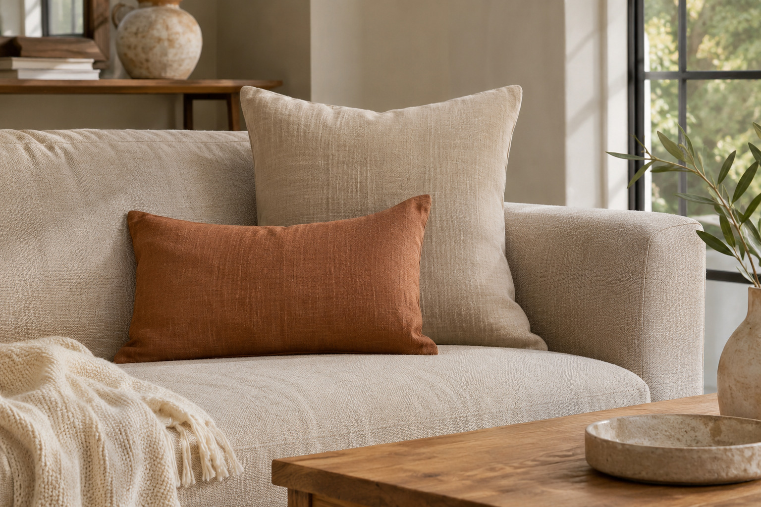
Use a plain flax-toned linen pillow as the broad background for a smaller clay-colored lumbar. The quiet square gives the warm rectangle room to show, while the different shapes keep the pair from looking like two versions of the same cover.
Let the linen’s weave remain visible and choose the clay tone beside the room’s wood and rug. Check the actual fiber content if natural linen matters to your choice; a linen-like appearance can come from different materials. The smaller pillow should be easy to move when someone wants the full seat depth.
5. Try Charcoal With a Soft Rose Accent
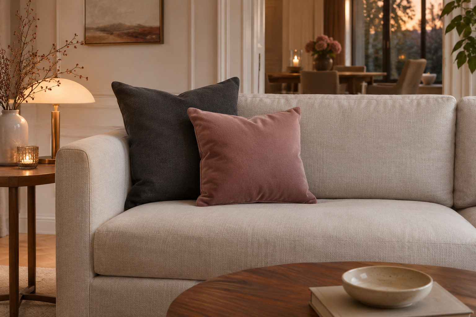
A charcoal pillow can give a pale sofa a defined edge, while a soft rose companion keeps the group from becoming entirely dark and light. Start with a quiet rose fabric rather than a very glossy one if you want a restrained effect.
Put the charcoal nearer the arm and bring the rose a little forward so both shapes show. Compare the rose with the wall color under evening light; some blush tones become much warmer beside a lamp. A plain rug and simple throw can leave the two cushion colors as the main change.
6. Use Ochre to Lift an Ink-Blue Sofa
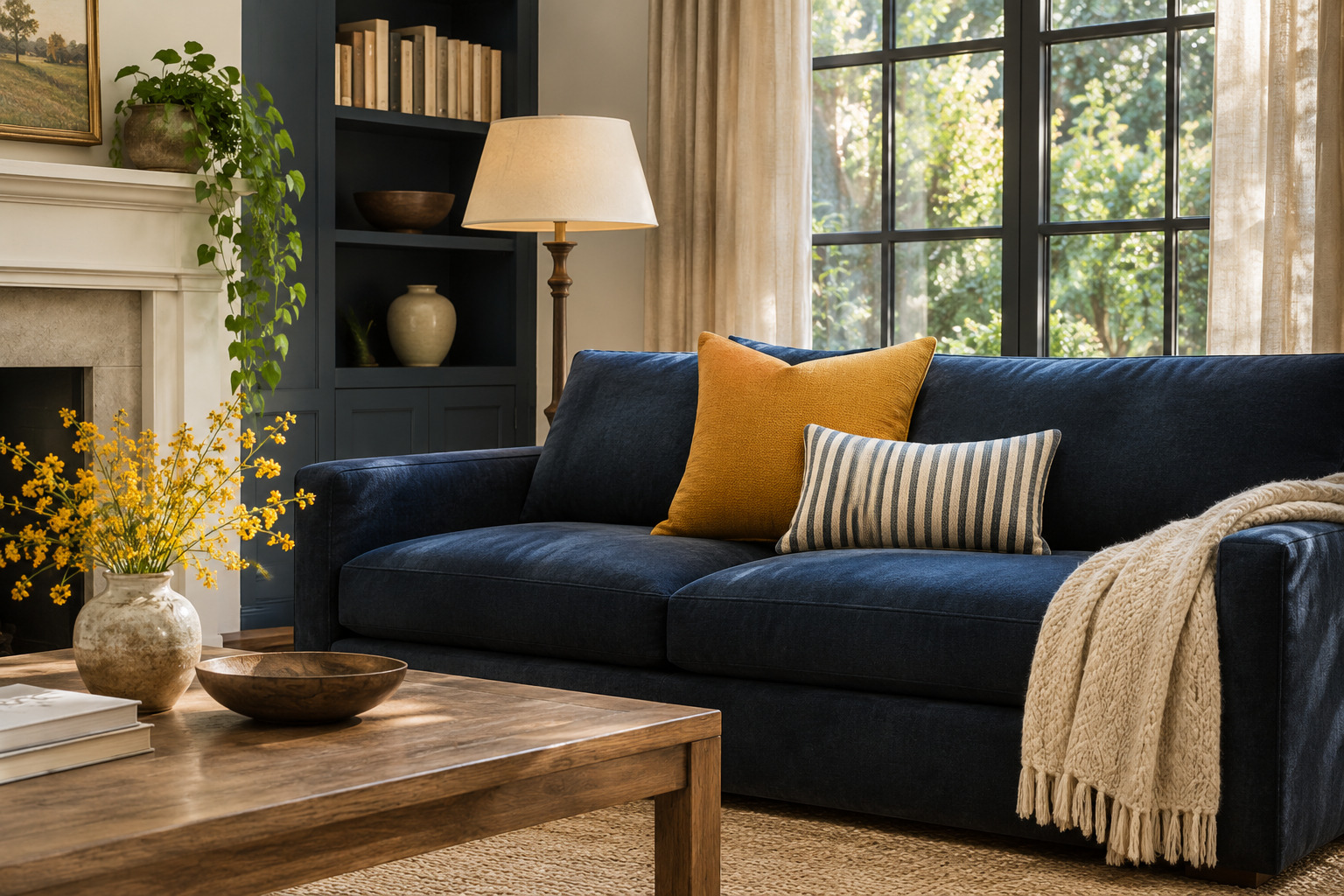
Try one ochre pillow on an ink-blue sofa and add a smaller blue-and-cream detail nearby, such as a narrow striped lumbar. The warm ochre stays clear against the dark upholstery, while the stripe connects it with a lighter note.
Keep the ochre modest in scale until you see the whole room. A saturated yellow can become the first thing you notice even in a small pillow. Compare a muted, brownish ochre with a clearer mustard to find the warmth that suits your actual blue, then choose the one you prefer rather than mixing both immediately.
7. Put a Broad Stripe Beside a Tiny Check
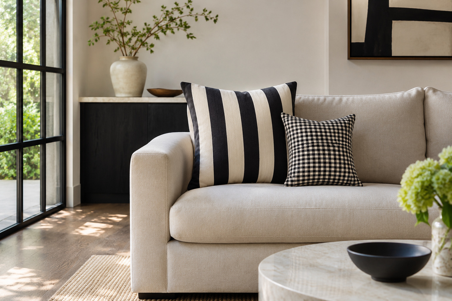
A broad stripe and a tiny check can share a sofa when their contrast and colors relate. Try an ink-and-cream stripe with a fine check in the same two tones. The stripe gives the group direction; the small check reads more quietly at normal viewing distance.
Leave some plain upholstery visible around both cushions. If the result feels too rigid, choose one pattern with a softer woven edge or add a single solid companion. View the grouping from the seat opposite the sofa before deciding whether it needs anything else.
8. Keep Cream Pillows Interesting With Different Textures
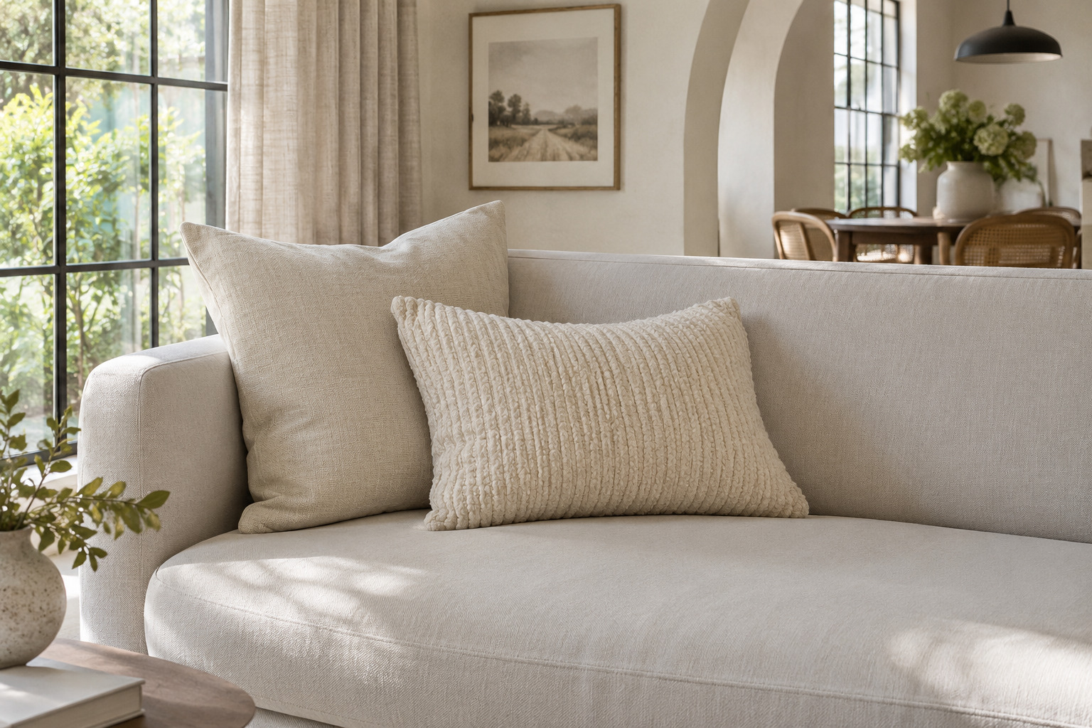
Try a cream woven square beside a softly ribbed or nubby cream pillow. Keep the colors close enough that the raised texture becomes the main difference. A smooth sofa fabric gives the surfaces a useful background.
Run your hand over the actual covers if you can, and check whether the raised texture suits the way you sit. Keep the group small enough to move easily rather than building a wall of pale cushions across the seats. The texture will read best when the cushions have slightly different shapes and their edges stay visible.
9. Pair a Faded Floral With One Deep Solid
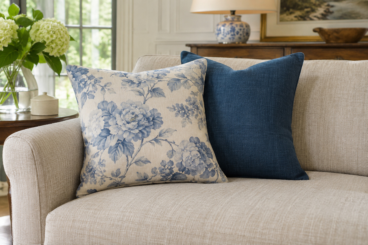
Choose a softly colored floral pillow and find one deeper color within its print. Use that note for a plain companion rather than trying to repeat every color in the flowers. A faded blue floral with a deep blue solid is one place to start.
Let the floral remain the detailed surface and keep the other cover unpatterned. If you are also choosing patterned upholstery, the patterned sofa living room ideas explain how the larger fabric changes the balance. On an existing plain sofa, start with one floral and one solid before adding another print.
10. Try Soft Blue With a Narrow Rust Stripe
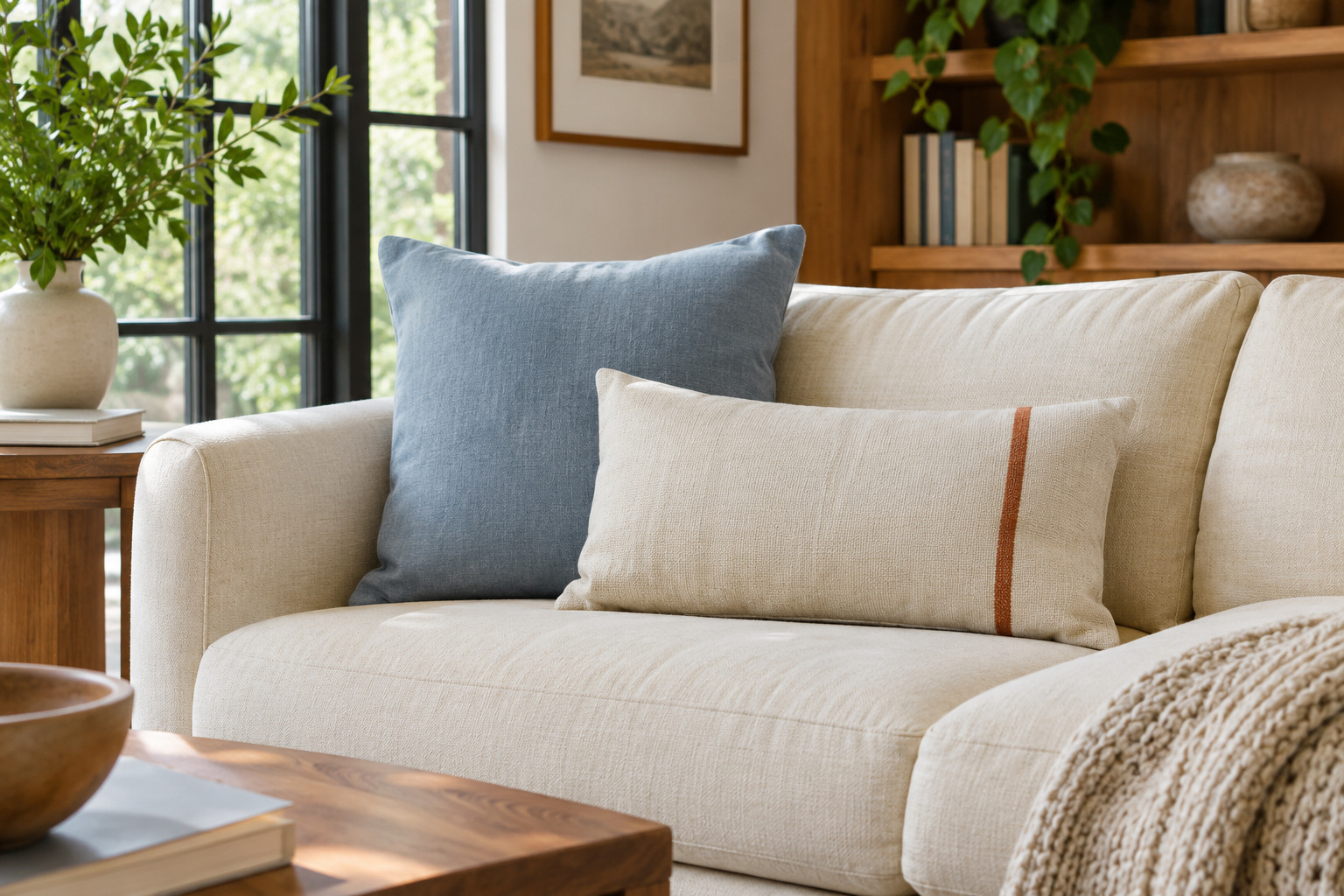
Pair a plain soft-blue square with a lumbar that has one narrow rusty-orange stripe on a pale ground. The stripe supplies a little warmth while leaving the blue as the larger color area. A warm wood table nearby can help the rust feel connected to the room.
Keep the patterned pillow’s background visible so the stripe remains a small accent. Compare the orange with the flooring before choosing it; a very bright rust may pull the whole group warmer than you intended. Leave another part of the sofa clear so the pair has a defined place.
11. Let Black Piping Define a Pale Pair
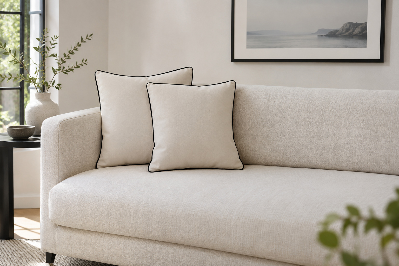
Try two pale pillows with a thin black outline on a simple light sofa. The piping gives each shape an edge without needing a large dark print. A small black lamp base or frame elsewhere in the room can repeat the line.
Check how wide the trim looks from across the room. If the border becomes the whole decoration, a quieter charcoal or narrower line may suit you better. Keep the pillow fronts mostly plain and compare their comfort as well as their appearance; prominent seams should sit where they do not bother the person using the seat.
12. Use Matching Velvet Pairs for a More Formal Sofa
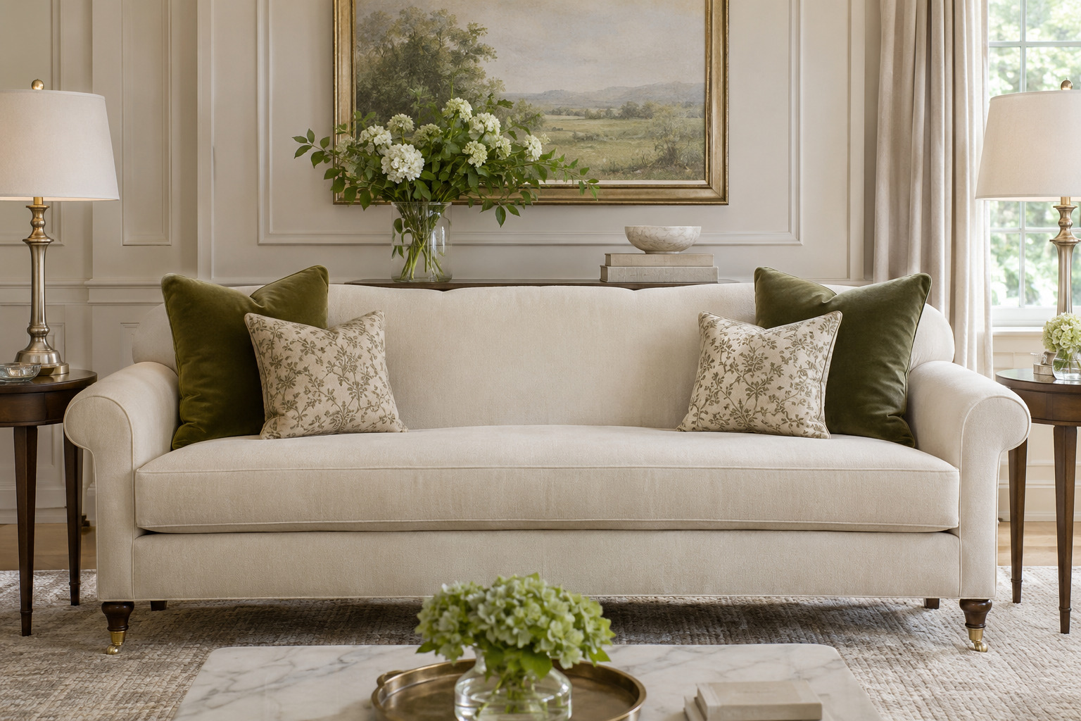
Place a matching velvet pillow at each end of a sofa, then add a smaller, restrained patterned companion in front of each if the seats have room. Keep the sizes and order consistent so the symmetry reads clearly. A subtle border or woven motif can supply detail without a bright contrast.
Sit in the actual arrangement before adding a central cushion. A formal look can still leave the middle seat useful. View the velvet in evening light, since its sheen may make the same cover appear lighter on one end than the other.
13. Give a Gray Sofa Two Warm Brown Tones
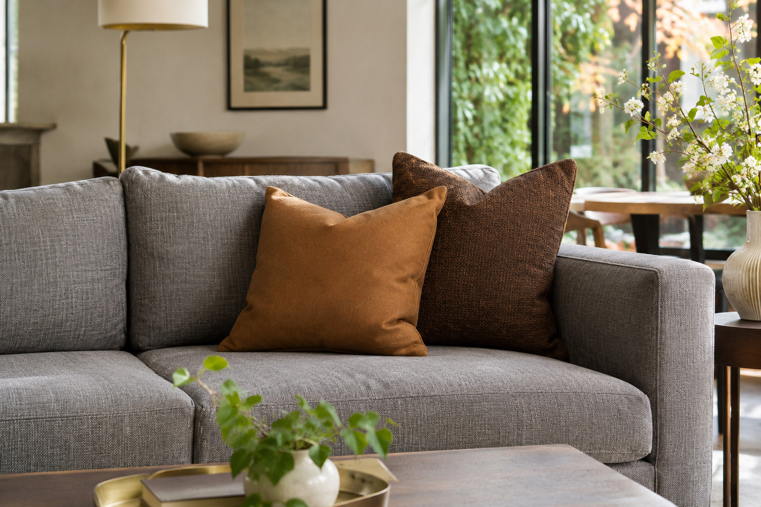
Put a caramel pillow beside a deeper walnut-brown one on gray upholstery. The two browns can bring warmth while their difference in depth keeps the group from becoming one dark patch. Try a smooth cover for one and a quiet weave for the other.
Check the browns against the gray’s undertone rather than treating all gray sofas as the same. A cool slate and a warm greige may need different companions. For another deeper room accent, the burgundy living room ideas show how to introduce a rich color without repeating it everywhere.
14. Keep a Deep Seat Comfortable With a Short Lumbar
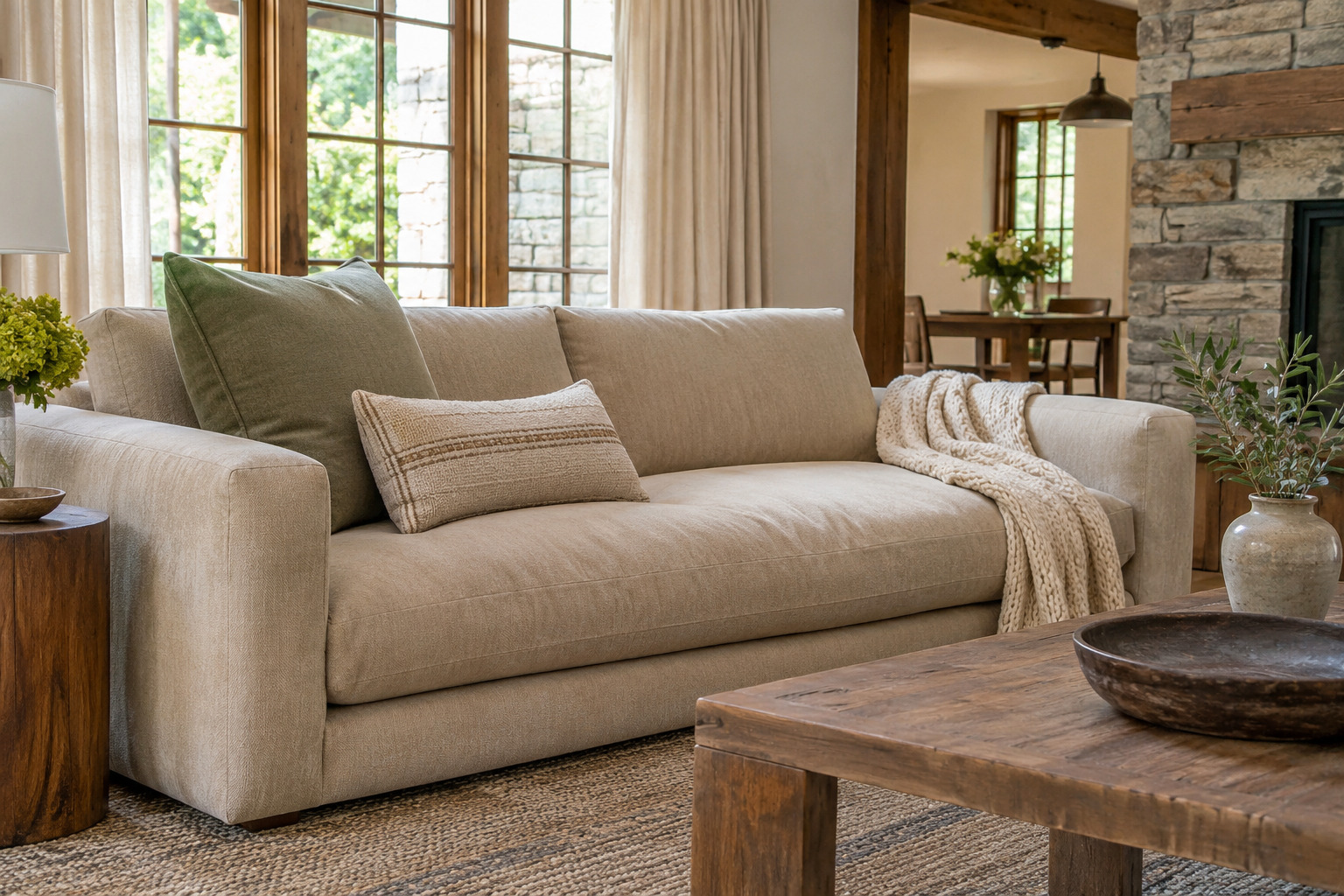
On a deep sofa, try one broad pillow near the arm with a shorter lumbar in front. The rectangle can add a second color without covering as much of the back as another tall square. Test the combination while sitting the way you normally do.
Move the smaller pillow aside if it pushes you too far forward or interferes with the sofa’s support. There is no universal decorative count that makes every seat comfortable. A pair that is easy to adjust is more useful than a larger arrangement that has to be removed whenever someone sits down.
15. Use Just Two Modest Pillows on a Loveseat
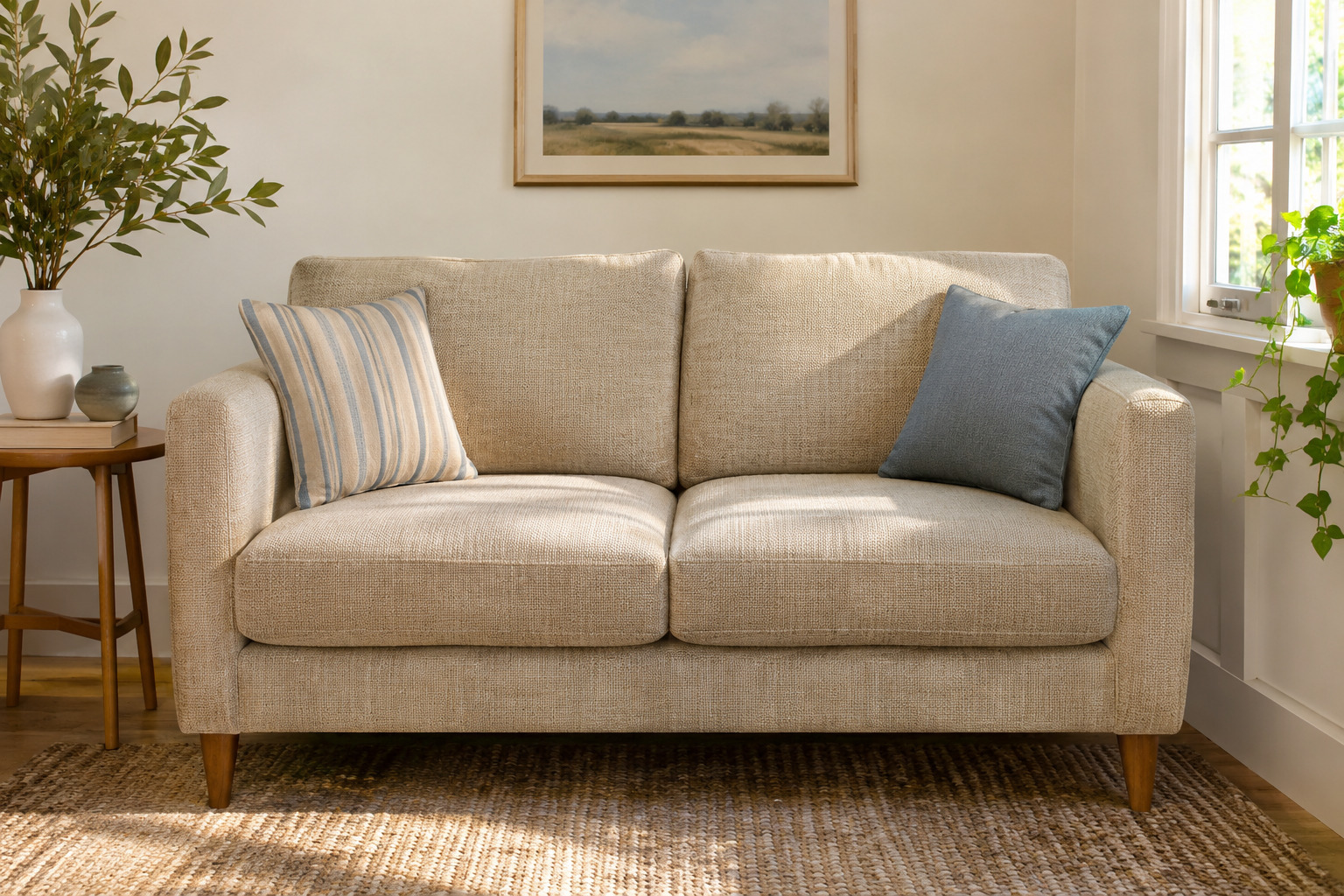
Start a compact loveseat with one modest pillow at each end, choosing covers that relate through color or texture. Leave the middle and most of the seat cushions open. Try one softly striped cover and one plain version of a color from the stripe for an easy comparison.
Check the remaining seat depth with two people sitting down. Reduce the pillow size or thickness if the arrangement crowds the arms. The room will feel more usable when the small sofa keeps its intended seating space instead of carrying the cushion count of a much larger couch.
16. Pick Up One Small Color From the Rug
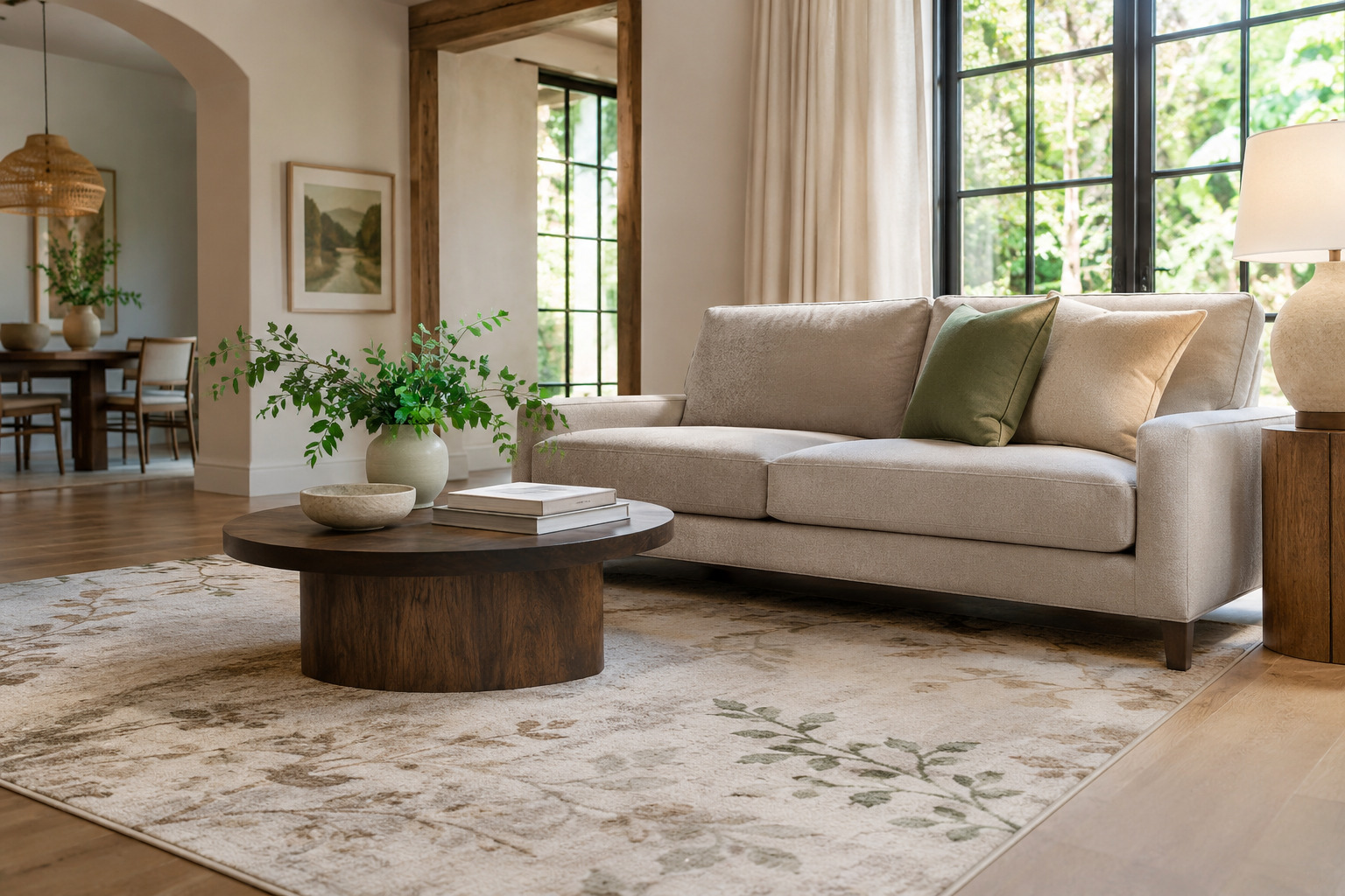
Find a minor color in the rug and try it on one pillow, with a neutral companion beside it. A little muted green or dusty pink may be enough to connect the floor and sofa. The smallest rug detail can be more useful here than copying its largest background color.
Look at the rug and cushions together from the doorway. If the repeated color becomes too strong, choose a quieter fabric or a smaller pillow. Keep the other cushion simple so the connection stays easy to see rather than competing with several new patterns.
17. Change One Pattern While Keeping the Other Covers
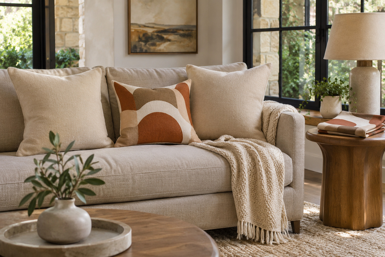
Leave the plain covers you already like in place and replace just one patterned cover. Pick a new print that shares a color with the remaining group. A different motif can make the sofa feel fresh while letting you judge exactly what changed.
Measure the existing insert and check the new cover maker’s fit guidance before ordering. Do not assume identical labels guarantee the same fullness. Store the removed cover clean according to its care instructions. This is a useful first trial when you enjoy a change but do not want to choose an entire set at once.
18. Let One Graphic Pillow Lead a Quiet Group
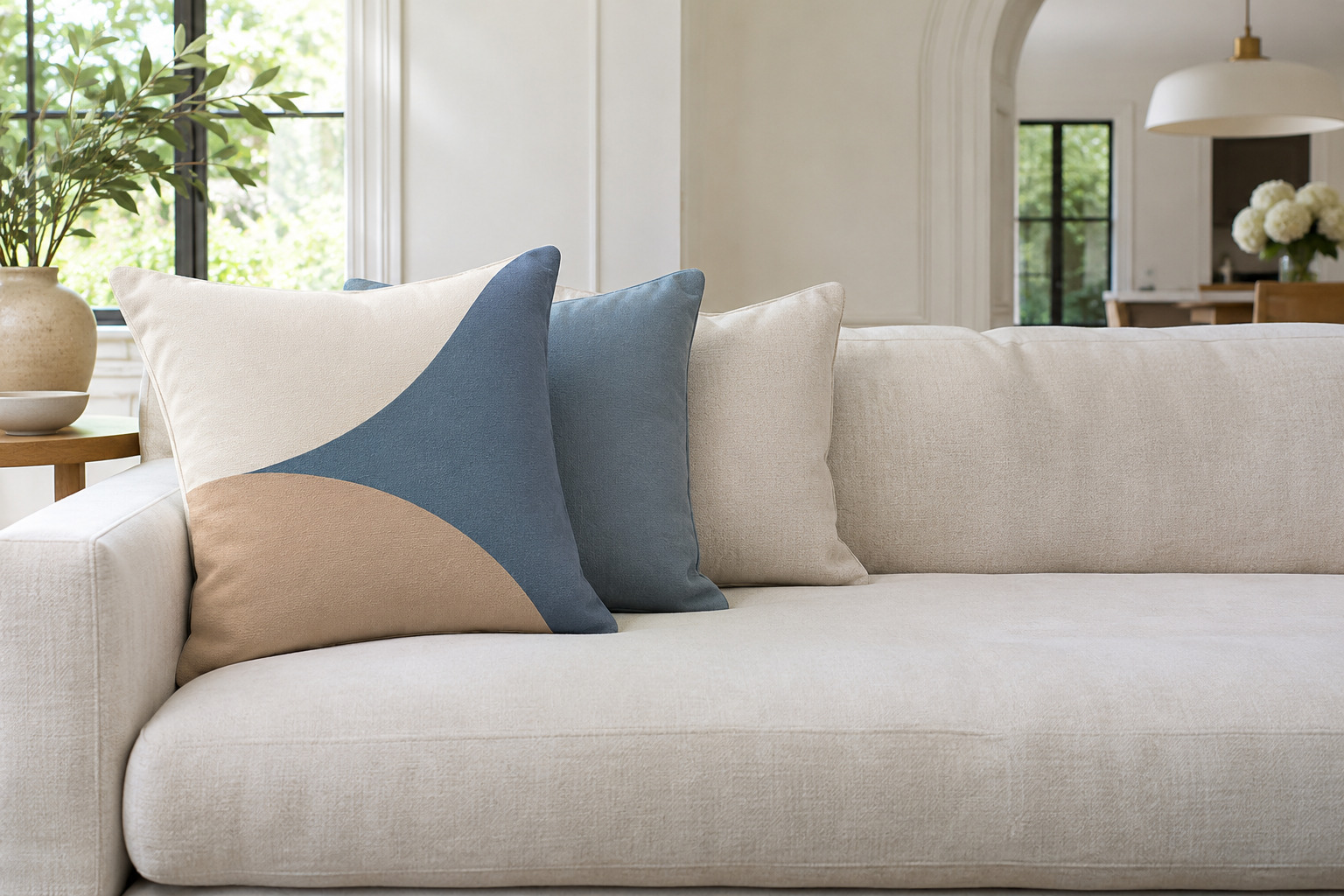
Use one pillow with a clear graphic shape, such as a large curve or block, alongside quieter solids. Repeat one color from the graphic in a plain cover and let the other cushions stay close to the sofa. The leading pillow should still be visible once the group is arranged.
Keep the graphic large enough to read without needing several competing motifs. If the sofa has a strong shape or bold upholstery, test the pillow on its own first. A single confident pattern can finish the arrangement when the surrounding colors already feel settled.
Build a small group on the sofa before buying more covers. Notice which color connects with the room, which texture you enjoy touching, and whether the seat still feels right. Keep the pillows that help those three things work together, and let the rest of the sofa remain part of the design.
Discover more from HomeTrendora
Subscribe to get the latest posts sent to your email.