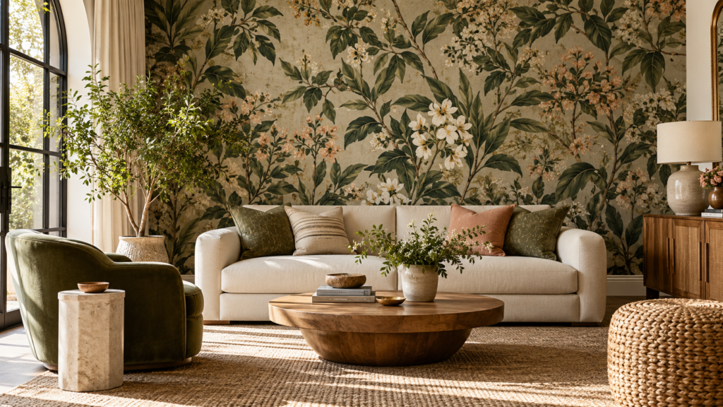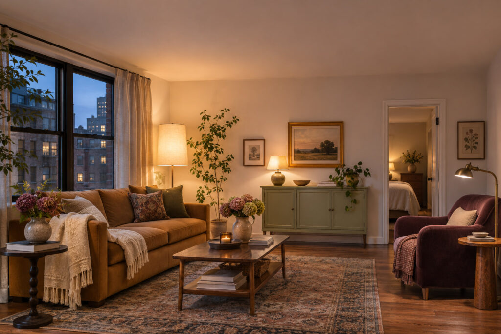
A teal wallpaper sample can look blue in the store and almost green when you bring it home. Start with the light you have and decide how much of the wall should carry the pattern before you buy a roll.
Hold each sample upright on the intended wall and look at it from where you sit or walk in. Leave it there long enough to see the room in daylight and with the lights you actually use at night. Pay attention to the ground color between the motifs. It has a lot to do with whether the paper reads as soft, sharp, or dark.
1. Try a Cream-Ground Print in a North-Facing Room
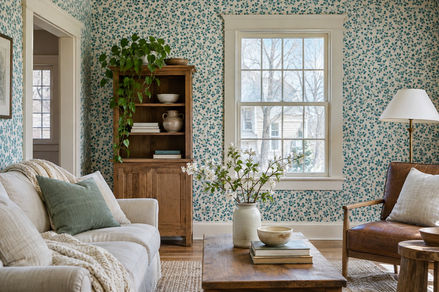
Bring a sample with a warm cream background and a small teal pattern into the room. Compare it with a sample that has a white ground. In indirect light, the cream may help the wall feel more closely related to warm wood and upholstery you already own.
Keep the sample beside the existing trim rather than viewing it alone. If the ground and the trim look good together but the motif disappears, try a stronger teal in the same family. A larger sample will show how often that stronger color repeats.
2. Compare a Sample Under Daylight and Your Evening Lamp
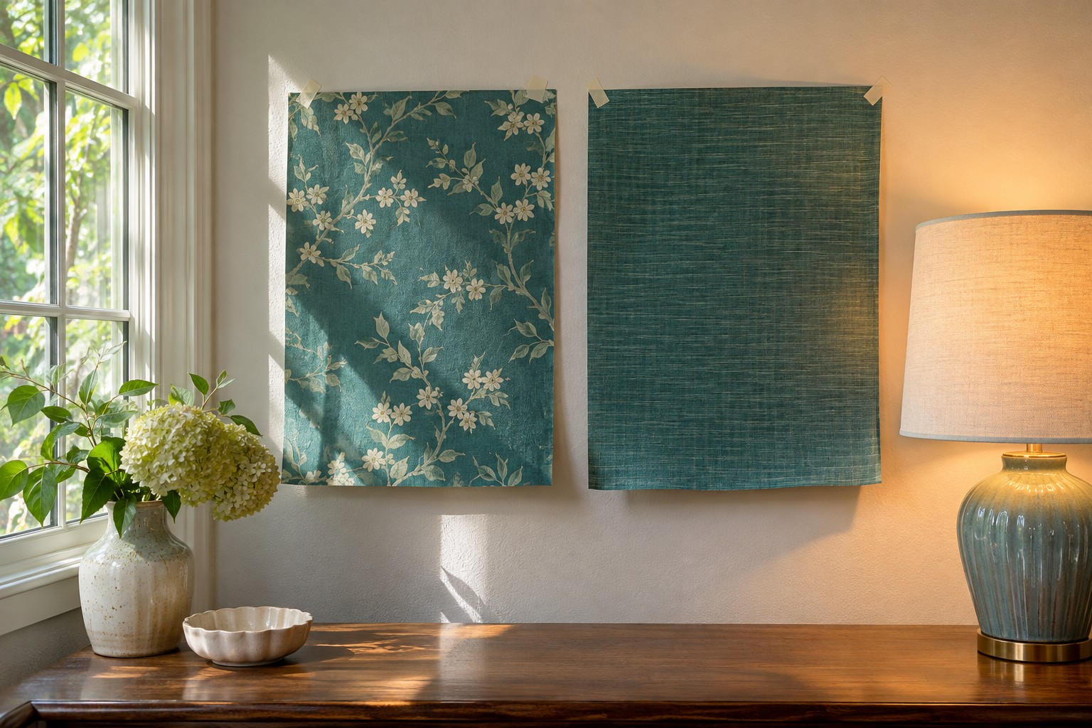
Put the same sample on the intended wall near the lamp for an evening, then check it again in daylight. If you’re deciding between two prints, place them side by side at the same height. You can hold them with a suitable temporary method that won’t harm the wall or tape the sample to a piece of stiff backing instead.
Look first from the usual seat and then from the doorway. Note which print looks too green or too dark at the time you use the room most. For a bolder pattern, stand back far enough to see the whole repeat before making the call.
Delicate-surface painter’s tape can hold a lightweight sample while you compare the two light conditions. Test a discreet patch first and follow the tape’s directions for your existing finish.
View the delicate-surface tape → (paid link)
3. Let Strong Sun Fall on a Low-Contrast Print
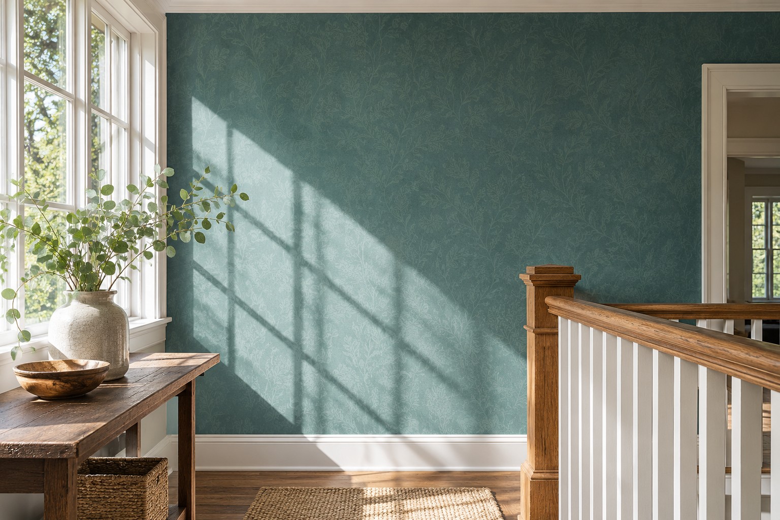
On a wall that gets bright direct sun, try a teal pattern with only a small difference between the motif and ground. A muted leaf or fine geometric can remain interesting in the shade and feel quieter on the bright part of the wall.
Check the design at the sunniest hour with the window covering the way you normally leave it. Look for a pattern that still has a readable edge in the shaded part of the room. If the contrast is harder to see from a seat, compare a second sample before choosing darker furniture or more pattern.
4. Give an East-Facing Breakfast Nook Green-Leaning Teal
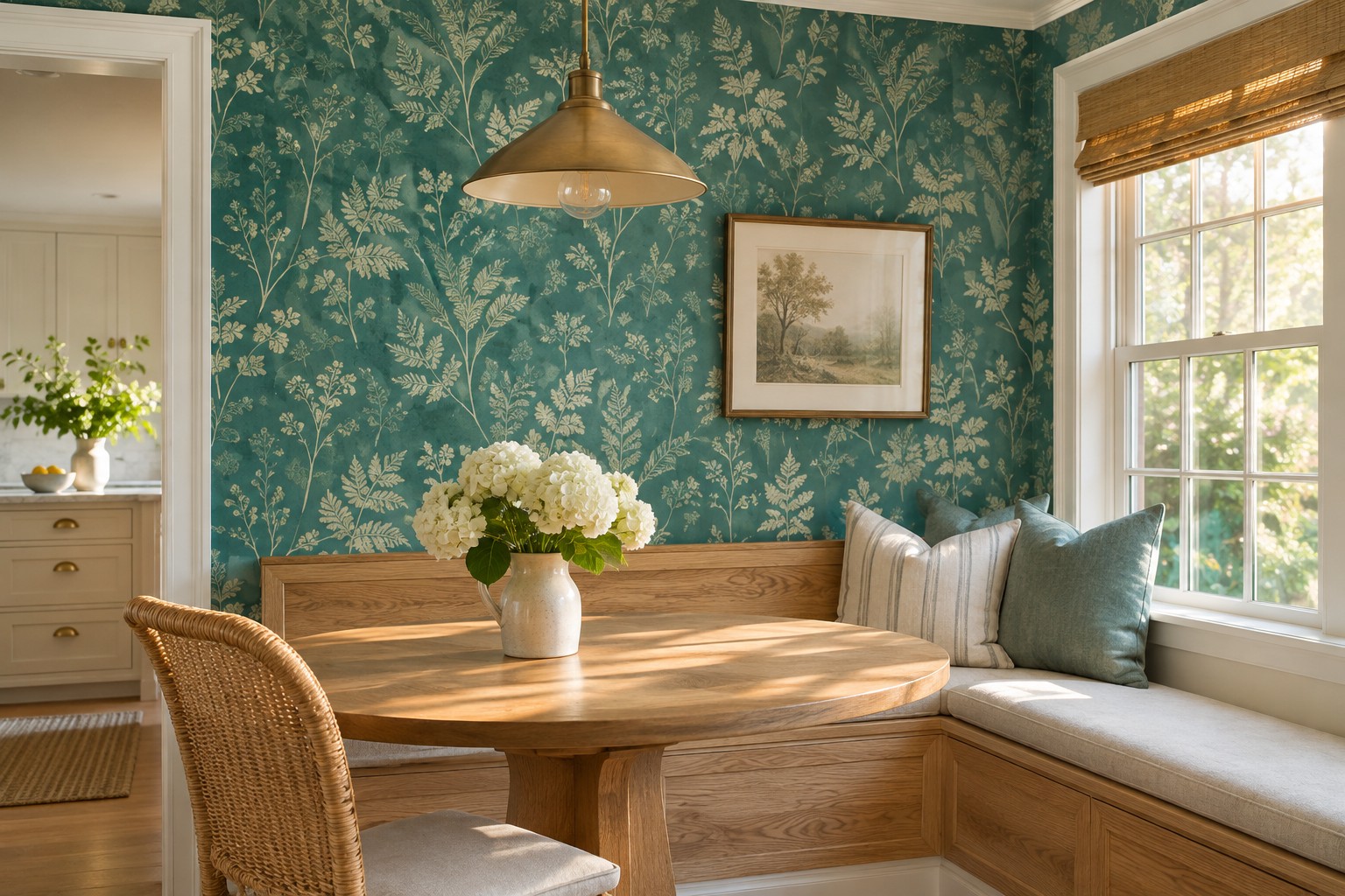
Use a small patch of green-leaning teal behind a breakfast bench and check it in the morning. A warm fabric or light wood can help the green feel at home while that early light is bright. A fern print is a natural place to start when the nearby table has a plain top.
Move the sample to the exact height where it will be visible above the back cushion. If the teal reads stronger than you expected, look for a print with a smaller proportion of color. Keep enough plain wall around the nook to give the pattern a distinct stopping point.
5. Try a Blue-Leaning Ground in a Warm West-Facing Room
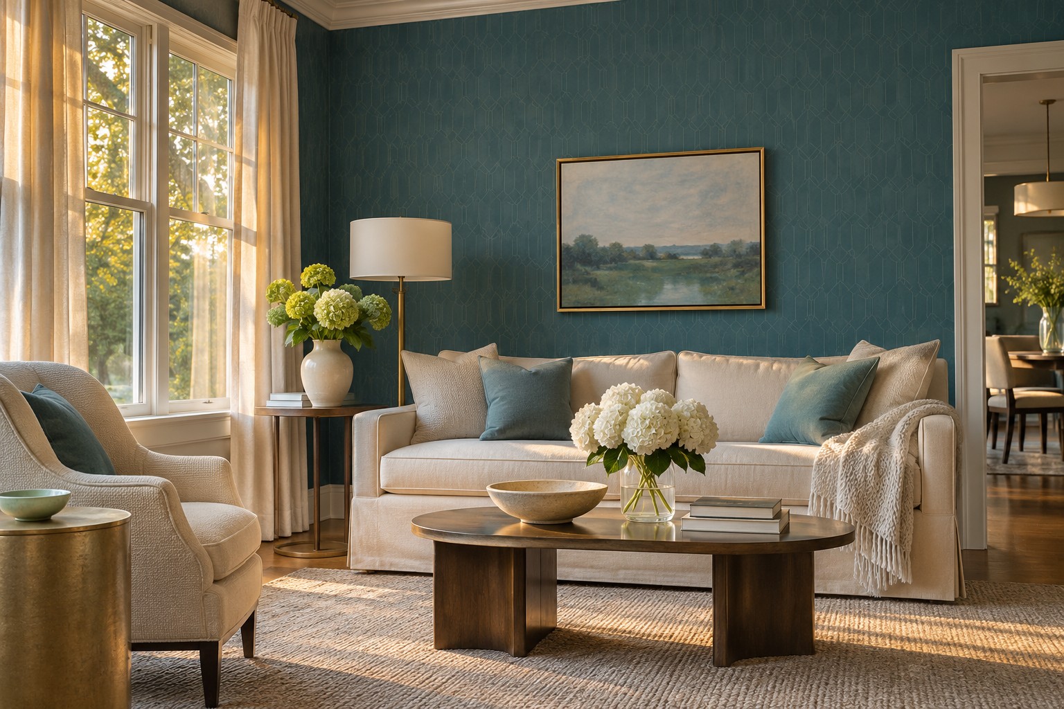
Hold a teal with a visibly blue ground beside the wall color as the afternoon warms up. Look at it next to a neutral fabric from the sofa. Depending on the light and print, the blue may give the room a cooler note beside wood or textiles that already lean golden.
Visit the same wall the next morning. If the color becomes much darker than you want, try a lighter ground or a pattern with more unprinted space. Choose the one that suits the room at the two times you’re most likely to be there.
6. Make a Long Hall Read From Both Ends
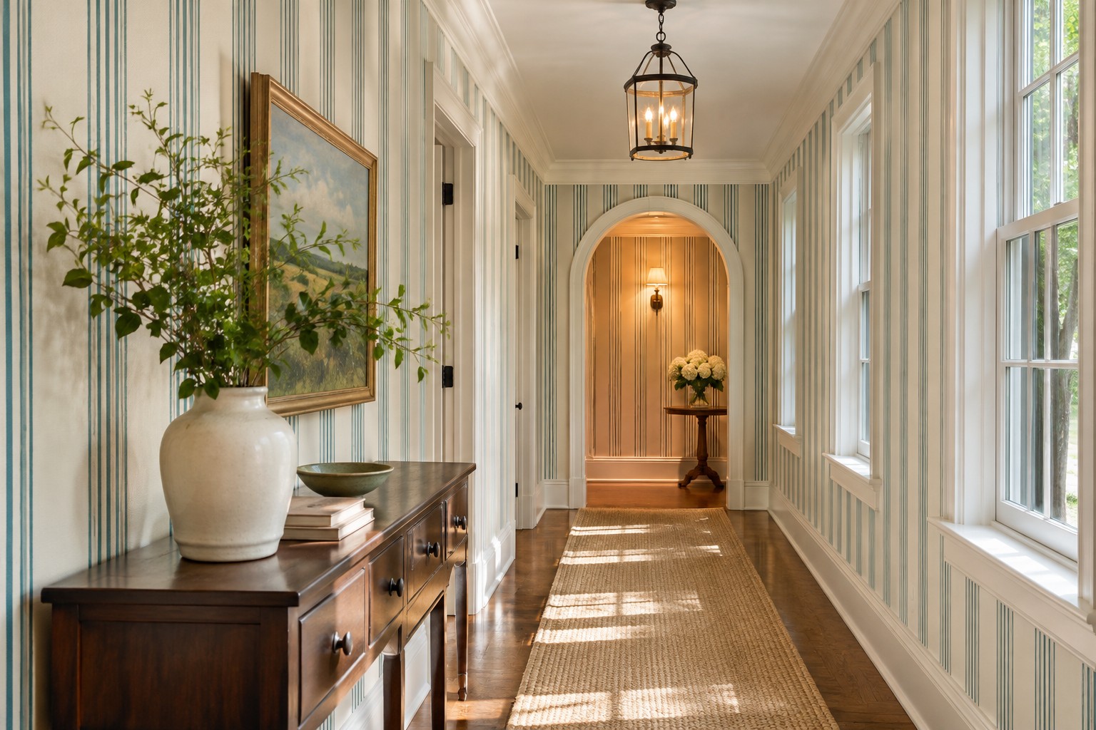
Try a slim teal line or a softly repeating shape on the long wall you see from both ends. A restrained design is easier to follow when the hall gets one patch of daylight and a different light source at the other end. Put a sample in each of those zones at the same height.
Walk the full route and look over your shoulder halfway along it. If one end reads more blue than the other, check whether that variation is something you like. These ways to brighten a windowless hallway can help where the second end needs its own light.
7. Put Large Teal Leaves Where You Can Stand Back
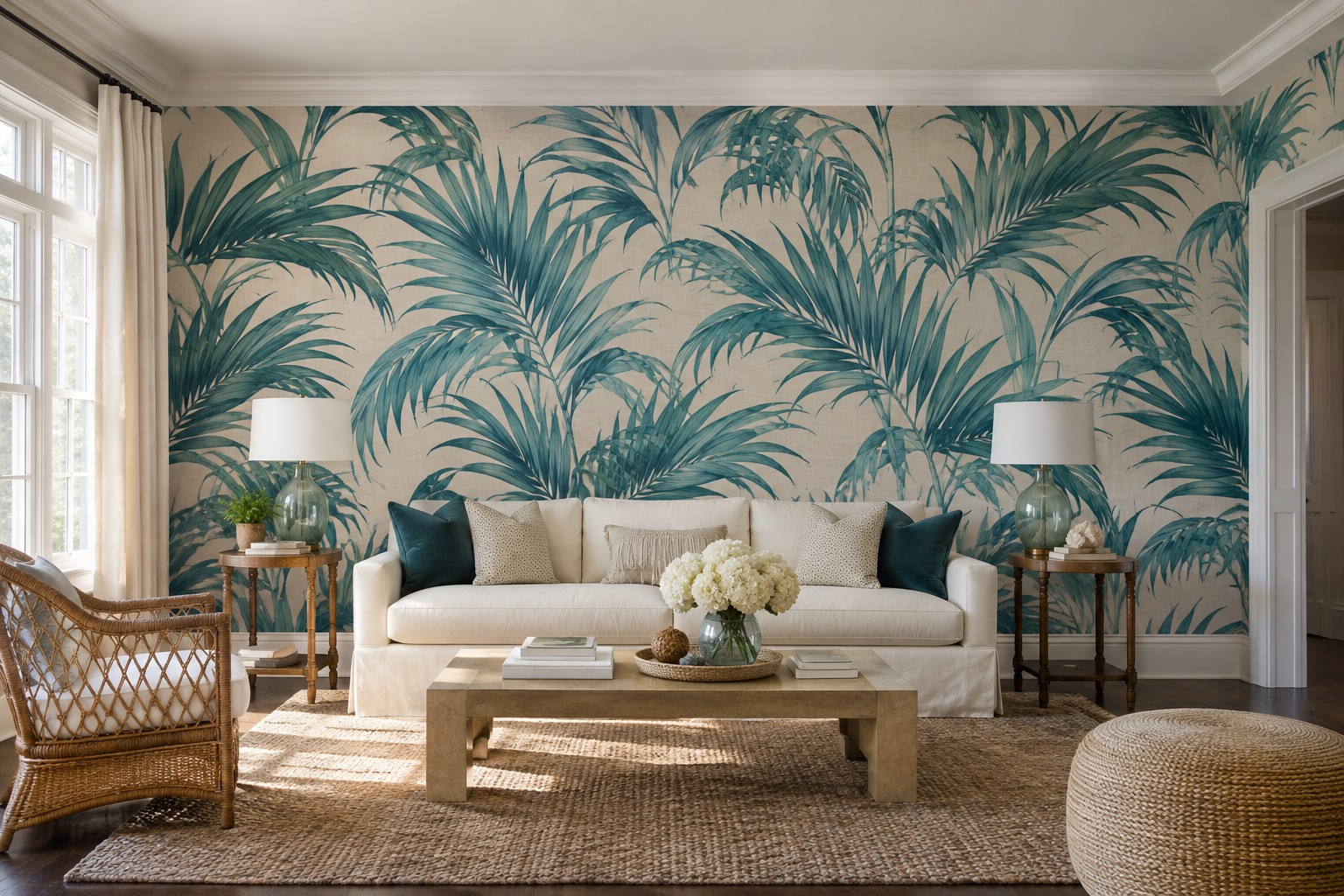
Give an over-scaled leaf print the wall you see across the room. A broad section of bare wall over a low sofa lets the leaves read as individual shapes. Match the ground to one steady color in the room so the foliage can be the one new pattern.
View more of the repeat than a small swatch can show. Find the height where the tallest leaves remain visible above the furniture and avoid trimming the most distinctive part of the motif behind a curtain. The best angle is the one you already look from every day.
8. Use a Fine Repeat Beside a Wide Mirror
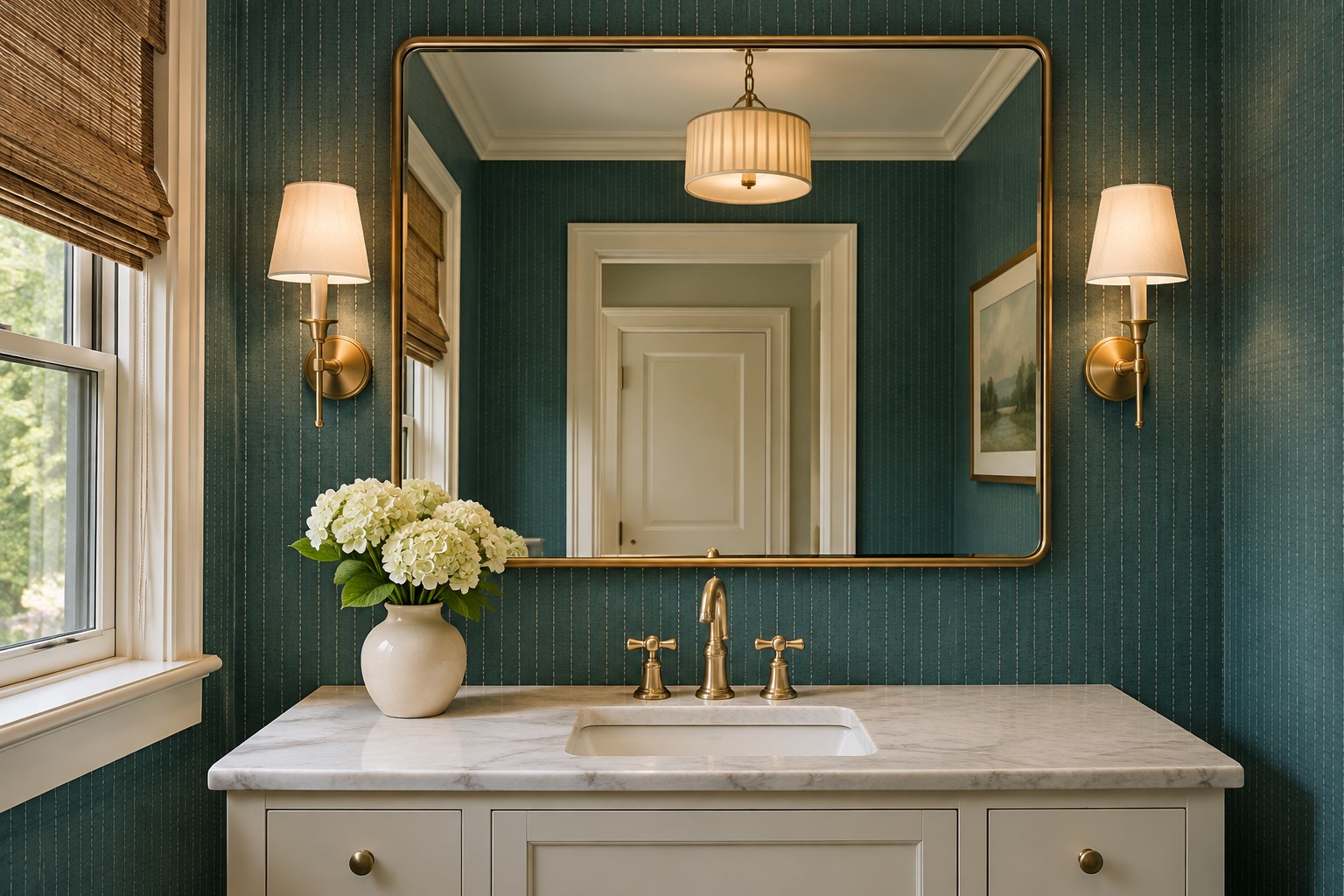
Try a narrow line or a small repeated motif on the visible wall around a wide mirror. The pattern should still make sense in the small patches beside the frame. Pick a sample with a different shade from the mirror trim so you can see both edges in artificial light.
In a bathroom, check the paper’s instructions for the intended surface and location, particularly near water or steam. For the wall layout, compare the ideas in this powder room wallpaper guide. A small repeat is easier to judge when you can see the actual gaps the mirror will leave.
9. Test a Metallic Detail With the Pendant On
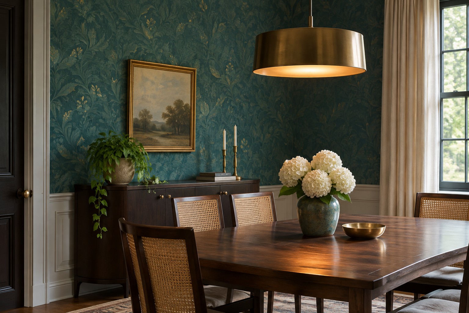
Pin a sample of the teal paper with its metallic detail next to a plain sample, then turn on the pendant. Sit where you usually eat or read. A small number of quiet highlights can bring the pattern forward after dark, while a high-shine finish may catch more light than you want.
Check the view from the opposite seat as well. If the reflection is concentrated in one bright section, try putting the pattern on a wall farther away or choose a matte version. Look for a finish that still makes sense in daylight, when the pendant is off.
10. Let Light Graze a Tonal Textured Wall
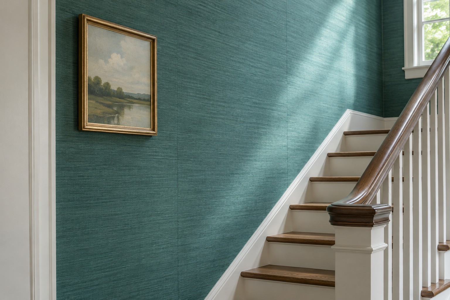
Put a teal paper with a discreet surface texture where a window throws light along the wall. A sideways view shows how the texture picks up shadows. Compare a textured sample and a flatter print in the same color family to see which gives the room the amount of variation you want.
Read how the manufacturer describes the material and its seams. A grasscloth print and a woven grasscloth wallcovering can behave differently at a join. Hold two matching samples together in the light that will reach the finished wall.
11. Separate a Deep Teal Ground From Dark Furniture
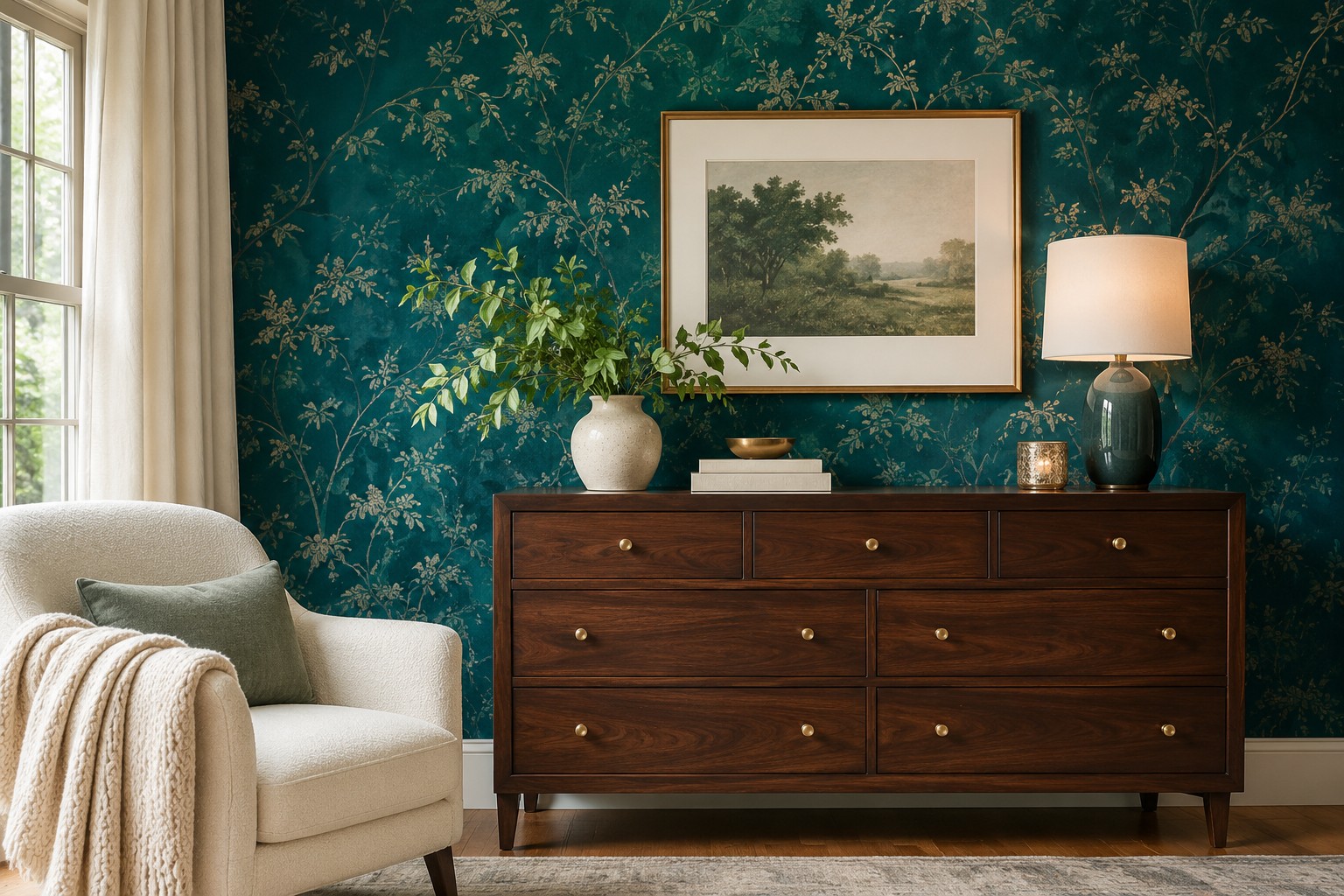
If you want a deep teal ground behind a walnut cabinet, leave a lighter interval next to it. A pale artwork mat, chair, or stretch of trim can make the dark pieces easier to distinguish in a dim room. Use the daylight check to see where that interval helps most.
Keep the floor and wall samples visible from the doorway. When the wood blends into the paper after dark, move a light accent to the place where the shapes meet. You may be able to keep the dark color and still let the cabinet have a clear outline.
12. Use a High Chair Rail to Limit a Dark Print
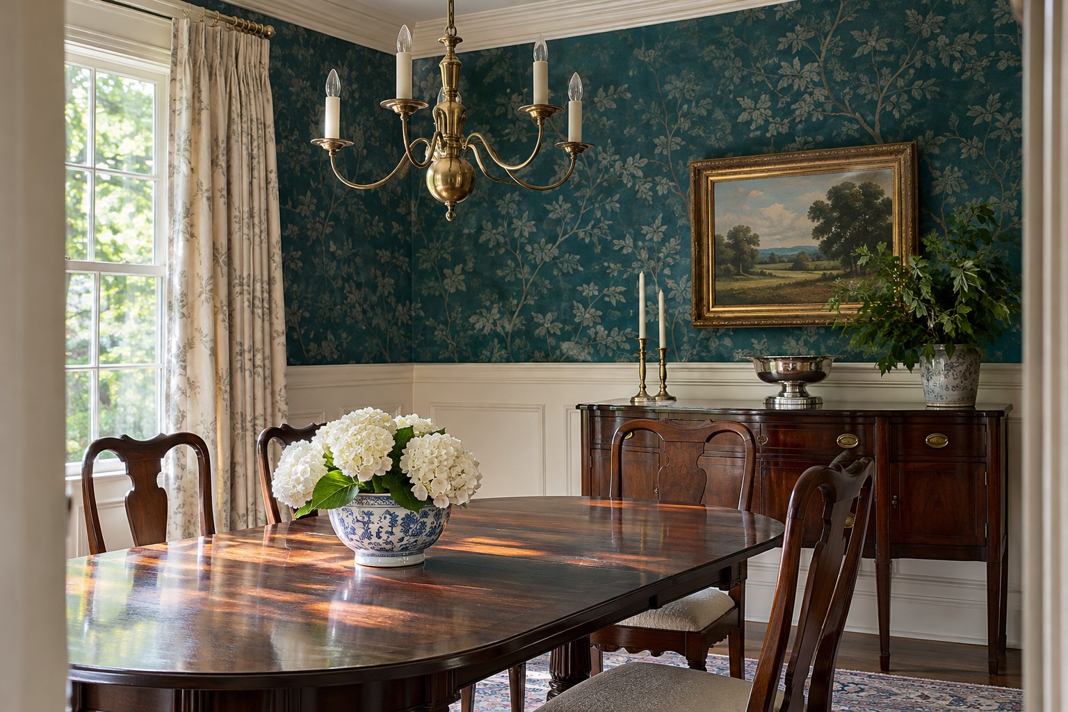
Above an existing chair rail, try a dark antique-style teal print with a lighter color below. The rail leaves a useful boundary and allows the lower wall to keep reflecting the light it already receives. Check how the motif reads from a chair as well as standing up.
Avoid choosing the upper color from a sample on the table. Put it directly above the rail and see where the top and bottom of a full motif will land. Move the starting point or choose a smaller repeat if the main design would end in an awkward sliver.
13. Find a Quiet Spot for a Teal Stripe in a Busy Room
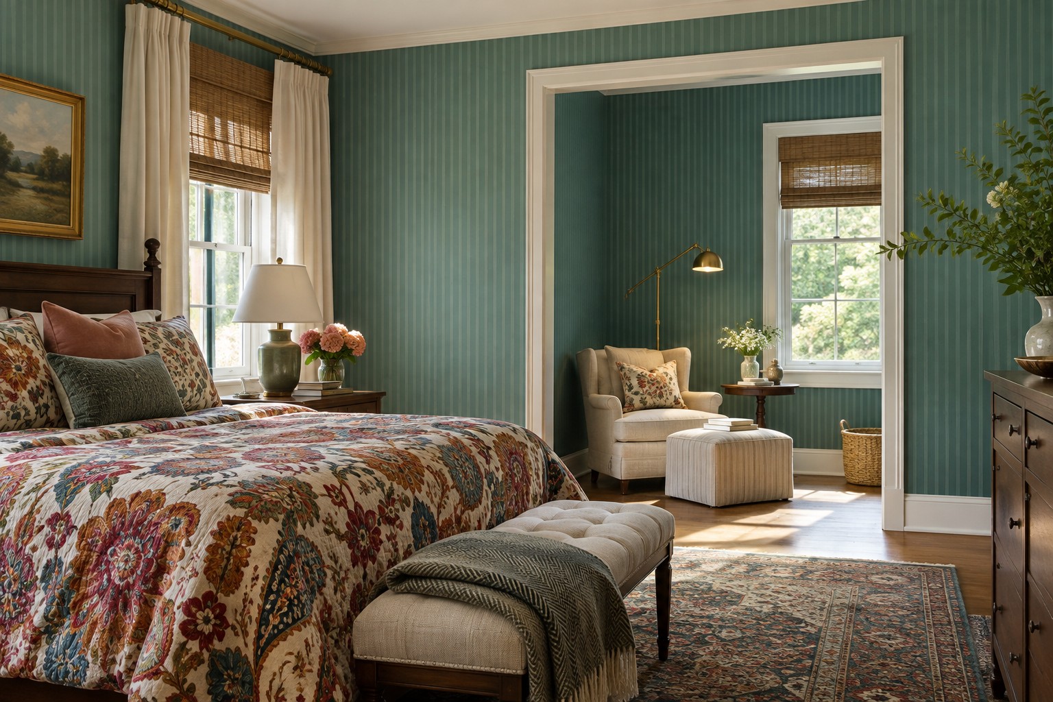
In a room with patterned bedding or a full bookshelf, use a soft teal stripe in a small alcove or an otherwise plain corner. Give it an uninterrupted edge so its rhythm stays separate from the furniture. A stripe on a neutral ground can carry one color from the rest of the room.
Look at the bedding pattern and the wall sample together from across the room. If both repeats have the same scale, try a much finer wall stripe or use a plain ground with a single thin teal line. Let the largest pattern stay where it will have room to be seen.
14. Keep a Doorway Return in the Same Undertone
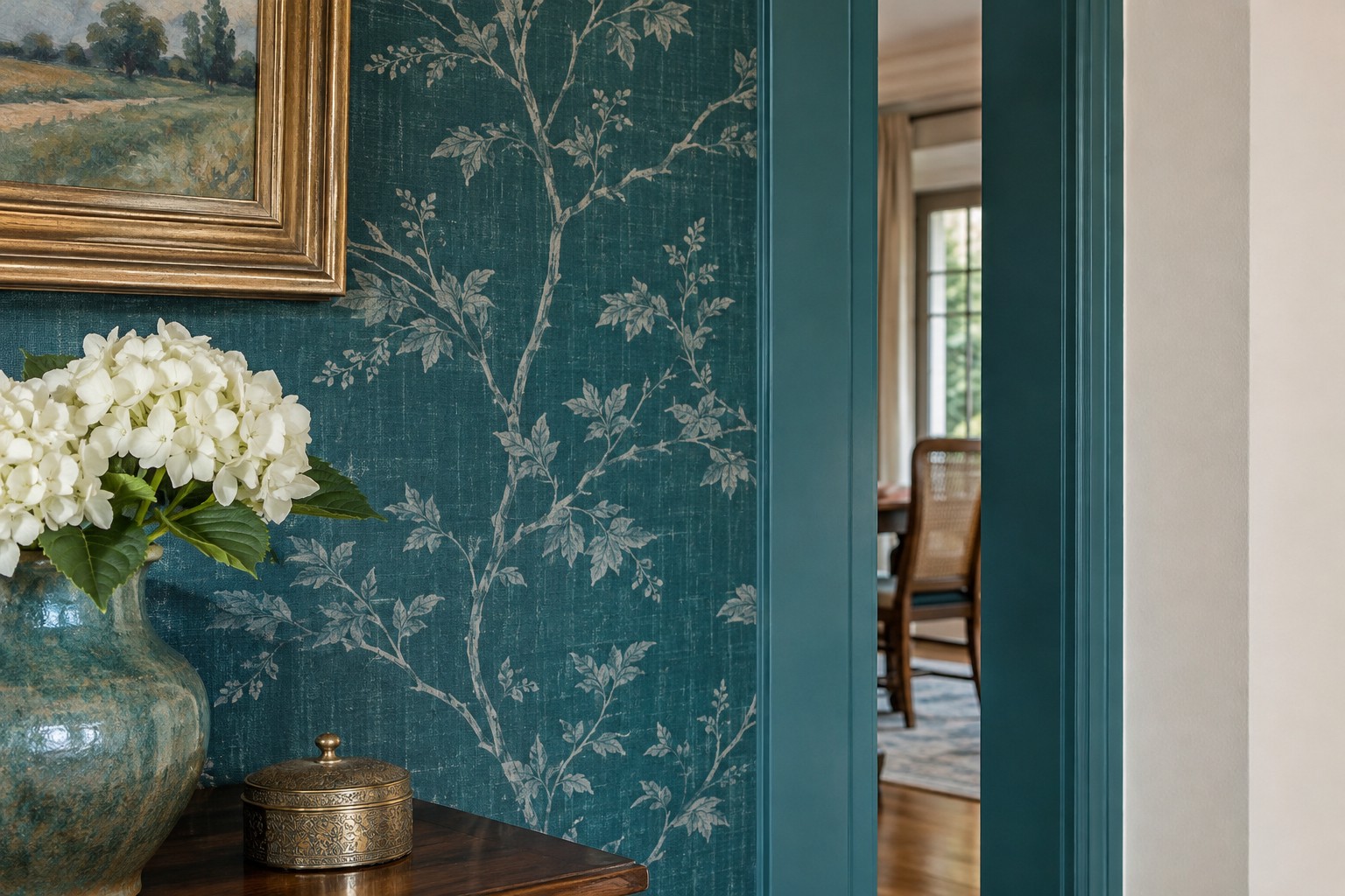
Where a papered wall turns toward a painted opening, pick a return color that has a similar underlying blue or green. Hold the paint sample against the edge of the paper in the shadow of the opening. The shade there will often matter more than the match in the room’s brightest spot.
Use the painted strip to give the pattern a clean boundary. If the two teal shades are close but look mismatched in shadow, choose a clearer neutral from the wallpaper ground. The transition is easier to see when you stand in the doorway where both surfaces meet.
15. Frame One Panel Where the Light Changes
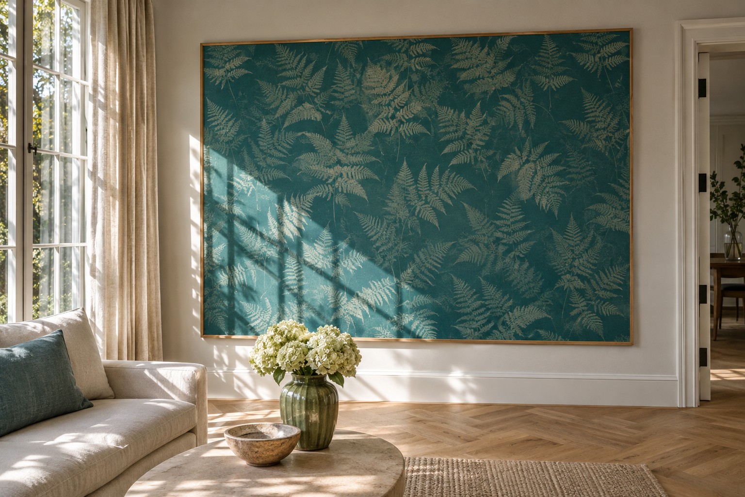
Use a framed panel to test a bold teal print on a wall that looks different through the day. Put the frame where you can see its upper and lower edges at once. A single panel lets the wall’s quiet color stay in view around the design.
Hang or mount it with hardware suited to the piece and wall. Watch what happens to the print when a shadow crosses it and when your evening light reaches it. If you enjoy both views, you have a strong starting point for deciding whether to extend the pattern farther.
Keep your favorite sample up for one ordinary day before choosing. Look at it when you first enter the room and when you settle there in the evening. Pick the teal you like beside the furniture and finishes that will still be there after the wallpaper goes up.
Discover more from HomeTrendora
Subscribe to get the latest posts sent to your email.